Designing data visualizations

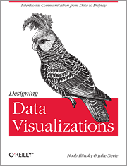
Designing data visualization book cover

Noah Iliinsky and O’Reilly were kind enough to send me one review copy of Noah’s book and who says review copy says review, so here goes.

We need more introductory books to data visualization.

I’ve had several discussions with data visualization colleagues who feel that there are too many books already. I strongly believe otherwise.

As of this writing, there are 59 books tagged data visualization on Amazon, versus well over a thousand for Java (for example). And on those 59, I would say about a dozen qualify as introductory. Here are 3 reasons why introductory books are important.

  • You only need to know a little to start making effective visualizations. A small book won’t teach you all there is to know about visualization, but you don’t need that to get off to a good start. A lot of this has to do with asking yourself the right questions. But this is a very unnatural thing to do, especially when you feel you can do stuff. Fortunately, even a short book can help you to pause and think.
  • An effective visualization is not harder to make than a poor one. Well, actually it is, really good visualizations are built after many iterations on one promising concept. But the point is, a lot of efforts and ressources can go into abyssmal visualizations. If you are in a position to buy visualization, having even basic knowledge of how data visualization works can prevent you from wasting your money.
  • There are many approaches to visualization. The right introductory book will be the one that resonates with you. Some people who are interested in this love to code, some are afraid of programming. Some are accomplished visual artists, some don’t know to draw. Some have specific needs (business dashboards, presentations, interactive web applications, etc.).

Where does designing data visualizations fit?

Designing Data Visualizations is a very short book – the advantage is that you can read this in a couple of hours. It’s perfect for a train or plane trip for instance. The format of the book (23 x 17.5 cm, flexible paperback) makes it easy to carry and read anywhere. And it’s an easy read – you won’t need to put down the book every few pages to make sure you understood.

The flipside of this is that you won’t learn any actionable skills from the book. The book is never trying to teach you to make things : this is explicitly outside of its scope. What is does is make you think on how to do stuff. It makes you consider the choices you make.

So you’re making a visualization. Does your choice of representation makes sense? how about your colors? placement? If you’re not confident that you know the answer to this kind of questions you must read the book right now; else, you won’t be able to improve your work. And again that is what successful designers do – iterate and improve, again and again and again.

As a non-native speaker of English one reason why I enjoy reading introductory books is for their excellent formulation of things. You know, there are those things you have a vague idea of, and the writer puts the exact words on it. So I’ll go ahead and quote my favorite paragraph :

Consult [your goal] when you are about to be seduced by the siren song of circular layouts, the allure of extra data, the false prophet of “because I can”. These are distractions on your journey. As Bruce Lee would say, “It is like a finger pointing a way to the moon. Don’t concentrate on the finger or you will miss all that heavenly glory”.

Who is this book for?

I think the people who would benefit the most from the books fall in two categories:

  1. Those who know absolutely nothing about visualization but have some interest in the subject. And the subset of those who don’t really have time to find out all about it (think: your client, your n+2 boss). They will appreciate that there is a real take-out value in such a short book.
  2. Those who can create visualization because for instance they are coders, designers, excel users etc. and who see data visualization as a byproduct of their activity, so they never really asked themselves those questions. And among those, I’m thinking mostly of coders. Noah and I met at last year’s Strata conference which is also attended by the cream of the crop of the data scientists. I was surprised to see that some of them, despite being able to harness huge quantity of data, were severely limited in their visualization options because they never had an opportunity to learn. These people who are already at ease with the tool will see their activity supercharged thanks to the book.
For a data practitioner who has already an interest in theory I won’t lie to you – reading the book will feel like patting yourself on the back and there will be little you will learn. But consider, for instance, giving copies to your customers and think of all the fruitless discussions that will  this will save you in the course of a project.
 

Now reading: Visualize This

I’ve just read Visualize This by Nathan Yau and you should too.
Before I go and develop why, I’d like to say a few words about the author.

Thank you Nathan!

Nathan started flowingdata in 2007. This wasn’t the first blog on data visualization, and his author wasn’t the best known member of this community. Maintaining the blog wasn’t (and still isn’t) his full-time occupation. Yet flowingdata rose to be the most read data visualization blog, thus making a huge service to us all, bringing this science much needed visibility.
Nathan pulled this off by posting something everyday: original content, fine examples of visualizations, technological advances, tutorials, and so on.

As if that were not enough, the job boards at flowingdata are an invaluable ressources for anyone who seeks to hire and infovis expert… and for experts themselves obviously.

So, for all of this: thank you Nathan!

Visualizing data or visualize this?

One of the first book I read on visualization was Visualizing Data by Ben Fry (not the equally interesting Cleveland book of the same title). Back then I wanted a generic book about good practices on visualization without getting my hands dirty with code. But Visualizing Data is really a book about processing. This is both the greatest limitation and the greatest strength of this book, which will teach you processing through data examples. (I am never happier than in front of an empty processing sketch).

Visualize this!, by contrast, is more agnostic. It has the same ambition to help beginners get past the initial stumbling blocks of visualization, but with a greater variety of tools. Nathan’s favorite approach is to start with R then turn to Illustrator for the win. Yet he covers more tools such as python, protovis or flash.

Nathan doesn’t go very far into the nitty-gritty. Instead, he attempts to make those tools less intimidating, more approachable. Also and perhaps more importantly, the focus of the various chapters is to distill some good ideas and practices on top of the practical examples.

Which lead us to…

Visualize this or Show me the Numbers?

Show me the Numbers by Stephen Few is one the essential books on data visualization. I have said many times that if one should read only one book on charts and tables, it should be this. A few years after reading it, I find its recommendations to be a bit rigid (which its author is not).

For comparison’s sake, here is what Stephen says about pie charts.

Speaking of “difficult to read”, allow me to declare with no further delay that I don’t use pie charts, and I strongly recommend that you abandon them as well. My reason is simple: pie charts communicate poorly. This is a fundamental problem with all types of area graphs but especially with pie charts. Our visual perception is not designed to accurately assign quantitative values to 2-D areas, and we have an even harder time when the third dimension of depth is added.

Now here’s what Nathan has to say on the subject:

Pie charts have developed a stigma for not being as accurate as bar charts or position-based visuals, so some think you should avoid them completely. It’s easier to judge length than it is to judge areas and angles. That doesn’t mean you have to completely avoid them though.

You can use the pie chart without any problems just as long as you know its limitations. It’s simple. Keep your data organized, and don’t put too many wedges on one pie.

The above is fairly representative of the tone of the book, which is less directive, less scary perhaps, than other guides that have been written on the subject. Nathan will point you in the right direction, rather than force you to do things in a certain way (as an aside, the citation of Show me the Numbers is less representative of that book as it is the strongest-voiced recommendation).

Wrapping up

Once you close Visualize this! you won’t be a master of R. But you will be on the good track to become one if you choose to. If you know nothing about visualization it is a comforting way to start as it presents the field in an accessible way. This is arguably the first book to do so. If you know more on visualization there may be a thing for you. I knew nothing on Illustrator for instance, and I also learned things in the first and last chapters. I also appreaciated the more design-oriented approach compared to more technical books.

At the end of this month I will go on vacation. I will leave the book on my desk and it will disappear, like my favorite books on the subject before it. I might find who will have borrowed it from me, but not who will have borrowed it from them… What better fate can I hope for this book?


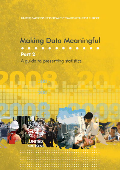
Making data meaningful – Style guide on the presentation of statistics

Making Data Meaningful part 2
Introducing Making Data Meaningful Part 2 – Style guide on the presentation of statistics – which, as its name cleverly suggests, is a compilation of  advice to present graphical information.

It’s a follow up to Making Data Meaningul part 1 , which focused on writing about data, as opposed to visualize it.

The book is a cooperation between representatives of national statistical offices and intergovernmental organizations – all public statisticians, if you will. I hope it will help others to communicate their data better. Personally, I have written the part about charts and collaborated to some other chapters. But if I could sum up my advice in one sentence, it would be: go buy Stephen Few books. Start with Show me the numbers.

The list of people who collaborated to the book includes:


Slideshare.net 2009 contest: I’m endorsing Dan Roam

Slideshare 2009 contest is up again, and there’s about 1 week to vote. For the contest, I’m endorsing Dan Roam and counting on everyone to vote for him and support his presentation. Previous winners of the contest include Shift happens or Thirst who got a lot of coverage and views. I think that Dan’s unique presentation style should get more exposure. One way to see the contest entries is by votes, so the ones with the most votes show on top. Dan’s presentation is currently #10, less than 200 votes behind the top spot. But you can only vote once per account. So if you see a presentation you like and give it your vote, it is gone forever.

Dan wrote The Back of the Napkin which is also the name of the blog he maintains. I enjoyed this book, and I think you should too.

The idea: all of the world’s problems can be solved by drawing. And even if you think you can’t draw, as most adults, it’s much simpler than it seems and it’s quite fun.

Problems can be reduced to 6 types of questions: who/what, how many, how, where, when and why. Each of these questions can be associated with a broad type of representation, for instance “where?” questions can be solved by a map where different elements are plotted. So that’s one way of categorizing visual representations.

The other axis that the author develops is what he calls SQUID. Depending on your audience, what you want to show may be:

  • simple or elaborate,
  • quality vs quantity,
  • vision vs execution,
  • individual vs comparison,
  • change (Delta) or as-is.

The combination of the SQUID framework and the who, how many, how, where, when, and why questions lead you to one logical choice of representation, which will work make your audience go “a-ha” – guaranteed.

The logic holds, although I feel he tweaked his process for most if not all of the examples in the book. Anyway, this line of thought can easily be reproduced and can solve problems. Now the hand-drawn style is not necessary to this process, but is a nice touch. I’ve used it in presentations and it gets attention and sympathy. I was amazed to see how much easier and quicker it is to draw a visual that works by hand than with a user-friendly software. I’m enclined to think that the corporate world would be much more interesting (and fun) if there were more drawings and fewer word documents.

For those reasons, go vote for Dan Roam.

Update

Dan Roam won! congratulations!


Book review: Presentation Zen by Garr Reynolds

Presentation Zen, by Garr Reynolds, has been my favorite business book in 2008.

Whatever your field, if you are a professional, chances are that you are going to make a presentation at least once a year. If you are looking for guidance, you could do worse than checking Garr’s website, aptly named presentation zen, or buying the book.

Garr’s book will not teach you everything you need to know about presentations, but is a great starting point.

If I were to summarize the book in one sentence, that would be:

Focus on your delivering your message.

Anything in your presentation that doesn’t help you deliver your key message must be removed. Conversely, there are ways to present your content that can enhance your message. Consider them.

I could sum up his practical advice in 3 points.

  • start to think offline.
  • in your favorite presentation software, start from a blank slide.
  • use visuals. And give your visuals all the space they need.
Let’s ellaborate a bit.
Start to think offline
The first thing most business professionals would do when asked to design a presentation would be to fire up Powerpoint and create slides. Then, they will edit slides. Insert slides… remove slides. Edit them some more. Tweak the design… Insert that extra idea. Ah, but the slide is no longer aligned. So we’re back to more editing and more tweaking. The end result is often busy, neither consistent nor convincing. Sounds familiar?

27062008661

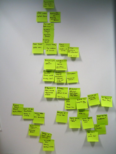
The solution to that problem is to start working on your presentation offline – determine the outline, how to structure your talk, what to say on each slide… A nice way to do this is with post-its.

Outlining my dConstruct talk

Post-its are easy to group and reposition, and if text doesn’t fit on a post it, it’s probably too wordy to put on a slide, anyway.
Start from a blank template
Powerpoint and others have trained us to think in terms of bulleted lists. But what an awful way of presenting information! When you’re showing a bulleted list, you’re reading out loud your slide, to an audience who has alreay read it by the time you get to point 2. Garr, in this star wars-themed slide show, shows how bulleted lists are the “dark side of the force” type of presentations.
Use visuals
Famous presenters each have their signature style, and Garr’s is the use of full-bleed image with minimal legends (and Gill Sans, but what’s wrong with that? I love Gill Sans). Full-bleed means that instead of integrating a smaller image in a template, you make it occupy all the space in the slide.

I won’t claim this is the single best way of presenting information, and by the way, neither does he. But it is fool-proof and easy to emulate. Finding the right image, which has never been that easy, and using it appropriately, will always have great impact.
In the book, Garr covers much more ground. It’s not only interesting, but it’s a nice read, and laced with examples you can actually use. I was quite surprised to see him redo charts I had done! (although, for my defense, they were never intended to be shown as is in a powerpoint).
If you need to buy one book on presentations, buy this book. If you think you don’t need a book on presentation, buy this book as well.
PS. Since the book has been released, I can see lots of presentations, on slideshare or elsewhere, that apply the visual style of Garr’s (nice, appropriately-chosen images, caption kept to an essential) but forget the other part of the story, which is the structure of the overall presentation. Both aspects are vital and complementary.