Last week, I had the privilege to attend the See#7 conference in Wiesbaden. I wrote a quick post summarizing the immediate feelings I had on my way back so here’s a more detailed follow-up.
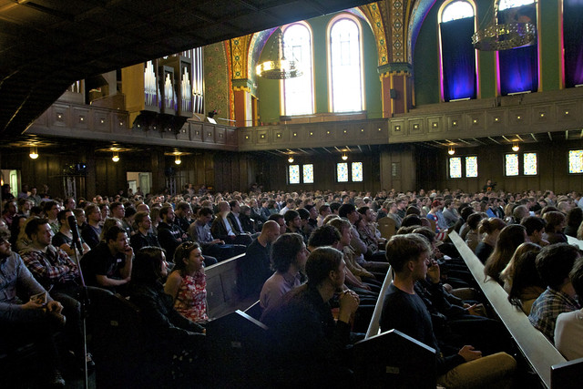
Three things to know about the conference. It’s one of the main events on visualization in Europe. The main event takes place in a church which sits hundreds.

Also, the conference is not called die Konferenz zur Visualisierung von Information for no reason. It’s mostly German-centric.
Finally, the conference’s approach to talking about visualization is to offer some height of view by inviting experts who do not work in information visualization proper but offer an interesting perspective to the field from their point of view.
Videos from all talks will be made available shortly.
The first speaker was Dr Thomas Henningsen from Greenpeace and was about how the organization is using visual impact for their agenda. Greenpeace goes indeed to considerable lengths to take the one picture that shows that what they are fighting is not an abstract possibility but something very tangible. Sometimes they create the picture as in this example,

sometimes they capture a certain moment, but they also use charts and data to make their point.
Next was Prof. Dr. Norbert Bolz. From the opinion of many of the native German speakers I heard this was the highlight of the day. As my German is somewhat rusty and as he didn’t use visual aides I admit I missed a lot of it. Prof. Bolz is presented on the see conference site as a media scholar and many of his books were on display at the conference. His talk was on how can one inform and be memorable through images. So here are parts I grabbed. To be remarkable a piece of information has to be new, it has to be on something that the reader didn’t know. This is very different from being important. A lot of the talk was also about the memorable faculty of images (Prägnanz), that images can’t be cancelled.
The next speaker was Stefanie Posavec who describes herself as a data illustrator. Like most people, you may think of data visualization as a supervised but automated process by which a computer generates an image based on data and a set of rules. Then, enters the data illustrator, who works entirely by hand.
Perhaps Stefanie’s best-known work is the representation she’s done of Kerouac’s On the Road:

which most people assume is a fine example of generative art. Wrong: every. single. element. is. placed. by. hand.
Stefanie took us through her project and shared how she works, how she collects data and encodes it (she did bring a computer).

Here’s a picture I took at the workshop the next day along with some of her sketches.
Stefanie always seems to be apologetic that she does not write code which is ironic considering that this approach is what makes her work unique. During the workshop, she took us through specifications that she had written for a developer to create an interactive visualization and which were insanely detailed. Everybody who writes code would be really thrilled to be able to rely on such a structured document!
The next speaker was Ben Kreukniet from UnitedVisualArtists. Now UVA may not be a household name, but how about Red Hot Chili Peppers or U2? Remember how everyone was talking about the gigantic scenic structure on the U2 last tour, which AFAIK was the highest-grossing concert tour ever? that was UVA’s work. They are lighting artists who specialize in large installations, and by large they mean friggin’ epic.
Ben’s talk took us through their work, with a focus on their “origin” project:

Origin is a gigantic cube of light and sound which is made to interact with an audience. During the workshop the next day, UVA showed us the tools they use to work, which revolves around a platform they call d3 (though not that d3). And we had the privilege to preview their next work which would be an advertisement campaign to be shown in movie theaters.
The next speaker was Yannick Jacquet from the antiVJ collective. More than a portfolio talk, this was an introduction to what VJing is about for the many of us who only had a vague idea. Basically, VJing is about showing moving pictures. But it doesn’t have to be ugly psychedelic shapes moving on flat screens in night clubs. antiVJ was created in reaction to this reductive view of the field. Through a technique called video-mapping, VJs can use one projector to cast images on many separate surfaces, and with a couple of projectors which can be controlled from just one computer, they can cover very complex geometries.

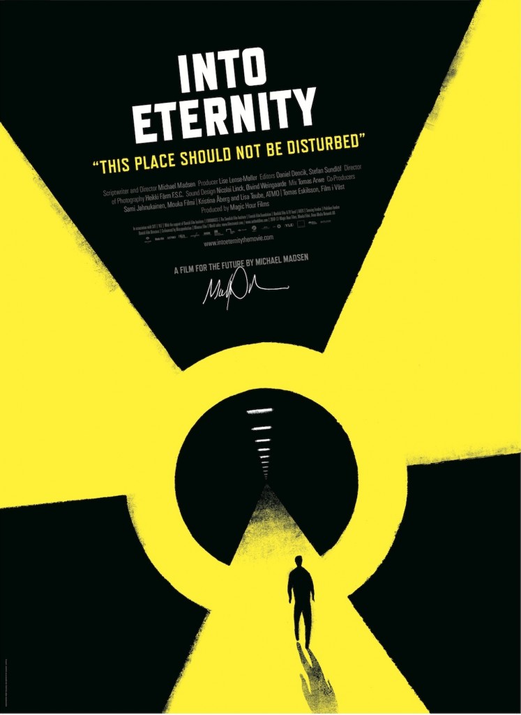
Next was Michael Madsen. I covered his workshop talk in my previous post, but during the conference he presented his movie “Into Eternity”:

Here’s the story. In Finland, law requires that nuclear waste be disposed within the country. So a company is building a bunker to bury it deep, deep within the earth – eventually, canisters of nuclear waste will be stored 4000 meters underground. In 2100, the facility will be reaching its capacity and it will be sealed and expected to remain undisturbed for the next 100 000 years. This is the first human creation designed with such a horizon. Contrary to religious buildings which are being built “forever” everything has been done to give the facility the highest chances to last 100 000 years. This led to surprising choices. First, the location of the facility is secret. When it will be sealed, there will be no distinctive mark at all. And while there is a possibility of a next ice age or a similar global disaster and with that the possibility that the security be breached. This is precisely on what the movie is about – which decisions were made, why, with what perspective.
So documentaries are all about telling stories visually, which could also be told of data visualization. Only for documentaries, the angle – a combination of the subject, the approach, the questions that need to be answered – is the result of an overly elaborate research, which we sometimes do in datavis, and sometimes don’t. More often than not it’s tempting to just go ahead with a form that agrees with the dataset though, so this work process is a welcome perspective.
The last talk of the conference was by none other than Manuel Lima, who pioneered visualization blogs with visualcomplexity. Both his talks (to the exception of the description of his experience at Bing) relate to material in his highly-recommended book, Visual Complexity: Mapping Patterns of Information, the See conference talk focusing more on trees and hierarchical displays of information and the second one more on networks.

Trees can be taken literally
This was definitely the closest talk to actual datavis practice. The principles he exposed really come to life with the examples, so I will encourage you to watch his talk in its entirety (it should be available on the 12th of May). In passing, in his workshop talk he mentioned that most of his “ancient” examples come from an out-of-print grimmoire called The Album of Science, I found one for $4 on Amazon so you may want to check it out.
That about wraps it up.
Pros of see conference:
- really cheap to attend from anywhere in Europe – transportation, accommodation and conference fees are super reasonable.
- big.
- not just about datavis, but rather on subjects which are particularly interesting for the datavis practitioner.
- in pleasant Wiesbaden.
- party-time/conference-time ratio about optimal.
- workshop is really, really fantastic (and free to attend btw).
Cons:
- you’re kind of expected to speak German.


