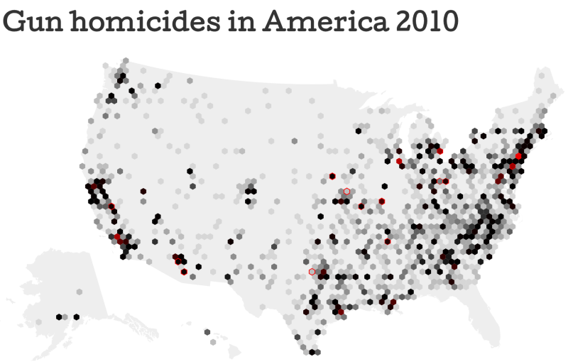
Gun murders in America


Click for interactive visualization

I have created this map of every homicide in the USA using firearms for the latest year where detailed information was available. Every, that is from all the agencies that report homicides to the FBI, which is not an obligation – this is why the map lacks Florida data.
In the interactive version you can see how murders happen through the year and explore them according to several criteria that were available in the database. While large shooting sprees receive media attention, unfortunately there are thousands of cases each year in just about every community.
Technically this is my first foray with d3.v3 and it uses two of its major new features, topoJSON for easy, lightweight maps, and hex binning to represent many individual events in one hexagon. Thanks to Mike Bostock for tutoring on that.


La nuit blanche

TL;DR: go check the model here

So I live in Paris and try to go to the museums there as much as I can, which is often.
About ten years ago (2002, I think) the city came up with what I thought was a fantastic idea: “nuit blanche”, an art event during one night in October. There were a dozen or so exhibits planned, all of which were fairly ambitious. For instance Sophie Calle would welcome visitors on a secret bedroom on the very top of the Eiffel tower.

When I saw the programme it was almost to good to be true: all those world class artists would do something extraordinary in Paris! I thought I could just casually walk all night from one installation to another along with a few other like-minded night wanderers. so it would look a bit like this:


(how to read this: circles are installations. The large black circle represents their capacity, the inner green circle the occupancy. If too many people try to enter an installation, the green circle will grow larger than the black one and will turn red, this is when queuing appears. Dots represent visitors).

Little did I know that the city expected 100000 visitors. Actually, 1 million showed up.

If the total number of visitors that were in the streets at one given moment in time is an indication of success, Nuit Blanche has been fantastic. But to anybody who’s experienced it it was really a night of waiting and walking. There just wasn’t enough capacity in the various places that would host the event, and no way for a visitor to expect the size of the queue that they would be facing (more on that later).

Every year, it’s a struggle. I’m like, the programme is so exciting, but then I know I will spend my time queuing or walking (in later editions, public transportation got better, so let’s say queuing and moving).

And each year I end up going, and I end up thinking: never again. (but hey, hey, and hey).

In the last edition there’s been something like 2.5 million visitors. There are about 100 places to visit in Paris. Many of which are indoors with a limited capacity and so enforce queues. Some are outside, so people can just walk past it and enjoy the art (sometimes, even from a great distance).

What I found annoying though it that there was no way to tell in advance which installations were going to be crowded, and which were going to be empty.
This is what led me to build this model.

Here’s how it works.
A certain number of people and attractions are randomly distributed in the city.
People will go to the nearest attraction. If it’s possible, they will go in, else they will queue until there is room.
While inside, they will enjoy it for a certain time, then they will move out and go to the nearest one they haven’t visited.

This model, which is fairly close to how things work currently, will always end up creating large queues in some places while others will run under capacity.

Now imagine a simple change: people get an idea of how long the queues are everywhere. Instead of going to the nearest exhibit, they will go to the place where they would be able to get in the quickest, taking into account the time to get there and the time to queue if applicable. Since nobody likes to wait, people will shy away from the places with long queues, evening the load, and by the same token reducing the waiting time for other visitors. Technically the waiting time at all the installations become Lyapunov functions, and provided they have enough information agents will make it optimal.

If you run this model in its full screen incarnation with dashboards, bells and whistles, you will see that this doesn’t really help increasing the number of installations that people get to visit. What happens is that the time spent waiting in queue shifts to time spent moving between places. (the overall time spent inside installations should increase, though).

In order to reduce the time spent moving, one can improve the public transportation (represented by the average speed, in the model), or putting installations close together, which has been done to some extent since the start. But do that with a limit, because that moving time is an interesting buffer, it’s not as annoying as queuing and Paris is beautiful at night, and when you’re among 2.5 million art enthousiasts it’s as safe a city can get.

To further improve the time spent visiting exhibits, one has to improve capacity or reduce attendance (two options which I trust the city of Paris will be wary about). One other option would be to improve the percentage of art installations that can be enjoyed from the outside, another parameter in the simulation.

Lastly, here are a few things the model doesn’t include, which IMO don’t make a lot of difference in the results, but to be honest:
– the installations are presented as being equally attractive. In fact, some are always more interesting than others and get even more queue. (that would make the model where queues are ignored even more unbalanced).
– the capacities of the installations are determined by random, but uniformly distributed. That isn’t the case, the largest museums are open that night and they can welcome thousands of visitors, while some other places would be full at 100.
– opening times of installations haven’t been taken into account; most will close at some point during the night.

and on that note, enjoy the model


Some simulation models

Inspired by the coursera class on model thinking, by Scott E Page, I have implemented a bunch of simulation models with d3. It’s something I have done on and off for the past few weeks, and let’s say it’s really the first 6. Those interactive versions just graze the surface of all there is to see.

So what I have is:

Enjoy!


d3 tutorial at visWeek 2012

Jeff Heer, Scott Murray and myself have done a d3 tutorial at visWeek 2012. You probably gathered that from the title of the post.

Here is a link to all the slides and code examples that we have presented:

d3 tutorial

For the purpose of the tutorial I have compiled a d3 cheat sheet, on 4 pages it groups some of the most common d3 functions. When I was learning d3 my number one problem was figuring out which property should be set using .attr, and which required .style. And also: which svg element support which property? All of this is addressed in the cheat sheet. It’s part of the link above, but if you want it directly without downloading a 13Mb file, here it is:

d3 cheat sheet


Getting to “Hello world” with d3

Back when I started learning programming, it was always fairly simple to achieve the canonical first step of accomplishments, that is, to get the system to announce that you are ready to do more by displaying “hello world” on the screen.

In most systems then, there was a command prompt somewhere that would usually do that when you would type, say:

PRINT "hello world"

.

Things have changed a lot since the early 80s. In some fields like fashion, I would argue it’s a good thing, but we’re definitely not going in the way of less complexity.

Now if you’re interested in web-oriented visualization and want to do it with d3.js, it’s still fairly simple, but it is built upon a number of technologies that you’re supposed to know a little. Front-end developers live and breathe the web and have been exposed to all things javascript, HTML, CSS, you name it, in enormous doses. Many developers probably have, at some point, tried to interface with the web and know enough of that to get started. So for this crowd, the amount of things you need to know to crack d3 code seems negligible, because they know all that and they are very familiar with it, just as well as people knew the first names of Friends characters by the end of the tenth season.

But what about those who didn’t? and the people who don’t see themselves as developers ? do they have to reimmerse themselves in 10 -odd years of web development history to get started? It turns out that this sum of knowledge, while not insurmountable, is certainly not trivial.

So without further ado, let’s get started

We’re cooking an omelette

And when we do, we need a few things: a pan, a recipe, eggs and stuff, a stove and then plates, knives and forks, etc.

The pan: a text editor

The first thing is really the pan. If you don’t have one when cooking eggs, you borrow one or go buy one. In our analogy the pan is the text editor. This is the tool with which you are going to make the files that will constitute your visualization.

There was a time when it was ok to use notepad (textedit if you are of the apple persuasion). And it’s still possible, but you are not making your life easier. What I recommend instead is that you get a hold of a copy of SublimeText2. (http://www.sublimetext.com/2). There are windows versions. And Mac versions. And linux versions. For windows users, there is a mobile version so you don’t need administrator access to install it. There is a free, unlimited evaluation version,  but unless you can’t spend $69, I strongly recommend that you buy it. Sublime Text 2 has a nearly infinite amount of niceties built in. And unlike some other powerful text editors, where the best features are only understandable by the tech masters, what’s really nice about Sublime Text 2 is that it would make you gain time even if you are an absolute beginner. One such nice things that it does is detect what language you are working with, automatically color and format the words as you type them depending on the category they fall in, and when possible, suggesting the word you are trying to type, automatically format and indent your code, all in a very unobtrusive and pleasant way. This will really help you troubleshoot problems like strings not closed properly or loose closing bracket which typically consume a lot of time.

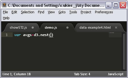
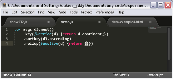
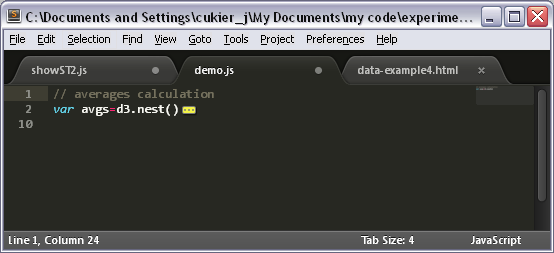
Let’s type a fairly common d3 statement to see how SublimeText2 can help. First, it recognized the var keyword as such and writes it in italics and cyan. Second, when I type my opening parenthesis, it adds a closing one, and as long as my cursor touches either it underlines them both.

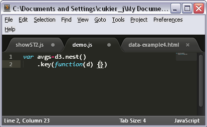
Let’s carry on. The function keyword is highlighted in italics cyan too – useful. The opening/closing thing works for curly braces too.

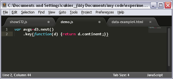
The return statement is highlighted in red. With the cursor on the closing parenthesis, we are starting to get a feel that the underlining function is a useful safety net

New line. Joy! the indentation is aligned with the line above.

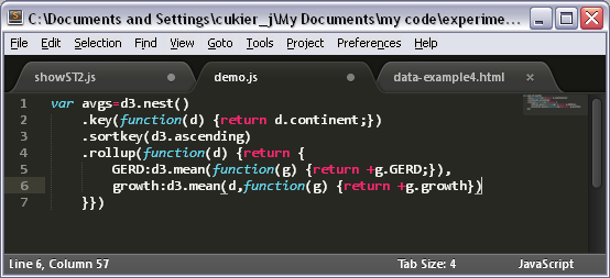
We now have four consecutive opening or closing curly braces and parentheses. Typically, this is where errors sneak in, and where sublime text 2 really shines.

And we now have 5 consecutive closing curly braces and parentheses. This is fairly common in d3 code. Is the order correct? Thank you Sublime Text 2!

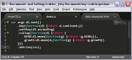
we finish up writing the statement.

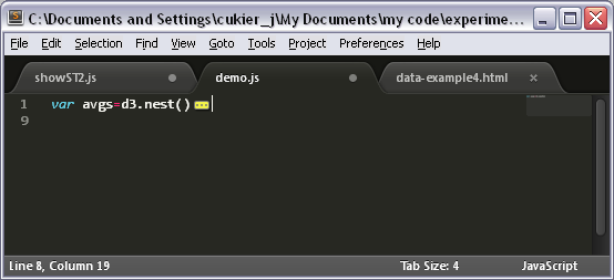
When moving the cursor to the left side, where the line numbers are, we notice down-pointing arrows. We know our code is correct, and we don’t want to see it again, so…

we just click on the top one to collapse this section. If we need to edit it again we can expand it.

Finally, we add a comment above. Notice the syntax highlighting, comments are colored with an unobtrusive dark grey.

The recipe: a basic file structure

In d3, you can’t really type a “print” command from a prompt. You need to write some files, which are loaded by a browser (that’s your “plate” in the metaphor, but let’s not get ahead of ourselves).

You are going to need up to 5 types of files.

First, an html file. This will be the file that your browser will read, either locally, or uploaded on a website. We’ll get to cover this in detail in a minute.

Second, believe it or not, you are going to need the d3 library, which is also a file. You may link to the version on the d3js.org site, and so not worry about having the actual file handy. That has advantages (like the one we just said, also, you’re pretty sure to always have the latest version on hand), and two problems. First, you always need to have a live internet connection, so there’s no working in the park outside of free wifi space (for example), and also, it will probably be slower than having the file locally or on your own web space. And if having your own web server seems kind of scary, I’ll show you in a short while that it’s not.

The three next kind of files are optional, but hey.

The third file is a javascript .js file which would be where you put your code. Some people would rather put all their code in the html file, which is an option, especially for short programs. Personally, I prefer having a separate file. So to make d3 work, you need some script, but it doesn’t have to be in a separate file.

The fourth file is a style sheet, or css file. This can be used to define some formatting options, for instance to make all your circles blue by default, or some circles that meet some pre-defined criterion. Like the javascript file, any style information can be contained within the html file, but unlike the script, it is completely optional. I also like to keep it separate from the html.

Finally, you may want a data file, you know, with data (csv, txt, json, xml…). If you have lots of data to visualize, it’s easier to keep it in separate files than in variables within the script. But it doesn’t have to be that way. And you could also use d3 without data.

The ingredients: contents of the files

The HTML file

So let’s see how this articulates by looking at a typical d3 html file. I am using templates which I try to change as little as possible from project to project.

<!DOCTYPE html>
<html>
 <head>
   <meta http-equiv="Content-Type" content="text/html;charset=utf-8">
   <title>My project</title>
   <script type="text/javascript" src="../d3.v2.js"></script>
   <link href="style.css" rel="stylesheet">
 </head>
 <body>
   <div id="chart">
   </div>
   <script type="text/javascript" src="script.js"></script>
 </body>
</html>

Well. That is certainly longer than the BASIC one-liner (and we haven’t even printed “hello world” yet).

Let’s take this piece by piece.

The first line is a doctype declaration. What this does is that it tells your browser that what follows should be interpreted as standard, HTML5-compliant HTML (standards mode). If you omit the doctype documentation, your browser will read the html in “quirks mode“, i.e. by replicating the non-standard behavior of Nescape 4 or IE5. You can still try to run d3 under quirks mode, but don’t be surprised if your HTML doesn’t behave as expected.

The doctype declaration doesn’t have to be more complicated than <!DOCTYPE html>.

The second line opens the html document proper. Technically, it’s ok to omit <html>, <head> and <body> tags in HTML5. The document will still be considered valid by tools like the W3C validator. But it seems that some browsers, in some complex cases, don’t like that so much, and I as a person find it more convenient to find those tags when reading code.

The next line opens the header section of the document. Again, it’s not absolutely necessary, but I consider it helpful to explicitly differentiate the header from the rest of the document.

The next line, which goes

<meta http-equiv="Content-Type" content="text/html;charset=utf-8">

is not absolutely required either. It specifies the encoding of the page, that is, what kind of characters will be seen in the page. Since I use non-ascii characters often, being French and all, I make sure to use it all the time. After all, this is a template, not something I type from beginning to end each time.

Next, we specify a title. This is what will appear in the title area of your browser, or, more likely, as the name of your tab.

In the next line, we load the d3 library. This is my preferred syntax. This is how my files are set up:

I have a directory where all my d3 projects are, and in this directory, I am also keeping (and maintaining reasonably up-to-date) a version of the d3 library, a file called d3.v2.min.js. (min stands for minified, which means that it’s not meant to be read by persons, but it’s faster to load). All my projects proper are in folders within that directory. So my html files are one level down from where the d3.v2.min.js file is kept. This is why the src attribute reads “../d3.v2.min.js”: the ../ part means, look one level up. If the d3.v2.min.js file were on the same directory where I keep my html, I would write src=”d3.v2.min.js”, if I kept it within a specific directory like “d3″, I could write src=”../d3/d3.v2.min.js”, and finally, there is always the option of getting it from the website, src=”https://d3js.org/d3.v2.min.js”.

I don’t have to load the d3 library then. I could have done it at the end of the page. The only requirement is that it should be before the script that will use it. But honestly, the file is so small that it doesn’t make much of a difference (9ms on my machine).

Next, I link to a style sheet. With this syntax, I am assuming that my style is specified in a file called style.css which will be in the same directory as this html page. And if there is no such file, it’s not a problem. It doesn’t prevent the page to load.

Instead of using this syntax, I could have written:


<style>

... // my style definitions

</style>

in the html file. And frankly, it is sometimes more convenient. But again, for the general case, it’s just as well to leave it like this.

Note that style information should always be in the header part of the file.

And that concludes the header, as noted by the closing tag </head>. Even if we use the <head> tag to mark the beginning of the header section, we may omit the closing tag </head>, and still get away with a valid (and slightly shorter) document, but I keep it for clarity’s sake.

The next part starts with <body>, and is where the content proper, which will get displayed on the screen, is described. <body> and </body>, just like <html> and <head>, are not mandatory, but do help, somewhat, to make the document easier to read.

So what do we find in the body section? Here, I’ve kept it very simple but also close to the conventions I use.

There is one <div> element, which is the basic building block of HTML, and with an id attribute – a document-wide, unique identifier – called “chart”.

Then, there is the <script> element, which is calling the javascript code we are going to use to create our visualization. It’s at the very bottom of the page, actually just before the closing tags (which, again, could be omitted, but let’s not).

Like for the style element, it is possible to leave the script inside the html document. Instead of using a src attribute – which, incidentally, assumes that the script is within the same directory as the html document with this syntax -, we can write:

<script>

// all our javascript instructions

</script>

And that’s it for the html document! A final word about the contents of the <body> element. In most of my projects, there is an interface such as buttons or controls which is also done in HTML. In that case, the contents of the <body> element get more complex. I would add a button to tweet the page, copyright notices, and other stuff. But I almost always have a <div> element with an identifier named “chart”.

ok, so now that you’re finished with writing your html file, you must save it under any name and use the “.html” extension (or .htm, but why no love for the l? why?)

The javascript file

In this section I will walk you through a very, very basic file, which includes things I do for every project.

var w=960,h=500,
svg=d3.select("#chart")
.append("svg")
.attr("width",w)
.attr("height",h);

var text=svg
.append("text")
.text("hello world")
.attr("y",50);

I like to define variables that describe the width and length of the visualization that I am creating. By putting these in variables, at the beginning of the file, I can easily modify them in case I need to. 960 and 500 work well for visualizations that should appear on their own page, by the way. No scrolling should be necessary.

The next statement use the d3.select construct. Here, it indicates that we are going to build something on top  of the element that meets the criterion that is described between the parentheses. The syntax used by that is that of css selectors, but long story short, #chart refers to whatever has an “id” attribute of “chart”. This is our lone <div> element in the html file. Then, we are going to add an svg element, which is what will hold the visualization proper in svg form, and give it a width of w and a height of h.

I always use that syntax, an “svg” variable that holds the top-level svg container, which resides in a <div> element which has an id of “chart”.

The final part of the file writes, finally, hello world proper. Note that I specify a y attribute (vertical position) else the text have its lower-left corner in the top-left corner of the browser window and will be effectively invisible.

Now, the HTML file we just created expect this file to be called “script.js”, so let’s save it under this name.

In this most simple example, we will not need a css file nor a data file. But, for the sake of discussion, let’s create a css file nonetheless.


text:{font-size:36px;}

and let’s save this under style.css (the name that, again, our HTML file expects). What this does is that it changes the size of the font to whatever the default was to a more massive 36 pixels.

The stove: a web server

As far as writing hello world, we’re done. You can load the html file you created in a browser, you should see the encouraging inscription. Congratulations!

Many visualizations can be seen in a browser directly, just by opening a local file. However, this won’t be the case for some, for instance, those who require external data. In that case, you need a web server. If you have web hosting, you may upload the files to your (remote) server, via FTP for instance, and see your visualization by typing the address of your site in the browser url bar. That said, it is a good idea to have a local web server, that is, one that runs on your computer, so you can view your files as if they were served by a web server, but with the added bonus that you can edit them and see the modifications directly without having to upload them each time you change them.

On Macs, you’re pretty much all set. All you have to do is enable web-sharing in your system preferences. Then, http://localhost/~YOURNAME will point to /Users/YOURNAME/Sites where YOURNAME is your user name. Just put your files there and go at it.

For windows, there are a bunch of solutions. The “Professional” versions of windows include the IIS web server, so, there. But beyond that, there is a lot of web server software available. I personally use EasyPHP. EasyPHP comes up with a web server (Apache), a mySql database, a PHP preprocessor and other niceties. And, as an aside, it doesn’t require administrator rights, for you corporate users.

EasyPHP installation is a breeze. When it’s on, by default, http://localhost/ points to the www/ directory in the install directory of EasyPHP, so you may want to install it in a place that suits you. Alternatively, you can create aliases in the admin panel of EasyPHP (http://localhost/home/index.php), in other words to give a name to any part of your hard drive. This is what I do, I put all my projects there and have a shortcut to that name in my browser, so whenever I want to see a project I use that shortcut and I can see the visualization as if it were on the web.

This is how you create aliases in EasyPHP.

The plate: a browser

We’ve talked browsers before, and chances are you have one (or several) on your computer.

Now I wish that by browsers, we could just skip it and mean “the latest version of chrome”, but it turns out that there are slight differences in the way that browsers handle d3 code so you should really test your work in at least chrome and firefox. As of this writing, Chrome + Firefox (version 5 and up) represent just under 50% of the browser market share. If you add all browsers that are d3-capable (Safari, earlier versions of Firefox, Opera, IE9) you reach about 75% of the market. Sadly, IE8 and IE7 which account for slightly over 20% of the market are not d3-compatible, though they can use the Google ChromeFrame free plug-in and do pretty much all that chrome does.

Knives and forks: the console

At the beginning of my dad’s engineering career, code came on a punch card. People then, allegedly, thought it through. You didn’t want to be the kid who didn’t follow your algorithm carefully enough to forecast an avoidable bug and waste a perfectly good card and oh-so precious computing time.

But now? no code is perfect by the time it hits the browser. You may want to launch incomplete code to get a feel for where you’re going. You may not be too sure of whether that should be a plus or a minus in that equation and just try either because it would be quicker to correct an unexpected outcome than to troubleshoot the formula on paper. You may want to iterate, to bring newer, more complex ideas to your visualization with each change to the code. Or just try out different aesthetic options.

Not too long ago, debugging javascript was really a pain. You’d have to fire those annoying alert boxes to understand what was the value of the variables, and dispatch them manually. Fortunately, that time is gone and now is the age of the Console.

There are console functionalities for Chrome, Firefox and Safari, and while the interface slightly varies, the idea is the same. The console allows you to do three main things:

– first, to see if your code executed without errors or warning. Some of those messages can be generated by javascript, and some can be added by you if certain unfortunate conditions are met. You get the position of the error in your code, which helps you to understand what went wrong and fix it.

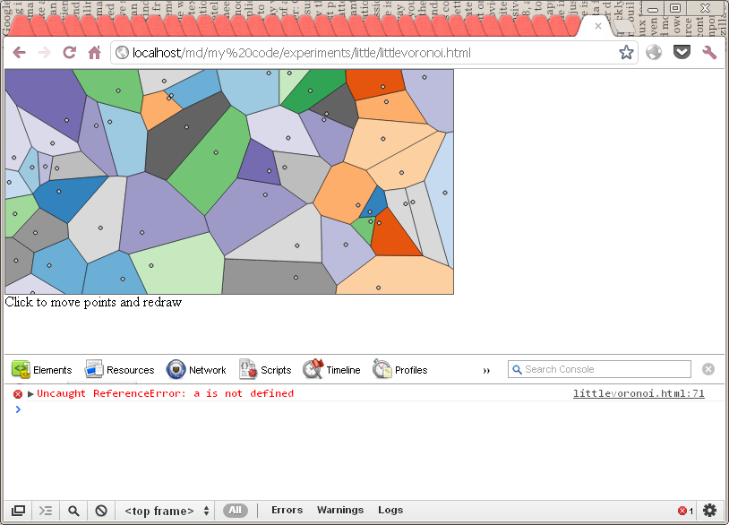
I have planted an error at the end of the code and it’s been picked up by the console which explains what’s wrong and when. Notice the red cross in the lower-right corner which counts errors. If there were warning, they would be indicated by a yellow triangle.

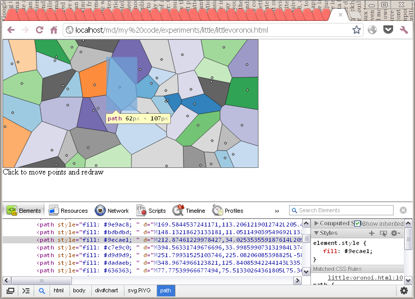
– second, to inspect elements, that is to find out all the information about the elements displayed on screen, even if (especially if) they have been generated at runtime. So you can see if those elements you really wanted to create have been indeed added, and if the right attributes have been passed.  third, to interact with the code after it’s run (or while it runs, if you manage to pause if with breakpoints). The most common use of this is, IMO, is to check the value of variables, which you can do simply by typing their name at the console command prompt. But you can also type in one-liner javascript statements, even if they are quite complicated. So it’s a way to test your code before you write it in your script file.

What a relief! all those paths elements that were supposed to be created in the code have been added as expected.

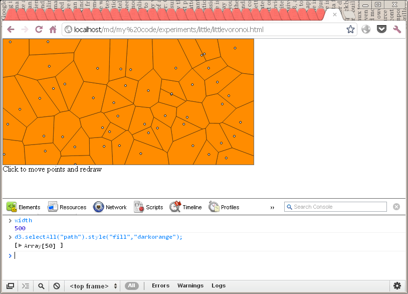
– third, it can be used to interact with the code after it’s run (or even during run-time, because you can pause the code with breakpoints using the console, but we won’t go into that). The most common use for that IMO is to check the value of variables, which can be changed during the code execution, but it can also be used to enter one-liner statements, which can be quite complicated. Such a use allows you to test and preview code hypothesis before you write it down in your script file, or to troubleshoot a problem that you could have difficulties seeing outside of the context.

Here, I am using the console to check the value of one variable, and to enter a statement that turns all the shapes orange.

Voilà! the last thing you need when you cook food is people to share it with, same goes for visualizations!


animations and transitions

That post originally appeared on visual.ly, I’m reproducing it here for clarity and ease of retrieval

In interactive visualisation, there is the word reactive. Well, maybe not literally, but close enough.
The fact is that reactivity, or the propension of a visualisation to respond to user actions, can really help engage the user in a visualisation, and help them understand its results. Both of which are usually good things. And how can this reactivity be achieved? Through animations.

So I’ll go ahead and state that animation, if done right, can make any interactive data visualization better..
How is that?

  • When coupled with interaction, it’s a very useful way to give feedback to the user. What has changed since their last command? If what’s on screen animates from one state to another, it’s obvious, it stands out and it makes sense. Or, when showing any form of real-time data, animation is pretty much required.
  • Animation can bring focus on the important things as a chart loads. Our vision is very sensitive to movement, so using these introduction transitions sensibly helps a lot to ease the effort required to get the right information off a chart.
    Compare these two charts:


    Which is better at getting the viewer’s attention on the last bar?
    [side note on examples: they all use the same model. Click on the button to start an animation. If there is nothing on the chart, clicking the button will make something appear.]
  • animation works well with metaphors, like growing, expanding, moving, dwindling, etc. so it can really enhance the expressiveness of a visualization that tries to convey any of these ideas (those and many others)

That’s said, animation can definitely ruin your visualization, too. Here are three general problems.

  • Animation is very prominent. That can be good to call attention to a specific, unambiguous part of your chart. But what happens when there is too much animation? without other cues it gets difficult for a viewer to determine where to focus their attention.
  • Animation across many states (like a video of animated data) make them difficult to compare to one another, as opposed to showing still images of various states side by side. (see for more on this.
  • If the animation is not continuous, if the chart is somehow wiped out during it, this caused change blindness which pretty much negates any benefit you may have hoped to reap from animation.
    Look at this example.

    When animated, the line goes through a blank state which makes is close to impossible to track changes between the original and final state. The only way to detect change is to focus on one given point and memorize its original position, but this is very ineffective.

Now how to do it?

So we’ve seen how animation is helpful in data visualization. Now, let’s do it!
For this purpose, let’s use d3. d3 has many, many possibilities when it comes to data animation which are relatively painless to implement.

The principle

If you know how to draw in d3, you almost know how to animate. (and if you don’t know yet, Alignedleft has a splendid collection of tutorials to get you started, and the d3 site lists more including some by yours truly.)
Animations are called transitions in d3 for a reason. A technical definition of animation can be that over a certain lapse of time, one or more characteristics of an object would transition from one value to another.

And what do we mean by characteristics? Well, just about anything that can be expressed numerically.

A few examples of transitions


Unsuprisingly, when you update the position of an item smoothly over time, it moves. In svg, position is determined for most shapes, such as our blue rectangle here, by the x and y attributes, which correspond to the top-left corner of the shape. For circles, you use cx and cy, or the coordinates of the center. For paths, such as our red triangle, you actually specify the position of all of the points in the “d” attribute.


Likewise, when you change size, your object grows (or shrinks!). You can use width and height for shapes like rectangles, or r for circles.


Color is really a numerical attribute too, and it’s indeed possible (and very useful) to transition from one color to another. In svg, color is a style attribute that is defined by fill or stroke.


Not unlike color, it’s very useful to be able to vary opacity. When opacity is set to 0, the corresponding object is completely transparent. So transitioning on opacity is very useful to make objects fade in or out.

How this is done

Now that we’ve seen what transitions can do, let’s see how to code this in d3.
Let’s go back to our first example. In fact, let’s make it even simpler.


To create a square like this in d3, we would write something like:

var mySquare=svg.append("rect")
  .attr("x",60)
  .attr("y",60)
  .attr("width",60)
  .attr("height",60);

4 attributes. Simple enough.
so if we want to make it move to the right, we are going to update the x attribute. That’s how we do it:

mySquare
  .transition()
  .attr("x",320);

It’s that simple: use the transition method, then specify all you want to see changed just as if you were creating a new item. And using that one principle, we can easily reproduce any of the above examples.

mySquare
  .transition()
  .attr("width",120); // will make it bigger

mySquare
  .style("fill","white") // if the fill is originally left blank and comes
                         //  from a style sheet, it will start as black 
  .transition()
  .style("fill","blue");

mySquare
  .transition()
  .style("opacity",0);

Now, in our simple examples, this is not exactly what happens. The transitions occur after an event, namely, when the user clicks on the button. And indeed, transitions are most useful when linked to events and interaction. But this doesn’t add a whole new layer of complexity.
We can just write:

button.on("click", function() {
  mySquare.transition().attr("x",320);
})

And now, our animation only starts when the button is clicked. Obviously, since the transition is within a function, we could even determine where the square should go programmatically, but let’s keep it simple for the examples.

Animation 102

So far, we’ve seen how we can do simple animations in d3 and even throw in a little interaction. We’ve seen that it’s really as simple as creating elements in the same place. But here are some good news. Transitions in d3 are extremely versatile and can be customized with a lot of finesse without getting overly complex to write. It’s more a matter of knowing what to do.


After using the transition() method, it’s possible to specify a value for duration and delay. Duration is the number of milliseconds the transition will last, while delay is the number of milliseconds the system will wait before launching it.
The syntax is:

mySquare.transition()
  .attr("x",320)
  .duration(1000) // this is 1s
  .delay(100)     // this is 0.1s

The default is a 250ms duration, and no delay.
I find 250ms to be a bit harsh. In most cases, transitions should be noticeable, so I oftentimes find myself increasing the duration to 500 or 1000. But unless there is a very good reason for that, durations should not be too long. If you use them to support your data, you don’t want the transition to take center stage by having them take several seconds.
Consider the following two examples (which you’ll have to start with the button)


Isn’t the second one simply atrocious? You may find hard to believe that it only wasted 25 seconds of your time.


Easing is the technical name of the actual function that turns time into attribute changes. From the previous examples, you may have noticed that the values change slowly first, and then faster, then slowly at the end? Well, it turns out that you can use different functions to get different results. In my practice, I’ve only seen the use for the 3 displayed here although there are many others. And yes, you can write your own, although we are not going to cover this here.
The syntax is similar to the above:

mysquare.transition()
  .attr("x",320)
  .ease("elastic")

(and by the way, the order in which you change attributes or specify animation parameters has no effect, so feel free to use .ease first then .attr).


For path objects, through transitions you can update the position of each point. This allows you to effectively turn one shape into another.
This can be especially interesting for line charts (or any chart which is a path)

Like this, if the values that you are plotting change, you can spot these changes very efficiently. If, instead, you just erase your chart redraw your data if would be very difficult to spot where the data has changed.
For both of these examples, the “d” attribute of the path is updated (so they are not intrinsically different from the simplest example).


Sometimes (and actually: often), you want to fire a transition right after another transition.
But in case you were wondering, the following doesn’t work:

mysquare.transition()
  .attr("x",320);
mysquare.transition()
  .attr("y",200);

You may think that this will move the square right, then down. But no: it will start to move the square right, then fire the second transition which will move it down. Since they have the same duration and no delay, what will happen is that only the second will have a visible effect.
If the second transition had a delay, smaller than the first transition’s duration, the first one will be in effect for a while until the delay expires. Then, the second transition will take over. However, chances are you don’t want to do that, because how much of the first transition will have been accomplished depends on the users machine, browser etc. and is therefore unpredictable.
So how about giving the second transition a delay which corresponds exactly to the duration of the first one? This will usually work, however, the delays and durations are not extremely accurate. Firing the transition proper takes a certain time (which is roughly 15ms on my machine and which may vary) so it is difficult to chain two transitions very precisely this way.
In more complex programs than our simplistic examples, sometimes, several events try to trigger transitions on the same object. When this happens, the first transaction is fired, and runs its course unless another transition starts. That second transition would interrupt, then replace the first one. What this means is that the attributes that were in the process of being changed by the first transition will remain as they were when the second transition starts, somewhere between their start and target value.
If you want to make sure that all your transitions update their attribute up to the value they are supposed to reach, you may want to re-specify the attributes of the first transition in subsequent ones, like so:

mysquare.transition()
  .attr("x",320);
mysquare.transition()
  .delay(250)
  .attr("y",200)
  .attr("x",320); // even if the first transition doesn't complete, 
                  // this one will and will update x to 320.

There is a more certain way to chain two transitions. With the following syntax, another event will start exactly at the end of a transition. That other event can be another transition (which is the case in the above example).

mysquare
 .transition() 

 ...

 .each("end", function() { ... });

here, what’s in the callback function on the last line, introduced by .each(“end”, will be fired exactly as the transition ends.

What can be done then? Here are 3 common scenarios.


(btw, if you’re wondering what’s the difference between this and the previous example, there is none – it’s just to save you some scrolling).
One possibility is to launch another transition on the same item. Here, the square moves right, then down.
Here’s how it’s done:

mysquare
  .transition()
  .attr("x",320)
  .each("end",function() { // as seen above
    d3.select(this).       // this is the object 
      transition()         // a new transition!
        .attr("y",180);    // we could have had another
                           // .each("end" construct here.
   });

Another possibility is to delete the object after the transition has run its course. This is super useful, especially when you are creating a lot of temporary objects. An interesting combo is when you decrease opacity all the way to 0, making it invisible, then using remove() if you don’t need it anymore.

mysquare
  .transition()
  .attr("x",320)
  .each("end",function() { 
    d3.select(this).       // so far, as above
      remove();            // we delete the object instead 
   });

Finally, we can create a new object. That can be a nice way to add a special effect. Here’s an example:


Here, at the end of the transition, a circle is created, a transition is started on that circle, which decreases opacity to 0, then the circle is removed.


And here is a last example with several effects combined.

Going further

Believe it or not, we barely scratched the surface of what can be achieved with animations in d3.
There are two other uses of transition that we haven’t seen because they are slightly more complex, so I’ll just mention them here.
Up to now, we have always seen transitions based on the properties of one specific object. We make the x property of that one square vary from what it was to 200.
Sometimes, though, you want many parts of your visualization to be updated according to the changes in one variable.
That is possible, too, by using the .tween and .interpolate methods. All of this is explained in the d3 documentation.
Another possibility is the use of the d3 timer method, which allows to call a function repeatedly, which can also be used to create animation.

The point I was hoping to make was that it’s possible to do a lot with relatively simple code and technique if you know what you are trying to do. Especially, chaining transitions, particularly when adding and removing objects when appropriate, goes a long way in creating powerful effects.


Embedding tableau visualizations on the web

I’m writing this short post because I see that exact phrase come up in the search engine terms of the blog now and again (along with “Hello this is bathtub” but I can’t really help there).

Long story short. I run into problems all the time trying to properly embed Tableau vis into wordpress blog posts. Does it happen outside of wordpress, I don’t know, because I don’t really try to embed Tableau vis outside of wordpress. That said, I have the same problem with d3 vis in wordpress and I’ve been asked several times how do I do it.

iframes.

That’s how.

Here is what I did last time.

<iframe
  style="border: 0px;"
  src="http://public.tableausoftware.com/views/champions/champions?:embed=y&amp;:from_wg=true"
  scrolling="no"
  width="652px"
  height="756px">
</iframe>

so you’ll have to go to HTML mode and type it out. When it’s done, you can safely go back to visual mode if you feel like it.
Let’s go through these lines one by one (btw, they don’t have to appear one line at a time, it’s just for presentation purposes).

Most important, what in on src. That’s simply the link to the page of your tableau vis. And if that’s not clear enough, it goes like this:
http://public.tableausoftware.com/views/ + name of your workbook + / + name of your dashboard or sheet.

Since I want to show a dashboard called champions in a workbook called champions as well, that’s http://public.tableausoftware.com/views/champions/champions.

I’m not sure whether what’s after the dashboard name is important. I’ll leave that as an exercise to figure it out. I’m pretty confident things work without it.

Then the rest.

style=”border: 0px” Yes, because you don’t want an ugly border around your iframe. or do you?

scrolling=”no”. So there’s no scrollbar. Look. Scrollbars in iframes were pretty rad in 1996, but if you want to give that embed feeling, you have to do without them.

height=…px, width=…px. Here’s the tricky part. You have to manually set the size of your visualisation and add a couple of pixels for good measure.

In tableau, when creating dashboards, I have always used the option to size them exactly at a precise size and I recommend you do that too. Then add 2-6 px to each dimension and use that as width and height.

In my experience going through these steps is really less painful than using the “native” embed functionality of tableau vis which sometimes work and sometimes doesn’t. The added bonus is that the resulting html is much more legible than what Tableau generates, which, for the record, is:

<script type="text/javascript" src="http://public.tableausoftware.com/javascripts/api/viz_v1.js"></script><div style="width:654px; height:799px;"><noscript><a href="http:&#47;&#47;www.jckr.github.io/blog&#47;blog&#47;2012&#47;06&#47;30&#47;tableau-2012-sports-visualization-contest-entry&#47;"><img alt="champions " src="http:&#47;&#47;public.tableausoftware.com&#47;static&#47;images&#47;ch&#47;champions&#47;champions&#47;1_rss.png" style="border: none" /></a></noscript><object width="654" height="799" style="display:none;"><param name="host_url" value="http%3A%2F%2Fpublic.tableausoftware.com%2F" /><param name="site_root" value="" /><param name="name" value="champions&#47;champions" /><param name="tabs" value="no" /><param name="toolbar" value="yes" /><param name="static_image" value="http:&#47;&#47;public.tableausoftware.com&#47;static&#47;images&#47;ch&#47;champions&#47;champions&#47;1.png" /><param name="animate_transition" value="yes" /><param name="display_static_image" value="yes" /><param name="display_spinner" value="yes" /><param name="display_overlay" value="yes" /><param name="display_count" value="yes" /><param name="from_wg" value="true" /></object></div><div style="width:654px;height:22px;padding:0px 10px 0px 0px;color:black;font:normal 8pt verdana,helvetica,arial,sans-serif;"><div style="float:right; padding-right:8px;"><a href="http://www.tableausoftware.com/public?ref=http://public.tableausoftware.com/views/champions/champions" target="_blank">Powered by Tableau</a></div></div>

Yeah. You say &#47; i say %2F. anyway, this is a bit difficult to troubleshoot.

The drawback when using iframes is that you lose the nice static image which is generated for RSS flows and other environments without interactivity. If you don’t know what I’m talking about (if you’re not familiar with that large orange arrow at the center) you’ll have no regrets.

Bonus: d3.

It turns out that the iframe is the simplest solution to have d3 work within wordpress, too. Sure, in theory it is possible to upload a js file as a media file, so you get a url with the date in it or something, which you can link to from the… whatever. It just never works and it’s a pain to maintain.

so instead, use iframes. Make your d3 visualisation into an html file which will have all the necessary links. Then upload the file to a location you know (and possibly dependencies) and you’re all set! set an iframe with the same guidelines as above. To make the process even less painful, I use a plug-in called FileManager which lets me upload and manage files from within my dashboard environment. On another server I use another app also called FileManager (quite a catchy name, apparently) which runs outside of the wordpress environment.

Happy embedding!


Manipulating data like a boss with d3

Updates:
1) I’ve put all the code examples in http://codepen.io/collection/njzYxo/
2) I will rewrite this post after I’m done publishing my Visualization with React series, because it’s 4 years old and there are other ways to do this now.

Data is the first D in d3 (or possibly the 3rd, but it’s definitely one of these).

Anyway. Putting your data in the right form is crucial to have concise code that runs fast and is easy to read (and, later, troubleshoot).

So what shape should your data be in?
You undoubtedly have many options.

To follow through this tutorial, let’s assume you want to plot the relationship between R&D expenditure and GDP growth for a number of countries. You have got this file, full of tabular data, which lists for every country a name, a continent, the gross R&D expenditure as a percentage of GDP, GDP growth, and for context population and GDP per capita.

So one very basic approach would be to put each of these variables into one independent array.

var GERD=[2.21367, 2.74826, 1.96158, 1.80213, 0.39451, 1.52652, 3.01937, 1.44122, 3.84137, 2.20646, 2.78056, 0.5921, 1.14821, 2.64107, 1.78988, 4.2504, 1.26841, 3.33499, 3.3609, 1.67862, 0.41322, 1.81965, 1.13693, 1.75922, 0.67502, 1.65519, 1.24252, 0.48056, 1.85642, 0.92523, 1.38357, 3.61562, 2.99525, 0.84902, 1.82434, 2.78518];
var growth=[2.48590317, 3.10741128, 1.89308521, 3.21494841, 5.19813626, 1.65489834, 1.04974368, 7.63563272, 2.85477157, 1.47996142, 2.99558644, -6.90796403, 1.69192342, -3.99988322, -0.42935239, 4.84602001, 0.43108032, 3.96559062, 6.16184325, 2.67806902, 5.56185685, 1.18517739, 2.33052515, 1.59773989, 4.34962928, -1.60958484, 4.03428262, 3.34920254, -0.17459255, 2.784, -0.06947685, 3.93555895, 2.71404473, 9.00558548, 2.09209263, 3.02171711];
var GDPcap=[40718.78167, 42118.46375, 38809.66436, 39069.91407, 15106.73205, 25956.76492, 40169.83173, 22403.02459, 37577.71225, 34147.98907, 39389.25874, 26878.00015, 21731.55484, 35641.55402, 40457.94273, 28595.68799, 32580.06572, 33751.23348, 29101.34563, 86226.3276, 15200.22119, 43455.30129, 29870.67748, 57230.89, 19882.99226, 25425.59561, 19833, 24429.61828, 27559.75186, 10497.583, 32779.3288, 41526.2995, 46621.77334, 15666.18783, 35715.4691, 46587.61843];
var population=[22319.07, 8427.318, 10590.44, 33909.7, 17248.45, 10286.3, 5495.246, 1335.347, 5366.482, 62747.78, 82852.47, 11312.16, 9993.116, 308.038, 4394.382, 7623.6, 59059.66, 126912.8, 48988.83, 483.701, 109219.9, 16480.79, 4291.9, 4789.628, 37725.21, 10684.97, 142822.5, 5404.493, 2029.418, 50384.55, 44835.48, 9276.365, 7889.345, 73497, 62761.35, 313232];
var country=["Australia", "Austria", "Belgium", "Canada", "Chile", "Czech Republic", "Denmark", "Estonia", "Finland", "France", "Germany", "Greece", "Hungary", "Iceland", "Ireland", "Israel", "Italy", "Japan", "Korea", "Luxembourg", "Mexico", "Netherlands", "New Zealand", "Norway", "Poland", "Portugal", "Russian Federation", "Slovak Republic", "Slovenia", "South Africa", "Spain", "Sweden", "Switzerland", "Turkey", "United Kingdom", "United States"];
var continent=["Oceania", "Europe", "Europe", "America", "America", "Europe", "Europe", "Europe", "Europe", "Europe", "Europe", "Europe", "Europe", "Europe", "Europe", "Asia", "Europe", "Asia", "Asia", "Europe", "America", "Europe", "Oceania", "Europe", "Europe", "Europe", "Europe", "Europe", "Europe", "Africa", "Europe", "Europe", "Europe", "Europe", "Europe", "America"];

(don’t bother scrolling, it’s more of the same 🙂 )
Then, you can just create marks for each data item and fetch each attribute independently.
Let’s do a bubble chart for instance.
(small aside: in the post I won’t go through the code to set up the svg container or the scales, instead focusing on the data structures. That code, which is really nothing special, can be found in the source code of the examples).

So to create our circles we would write something like:

svg.selectAll("circle").data(country).enter()
  .append("circle")
  .attr("cx",function(d,i) {return x(GERD[i]);})
  .attr("cy",function(d,i) {return y(growth[i]);})
  .attr("r",function(d,i) {return r(Math.sqrt(population[i]));})

  .style("fill",function(d,i) {return c(continent[i]);})
  .style("opacity",function(d,i) {return o(GDPcap[i]);})

    .append("title")
    .text(String)

and this works:

See example in its own tab or window
but this is hell to maintain. If for some reason there is an error in one of the values, for instance due to a cat or a small child in the proximity of the computer, the error will be very difficult to troubleshoot.
Another problem is that it’s very difficult to apply any kind of subsequent treatment to the data. For instance, you will notice that there are smaller bubbles entirely within the large orange bubble which happens to be on top of them. So it’s not possible to mouseover the smaller bubbles. One way to address that would be to sort data in order of decreasing population (the size of the bubbles) so that it would be impossible to have this kind of situation. Now while it is possible sorting 6 arrays according to the values of one, it’s very messy.

Ideally, you should have all the values that will be translated graphically within one, single object. You want to have an array of these objects that you will pass to the data method, and be able to write something like:

svg.selectAll("circle").data(data).enter()
  .append("circle")
  .attr("cx",function(d) {return x(+d.GERD);})
  .attr("cy",function(d) {return y(+d.growth);})
  .attr("r",function(d) {return r(Math.sqrt(+d.population));})

  .style("fill",function(d) {return c(d.continent);})
  .style("opacity",function(d) {return o(+d.GDPcap);})

Here, you have just one data source, which is much safer.

So if you’re thinking: I know, I should create a variable like this:

var data=[
  {"country":"Australia","continent":"Oceania","population":22319.07,"GDPcap":40718.78167,"GERD":2.21367,"growth":2.48590317},
  {"country":"Austria","continent":"Europe","population":8427.318,"GDPcap":42118.46375,"GERD":2.74826,"growth":3.10741128},
  {"country":"Belgium","continent":"Europe","population":10590.44,"GDPcap":38809.66436,"GERD":1.96158,"growth":1.89308521},
  {"country":"Canada","continent":"America","population":33909.7,"GDPcap":39069.91407,"GERD":1.80213,"growth":3.21494841},
  {"country":"Chile","continent":"America","population":17248.45,"GDPcap":15106.73205,"GERD":0.39451,"growth":5.19813626},
  {"country":"Czech Republic","continent":"Europe","population":10286.3,"GDPcap":25956.76492,"GERD":1.52652,"growth":1.65489834},
  {"country":"Denmark","continent":"Europe","population":5495.246,"GDPcap":40169.83173,"GERD":3.01937,"growth":1.04974368},
  {"country":"Estonia","continent":"Europe","population":1335.347,"GDPcap":22403.02459,"GERD":1.44122,"growth":7.63563272},
  {"country":"Finland","continent":"Europe","population":5366.482,"GDPcap":37577.71225,"GERD":3.84137,"growth":2.85477157},
  {"country":"France","continent":"Europe","population":62747.78,"GDPcap":34147.98907,"GERD":2.20646,"growth":1.47996142},
  {"country":"Germany","continent":"Europe","population":82852.47,"GDPcap":39389.25874,"GERD":2.78056,"growth":2.99558644},
  {"country":"Greece","continent":"Europe","population":11312.16,"GDPcap":26878.00015,"GERD":0.5921,"growth":-6.90796403},
  {"country":"Hungary","continent":"Europe","population":9993.116,"GDPcap":21731.55484,"GERD":1.14821,"growth":1.69192342},
  {"country":"Iceland","continent":"Europe","population":308.038,"GDPcap":35641.55402,"GERD":2.64107,"growth":-3.99988322},
  {"country":"Ireland","continent":"Europe","population":4394.382,"GDPcap":40457.94273,"GERD":1.78988,"growth":-0.42935239},
  {"country":"Israel","continent":"Asia","population":7623.6,"GDPcap":28595.68799,"GERD":4.2504,"growth":4.84602001},
  {"country":"Italy","continent":"Europe","population":59059.66,"GDPcap":32580.06572,"GERD":1.26841,"growth":0.43108032},
  {"country":"Japan","continent":"Asia","population":126912.8,"GDPcap":33751.23348,"GERD":3.33499,"growth":3.96559062},
  {"country":"Korea","continent":"Asia","population":48988.83,"GDPcap":29101.34563,"GERD":3.3609,"growth":6.16184325},
  {"country":"Luxembourg","continent":"Europe","population":483.701,"GDPcap":86226.3276,"GERD":1.67862,"growth":2.67806902},
  {"country":"Mexico","continent":"America","population":109219.9,"GDPcap":15200.22119,"GERD":0.41322,"growth":5.56185685},
  {"country":"Netherlands","continent":"Europe","population":16480.79,"GDPcap":43455.30129,"GERD":1.81965,"growth":1.18517739},
  {"country":"New Zealand","continent":"Oceania","population":4291.9,"GDPcap":29870.67748,"GERD":1.13693,"growth":2.33052515},
  {"country":"Norway","continent":"Europe","population":4789.628,"GDPcap":57230.89,"GERD":1.75922,"growth":1.59773989},
  {"country":"Poland","continent":"Europe","population":37725.21,"GDPcap":19882.99226,"GERD":0.67502,"growth":4.34962928},
  {"country":"Portugal","continent":"Europe","population":10684.97,"GDPcap":25425.59561,"GERD":1.65519,"growth":-1.60958484},
  {"country":"Russian Federation","continent":"Europe","population":142822.5,"GDPcap":19833,"GERD":1.24252,"growth":4.03428262},
  {"country":"Slovak Republic","continent":"Europe","population":5404.493,"GDPcap":24429.61828,"GERD":0.48056,"growth":3.34920254},
  {"country":"Slovenia","continent":"Europe","population":2029.418,"GDPcap":27559.75186,"GERD":1.85642,"growth":-0.17459255},
  {"country":"South Africa","continent":"Africa","population":50384.55,"GDPcap":10497.583,"GERD":0.92523,"growth":2.784},
  {"country":"Spain","continent":"Europe","population":44835.48,"GDPcap":32779.3288,"GERD":1.38357,"growth":-0.06947685},
  {"country":"Sweden","continent":"Europe","population":9276.365,"GDPcap":41526.2995,"GERD":3.61562,"growth":3.93555895},
  {"country":"Switzerland","continent":"Europe","population":7889.345,"GDPcap":46621.77334,"GERD":2.99525,"growth":2.71404473},
  {"country":"Turkey","continent":"Europe","population":73497,"GDPcap":15666.18783,"GERD":0.84902,"growth":9.00558548},
  {"country":"United Kingdom","continent":"Europe","population":62761.35,"GDPcap":35715.4691,"GERD":1.82434,"growth":2.09209263},
  {"country":"United States","continent":"America","population":313232,"GDPcap":46587.61843,"GERD":2.78518,"growth":3.02171711}
]

and get this done, and furthermore if you are thinking “Hey, I can do this in Excel from my csv file, with one formula that I will copy across the rows”, you need to stop right now in the name of all that is good and holy.
Even though it works:


See example in its own tab or window

This approach has a number of flaws which you can all avoid if you read on.
First, the execution of your program will be stopped while your browser reads the source code that contains the “data” variable. This is negligible for 36 rows, but as objects get bigger and more complex, an equivalent variable may take seconds or even minutes to load. And now we have a problem.
That’s a problem for your users. Now to you: creating a JSON variable from tabular data is tedious and error prone. The formula editing interface in Excel doesn’t really help you spot where you have misplaced a quote or a colon. As a result, this is very time-consuming.

Don’t do that: there is a much simpler way.

Enters the d3.csv function.

d3.csv("data.csv",function(csv) {
  // we first sort the data

  csv.sort(function(a,b) {return b.population-a.population;});

  // then we create the marks, which we put in an initial position

  svg.selectAll("circle").data(csv).enter()
    .append("circle")
    .attr("cx",function(d) {return x(0);})
    .attr("cy",function(d) {return y(0);})
    .attr("r",function(d) {return r(0);})

    .style("fill",function(d) {return c(d.continent);})
    .style("opacity",function(d) {return o(+d.GDPcap);})

      .append("title")
      .text(function(d) {return d.country;})
  
  // now we initiate - moving the marks to their position

  svg.selectAll("circle").transition().duration(1000)
    .attr("cx",function(d) {return x(+d.GERD);})
    .attr("cy",function(d) {return y(+d.growth);})
    .attr("r",function(d) {return r(Math.sqrt(+d.population));})
})

Here’s how it works.
You tell your d3.csv function the location of a csv file, (which we had all along) and a function that must run on the array of objects (what we always wanted) created by using the first row as keys.
In other words, once inside the d3.csv function, the “csv” variable will be worth exactly what we assigned to “data” earlier, with one major difference, it’s that we didn’t have to manufacture this variable or do any kind of manual intervention: we are certain it corresponds to the file exactly.

One nice thing with this method is that since your variable is not explicitly in the source code, your browser can read it much faster. The data is only read when the d3.csv function is called, as opposed to the previous approach where the entirety of the source code (including the data) had to be read before the first statement could be executed. Of course, it only makes a difference when the data size is significant. But using the d3.csv approach would let you display a “loading data” warning somewhere on your page, and remove it when inside d3.csv. Much better than a blank page.

Three caveats with this method.

  • This will no longer work in a local file system (ie opening a file in the browser). The resulting file can only run on a webserver, which can be local (ie the page has a url).
  • whatever happens within the d3.csv function is no longer in the global scope of the program. This means that after the program has run its course you cannot open the javascript console and inspect the value of “csv”, for instance. This makes these programs slightly more difficult to debug (there are obviously ways, though).
  • Everything read from the file is treated as strings. Javascript does a lot of type conversion but be mindful of that or you will have surprises. This is why I wrote x(+d.GERD) for instance (+ before a string converts it to a number).

To celebrate this superior way of aquiring data, we’ve thrown in animated data entry: the circles are initiated at a default value and move towards their position. You may want to check the link to see the transition effect.


See example in its own tab or window

So, at the level of the mark (ie our circles) the most comfortable form of data is an object with at least as many keys as there will be graphical properties to change dynamically.
One flat array of data is fine if we have just one series of data. But what if we have several series? Indeed, most visualizations have a structure and a hierarchy.
So let’s proceed with our data but now let’s assume that we want to show values for different continents as different little scatterplots (“small multiples”).
Intuitively:

  • we’ll want to add 5 “g” groups to our svg container, one for each continent,
  • and then add one dots per country in each continent to those groups.

Our flat array won’t work so well then. What to do?

The d3 answer to this problem is the d3.nest() set of methods.
d3.nest() turns a flat array of objects, which thanks to d3.csv() is a very easily available format, in an array of arrays with the hierarchy you need.
Following our intuition, wouldn’t it be nice if our data would be:

  • An array of 5 items, one for each continent, so we could create the “g” groups,
  • And if each of these 5 items contained an array with the data of all the corresponding countries, still in that object format that we love?

This is exactly what d3.nest() does. d3.nest(), go!

var data=d3.nest()
  .key(function(d) {return d.continent;})
  .sortKeys(d3.ascending)
  .entries(csv);

With the .key() method, we are indicating what we will be using to create the hierarchy. We want to group those data by continent, so we use this syntax.
.sortKeys is used to sort the keys in alphabetical order, so our panels appear in the alphabetical order of the continents. If we omit that, the panels will show up in the order of the data (ie Oceania first as Australia is the first country). We could have avoided that by sorting the data by continent first before nesting it, but it’s easier like this.
Here, we just have one level of grouping, but we could have several by chaining several .key() methods.
The last part of the statement, .entries(csv), says that we want to do that operation on our csv variable.

Here is what the data variable will look like:

[
  {"key":"Africa","values":[...]},
  {"key":"America","values":[
    {"country":"United States","continent":"America","population":"313232","GDPcap":"46587.61843","GERD":"2.78518","growth":"3.02171711"},
     {"country":"Mexico","continent":"America","population":"109219.9","GDPcap":"15200.22119","GERD":"0.41322","growth":"5.56185685"},
      {"country":"Canada","continent":"America","population":"33909.7","GDPcap":"39069.91407","GERD":"1.80213","growth":"3.21494841"},      {"country":"Chile","continent":"America","population":"17248.45","GDPcap":"15106.73205","GERD":"0.39451","growth":"5.19813626"}
  ]
}, 
  {"key":"Asia","values":[...]},
  {"key":"Europe","values":[...]},
  {"key":"Oceania","values":[...]},
]

Now that we have our data in an ideal form let’s draw those marks:

  // One cell for each continent
  var g=svg.selectAll("g").data(data).enter()
    .append("g")
    .attr("transform",function(d,i) {return "translate("+(100*i)+",0)";});
  // we add a rect element with a title element
  // so that mousing over the cell will tell us which continent it is
  g
    .append("rect")
    .attr("x",cmargin)
    .attr("y",cmargin)
    .attr("width",cwidth-2*cmargin)
    .attr("height",cheight-2*cmargin)
      .append("title")
      .text(function(d) {return d.key;})
  // we also write its name below.
  g
    .append("text")
    .attr("y",cheight+10)
    .attr("x",cmargin)
    .text(function(d) {return d.key;})
  
  // now marks, initiated to default values
  g.selectAll("circle")
  // we are getting the values of the countries like this:
  .data(function(d) {return d.values}) 
  .enter()
      .append("circle")
      .attr("cx",cmargin)
      .attr("cy",cheight-cmargin)
      .attr("r",1)
      // throwing in a title element
      .append("title")
        .text(function(d) {return d.country;});

  // finally, we animate our marks in position
  g.selectAll("circle").transition().duration(1000)
      .attr("r",3)
      .attr("cx",function(d) {return x(+d.GERD);})
      .attr("cy",function(d) {return y(+d.growth);})
      .style("opacity",function(d) {return o(d.population)})
      .style("opacity",function(d) {return o(+d.GDPcap);})

(you may want to click on the link to see the transition effect and read the full source).

See example in its own tab or window

This is all very nice but wouldn’t it be better if we could characterize some aggregate information from the continents? Let’s try to find out the average values for R&D expenditure and GDP growth.

Can it be done easily? This is a job for the other main d3.nest method, rollup.

rollup is the aggregating function. Here’s an example.

var avgs=d3.nest()
    .key(function(d) {return d.continent;})
    .sortKeys(d3.ascending)
    .rollup(function(d) {
      return {
        GERD:d3.mean(d,function(g) {return +g.GERD;}),
        growth:d3.mean(d,function(g) {return +g.growth})
      };
    })
    .entries(csv);

Remember how the combination of .key() and .entries() rearranges an array into arrays of smaller arrays, depending on these keys? well, the value that is being passed to the function inside the rollup method is each of these arrays (ie an array of all the objects corresponding to countries in America, then an array of all the objects corresponding to countries in Europe, etc.)
Also, if we use sortKeys in our previous nesting effort we’d better use it here too.
Here is what the variable will look like:

[
  {
    "key":"Africa",
    "values":{
      "GERD":0.92523,
      "growth":2.784
    }
  },  
  {
    "key":"America",
    "values":{
      "GERD":1.34876,
      "growth":4.2491646575
    }
  },
  {
    "key":"Asia",
    "values":{
      "GERD":3.6487633333333336,
      "growth":4.991151293333334
    }
  },
  {
    "key":"Europe",
    "values":{
      "GERD":1.8769234615384616,
      "growth":1.7901778096153846
    }
  },
  {
    "key":"Oceania",
    "values":{
      "GERD":1.6753,
      "growth":2.40821416
    }
  }
]

Incredible! just the values we need.
Now it’s just a matter of adding them to the sketch. Two little additions here:

// we add 2 lines for the average. They will start at a default value.
  g
    .append("line").classed("growth",1)
    .attr("x1",cmargin).attr("x2",cwidth-cmargin)
    .attr("y1",cheight-cmargin)
    .attr("y2",cheight-cmargin)
    // we give these lines a title for mouseover interaction.
      .append("title").text(function(d,i) {
        return "Average growth:"+avgs[i].values.growth
      });
  g.append("line").classed("GERD",1)
    .attr("y1",cmargin)
    .attr("y2",cheight-cmargin)
    .attr("x1",cmargin)
    .attr("x2",cmargin)
      .append("title").text(function(d,i) {
        return "Average GERD:"+avgs[i].values.GERD
      });

 ...
  // we also animate the lines
  g.select(".growth").transition().duration(1000)
    .attr("y1",function(d,i) {return y(avgs[i].values.growth);})
    .attr("y2",function(d,i) {return y(avgs[i].values.growth);})
  g.select(".GERD").transition().duration(1000)
    .attr("x1",function(d,i) {return x(avgs[i].values.GERD);})
    .attr("x2",function(d,i) {return x(avgs[i].values.GERD);})

This is the final example – again you may want to click on the link to see the transition and get the entirety of the source.

See example in its own tab or window

To wrap up:

  • At the mark level, you want to have objects with as many properties as you need graphical variables (like x,y, fill, etc.)
  • using d3.csv() and a flat file will make this easy (d3 also provides functions like d3.json or d3.xml to process data in another format).
  • d3.nest can help you group your entries to structure your data and create more sophisticated visualizations
  • rollup can be used to aggregate the data grouped using d3.nest
 

Making-of: the map of congress equality

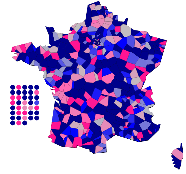
It's all about this map (click for interactive version)

To my datavis readers, sorry for that string of posts in French but what better data to visualize than political data, and what better time to visualize political data than election time, and what better audience for such visualizations than the folks who are asked to vote?

Like last time, though, I am writing a follow-up technical post about how I dealt with the issues of this visualization.

So anyone who ever tried to make data visualizations knows that you can hardly start without data.

My ingredients for the recipe were:

2012 presidential election results by circonscription, plus those of 2007.

Results of the previous congressional election. There were 2 files, one per round, as opposed to a flat file of députés in place (I didn’t find one that didn’t required some significant editing to be of use). Most importantly, I needed their political orientation which required some tweaking.

Matching tables between circonscriptions and cities.  From a previous project, presidential election data at the city level. Also, geo coordinates of the cities.

The data which was most painful to extract was the list of candidates. In all fairness, UMP made it easier than PS as they had them all on a page. For PS, they had a google fusion table which had this as a data source. That file required a lot of massaging. Eventually local pages of the PS site would list the candidates missing from the map (or provide alternate names). When it was up, I also used the http://www.elections-legislatives.fr/ site to check for the missing names.

Finally, I figured out the genders of all the candidates by extracting their first name and looking up all the ones I wasn’t sure about (there are quite a few unisex first names in French).

Now calculations.

There is a pretty strong statistical link between the score of a party on an election in a certain territory, and the chances of a congress candidate of the same party of winning the district.

Predicting these chances is a well-known problem known as classification  for which the textbook method is logistic regression.

All we need was the 575 districts for which I had results. We then associate the score of a party at the 2nd round of the election to whether the corresponding congress candidate got elected (1 or 0). That gives us 1150 pairs of values which we throw in the mathematical cooking pot.

And what we get is the following formula:

where x is the score in the previous election (between 0 and 1).  As you can see when x gets close to 0, the denominator becomes a very large number and the probability quickly drops to virtually nothing, and converserly when x gets close to 1, the denominator becomes very close to 1 so the probability rises up to 1 equally fast.

With this and that in place, it is possible to come up with a reasonable estimation of the chances of any candidate based on the recent results. As an aside, the current Prime Minister has renewed the tradition started by his predecessor to ask ministers to seek office and to force them to step down if they fail to win their district. As a result, 24 out of the 37 ministers are campaigning. Out of those 24, 2 are taking very serious risks according to this model: Marie-Anne Carlotti and Benoît Hamon.

Finally, geography.

In an ideal world, there will be an abundance of geoJSON files describing France and its many administrative entities. Usable data must exist somewhere, because the maps on www.elections-legislatives.fr have all been generated (by Raphael.js says the source code). If I’m doing another project on these elections I might reverse engineer the shape of the maps to extract the coordinates.

Without a dataset, the work of drawing the boundaries of 577 districts is just huge. However, accuracy is not required as I’m only putting the districts on a map so people can look up where they live or places they know. In my previous work in order to let users change the composition of the districts, I wanted to be rigorous in the placement of everything but here we can live with imperfection.

So I am using the same principle as I did: voronoi tesselation.

For each district I am picking the largest city, for which I have the coordinates. But most large cities belong to several districts. So I am adding random noise to each point. Then, I am drawing shapes around them.

That would normally fill a rectangle, so in order to make it look like France, I have drawn a clipping mask on top of it (that, I’ve done by hand, picking coordinates of the outline of France).

That about wraps it up!