Making data meaningful – Style guide on the presentation of statistics

Making Data Meaningful part 2
Introducing Making Data Meaningful Part 2 – Style guide on the presentation of statistics – which, as its name cleverly suggests, is a compilation of  advice to present graphical information.

It’s a follow up to Making Data Meaningul part 1 , which focused on writing about data, as opposed to visualize it.

The book is a cooperation between representatives of national statistical offices and intergovernmental organizations – all public statisticians, if you will. I hope it will help others to communicate their data better. Personally, I have written the part about charts and collaborated to some other chapters. But if I could sum up my advice in one sentence, it would be: go buy Stephen Few books. Start with Show me the numbers.

The list of people who collaborated to the book includes:


Using Tableau Public: first thoughts

I am currently beta testing Tableau Public. Essentially Tableau Public let you bring the power of Tableau analysis online. With Tableau public, your audience doesn’t need to download a workbook file that they can see in an offline, software client – they can see and interact with your work directly on a web page.

There are quite a few examples of the things you can do with Tableau public. These are the examples you are given when you start the product:

Tracking Economic Indicators by FreakalyticsA Tale of 100 Entrepreneurs by Christian ChabotBird strikes by airport by CrankyflierInteractive Running Back Selector by CBS sports

And there are always more on Tableau’s own blog. I’ve done quite a few which I’ll share progressively on this blog and on my OECD blog, http://www.oecd.blog/statistics/factblog.

So that’s the context. What’s the verdict?

1. There is no comparable data visualization platform out there.

There are many ways to communicate data visually. Count them: 1320, 2875… and many more.

However these tools have a narrower focus than Tableau, or require the user some programming ability. For instance, Many Eyes uses a certain number of types of data visualization which can be set up in seconds, but which cannot be customized. Conversely, Protovis is very flexible but requires some knowledge of Javascript. And even for a skilled developer, coding an interactive data visualization from scratch takes time.

By contrast, Tableau is a fully-featured solution which doesn’t require programming. It has many representation types which can be deeply customized: every visual characteristic of a chart (colour, size, position, etc.) can depend on your data. Several charts can also be combined as one dashboard. On top of that, data visualization done in Tableau comes with many built-in controls, with an interface to highlight and filter data, or to get more details on demand. For dashboards, it is also possible to link charts, so that actions done on one chart (highlighting records, for instance) affect other charts.

2. The solution is not limitless.

Tableau enables you to do things which are not possible using other packages. But it doesn’t allow you to do anything. That’s for your own good – it won’t allow you to do things that don’t make sense.

There are many safety nets in Tableau, which you may or may not run into. For instance, you can’t make a line chart for data which don’t have a temporal dimension – so much for parallel coordinates. However, the system is not fool-proof. Manipulating aggregates, for instance, can lead to errors that you wouldn’t have to worry about in plain old Excel, where the various steps through which data are computed to create a graph are more transparent (and more manual). Compared to Excel, you have to worry less about formatting – the default options for colours, fonts and positions are sterling – and be more vigilant about calculations.

3. Strength is in numbers.

Over the years, many of us grew frustrated with Excel visual capacities. Others firmly believed that anything could be done with the venerable spreadsheet and have shown the world that nothing is impossible.

The same applies to Tableau. The vibrant Tableau community provides excellent advice. “Historic” Tableau users are not only proficient with the tool, but also have a better knowledge of data visualization practices than the average Excel user. Like any fully-featured product, there is a learning curve to Tableau, which means that there are experts (the proper in-house term is Jedis) which find hacks to make Tableau even more versatile. So of course, it is possible to do parallel coordinates with Tableau.

The forum, like the abundant training, available as videos, manuals, list of tips,or online sessions with an instructor, doesn’t only help the user to solve their problems, but it also a fantastic source of inspiration.

With the introduction of Tableau Public, the forum will become even more helpful, as there will be more questions, more problems and more examples.


Plotter: a tool to create bitmap charts for the web

In the past couple of months, I have been busy maintaining a blog for OECD: Factblog.

The idea is to illustrate topics on which we work by a chart which we’ll change regularly. So in order to do that, I’d have to be able to create charts of publishable quality.

Excel screenshots: not a good option

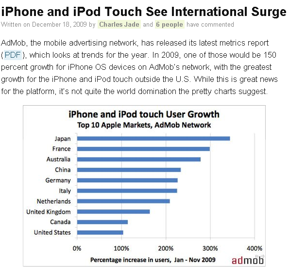
There are quite a few tools to create charts on the net. Despite this, the de facto standard is still a screenshot of Excel, a solution which is even used by the most reputable blogs.

excelinblog

This is taken from http://theappleblog.com/2009/12/18/iphone-and-ipod-touch-see-international-surge/

But alas, Excel is not fit for web publishing. First, you have to rely on Excel’s choice of colours and fonts, which won’t necessarily agree to those of your website. Second, you can’t control key characteristics of your output, such as its dimensions. And if your chart has to be resized, it will get pixelated. Clearly, there is a better way to do this.

That's a detail of the chart on the link I showed above. The letters and the data bars are not as crisp as they could have been.

That's a detail of the chart on the link I showed above. The letters and the data bars are not as crisp as they could have been.

How about interactive charts?

Then again, the most sensible way to present a chart on the web is by making it interactive. And there is no shortage of tools for that. But there are just as many issues.
Some come from the content management system or blogging environment. Many CMS don’t allow you to use javascript and/or java and/or flash. So you’ll have to use a technology which is tolerated by your system.

Most javascript charting solutions rely on the <CANVAS> element.  Canvas is supported by most major browsers, with the exception of the Internet Explorer family. IE users still represent roughly 40% of the internet, but much more in the case of my OECD blog, so I can’t afford to use a non-IE friendly solution. There is at least one library which works well with IE, RaphaelJS.
Using java cause two problems. First, the hiccup caused by the plug-in loading is enough to discourage some users. Second, it may not be understood well by readers:

This is how one of my post reads in google reader.

This is how one of my posts reads in google reader.

And it’s futile to believe that readers will read blogs from their home pages. So if all readers can’t show it well it’s a show-stopper.

A tool to create good bitmap charts

So, in a variety of situations the good old bitmap image is still the most appropriate thing to post. That’s why I created my own tools with Processing.

plotter windows

plotter mac OS X

plotter linux

Here’s how it works.

when you unzip the files, you have a file called “mychart.txt” which is a set of parameters. Edit the file according to the instructions in “instructions.txt” to your liking, then launch the tool (plotter application). It will generate an image, called “mychart.png”.

The zip files contain the source code, which is also found here on my openprocessing account.

With my tools, I wanted to address two things. First, I wanted to be able to create a chart and to have a precise control of all of its components, especially the size. In Excel, by contrast, it’s difficult to control the size of the plotting area, or the placement of the title – all of this things are done automatically and are difficult to correct (when it’s possible). Second, I wanted to be able to create functional thumbnails.

If you have to create smaller versions of a chart from a bigger image, the easiest solution is to resize the chart using an image editing software. But that’s what you’d get:

That's the original chart.

That's the original chart.

And that's the resized version. Legible? nah.

And that's the resized version. Legible? nah.

But what if it were just as easy to re-render the chart in a smaller size, than to resize it with an external program? My tool can do that, too.

Left: resized, right: re-rendered.

Left: resized, right: re-rendered.

Here’s a gallery of various charts done with the tool. The tool supports: line charts, bar charts (both stacked and clustered), dots charts and area charts. No pie charts included. It’s best suited for simple charts with few series and relatively few data points.

Impact of energy subsidies on CO2 emissions

Impact of energy subsidies on CO2 emissions

Temperature and emission forecasts

Temperature and emission forecasts

Greenhouse gas emission projections

Greenhouse gas emission projections

I hope you find it useful, tell me if you do and let me know if you find bugs.


Review of Tableau 5.0

Those last 2 weeks, I finally found time to give Tableau 5.0. Tableau enjoys a stellar reputation among the data visualization community. About a year ago, I saw a live demo of Tableau by CEO and salesman extraordinaire Christian Chabot. Like most of the audience, I was very impressed, not so much by the capacities of the software but by the ease and speed with which insightful analysis seemed to appear out of bland data. But what does it feel on from the user perspective?

Chartz: ur doing it wrong

Everyone who wrote about charts would pretty much agree that the very first step in making one is to decide what to show. The form of the display is a consequence of this choice.

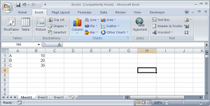
Most software got this wrong. They will ask you how you want your display to look like, then ask you for your data. Take this screenshot from Excel:
excel

When you want to insert a chart, you must first choose what kind of chart (bar, line, column, pie, area, scatter, other charts) and one of its sub-types. You are not asked, what data does this apply to, and what that data really is. You are not asked, what you are trying to show through your chart – this is something you have to manage outside of the software. You just choose a chart.

I’m picking Excel because with 200m users, everyone will know what I’m talking about, but virtually all software packages ask the user to choose a rather rigid chart type as a prerequisite to seeing anything, despite overwhelming theoretic evidence that this approach is flawed. In Excel, like in many other packages, there is a world of difference between a bar chart and a column chart. They are not of the same nature.

A reverted perspective

Fortunately, Tableau does it the other way round. When you first connect with your data in Tableau, it distinguishes two types of variables you can play with: dimensions and measures. And measures can be continuous or discrete.

tableau-dimensions(This is from an example file).

Then, all you have to do is to drag your dimensions and your measures to the center space to see stuff happening. Let’s drag “close” to the rows…

tableau-dragging-1We already see something, which is not terribly useful but still. Now if we drag Date into the columns…
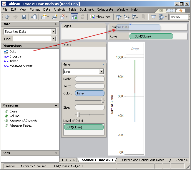
tableau-dragging-2

Instant line chart! the software found out that this is the type of representation that made the most sense in this context. You’re trying to plot continuous variables over time, so it’s pretty much a textbook answer. Let’s suppose we want another display: we can click on the aptly name “show me!” button, and:
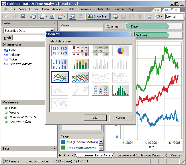
tableau-show-me

These are all the possible representations we have. Some are greyed out, because they don’t make sense in this context. For instance, you need to have dimensions with geographic attributes to plot things on a map (bottom left). But if you mouse over one of those greyed out icons, you’ll be told why you can’t use them. So we could choose anything: a table, a bar chart, etc.

A simple thing to do would be to switch rows and columns. What if we wanted to see date vertically and the close horizontally? Just drag and drop, and:
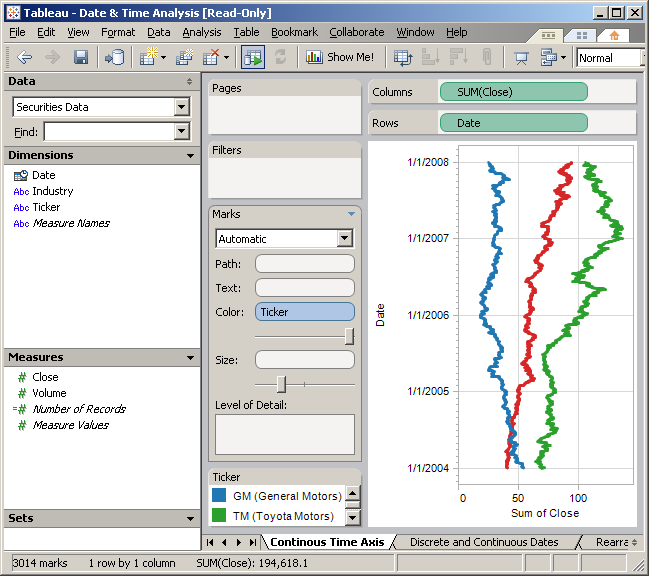
tableau-flip

Crafting displays

Gone are the frontiers between artificial “chart types”. We’re no longer forcing data into preset representations, rather, we assign variables (or their automatic aggregation, more on that shortly) to possible attributes of the graph. Rows and columns are two, which shouldn’t be taken too literally – in most displays, those would be better described as abcissa and ordinate – but all the areas in light grey (called “shelves”) can welcome variables : pages, filters,path, text, color, size, level of detail, etc.
more-dimensions

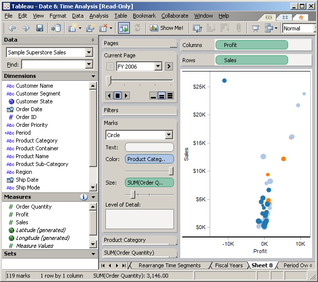
Here’s an example with a more complex dataset. Here, we’re looking at sales figures. We’re plotting profit against sales. The size of the marks correspond to the volume of the order, and the colour, to their category. Results are presented year by year. It is possible to loop through the years. So this display replicates the specs of the popular Trendalyzer / Motion chart tool, only simpler to set up.

Note that as I drag variables to shelves, Tableau often uses an aggregation that it thinks makes more sense. For instance, as I dragged Order Date to the page shelf, Tableau picked the year part of the date. I could ask the program to use every value of the date, the display will be almost empty but there would be a screen for each day. Likewise, when I dragged Order Quantity to the Size shelf, Tableau chose to use the sum of Order Quantity instead. Not that it makes much of a difference here, as each bubble represents only one order. But the idea is that Tableau will automatically aggregate data in a way that makes sense to display, and that this can always be overridden.

But if I keep the data for all the years in the display, I can quickly see the transactions where profit was negative.

sets1And I can further investigate on this set of values.

So that’s the whole idea. Because you can assign any variable to any attribute of the visualization, in the Tableau example gallery you can see some very unusual examples of displays.

Using my own data

When I saw the demos, I was a little skeptical of the data being used. I mean, things were going so smoothly, evidence seemed to be jumping at the analyst, begging to be noticed. Tableau’s not bad at connecting with data of all forms and shapes, so I gave it a whirl with my own data.

Like a lot of other official data providers, OECD’s format of choice for exporting data is SDMX, a flavor of XML. Unfortunately, Tableau can’t read that. So the next easiest thing for me was Excel.

I’m not going to get too much into details, but to come up with a worksheet that Tableau liked with more than a few tidbits of data required some tweaking and some guessing. The best way seems to be: a column for each variable, dimensions and dates included, and don’t include missing data (which we usually represent by “..” or by another similar symbol).

Some variables weren’t automatically reckognized for what they were: some were detected as dimensions when they were measures, date data wasn’t processed that well (I found that using 01/01/2009 instead of 2009 or 1/2009 worked much better). But again, that was nothing that a little bit of tweaking couldn’t overcome.

On a few occasions, I have been scratching my head quite hard as I was trying to understand why I could get Y-o-Y growth rates for some variables, but not for some others, or to make custom calculated fields. Note that there are plenty of online training videos on the website. I found myself climbing the learning curve very fast (and have heard similar statements of recent users who quickly felt empowered) but am aware that practice is needed to become a Tableau Jedi. What I found recomforting is that without prior knowledge of the product, but with exposure to data design best practices, almost everything in Tableau seems logical and simple.

But anyway – I was in. Here’s my first Tableau dashboard:

my-dashboardA Dashboard is a combination of several displays (sheets) on one space. And believe me, it can become really sophisticated, but here let’s keep it simple. The top half is a map of the world with bubbles sized after the 2007 population of OECD countries. The bottom half is the same information as a bar chart, with a twist: the colour corresponds to the population change in the last 10 years. So USA (green) have been gaining population while Hungary has seen its numbers decrease.

I’ve created an action called “highlighting on country” to link both displays. The best feature of these actions is that they are completely optional, so if you don’t want to have linked displays, it is entirely up to you and each part of the dashboard can behave independantly. You can also bring controls to filter or animate data which I left out for the sake of simplicity. However, you can still select data points directly to highlihght them in both displays, like this:

my-dashboard-highlight-bottomHere I’ve highlighted the top 5 countries. The other ones are muted in both displays. Here my colour choice is unfortunate because Japan and Germany, which are selected, don’t look too different from the other countries. Now I can select the values for the countries of Europe:
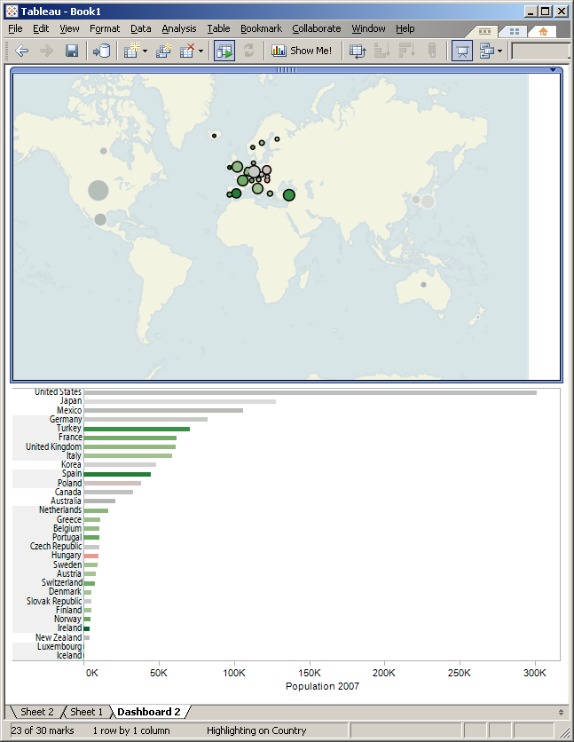
my-dashboard-highlight-europe

And you’ll see them highlighted in the bottom pane.

Display and style

Representing data in Tableau feels like flipping the pages of a Stephen Few book, which is more than coincidiential as he is an advisor to Tableau. From my discussion with the Tableau consultant that called me, I take that Tableau takes pride in their sober look and feel, which fervently follows the recommendation of Tufte, and Few. I remember a few posts from Stephen’s blog where he lashed as business intelligence vendors for their vacuous pursuit of glossiness over clarity and usefulness. Speaking of Few, I’ve upgraded my Tableau trial by re-reading his previous book, Information Dashboard Design, and I could really see where his philosophy and that of Tableau clicked.

So there isn’t anything glossy about Tableau. Yet the interface is state-of-the-art (no more, no less). Anyone who’ve used a PC in the past 10 years can use it without much guessing. Colours of the various screen elements are carefully chosen and command placement makes sense. Most commands are accessible in contextual menus, so you really feel that you are directly manipulating data the whole time.

When attempting to create sophisticated dashboards, I found that it was difficult to make many elements fit on one page, as the white space surrounding all elements becomes incompressible. I tried to replicate displays that I had made or that I had seen around, I was often successful (see motion chart reproduction above) but sometimes I couldn’t achieve the level of customization that I had with visualizations which are coded from scratch in Tableau. Then again even Tableau’s simplest representations have many features and would be difficult to re-code.

Sharing data

According to Dan Jewett, VP of product development at Tableau,

“Today it is easier to put videos on the Web than to put data online.”

But my job is precisely to communicate data, so I’m quite looking forward this state of affairs to change. Tableau’s answer is twofold.

The first half is Tableau Server. Tableau Server is a software that organizes Tableau workbooks for a community so they can access it online, from a browser. My feeling is that Tableau Server is designed to distribute dashboards within an organization, less so with the anyone on the internet.

That’s where the second part of the answer, Tableau Public, comes into play. Tableau Public is still in closed beta, but the principle is that users would have a free desktop applications which can do everything that Tableau Desktop does, except saving files locally. Instead, workbooks would have to be published on Tableau servers for the world to see.

There are already quite a few dashboards made by Tableau Public first users around. See for instance How Long Does It Take To Build A Technology Empire? on one of the WSJ blogs.

Today, there is no shortage of tools that let users embed data online without technical manipulations. But as of today, there is no product that could come close to this embedded dashboard. Stephen McDaniel from Freakalytics notes that due to Tableau’s technical choices (javascript instead of flash), dashboards from Tableau Public can be seen in a variety of devices, including the iPhone.

I’ve made a few dashboards that I’d be happy to share with the world through Tableau Public.

This wraps up my Tableau review. I can see why the product has such an enthusiastic fan base. People such as Jorge Camoes, Stephen Few, Robert Kosara, Garr Reynolds, Nathan Yau, and even the Federal CIO Vivek Kundra have all professed their loved for the product. The Tableau Customer Conference, which I’ve only been able to follow online so far, seems to be more interesting each year. Beyond testimonies, the gallery of examples (again at http://www.tableausoftware.com/learning/examples, but do explore from there to see videos and white papers), still in the making, shows the incredible potential of the software.
 

New data services 3: data.gov

The United States are the only western country without a centralized data office. Instead, official statistics are produced by well over 100 agencies. This makes obtaining official US data difficult, and that’s somewhat of a paradox because in most cases, these data are public and free. Of course, with data coming from so many sources, they are also in a variety of shapes and sizes. Says Wired,

Until now, the US government’s default position has been: If you can’t keep data secret, at least hide it on one of 24,000 federal Web sites, preferably in an incompatible or obsolete format.

A commitment made by the Obama administration was to tackle this and make data more widely available. To that end, a data portal was announced in early April and data.gov was officially launched end of May.

Data.gov is three things in one.

A sign that this administration wants to make the data more accessible, especially to developers.

A shift towards open formats, such as XML.

A catalogue of datasets published by US government agencies.

The rationale is that with data.gov, data are available to wider audiences. There’s a fallacy in that, because the layperson cannot do much with an ESRI file. But hopefully, someone will and may build something out of it for the good of the community.

The aspect I found most interesting is the catalogue proper. For each indexed dataset, data.gov builds an abstract, inspired by the Dublin-Core Metadata Initiative, with fields such as authoring agency, keywords, units, and the like. This, in itself, is not a technological breakthrough but imagine if all the datasets produced by all the agencies were described in such a uniform fashion. Then, retrieving data would be a breeze.

Note that data.gov does not store the datasets. They provide a store-front which then redirects users to the proper location once a dataset has been selected.

There have been other, similar initiatives. Fedstats.gov, allegedly, provided a link to every statistical item produced by the federal government. By their own admission, the home page was last updated in 2007, and its overall design hasn’t changed much since its launch by the Clinton administration in 1997 (a laudable effort at the time). Another initiative, http://usgovxml.com, is a private portal to all data available in XML format.

So, back to “find access process present share”. Where does data.gov fall?

It can come as a surprise that they don’t touch the last 3 steps. Well, it certainly will be a surprise for anyone expecting the government to open a user-centric, one-stop-shop for data. Data.gov is certainly not a destination website for lay audiences.

It doesn’t host the data either, however, its existence drives agencies to publish their datasets in compliance with its standards. So we can say that it indirectly addresses access.

So what it really is about is finding data. Currently, the site has two services to direct users to a dataset: a search engine and a catalogue. The browsable catalogue has only one layer of hierarchy, and while this is fine with their initial volume (47 datasets, around 200 as of end of June) that won’t suffice if their ambition is to host 100,000 federal data feeds.

All in all, it could be argued that data.gov doesn’t do much by itself. But what is interesting is what it enables others to do.

On the longer term, it will drive all agencies to publish their data under one publication standard. And if you have 100,000 datasets published under that standard, and if people use it to find them, then we will have a de facto industry standard to describe data. The consequences of that cannot be overestimated.

The other not obvious long-term advantage is what it will allow developer to create. There are virtually no technical barriers to creating interesting applications on top of these datasets. Chances are that some of these applications could change our daily lives. And they will be invented not by the government, but by individuals, researchers or entrepreneurs. quite something to be looking forward to.


New data services 2: Wolfram|alpha

In March this year, überscientist Stephen Wolfram, of Mathematica fame, revealed the world he was working on something new, something big, something different. The first time I heard of this was through semantic web prophet Nova Spivack, who is not known to get excited by less-than-revolutionary projects. That, plus the fact that the project was announced so short before its release, contributed to build anticipation to huge levels.

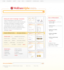
wolframalpha

Wolfram|alpha describes itself as a “computational knowledge engine” or, simply put, as an “answer engine”. Like google and search engines, it tries to provide information based on a query. But while search engines simply try to retrieve the keywords of the query in their indexed pages, the answer engine tries to understand the query as a question and forms an educated answer. In a sense, this is similar to the freebase project, which is to put all the knowledge of a world in a database where links could be established across items.

It attempts to detect the nature of each of the word of the query. Is that a city? a mathematic formula? foodstuff? an economic variable? Once it understands the terms of the query, it gives the user all the data it can to answer.

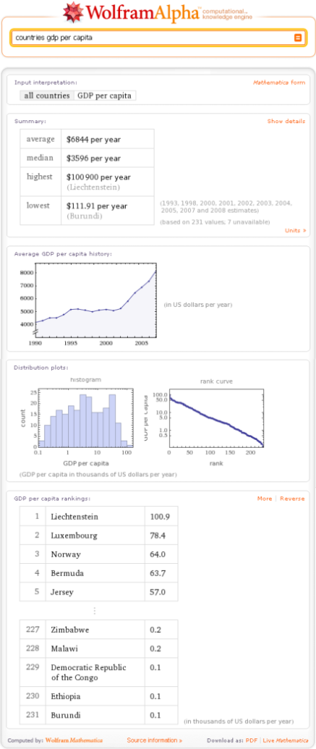
Here for instance:

wolframalpha-2

Using the same find access process present share diagram as before,

Wolfram|alpha’s got “find” covered. More about that below.

It lets you access the data. If data have been used to produce a chart, then there is a query that will retrieve those bare numbers in a table format.

Process is perhaps Wolfram|Alpha’s forte. It will internally reformulate and cook your query to produce all meaningful outputs in its capacity.

The presentation is excellent. It is very legible, consistent across the site, efficient and unpretentious. When charts are provided which is often, the charts are small but both relevant and informative, only the necessary data are plotted. This is unusual enough to be worth mentioning.

Wolfram|alpha doesn’t allow people to share its outputs per se, but since a given query will produce consistent results, users can simply exchange queries or communicate links to a successful query result.

Now back to finding data.

When a user submits a query, the engine does not query external sources of data in real time. Rather, it used its internal, freebase-like database. This, in turn, is updated by external sources when possible.

For each query, sources are available. Unfortunately, the data sources provided are for the general categories. For instance, for all the country-related informations, the listed sources are the same, and some are accurate and dependable (national or international statistical offices), some are less reliable or verifiable (such as the CIA world factbook or what’s cited as Wolfram|Alpha curated data, 2009.). And to me that’s the big flaw of this otherwise impressive system.

Granted, coverage is not perfect. That can only improve. Syntax is not always intuitive – to make some results appear in a particular way can be very elusive. But this, as well, will get gradually better over time. But to be able to verify the data presented, or not, is a huge difference – either it is possible or not. I’m really looking forward to this.


New data services 1: Google’s public data

Google’s public data has been launched somewhat unexpectedly at the end of April 2009.

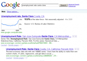
The principle is as follows. When someone enters a search query that could be interpreted as a time series, Google displays a line graph of this time series before other results. Click on it, and you can do some more things with the chart.

googlepublicdata1

The name public data can seem ambiguous.

Public, in one sense, refers to official, government-produced statistics. But, for content, public is also the opposite of copyrighted. And here, a little bit of digging reveals that it’s clearly the latter sense. If you want this service to point to your data, it must be copyright-free.

I’ve seen Hans Rosling (of Gapminder fame, now Google’s data guru) deliver a few speeches to national statisticians to which he expressed all the difficulties he had to access their data, and battle with formatting or copyright issues. So I can understand where this is coming from. However. Imagine the outcry if google.com decided to stop indexing websites which were not in the public domain!

Remember my find > access > process > present > share diagram?

I’d expect that google will solve the find problem. After all, they’re search people. But they don’t! You’d find a time series if you enter its exact name in google. There is no such thing (yet, as I imagine it would be easy to fix) as a list of their datasets.

They don’t tackle the access problem either. Once you see the visualizations, you’re not any step closer to actually getting the  data. You can see them, point by point, by mousing over the chart. I was also disappointed by the inaccuracy of the citation of their datasets. I’d have imagined that they’d provide a direct link to their sources, but they only state which agency produced the dataset. And finding a dataset from an agency is not a trivial matter.

They don’t deal with process, but who will hold that against them? Now what they offer is a very nice, very crisp representation of data (presenting data). I was impressed how legible the interface remained with many data series on the screen, while respecting Google’s look and feel and colour code.

Finally, it is also possible to share charts. Or rather, you can have a link to an image generated by google’s chart API, which is more than decent. A link to this static image, and a link to the chart on google’s public data service, and that’s all you should need (except, obviously, a link to the data proper!)

Another issue comes from the selection of the data sets proper.

One of the datasets is the unemployment rates, which are available monthly and by USA county. Now I can understand the rationale to match a google query of “unemployment rates” to that specific dataset. But there are really many unemployment rates, depending on what you divide by what. (are we counting unemployed people? unemployed jobseekers? which definition of unemployment are we using – ILO’s, or the BLS’s? and against what is the rate calculated – total population? population of working age? total labour force?) But how could that work if you expand the system to another country? To obtain the same level of granularity (to a very narrow geographic location, to a period of a month) would require some serious cooking of the data, so you can’t have granularity, comparability and accuracy.

I don’t think the system is sustainable. I don’t like the idea that it gives the impression to people that economic statistics can be measured in real time at any level, just like web usage statistics for instance. They can’t be just observed, they’re calculated by people.

Google public data is still in its infancy. To have a usable list of the datasets, for instance, would alleviate much of my negarive comments on the system. But for the time being, I’m not happy with the orientation they’ve chosen.