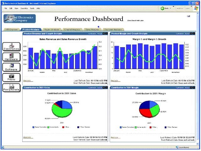
From the past posts, you would have gathered that dashboards are tools to solve specific problems. They are also formed from individual charts and data elements.
Selecting information
That dashboards are so specific is great, because the problem that they are designed to solve will help choosing the information that we need and also prioritizing it – two essential tasks in dashboard creation. Again, we don’t want to shove every data point we have.
Another great tool to help us do those two tasks is user research. As a designer, we may think we chose the right metrics, but they have to make sense to real users and resonate with them. The bias that we may have is that we would favor data which is easy to obtain or that makes sense to us, compared to data which can be more elaborate, more sophisticated or more expensive to collect or compute, even if that makes more sense to the user.
Here’s an illustration of that.
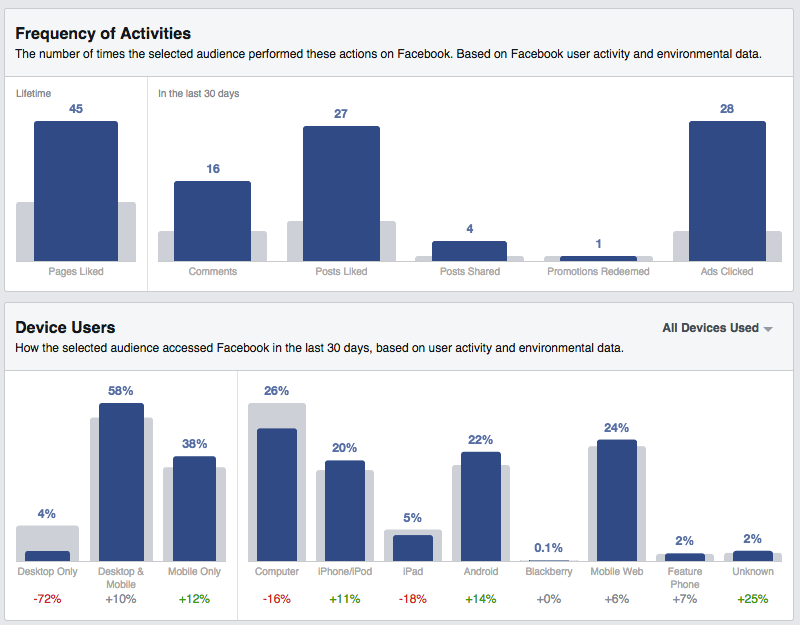
When I was working at Facebook on this product, Audience Insights, we designed this page to help marketers understand how a group of users they could be interested in used Facebook. (The link / screenshot showcases fans of the Golden State Warriors). One of the main ways we classified users at Facebook, for internal purposes, is by counting how many days of the last four weeks they have been on Facebook. It’s a metric called L28 and one of the high-level things Facebook knows about everyone. So, we integrated it in the first version of this page. But, even though it’s not a concept unique to Facebook, it wasn’t that useful to our users, and it was taking space from a more relevant indicator.

Instead, we have included indicators which are more relevant to the task at hand (ie getting a sense of who those users are through the prism of their activity). For instance we can see that very few Warriors fans only use Facebook on their computer, compared to the general population of US Facebook users. They tend to skew more towards Android and mobile web (going to www.facebook.com from their phone, versus using an app.) They tend to be more active in terms of likes, comments and shares.
Information hierarchy
Once information is chosen and you get a sense of what is more important than the rest, it’s time to represent that visually.
Here are some of the choices you can make.
Show some metrics on top or bigger than others.
That’s probably the first thing that comes to mind when thinking hierarchy and prioritization. And it needs to be done! Typically, you should get one to three variables that really represent the most important thing you want your users to read or remember. If you come up with more than 3, you should refine your question/task and possibly split it in two.
The rest of the variables will support these very high level metrics. Again, in a typical situation, you could come up with up to three levels of data (with more than three being a good indication to rethink your scope). Some metrics can support the high-level metrics (i.e. show them with a different angle, or explain them) and some metrics could in turn support them.
Present some metrics together.
Stephen Few argues that dashboards should fit on one page or one screen because their virtue is to present information together. With the flexibility offered by the modern web, and the size constraints of mobile, this is a requirement that shouldn’t be absolute. But it’s relevant to remember that some variables add value when seen along other variables. With that in mind, you can have part of your dashboard as a fixed element (always visible on screen) while the rest can scroll away, for instance.
Push some metrics to secondary cards (such mouseovers, pop-ups or drill-down views)
Hierarchizing information is not just about promoting important information. It’s also about demoting information which, while is useful in its own right, doesn’t deserve to steal the show from the higher level metric. The great thing about interactive dashboards is that there are many mechanisms for that. Some information can be kept as “details on demand” and only shown when needed.
Figure out what form to give to the data
So you have data. It probably changes over time, too (and you have that history as well!). And a sense of how important it is.
You can represent it as a static number (and, further, to adjust the precision of that number) or as a time series (i.e. line graph, area graph, bar graph etc.), or both.
The key question to answer is whether the history and how the metric moved over time is relevant and important, versus the latest figures. If you think that the history is always important or that it doesn’t hurt to have it for context anyway, consider that it’s yet another visual element to digest, another thing that can be misinterpreted, and that unless its importance is clearly demonstrated, you’d rather not include it. Yes – even as a tiny sparkline.

Here is another example from my work at Facebook of a page where proper hierarchy has been applied.
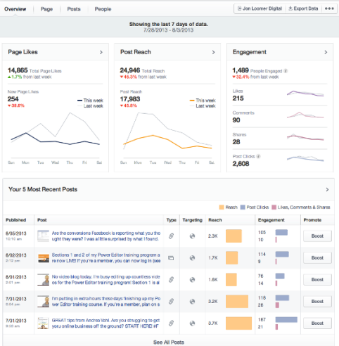
Page Insights, to use a parallel with a better known product, is like google analytics, only for Facebook Pages instead of web sites. Unsurprisingly, the metric we put to the top left is the Page Likes, which is the number of people who like a page. The whole point of the system is to let people understand what affects that number and how to grow it. Two other high-level metrics are shown on the same row in the two cards on the right: the Post Reach for the week (number of people who have seen content from this page this week, whether they like the Page or not) and Engagement (number of people who acted on the content – actions could be liking, commenting, sharing, clicking, etc.)
The number of new Page Likes of the past week, which is represented as a both a line chart and a number in the left card, is an example of a level two metric. It supports the top metric – total likes. The number of Page Likes of the past week, which is represented as a line chart only, is a level three metric. It’s here just as a comparison to the number of the current week – here, it helps us figuring out that last week has been a better week.
Connecting the dots
Ultimately, a dashboard is more than a collection of charts. It’s an ensemble: charts and data are meant to be consumed as a whole, with an order and a structure. Charts that belong together should be seen together. The information gained like so will be much more useful than from looking at them in sequence.
Linking, for instance, is the concept of highlighting an element in a given chart with repercussions on other charts, depending on the element highlighted. A common use case is to look at a data for one given time point, and see the value for that time point highlighted in related charts. Here is an example:

In this specific case, the fact that both charts share the same x-axis makes comparing the shape of both charts easier even without linking.
Each variable doesn’t have to be on its own chart. Your variables can have an implicit relation between one another. Bringing them together might make that relation explicit. Here are some interesting relationship between variables or properties of variables that can be made apparent through the right chart choice.
- One variable could be always greater than another one, because the second is a subset of the first. Here are some examples:
- The number of visits on a website last week will always be greater or equal than the number of unique visitors that week, which will always be greater than the number of visitors last day.
- The number of visitors will always be greater to the number of first-time visitors.
- The cumulative number of orders over a period of time will always be greater than the number of daily orders over that same period.
- The time that users spend with a website in an active window of their browser will always be greater than the time they spend actively interacting with the site.
What’s interesting here is that these relations are not just true because of experience, they are true by definition. It’s also metrics that are expressed in the same units, and, in most cases, with the same order of magnitude, so they can be displayed on the same chart. When applicable, showing them together can show how they, indeed, move together or not.
- One variable could be the sum of two other, less important variables.
In the example below we go even one step further and we show that one variable is the sum of two variables minus a fourth one.
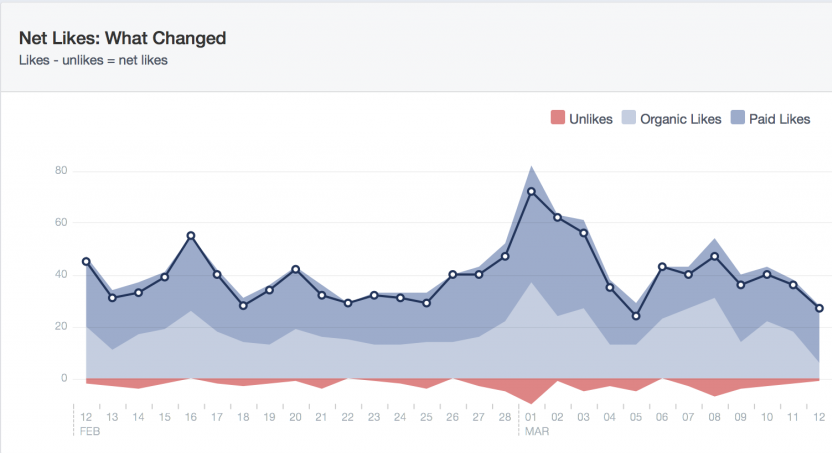
Here, we look at the net likes of a Facebook Page, that is, the difference between the number of people who like a page on a given day and the day before.
Two factors can make more people like a page: paid likes (a user sees an ad, is interested, and from it, likes the page) or organic likes (a user visits a page, or somehow see content from that page, and likes it, without advertisement involved). Finally, people may also decide to stop liking the page (“unlikes”).
Here, net likes = organic likes + paid likes – unlikes. The reason why we have decomposed Likes between organic and paid is because we wanted to show that ads can amplify the effect of good content. So, visually, we chose to represent that as a layer on top of the rest. (important remark: your dashboard doesn’t have to be neutral. If it can show that your product, company, team etc. is delivering, and you have an occasion to demonstrate it, don’t hesitate a moment). By showing the unlikes as a negative number, as opposed to a positive variable, going up, possibly above the likes (which would be unpredictable) we can keep the visual legible and uncluttered. A user can do the visual combination of all these variables. This chart, by the way, shows the typical dynamic of a Page : new content will generate peaks of new users, but also will cause some users to stop liking the page.

- One variable could be always growing. Or always positive.
When that is the case this can be used to make choices to represent the chart. If a variable is always growing by nature (i.e. cumulative revenue) you may want to consider representing a growth rate rather than the raw numbers. A reason to consider that is that your axis scale will have to change over time (i.e. if you plot a product that sells for around $1m per day, having an axis that goes from 0 to $10m would be enough for a week, but not for a month let alone for a year, whereas with a growth rate you can represent a long period of time consistently). And if a variable is always positive (ie stock price), your y axis can start at 0, or even at an arbitrary positive value, as opposed to allocate space for negative values.
Conversely, if a variable doesn’t change over time, it doesn’t mean that it’s not interesting to plot. That absence of change could be a sign of health of the system (which is the kind of task that dashboards can be useful for). So the absence of change doesn’t mean that there’s an absence of message.
