d3 tutorial at visWeek 2012

Jeff Heer, Scott Murray and myself have done a d3 tutorial at visWeek 2012. You probably gathered that from the title of the post.

Here is a link to all the slides and code examples that we have presented:

d3 tutorial

For the purpose of the tutorial I have compiled a d3 cheat sheet, on 4 pages it groups some of the most common d3 functions. When I was learning d3 my number one problem was figuring out which property should be set using .attr, and which required .style. And also: which svg element support which property? All of this is addressed in the cheat sheet. It’s part of the link above, but if you want it directly without downloading a 13Mb file, here it is:

d3 cheat sheet


Don’t take my word for it

Inspiration

In June 2010, I attended a Wolfram|Alpha event called the London Computational Knowledge Summit where speakers mostly focused on how computers can transform the way we teach and transmit knowledge. Several of the presentations made a lasting impression, and mostly the talk by Jon McLoone:

Jon’s point was that academic papers today look an awful lot like those in the 17th century. Granted, they’re not in latin, they can be displayed online and there is color, but as far as maths are concerned it’s still long pages of difficult language and long formulas. The computer, however, can do so much more than transmit information. In the clip above (around 6’20”) Jon shows how a paper on edge detection can be much more effective if instead of using a static example to demonstrate the technique, the paper were able to use a live example, such as input from the camera. In that talk and throughout the day, there were more examples on how interactive displays could be useful for teaching.

Teaching, telling stories and getting a message across use similar functions. Fast forward to VisWeek 2010 and the first “Telling Stories with Data” workshop. Some of the presentations there (I’m thinking of Nick Diakopoulos and Matthias Shapiro mostly) hinted that there could be a process through which readers/users/audience could be taken through so they can make the most of an intended message. Interestingly, this process is not about transmitting as much data as effortlessly as possible but rather to engage the audience, to get them to challenge their assumptions.

Those two events really made me pause and think. Ever since I had started working in visualization, all my efforts had been focused on being as clear as possible, and my focus, on efficient visuals. However, for some tasks, clarity just isn’t optimal. That wasn’t much of an issue in most of my OECD work where such an approach makes a lot of sense but I started seeing that there was a world of possibility when it comes to changing people’s perception on a subject or even persuading them.

Application

French pension reform

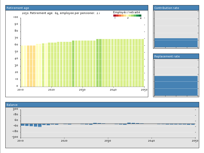
Right at the moment of visWeek 2010, France was plagued by strikes against the proposed pension reform. At the peak of contestation up to 3m people demonstrated (that’s as much as one adult out of 14). I was quite irritated by the protests. In theory, left and right had very comparable views on this problem and only disagreed on unsignificant details. They both knew reform was unavoidable, and, again, had similar plans. But when those of the current government were implemented, the opposition capitalized on the discontent and attacked the plan vigorously. Their rethoric were entirely verbal – no numbers were harmed in the making of their discourse! Consequently, protesters and a large part of the population started to develop notions about the state of pensions which were completely disconnected from reality.

I believe that if numbers had been used early enough, it would have been enough to provide a counterpoint to such fallacies and while it may not have prevented demonstrations, it would have greatly helped to dampen their effect. With that in mind and with official data I tried to build a model to show what would happen if one changed this or that parameter of pension policy. Pension mechanics are quite simple: what you give on one side, you take on another; the evolution of population is quite well known, so making such a model is pretty straight forward. But putting that in a visual application really showed how the current situation was unsustainable. In this application I challenge the user to find a solution – any solution – to the pension problem, by using the same levers as the policy makers. It turns out that there is just one viable possibility. Yet, letting people find that by themselves and challenge that idea as hard as they could was very different from paternalizing and telling people that this was just the way it is.

On the course of the year I got involved in several occasions in situations like this where data visualization could be used to influence people’s opinion, and likewise I tried to use that approach. Instead of sending a top-down message (with or without data), instead confront the assumptions of the audience and get them to interact with a model. After this experience, their perception will have changed. This technique doesn’t try to bypass the viewers critical thinking, but instead to leverage their intelligence.

In politics

I am very concerned with the use of data visualization in politics for many reasons. One of them is because I’m a public servant. In my experience, most decisions are not taken by politicians, but by experts or technicians who are commited to the public good. Yet, when poorly  explained, these decisions can be misunderstood and attacked. Visualization, I believe, can help defend such decisions (those who are justifiable at least) and explain them better to a greater number.

Although a lot of data is available out there (or perhaps for that very reason) only few people have a good grasp of the economic situation of their country. This just can’t be helped. It’s not possible to increase the percentage of people who can guestimate the unemployment rate and it’s not really important. Very few people need to know such a number, now what is important is to be able to use that information in context when it is useful. For instance, at election time, a voter should be able to know if the incumbent has created or destroyed jobs. This is something that data visualization can handle brilliantly.

Finally, my issue with political communication is that it is written by activists, for activists. It works well to motivate people with a certain sensitivity but it is not very effective at getting others to change side. This is a bias which is difficult to detect by those in charge of political communications because, well, they’re activits too… and here this flavor of model-based data visualization, with its appearance of objectivity and neutrality, can complement the more verbal aspect of rhetoric quite well.

In the talk I used Al Gore’s An Inconvenient Truth as a counter example. This movie is a fine example of story-telling, and operating at an emotional rather that at a rational novel. I trust that people who feel concerned about climate change will be reinforced in their beliefs after seeing the movie. However, those who do not were unconvinced. In fact, the movie also gave a strong boost to climate skeptics. There was a real barrage of blog posts and websites attempting to debunk the assertions of that “truth”, most often with data. There is a missed opportunity: if the really well-made stories of the movie had been complemented with a climate model that people could experiment with, it would have been perceived as less monolithic, less manichean, less dogmatic.

The conclusions

In my practice using an interactive model can help a lot to get a message across (and no, I don’t have a rigorous evaluation for “a lot”, that’s the advantage of not being an academic).

Such models engage the users, they come out as more objective and truthful as static representations, and they can be very useful to address preconceptions. Chances are they’re more fun, too.

Then again, just because a model is interactive and built on transparent data and equations doesn’t mean it’s objective. It is usually possible to control the model or the interface so that one interpretation is more likely than the other, and that’s precisely the point if you are using data visualization to influence.

It can be very cheap and easy to turn a static representation into an interactive display. Every chart with more than 2 dimensions can be turned in a visualization where the user controls one dimension and sees data for the others evolve.

And if you build a model like this, you must be very open and transparent about the data and the equations and sometimes find ways to get people to overcome their doubts.

Besides, having a working interactive model is no guarantee of success. You really have to be careful that your users are not likely to interpret your visualization in ways you never intended.

The presentation


All examples I used in the presentation both good and bad, both mine and others can be found at http://jckr.github.io/blog/data-stories/


Open data and data journalism

Yesterday I attended a workshop organized by Etalab on data journalism. Since open data, data visualization and storytelling with data are my 3 work interests I could not just be found elsewhere that day.

Interestingly, while speakers and attendants were very much discussing the same subject, what was said (or inferred in questions asked) was very different. On some topics participants presented opposite opinions,  while on others there was a strong agreement.

Inspiration and enthusiasm

That was definitely the common denominator across presentations.

In short: visualization + journalism = win.

Every presenter, @dataveyes, Pierre Falga, @datastore, @sayseal, @we_do_data and @epelboin all showed are talked about things which were pretty awesome and which would have not been possible with data or visualization. While I was familiar with the other examples, I was most fired up by Fabrice Epelboin’s presentation of Tunisian media, Fhimt.com and its dataviz gallery.

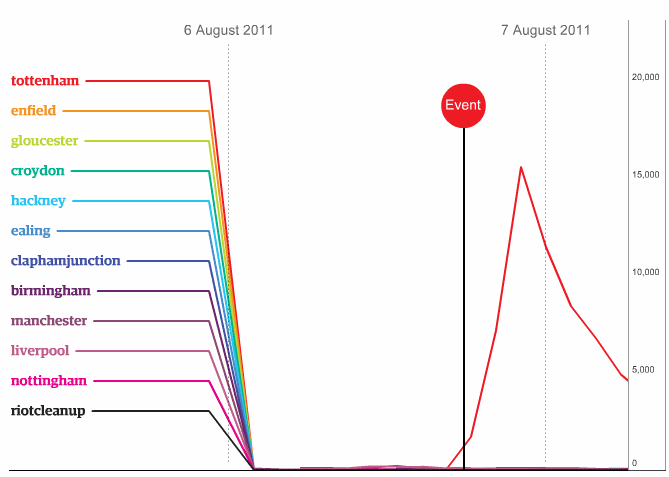
What was interesting was how it was easy to tell a memorable story with the support of data. I think for the picture to be complete you also have to include in the big picture the viewer’s assumption and the presenter/journalist narration. One example which was shown by both Caroline Goulard and Simon Rogers is the relationship between tweets and UK riots.

The unsaid assumption was that social media have helped organize the riots.

Facts in hand, in turns out that the bulks of the tweets related to a  riot happened after, not before, the event.  So the narrator help us conclude that riot caused tweets rather than the other way around.

Another example from fhimt.com:
We assume that tertiary graduates have better job prospects than those with less education.

This isn’t the case in Tunisia where there graduates endure a 23% unemployment rate, while the rate for those who haven’t completed primary school is around 5%.
Comment by Fabrice Epelboin: the only thing left to do for them is prepare the revolution. I find this a very clear and rational explanation of the arab spring, in contrast with how television presented those events.

Is this difficult?

It requires work

And no one denies this. Cécile Dehesdin and We Do Data presented us their work process, from the original idea to the final piece. Cécile would stress more the usage aspects while Karen and François emphasized the benefits of illustration and aesthetics to the final result. They both tried to convey us the amount of time and effort it takes to achieve something.

and ressources… or not

Then Pierre Falga and Simon Rogers gave somewhat conflicting views of the inner working of a newsroom. While Simon Rogers depicts the process as relatively effortless and quick thanks to freely available tools, Pierre Falga’s views where that an online newsroom’s resources were very thin, which prevented most media from fully embracing data journalism. To nuance Rogers position and bring it closer to consensus, he argues that the work-intensive part is not the output proper, but rather the data collection, and like Cécile and Pierre he had his share of horror stories on this front.

Thank you, open data

All presenters were grateful for data being increasingly accessible through open data initiatives. Not all is rosy in dataland, however, as institutions here and there are not all excited about doing the prospects of spending their own resources to retrieve data for journalists – even in the case where they are legally forced to.
While data journalism obviously need open data, the reverse is possibly truer – that may be the motive for Etalab to organize the event. So far, official data portals haven’t proved to be directly useful to the concerned citizen, so it is those who are able to utilize those free data and turn them into attention-arresting stories that give them a purpose and demonstrate very visibly that the open data process truly benefits all.

Is there a demand for data journalism?

Presenters didn’t all address this question frontally but seemed to have mixed opinions about that. The guardian has been resorting to data journalism for over one century and gave no impression to ever have reconsidered the question. Others in the rooms, including attendants, had less faith on the matter. Pierre Falga and Eric Mettoux from lexpress.fr admitted their share of responsibility as that demand is largely dependent on the supply of quality material from existing media.

More fundamentally, I see that the mix of data visualization and communication is commonly referred to as data journalism which may be a slight over simplification.
Why would the task of communicating with data visualization be restricted to journalists or media? Companies and government agencies alike have considerable budgets devoted to communication. IMO they should be the ones driving that effort. To a curious audience, that is, to the people who are actively seeking information on a certain topic, data visualization answers can be insanely more powerful and cost-effective than classic communication tailored for a more passive receiver.


Changing the world with data visualization

This Wednesday, I had the privilege of talking at Visweek at a panel with Robert Kosara, Sarah Cohen and Martin Wattenberg. That was a truly great experience (at least from that side of the microphone). We all had a different approach to the subject. Sarah showed some of the stories she ran on the Washington Post where showing data visually helped expose scandals and move things forward. Martin made insightful comparisons with writing – information verbalization. As for myself I elaborated on the OECD mantra that if people had better knowledge, they could make better decisions and that data visualization can help by providing the people that knowledge, without requiring them to actually know the data.

But as with panels, the most interesting part is always the discussion. And I was quite surprised to see where it was headed.

I have reserves in my belief that data visualization can save the world. For instance, I have been slightly disappointed by the outcome of the sunlight foundation apps for America contest. I thought the idea was fantastic and the finalist applications were very well designed, but not necessary useful. But I had read many positive reactions on blogs on this, or on anything related to data.gov, I thought I would be the skeptical one.

But during the panel, during the discussions and in the subsequent days, I really found myself in the opposite role. I think data visualization can achieve much more than what we ask it to do!

let’s put it this way. Currently there are approximately 1.7 billion internet users. That’s a order of magnitude of  the number of people that data visualization could help. Now before the before the panel, we had a talk about the number of visits that a successful data representation gets, and we convened that 100,000 viewers for one visualization is a lot. In other words, we still have more than 99.99% of the population to reach!

True, we can use data visualization to inform better. But we can do more! use it to support decisions! couldn’t the subprime crisis have been avoided, for instance, if households were helped to make the right ones?

Raising the level of adoption of data visualization – not increasing it, but multiplying it – should really be a challenge of the field. However, academics seem to be more concerned with designing novel solutions which could turn into published papers. Then again, if public interest for data visualization was higher, funding would be more easily available to researchers.

As an aside, Excel has also been discussed. Is it the problem? Partly. If a data representation is not a canonical chart type in Excel, people are not aware it exists, and mainstream media or others with a long reach will not use it for fear that potential users may be confused. Even scatterplots, to Martin’s lament, although they are in Excel and that they are pretty straightforward to use and understand, generate that aura of fear.

Another comment which I really took to heart was the regret that while data visualization was thought to computer scientists, using data analytics isn’t tought in business schools. Wouldn’t it be part of the solution?


Testing Microsoft Office 2010

If you are using computers for work, chances are that you are spending a good portion of your day with Microsoft products such as the Office suite. Some hate it, some love it, but to hundreds of millions it’s part of our daily lives and its design choices affect how we think and work in a much more profound way than we are aware of. So, the release of a new version of Office is always a significant event.

I’ve just installed Office 2010 and here are my first impressions.

The UI is rationalized.
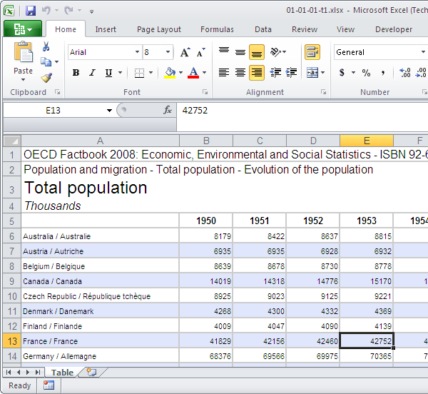
excel 2010

The UI is rationalized.

The interface will be familiar to Office 2007 users – they are still using the ribbon. Only a few buttons have been added to the applications I’ve tested, and the others have fortunately not moved since the previous version. However, the ribbon’s colours have been muted to a conservative white to grey gradient, which is much easier on the eyes. The added benefit is to make highlighted sections of the ribbon stand out much more efficiently.
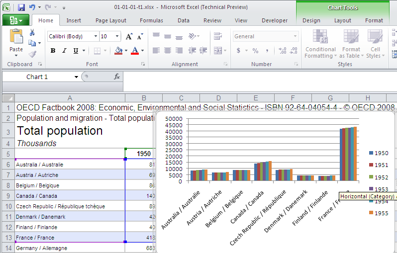
excel highlight

Highlighting a section works much better against a sober gray than against a vivid blue.

The one button that changed was the top-left Office button. Frankly, what it was for was obvious to no-one in Office 2007. Due to its appearance, it wasn’t really clear that it was clickable, and the commands it gave access to were a mixed bunch – file control, program options, printing, document properties… which, before, were not in the same top-category.
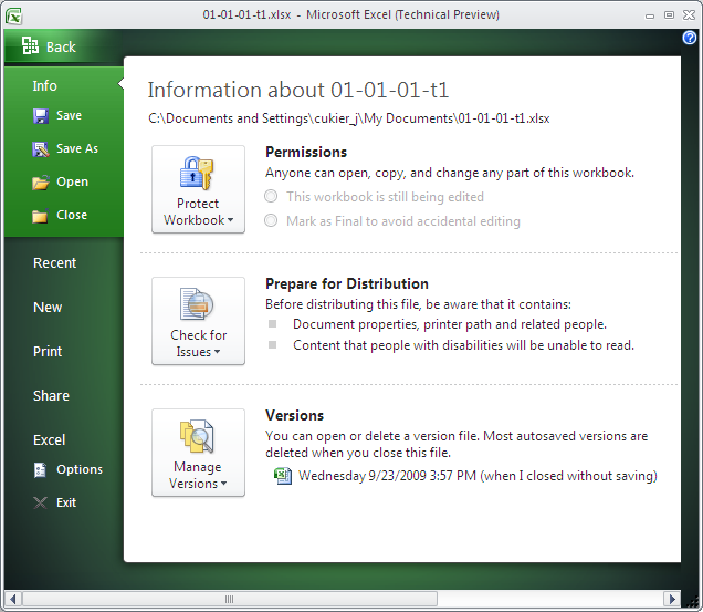
This new area is called "Office backstage" and is a welcome change to the akward "file" menu or office button from previous versions.

This new area is called "Office backstage" and is a welcome change to the akward "file" menu or office button from previous versions.

In Office 2010, the Office button is still there, but this time, it looks like a button and is much more inviting. This time, it presents the user with the various commands on a separate screen. That way, commands are well-categorized, and there is ample space for UI designers to explain those commands which are not clear. This had not been possible when all those commands were forced to fit in one tiny menu.

Another thing that jumped at me when I started manipulating the programs were the improvement in the copy/paste interface. It’s fair to say that pasting has always been a very time-consuming task. It had never been easy, for instance, to paste values only or to keep source formatting, without having to open menus and choose options which require time and effort. Besides, some pasting options descriptions are cryptic and a bit daunting, so novice users aren’t encouraged to use them for fear of what might happen.
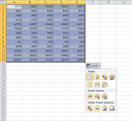
I've been using Excel for about 15 years so I know my way around. But improvement in the paste interface directly translates into productivity gains.

I've been using Excel for about 15 years so I know my way around. But improvement in the paste interface directly translates into productivity gains.

Now the various pasting options are promoted within the contextual menu – they are big icons, and it is possible to preview how pasted material would look before pasting. The best part is that these commands are now accessible via native keyboard shortcuts, so we no longer need a string of 4 mouse clicks, or having to key in alt+E, V, S,  enter alt + H, V, S, V, enter in sequence. After a normal paste (ctrl +V) you can hold control and choose a one key option, such as V for values, T for transposing, etc. Much better.

Changes in the Excel chart engine

There are 3 ways in Excel to represent numbers graphically: charts proper, pivot charts and sparklines.

Charts and pivot Charts didn’t see much improvement since the previous version of Excel. The formatting options move along in the direction initiated by Excel 2007: in addition to the controversed 3-D format set of options, users now have an advanced “shadow” and “glow and soft edges” submenus to spice up their charts. The interface for designing gradient fills has been upgraded. The underlying functionality remains unchanged but it is now easier to control. However, the pattern fill option returns, which is great news for people who print their graphs in B&W.
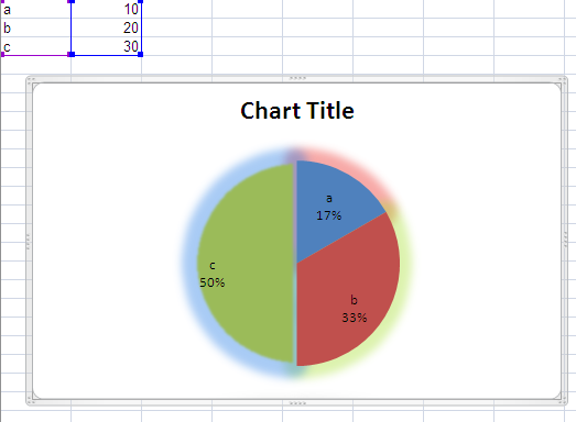
Even more complex formatting options mean a greater chance to use them poorly

Even more complex formatting options mean a greater chance to use them poorly

Sparklines are the real innovation of Excel 2010. Sparklines are a minimalist genre of chart that has been designed to fit in the regular flow of the text – they don’t require more space to be legible and efficient. While sparklines do not allow a user to look up the value of a specific data point, they are very efficient for communicating a trend. As such, they are increasingly used in dashboards and reports. There has been 3rd-party solutions to implement them in Excel but this native implementation is robust and well done. This will put sparklines on the radar for the great number of people who didn’t use them because they were not aware of their existence.
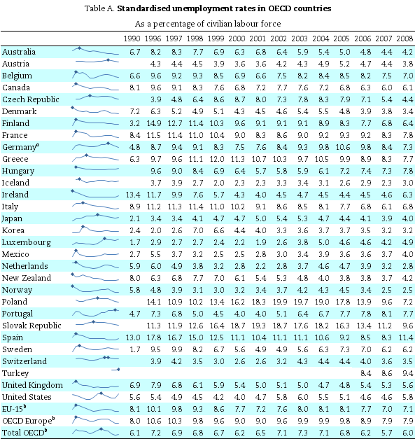
Sparklines give immediate insight on the trends in this data table. A dot marks when the maximum value was reached. That makes it easier to compare peaks at a glance.

Sparklines give immediate insight on the trends in this data table. A dot marks when the maximum value was reached. That makes it easier to compare peaks at a glance.

Changes in other applications

Word has advanced options for opentype fonts, for instance, if your font has several character sets, you can now access them from Word. This is especially good for distressed fonts or the excessively ornate ones. In addition to kerning, it is now possible to control ligatures (i.e. to allow users to specify how ff, fl or fi would appear on screen, as one unique glyph or as two separated letters). Another new feature of Word is an advanced spell checker who is able to warn you of possible word choice errors, when using homonyms for instance.

On my setup, these 3 options didn’t really work, but it’s a beta and I understand the intent.
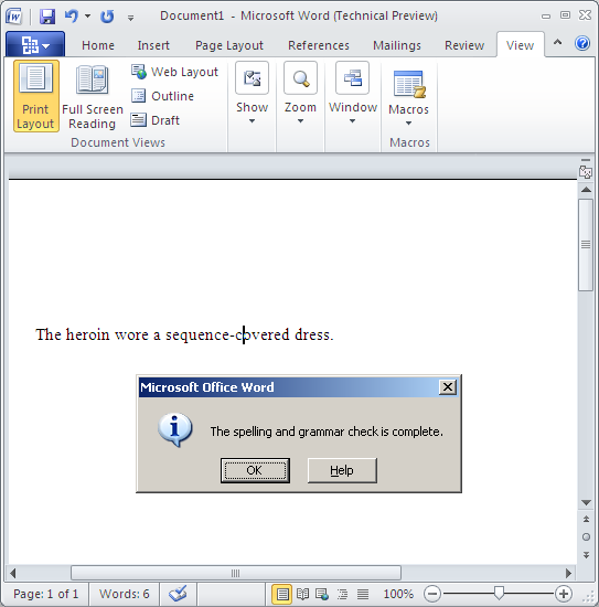
The advanced spell checker didn't catch those words which were quite obviously used out of context.
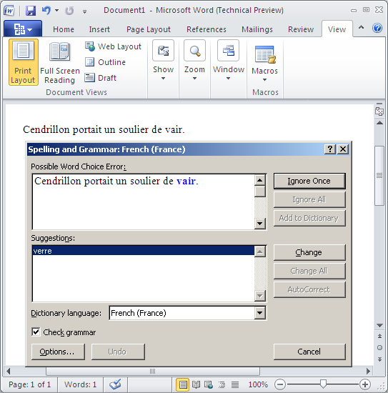
The advanced spell checker didn't catch those words which were quite obviously used out of context.

In French, it picked sides in a famous spelling controversy. Many people believe that Perrault originally wrote that Cindirella wore fur slippers (soulier de vair). Microsoft sides with Disney on that ones and glass slippers (souliers de verre).

In French, it picked sides in a famous spelling controversy. Many people believe that Perrault originally wrote that Cindirella wore fur slippers (soulier de vair). Microsoft sides with Disney on that one and glass slippers (souliers de verre).

Powerpoint features 3 high-level changes: the possibility to structure a long presentation using sections, which somehow helps. However, as far as I could see, sections are only a grouping feature. There are few operations that can be performed on the section as a whole (as opposed to on all the presentation, or on each slide separately). For some tasks, you can think it is the case (as selecting the section implicitly selects its slides) but you’ll see that the operation only affected the current slide. Hmm. It can be useful to manage a presentation after it’s done, but IMO this will reduce the amount of time people spend designing their presentation away from powerpoint which is ultimately a bad thing.
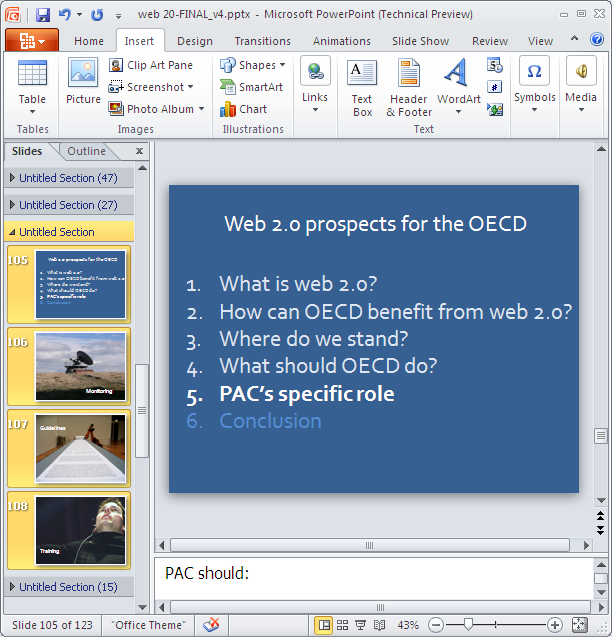
Powerpoint sections make it easier to manage very long documents.

Powerpoint sections make it easier to manage very long documents.

Powerpoint 2010 also features 3D transitions not unlike those of Keynote ’08. It is also possible to include movie clips in presentation. Wasn’t this already the case? Previously, you’d have to embed video files in your presentations. Now it is possible to embed online videos as well. I’m not quite sure about these two options really, the first one for ideologic reasons, the 2nd because I wouldn’t recommend any speaker to rely overly on an internet connection and a video hosting service during a live presentation.
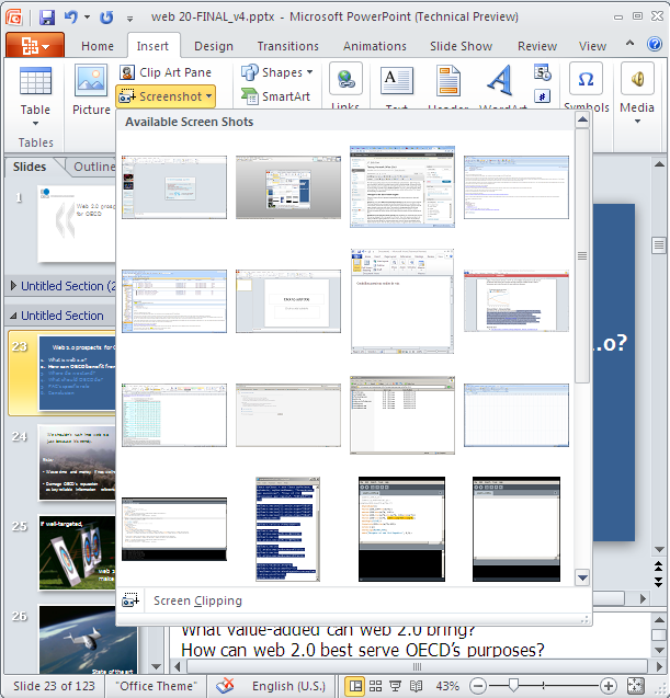
The insert screenshot shows a gallery from all my open windows to choose from. The screen clipping tool allows one to insert only a section of the window. Neat!

The insert screenshot shows a gallery from all my open windows to choose from. The screen clipping tool allows one to insert only a section of the window. Neat!

There’s another thing available everywhere in Office but which is possibly most useful in powerpoint, that is, insert screenshot. By clicking on this button, you have a list of thumbnails of all your open windows to choose from, this really reduces the hassle of using a screen capture tool, or worse, to manually do a screen capture, paste it in an image editing program, crop the image, save it to an acceptable format and copy/paste it again where you need it. It is possible to only copy part of these screens, too. It’ s quite well done.

Overall impressions

I’m impressed with the thinking that went into the interface. The ribbon was already a great demonstration of out-of-the-box thinking and looked great on paper. I wasn’t thrilled to use it as the commands I had been using for some 15 years were not always easily found, but it seems that first-time users of Office 2007 outweight those who’ve used previous versions. The execution of the ribbon in Office 2010 is improved, and the team allowed themselves to go beyond some arbitrary constraints they had imposed to themselves, such as the pasting options or the office button. Well done.

I’m happy that sparklines have been added to Excel. In the next few years, we’ll find even better usage for them. However, I’m disappointed that the charting options remain essentially unchanged. Take the pie chart for instance. Everyone is aware of its limitations. There are many alternatives which would be easy to implement in Excel. Also, I’m disappointed that the charting mechanism remains the same: present the user with a long list of chart types, without supporting their reasoning in the choice of one over the other. There should be a chart wizard that would ask the user what do they want to show with the data and suggests the best choice (and not many possible choices) of chart.

I am not sure about the improved spell checker. Improved means increased dependency on the tool, which is the reason why typos haven’t been eradicated despite the technology.

I am very skeptical about all the advances of the Office product into design. Office users are not designers. Or rather, to be a designer requires a specific form of critical reasoning, not a new tool. More sophisticated graphical options allow novice users to achieve complex results without going through that phase of reasoning, which ultimately won’t help them.
 

Slideshare.net 2009 contest: I’m endorsing Dan Roam

Slideshare 2009 contest is up again, and there’s about 1 week to vote. For the contest, I’m endorsing Dan Roam and counting on everyone to vote for him and support his presentation. Previous winners of the contest include Shift happens or Thirst who got a lot of coverage and views. I think that Dan’s unique presentation style should get more exposure. One way to see the contest entries is by votes, so the ones with the most votes show on top. Dan’s presentation is currently #10, less than 200 votes behind the top spot. But you can only vote once per account. So if you see a presentation you like and give it your vote, it is gone forever.

Dan wrote The Back of the Napkin which is also the name of the blog he maintains. I enjoyed this book, and I think you should too.

The idea: all of the world’s problems can be solved by drawing. And even if you think you can’t draw, as most adults, it’s much simpler than it seems and it’s quite fun.

Problems can be reduced to 6 types of questions: who/what, how many, how, where, when and why. Each of these questions can be associated with a broad type of representation, for instance “where?” questions can be solved by a map where different elements are plotted. So that’s one way of categorizing visual representations.

The other axis that the author develops is what he calls SQUID. Depending on your audience, what you want to show may be:

  • simple or elaborate,
  • quality vs quantity,
  • vision vs execution,
  • individual vs comparison,
  • change (Delta) or as-is.

The combination of the SQUID framework and the who, how many, how, where, when, and why questions lead you to one logical choice of representation, which will work make your audience go “a-ha” – guaranteed.

The logic holds, although I feel he tweaked his process for most if not all of the examples in the book. Anyway, this line of thought can easily be reproduced and can solve problems. Now the hand-drawn style is not necessary to this process, but is a nice touch. I’ve used it in presentations and it gets attention and sympathy. I was amazed to see how much easier and quicker it is to draw a visual that works by hand than with a user-friendly software. I’m enclined to think that the corporate world would be much more interesting (and fun) if there were more drawings and fewer word documents.

For those reasons, go vote for Dan Roam.

Update

Dan Roam won! congratulations!


The state of presentations in 2008

There have been many changes in how people understand presentations in 2008. How far have we gone?

In 2008, 2 major books on the topic have been published. Presentation Zen, by Garr Reynolds, and slide:ology, by Nancy Duarte.

People are accepting that a well-executed presentation can change the world. An Inconvenient Truth got nothing less than 2 academy awards and a nobel prize. And rumors about the health of master presenter Steve Jobs caused the stock markets to panic.

People are also finding that tools to create successful presentations are incredibly commonplace. From a technical standpoint, anyone with a computer could have created “shift happens“, which has been viewed by 5 to 10 million people.

As a result, blogs are now swarming with sensible presentation advice. A google query for “death by powerpoint” returns 397000 hits today. A year ago, searching for presentation tips yielded ideologic (as opposed to evidence-based) guidelines such as “no more than 7 bullets per slide” or “one slide per minute”. (you can still find those as well).

2008 was also the year where Slideshare took off. Not only did the viewership and amount of contents increase drastically, but the quality, relevancy and sophistication of the best presentations is now incredible. Empowered by inspring examples, clear guidelines and adequate tools, many are thriving to emulate great presenters.

So if I just end here, one could conclude that the world is definitely saved from ineffective presentations. The reality is slightly different.

This year, I have seen so far approximately 400 live presentations, and god knows how many online. Some were excellent, many were good, most were at least adequate. But a good proportion of them were still boring and I’d be lying if I claimed I could remember as much as 10% of them.

One explanation I came up with for that is that many presenters are still focusing on the final deliverable product rather than the fundamentals. These folks are very sensitive to advice like “mind your typography”, “illustrate your slides with large images”, or “forget bullets”. Now typography or images are important and can make a difference between a good and an excellent presentation. But it’s crucial to have a message to deliver and to focus on that message.

Bulleted texts are accused of cluttering the presentations. But if every little point or anecdote is illustrated with a vividly-colored image, then the images themselves become the clutter and clog everyone’s limited attention. You’d remember the images and cool effects but not the point. And a week later, you’ll have forgotten the images and the presentation altogether.

So my own piece of advice is that your big images won’t make your presentation. Your angle,  structure and consistency will. The best advice I got from Presentation Zen was to prepare a presentation away from a computer and only produce it once it’s final. It works. It really does.

Once this will be an accepted practice, seminars, classes and meetings will be much more exciting (let’s hope!).


Go deep rather than go wide

Yesterday, I attended a Presentation Zen webinar. One phrase that struck me was this advice to go deep rather than go wide. In a presentation, there is only so much time to present information, before everyone’s attention collapses.

Rather than try to cover as much ground as possible, it’s much more efficient to focus on a subject and make sure to deliver.

And if you are expected to deliver lots of information on a wide scope, then a written report is a more appropriate medium.

The presentation should be available in slideshare any time soon.


Book review: Presentation Zen by Garr Reynolds

Presentation Zen, by Garr Reynolds, has been my favorite business book in 2008.

Whatever your field, if you are a professional, chances are that you are going to make a presentation at least once a year. If you are looking for guidance, you could do worse than checking Garr’s website, aptly named presentation zen, or buying the book.

Garr’s book will not teach you everything you need to know about presentations, but is a great starting point.

If I were to summarize the book in one sentence, that would be:

Focus on your delivering your message.

Anything in your presentation that doesn’t help you deliver your key message must be removed. Conversely, there are ways to present your content that can enhance your message. Consider them.

I could sum up his practical advice in 3 points.

  • start to think offline.
  • in your favorite presentation software, start from a blank slide.
  • use visuals. And give your visuals all the space they need.
Let’s ellaborate a bit.
Start to think offline
The first thing most business professionals would do when asked to design a presentation would be to fire up Powerpoint and create slides. Then, they will edit slides. Insert slides… remove slides. Edit them some more. Tweak the design… Insert that extra idea. Ah, but the slide is no longer aligned. So we’re back to more editing and more tweaking. The end result is often busy, neither consistent nor convincing. Sounds familiar?

27062008661

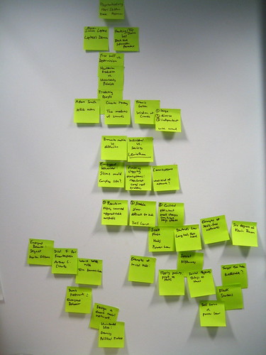
The solution to that problem is to start working on your presentation offline – determine the outline, how to structure your talk, what to say on each slide… A nice way to do this is with post-its.

Outlining my dConstruct talk

Post-its are easy to group and reposition, and if text doesn’t fit on a post it, it’s probably too wordy to put on a slide, anyway.
Start from a blank template
Powerpoint and others have trained us to think in terms of bulleted lists. But what an awful way of presenting information! When you’re showing a bulleted list, you’re reading out loud your slide, to an audience who has alreay read it by the time you get to point 2. Garr, in this star wars-themed slide show, shows how bulleted lists are the “dark side of the force” type of presentations.
Use visuals
Famous presenters each have their signature style, and Garr’s is the use of full-bleed image with minimal legends (and Gill Sans, but what’s wrong with that? I love Gill Sans). Full-bleed means that instead of integrating a smaller image in a template, you make it occupy all the space in the slide.

I won’t claim this is the single best way of presenting information, and by the way, neither does he. But it is fool-proof and easy to emulate. Finding the right image, which has never been that easy, and using it appropriately, will always have great impact.
In the book, Garr covers much more ground. It’s not only interesting, but it’s a nice read, and laced with examples you can actually use. I was quite surprised to see him redo charts I had done! (although, for my defense, they were never intended to be shown as is in a powerpoint).
If you need to buy one book on presentations, buy this book. If you think you don’t need a book on presentation, buy this book as well.
PS. Since the book has been released, I can see lots of presentations, on slideshare or elsewhere, that apply the visual style of Garr’s (nice, appropriately-chosen images, caption kept to an essential) but forget the other part of the story, which is the structure of the overall presentation. Both aspects are vital and complementary.