d3: scales, and color.

In protovis, scales were super-useful in just about everything. That much hasn’t changed in d3, even though d3.scale is a bit different from pv.Scale. (do note that d3.scale is in lowercase for starters).

Scales: the main idea

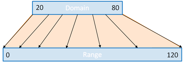
Simply put: scales transform a number in a certain interval (called the domain) into a number in another interval (called the range).
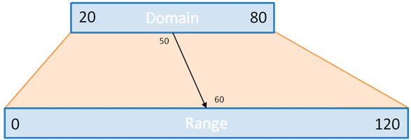
an example of how scales work
For instance, let’s suppose you know your data is always over 20 and always below 80. You would like to plot it, say, in a bar chart, which can be only 120 pixels tall.
You could, obviously, do the math:

.attr("height", function(d) {return (d-20)*2;})

But what if you suddenly have more or less space? or your data changes? you’d have to go back to the entrails of your code and make the change. This is very error prone. So instead, you can use a scale:

var y=d3.scale.linear().domain(20,80).range(0,120);
...
.attr("height", y)

this is much simpler, elegant, and easy to maintain. Oh, and the latter notation is equivalent to

.attr("height", function(d) {return y(d);})

… only more legible and shorter.
And, there are tons of possibility with scales.

Fun with scales

In d3, quantitative scales can be of several types:

  • linear scales (including quantize and quantile scales,
  • logarithmic scales,
  • power scales (including square root scales)

While they behave differently, they have a lot in common.

Domain and range

For all scales, with the exception of quantize and quantile scales which are a bit different, domain and range work the same.
First, note that unlike in protovis, domain and range take an array as argument. Compare:

var y=pv.Scale.linear().range(20,60).domain(0,120);
var y=d3.scale.linear().range([20,60]).domain([0,120]);

This is because contrary to protovis, where domain could be a whole dataset, in d3, domain contains the bounds of the interval that is going to be transformed.
Typically, this is two numbers. If this is more, we are talking about a polypoint scale: there are as many segments in the intervals as there are numbers in the domain (minus one). The range must have as many numbers, and so as many segments. When using the scale, if a number is in the n-th segment of the domain, it is transformed into a number in the n-th segment of the range.
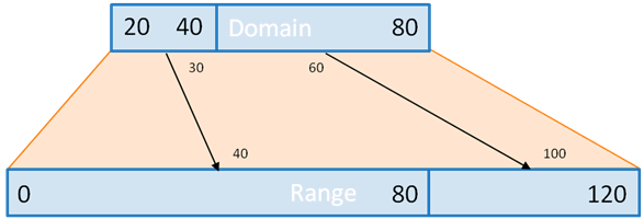
illustration of a multipoint scale
With this example, 30 finds itself in the first segment of the domain. So it’s transformed to a value in the first segment of the range. 60, however, is in the 2nd segment, so it’s transformed into a value in the 2nd segment of the range.
Also, bounds of domain and range need not be numbers, as long as they can be converted to numbers. One useful examples are colors. Color names can be used as range, for instance, to create color ramps:

var ramp=d3.scale.linear().domain([0,100]).range(["red","blue"]);

This will transform any value betwen 0 and 100 into the corresponding color between red and blue.

Clamping

What happends if the scale is asked to process a number outside of the domain? That’s what clamping controls. If it is set, then the bounds of the range are the minimum and maximum value that can be returned by the scale. Else, the same transformation applies to all numbers, whether they fall within the domain or not.
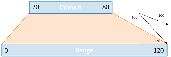
Clamping example
Here, with clamping, the result of the linear transformation is 120, but without it, it’s 160.

var clamp=d3.scale.linear().domain([20,80]).range([0,120]);
clamp(100); // 160
clamp.clamp(true);
clamp(100); // 120

Scales and nice numbers

More often than not, the bounds of the domain and/or those of the ranges will be calculated. So, chances are they won’t be round numbers, or numbers a human would like. Scales, however, come with a bunch of method to address that. d3 keeps in mind that scales are often used to position marks along an axis.

.nice()

When applied to a scale, the nice method expends the domain to “nicer” numbers. You wouldn’t want your axis to start at -2.347 and end at 7.431, right?
So, there.

var data=[-2.347, 4, 5.23,-1.234,6.234,7.431]; // or whatever.
var y=d3.scale.linear().range([0,120]);
y.domain([d3.min(data), d3.max(data)]); // domain takes bounds as arguments, not all numbers
y.domain() // [-2.347, 7.431];
y.nice() // [-3, 8]

.ticks(n)

Given a domain, and a number n (which, contrary to protovis, is mandatory in d3), the ticks method will split your domain in (more or less) n convenient, human-readable values, and return an array of these values. This is especially useful to label axes. Passing these values to the scale allows them to position ticks nicely on an axis.

var y=d3.scale.linear([20,80]).range([0,120]);
...
var ticks=axis.selectAll("line")
  .data(y.ticks(4)) // 20, 40, 60 and 80
  .enter().append("svg:line");
ticks
  .attr("x1",0).attr("x2",5)
  .attr("y1",y).attr("y2",y) // short and simple. 
  .attr("stroke","black");

.rangeRound()

If used instead of .range(), this will guarantee that the output of the scales are integers, which is better to position marks on the screen with pixel precision than numbers with decimals.

.invert()

The invert function turns the scale upside down: for one given number in the range, it returns which number of the domain would have been transformed into that number.
For instance:

var y=d3.scale.linear([20,80]).range([0,120]);
y(50); // 60
y.invert(60); // 50

That’s quite useful, for instance, when a user mouses over a chart, and you would like to know to what value the mouse coordinates correspond.

Power scales and log scales

The linearscale is a function of the form y=ax+b which works for both ends of the domain and range. In the example we’ve used most often until now, this function is really f(x): y=2x-40.
Power and logarithm scales work the same, only we are looking for a function of the form y=axk+b, or y=a.log(x)+b.
For the power scales, you can specify an exponent (k) with the .exponent() method. For instance, if we specify an exponent of 2, here is what the scale would look like:
an example of a power scale
The equation is now f(x): y=x²/50-8. So 20 still becomes 0 and 80 still becomes 120, but other than that the values at the beginning of the domain would be lower than with the linear scale, and those at the end of the scale will be higher.
For convenience, d3 includes a d3.scale.sqrt() (the square root scale) so you never have to type d3.scale.pow.exponent(0.5) in full.
Also note that if you are using a log scale, you cannot have 0 in the domain.

Quantize and quantile

quantize and quantile are specific linear scales.
quantize works with a discrete, rather than continuous, range: in other terms, the output of quantize can only take a certain number of values.
For instance:

var q=d3.scale.quantize().domain([0,10]).range([0,2,8]); 
q(0); // 0
q(3); // 0
q(3.33); // 0
q(3.34); // 2
q(5); // 2
q(6.66); // 2
q(6.67); // 8
q(8); // 8
q(1000); // 8

quantile on the other hand matches values in the domain (which, this time, is the full dataset) with their respective quantile. The number of quantiles is specified by the range.
For instance:

var q=d3.scale.quantile().domain([0,1,5,6,2,4,6,2,4,6,7,8]).range([0,100]);
q.quantiles(); // [4.5], only one quantile - the median
q(0); // 0
q(4); // 0
q(4.499); // 0
q(4.5); // 100 - over the median
q(5); // 100
q(10000); // 100
q.range([0,25,50,75,100]);
q.quantiles(); // [2, 4, 5.6, 6];
q(0); // 0 
q(2); // 25 - greater than the first quantile limit
q(3); // 25
q(4); // 50
q(6); // 100
q(10000); // 100

Ordinal scales

All the scales we’ve seen so far have been quantitative, but how about ordinal scales?
The big difference is that ordinal scales have a discrete domain, in other words, they turn a limited number of values into something else, without caring for what’s between those values.
Ordinal scales are very useful for positioning marks along an x axis. Let’s suppose you have 10 bars to position for your bar chart, each corresponding to a category, a month or whatever.
For instance:

var x=d3.scale.ordinal()
  .domain(["Sunday","Monday","Tuesday","Wednesday","Thursday","Friday","Saturday"]) // 7 items
  .rangeBands([0,120]);
x("Tuesday"); // 34.285714285714285

There are 3 possibilites for range. Two are similar: the .rangePoints() and .rangeBands() methods, which both work with an array of two numbers – i.e. .rangeBands([0,120]). The last one is to specify all values in the range with .range().

rangePoints() and rangeBands()

With .rangePoints(interval), d3 fits n points within the interval, n being the number of categories in the domain. In that case, the value of the first point is the beginning of the interval, that of the last point is the end of the interval.
With .rangeBands(interval), d3 fit n bands within the interval. Here, the value of the last item in the domain is less than the upper bound of the interval.
Those methods replace the protovis methods .split() and .splitBanded().
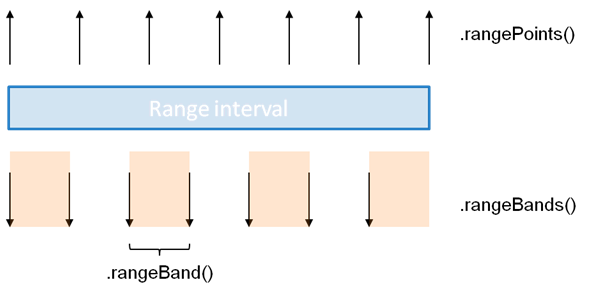
difference between rangeBands and rangePoints
This chart illustrates the difference between using rangeBands and rangePoints.

var x=d3.scale.ordinal()
  .domain(["Sunday","Monday","Tuesday","Wednesday","Thursday","Friday","Saturday"]);
x.rangePoints([0,120]);
x("Saturday"); // 120
x.rangeBands([0,120]);
x("Saturday"); // 102.85714285714286
x("Saturday")+x.rangeBand(); // 120

the range method

Finally, we can also use the .range method with several values.
We can specify the domain, or not. Then, if we use such a scale on a value which is not part of the domain (or if the domain is left empty), this value is added to the domain. If there are n values in the range, and more in the domain, then the n+1th value of the doamin is matched with the 1st value in the range, etc.

var x=d3.scale.ordinal().range(["hello", "world"]); 
x.domain(); // [] - empty still.
x(0); // "hello"
x(1); // "world"
x(2); // "hello"
x.domain(); // [0,1,2]

Color palettes

Unlike in protovis, which had them under pv.Colors – i.e. pv.Colors.category10(), in d3, built-in color palettes can be accessed through scales. Well, even in protovis they had been ordinal scales all along, only not called this way.
There are 4 built-in color palette in protovis: d3.scale.category10(), d3.scale.category20(), d3.scale.category20b(), and d3.scale.category20c().

A palette like d3.scale.category10() works exactly like an ordinal scale.

var p=d3.scale.category10();
var r=p.range(); // ["#1f77b4", "#ff7f0e", "#2ca02c", "#d62728", "#9467bd", 
                      // "#8c564b", "#e377c2", "#7f7f7f", "#bcbd22", "#17becf"]
var s=d3.scale.ordinal().range(r); 
p.domain(); // [] - empty
s.domain(); // [] - empty, see above
p(0); // "#1f77b4"
p(1); // "#ff7f0e"
p(2); // "#2ca02c"
p.domain(); // [0,1,2];
s(0); // "#1f77b4"
s(1); // "#ff7f0e"
s(2); // "#2ca02c"
s.domain(); // [0,1,2];

It’s noteworthy that in d3, color palette return strings, not pv.Color objects like in protovis.
Also:

d3.scale.category10(1); // this doesn't work
d3.scale.category10()(1); // this is the way.

Colors

Compared to protovis, d3.color is simpler. The main reason is that protovis handled color and transparency together with the pv.Color object, whereas in SVG, those two are distinct attributes: you handle the background color of a filled object with fill, its transparency with opacity, the color of the outline with stroke and the transparency of that color with stroke-opacity.

d3 has two color objects: d3_Rgb and d3_Hsl, which describe colors in the two of the most popular color spaces: red/green/blue, and hue/saturation/light.

With d3.color, you can make operations on such objects, like converting colors between various formats, or make colors lighter or darker.

d3.rgb(color), and d3.hsl(color) create such objects.
In this context, color can be (straight from the manual):

  • rgb decimal – “rgb(255,255,255)”
  • hsl decimal – “hsl(120,50%,20%)”
  • rgb hexadecimal – “#ffeeaa”
  • rgb shorthand hexadecimal – “#fea”
  • named – “red”, “white”, “blue”

Once you have that object, you can make it brighter or darker with the appropriate method.
You can use .toString() to get it back in rgb hexadecimal format (or hsl decimal), and .rgb() or .hsl() to convert it to the object in the other color space.

var c=d3.rgb("violet") // d3_Rgb object
c.toString(); // "#ee82ee"
c.darker().toString(); // "#a65ba6"
c.darker(2).toString(); // "#743f74" - even darker
c.brighter().toString();// "ffb9ff"
c.brighter(0.1).toString(); // "#f686f6" - only slightly brighter
c.hsl(); // d3_Hsl object
c.hsl().toString() // "hsl(300, 76, 72)"
 

d3: adding stuff. And, oh, understanding selections

From data to graphics

the d3 principle (and also the protovis principle)
d3 and protovis are built around the same principle. Take data, put it into an array, and for each element of data a graphical object can be created, whose properties are derived from the data that was provided.

Only d3 and protovis have a slightly different way of adding those graphical elements and getting data.

In protovis, you start from a panel, a protovis-specific object, to which you add various marks. Each time you add a mark, you can either:

  • not specify data and add just one,
  • or specify data and create as many as there are items in the array you pass as data.

.

How de did it in protovis

var vis=new pv.Panel().width(200).height(200); 
vis.add(pv.Panel).top(10).left(10)
  .add(pv.Bar)
    .data([1,4,3,2,5])
    .left(function() {return this.index*20;})
    .width(15)
    .bottom(0)
    .height(function(d) {return d*10;});
vis.render();

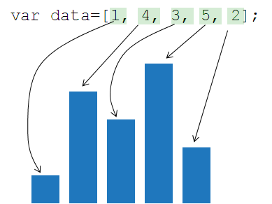
this simple bar chart in protovis
you first create a panel (first line), you may add an element without data (here, another panel, line 2), and add to this panel bars: there would be 5, one for each element in the array in line 4.

And in d3?

In d3, you also have a way to add either one object without passing data, or a series of objects – one per data element.

var vis=d3.select("body").append("svg:svg").attr("width",200).attr("height",200);
var rect=vis.selectAll("rect").data([1,4,3,2,5]).enter().append("svg:rect");
rect.attr("height",function(d) {return d*20;})
  .attr("width", 15)
  .attr("x",function(d,i) {return i*20;})
  .attr("y",function(d) {return 100-20*d;}
  .attr("fill","steelblue");

In the first line, we are creating an svg document which will be the root of our graphical creation. It behaves just as the top-level panel in protovis.

However we are not creating this out of thin air, but rather we are bolting it onto an existing part of the page, here the tag. Essentially, we are looking through the page for a tag named and once we find it (which should be the case often), that’s where we put the svg document.

Oftentimes, instead of creating our document on , we are going to add it to an existing <div> block, for instance:

<div id="chart"></div>
<script type="text/javascript">
var vis=d3.select("#chart").append("svg:svg");
...
</script>

Anyway. To add one element, regardless of data, what you do is:

The logic is : d3.select(where we would like to put our new object).append(type of new object).

Going back to our code:

var vis=d3.select("body").append("svg:svg").attr("width",200).attr("height",200);
var rect=vis.selectAll("rect").data([1,4,3,2,5]).enter().append("svg:rect");
rect.attr("height",function(d) {return d*20;})
  .attr("width", 15)
  .attr("x",function(d,i) {return i*20;})
  .attr("y",function(d) {return 100-20*d;}
  .attr("fill","steelblue");

On line 2, we see a different construct:

an existing selection, or a part of the page
.selectAll(something)
.data(an array)
.enter()
.append(an object type)

This sequence of methods (selectAll, data, enter and append) are the way to add a series of elements. If all you need to know is to create a bar chart, just remember that, but if you plan on taking your d3 skills further than where you stopped with protovis, look at the end of the post for a more thorough explanation of the selection process.

Attributes and accessor functions

At this stage, we’ve added our new rectangles, and now we are going to shape and style them.

rect.attr("height",function(d) {return d*20;})
  .attr("width", 15)
  .attr("x",function(d,i) {return i*20;})
  .attr("y",function(d) {return 100-20*d;}
  .attr("fill","steelblue");

All the attributes of a graphical element are controlled by the method attr(). You specify the attribute you want to set, and the value you want to give.
In some cases, the value doesn’t depend on the data. All the bars will be 15 pixels wide, and they will all be of the steelblue color.
In some others, the value do depend on the data. We decide that the height of each bar is 20 times the value of the underlying data, in pixels (so 1 becomes 20, 5 becomes 100 etc.). Like in protovis, once data has been attributed to an element, function(variable name) enables to return a dynamic value in function on that element. By convention, we usually write function(d) {…;} (d for data) although it could be anything. Those functions are still called accessor functions.
so for instance:

.attr("height",function(d) {return d*20;})

means that the height will be 20 times the value of the underlying data element (exactly what we said above).
In protovis, we could position the mark relatively to any corner of its parent, so we had a .top method and a .bottom method. But with SVG, objects are positioned relatively to the top-left corner. So when we specify the y position, it is also relative to the top of the document, not necessarily to the axis (and not in this case).
so –

.attr("y", function(d) {return 100-d*20;})

if we use scales (see next post), all of this will have no impact whatsoever anyway.
Finally, there is an attribue here which doesn’t so much depend on the value of the data, but of its rank in the data items: the x position.
for this, we write: function(d,i) {return i*20;}
Here is a fundamental difference with protovis. In protovis, when we passed a second argument to such a function, it meant the data of the parent element (grand parent for the third, etc.). But here in d3, the second parameter is the position of the data element in its array. By convention, we write it i (for index).
And since you have to know: there is no easy way to retrieve the data of the parent element.

Bonus: understanding selections

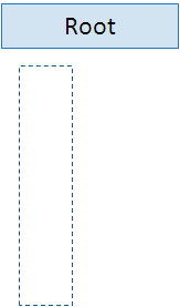
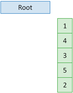
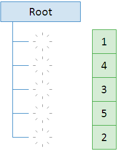
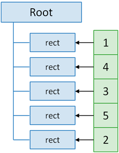
To add many elements at once we’ve used the sequence: selectAll, data, enter, append.
Why use 4 methods for what appears to be one elementary task? If you don’t care about manipulating nodes individually, for instance for animations, you can just remember the sequence. But if you want to know more, here is what each method does.

selectAll

the selectAll method
First, we select a point on which to add your new graphical objects. When you are creating your objects and use the selectAll method, it will return an empty selection but based on that given point. You may also use selectAll in another context, to update your objects for instance. But here, an empty selection is expected.

data

the data method
Then, you attribute data. This works quite similarly to protovis: d3 expects an array. d3 takes the concept further (with the concept of data joins) but you need not concern yourself with that until you look at transitions.
Anyway, at this stage you have an empty selection, based on a given point in the page, but with data.

enter

the enter method
The enter method updates the selection with nodes which have data, but no graphical representation. Using enter() is like creating stubs where the graphical elements will be grafted.

append

the append method
Finally, by appending we actually create the graphical objects. Each is tied to one data element, so it can be further styled (for instance, through “attr”) to derive its characteristics from the value of that data.


From protovis to d3

You’ve spent some time learning protovis only to find that its development is halted as authors have switched to work on d3. Have your efforts all been in vain? Fear not! This series of posts will help you adapt to d3 with a protovis background.

Before we go anywhere further, let me say that these posts won’t make you awesome at d3 (yet). We won’t be talking about how to do all amazing things you could never do in protovis. Rather, we’ll focus on enabling you to be as comfortable with d3 than you could have been with protovis. And once that’s done, nothing will prevent you from learning the more powerful aspects of d3.

Anyway, if you’re reading this, you are already awesome.

Why should I make the switch to d3?

Frankly, you don’t have to. Protovis is a fine framework and works well. Now you may want to switch to d3 for several reasons.

  • d3 is fast. d3 is better at handling scenes with hundreds or thousands of elements. So if you like scatterplots or network graphs, and who doesn’t, d3 has much stronger performance.
  • d3 does animation. There were workarounds to get animation in protovis but there were that. Workarounds. Animation and transitions are built in d3 and are a snap to implement.
  • More features. Just because development has stopped on protovis doesn’t mean that it has stopped elsewhere… for instance, d3 has more ready-to-use layouts, like voronoi tesselation or chords, and it has more methods and functions to make your life easier, to access and manipulate data for example.
  • Styling. In d3 it is possible to apply style sheets in CSS to graphical elements. This helps keeping the code and the format separate.

Yes but doesn’t everything change?

Short answer: no.

Less short answer: some things do change substantially. Most things stay the same. And then, some things look the same but have changed.

Things that stay the same

  • The general principle.Protovis is about transforming an array of data into the same number of graphical elements, with characteristics derived from that data. d3 does exactly this as well.
  • pv.Nest, which in my personal protovis experience has been the hardest to understand. Only, it’s called d3.nest now.
  • Methods that supplement the existing javascript array manipulation methods, like pv.min, pv.values, pv.entries etc. are also back (as d3.min, d3.values, d3.entries, but you’ve guessed it by now). Some, like pv.mean or pv.median, didn’t make it through but you could easily rewrite them, or continue using the protovis ones.

Things that look different, but which are largely the same

Protovis had a number of native graphical objects, or marks, that could be manipulated at will with methods.

var vis=new pv.Panel()
  .height(400)
  .width(400)
  .fillStyle("aliceblue")
  .lineWidth(1)
  .strokeStyle("steelblue");
vis.render();

In protovis, it is inherently different to set the height, the width or just any property of an object. This uses different methods.

var vis=d3.select("body").append("svg:svg");
  vis.append("svg:rect")
    .attr("height",400)
    .attr("width",400)
    .attr("fill","aliceblue")
    .attr("stroke","steelblue")
    .attr("stroke-width",1);

This produces essentially the same thing. We add a rectangle of a specified height, width, and colors. There are a few differences though. Here, controlling height, width or fill is essentially the same thing and uses the same method, .attr(). Notice also that we first created an svg document, then a shape within that document. And also, that we don’t need to use vis.render(); anymore.

The d3 approach looks longer. But if we define all the style information first we could make it much shorter, shorter than in protovis in fact!
For instance:

var vis=d3.select("body").append("svg:svg").append("svg:rect").attr("class", "myRect");

Much of the apparent differences between d3 and protovis come from using explicitly svg shapes (paths, polygons, ellipses, etc.) as opposed to native objects (pv.Panel, pv.Bar, pv.Dot, etc.), although – it’s essentially the same thing. Yes, you have to learn your SVG but it’s really on a need-to-know basis. In fact, if you’ve worked with protovis, or even if you’ve worked with HTML and CSS, you probably know more SVG than you thought.

SVG is more flexible than protovis objects. The flipside is that constructs which were once simple in protovis become less obvious in SVG. But for those cases, d3 has recreated some native objects, even if not as many as in protovis.

Things that look the same, but which are different

There have been some changes in methods that have kept the same name since protovis – some minor, some more substantial. In any case, the basic ways of using these methods (like scale, color, data…) doesn’t change much. It’s only their more exotic uses who do change.


VAST challenge 2011

This year I have participated to the VAST Challenge (VAST stands for visual analytics science and technology). The VAST symposium is part of the yearly VisWeek conferences.

Anyway. The rules required contestants to send videos with voiceovers, so without further ado here they are.


Watch me in HD instead!!


Watch me in HD too!!

If you want to play with the tools you can download them here: mini-challenge 1, mini-challenge 3.

Unfortunately, I couldn’t find the time to complete mini-challenge 2 and the grand challenge. I’m making this on my free time and I had to balance all kinds of commitments, so I couldn’t secure enough time to finish. Unlike previous years, though, I managed to find enough time to start ! so, in the words of Charlie Sheen: winning.

So what is this about?
In the fictional Vastopolis, a mysterious infection strikes. Where does it come from and how is this transmitted? To answer these questions we have one million tweets sent by residents in the past 3 weeks. and among that million, there are quite a few about people reporting symptoms.

The first thing that I did was coming up for a method to tell whether one tweet was actually about a disease or not. so I scored them. I made a list of words that were required to consider that one message related to sickness, they were fairly univoquial like sick, flu, pneumonia, etc. Each of those words added one point to a “sickness” score. Then there was a second list of more ambiguous words like “a lot”, “pain”, “fire” etc. I added one point for each of these words or phrase, if a message already contains a required word. So, there were a few false negative, a few false positive, but all in all it was fairly accurate.

Fairly soon I had the idea to show the sums of all the scores of a part of the map, rather than showing each individual tweet. But originally, the sectors were quite large and I showed data by day.

Then, I worked with finer sectors and by 6 hours chunks. That’s how I could exhibit how people moved towards the center of the map by day, and back to its edges every night. With finer geographic details I could also see some spikes in various areas of the map during the period that I couldn’t see before, which were not necessarily related to the disease.

Eventually, I wanted to read what the tweets corresponded to, so I loaded the full text of the messages so that clicking on a square would reveal what was said at that moment. In this dataset, every spike in volume corresponds with an event that’s been added by the designers, so it was fun to discover everything happening there, from baseball games to accidents or buildings catching fire. Often, there were articles in the mini-challenge 3 dataset that would give more information about what really happened.

so, what was mini-challenge 3 about? nothing less than diagnosing possible terrorist threat. This time we were given not one million tweets, but thousands of articles which were much longer than 140 characters! From reading a few sample articles, I saw that most didn’t talk about terrorism or vastopolis at all. But couldn’t they contain clues that could link 2 and 2?

my first idea was to find all entities in the articles, that is names of people, or names of organizations (which follow a certain syntax) and arrange them in a network. The problem is that there were just too many names and groups (thousands of both) and I couldn’t tell from such a list which sounded suspicious. Although, a group called “network of hate” is probably not a charity. I’m sure it is possible to solve the challenge like this, but I chose another way to get my first leads.

I just did like in mini-challenge 1 and scored my articles, but I gave them several scores instead of just one by comparing them to several series of words. One series, for instance, was all the proper names in Vastopolis, like names of neighborhoods, because articles about Vastopolis are probably more interesting. The other series corresponded to various kind of threats.

That allowed me to create the scatterplot form which I used both to represent articles and to narrow the selection by selecting an area if needed. Then, as time went by I added more and more features to the tool, for instance an interface to read articles with keywords highlighted, the possibility to filter articles by keyword in addition to a graphical interface, being able to see all the articles as a list and select from that list, not just from the scatterplot, and finally the possiblity to mark articles as interesting and regroup them in another list…

That was about when I felt I could run out of time, so I didn’t add the other features I had planned or worked on making a decent interface. Also, I spent a lot of time not just trying to solve the challenge, but reading all the stories that were planted in the dataset, linking them to the tweets of MC1, etc.

Anyway. I quite enjoyed working on that and really, really appreciated the humongous work that went into creating the vast challenge universe. I’m looking forward seeing what other teams came up with. On a side note, it’s probably my last protovis projects as it makes sense to completely switch to D3 now…


Cantonales suite et fin: duels et transferts de voix

[A note to my English readers – as you’d have probably guessed by the title in French, this post about French politics is in French again, but I’ll soon resume posting in English]
Dimanche 27 a eu lieu le deuxième tour des élections cantonales, dont j’ai déjà un peu parlé ici ou ici. Et qui dit second tour dit duels :


Comme on peut le voir, le “classico” du second tour c’était le duel UMP-PS (336 cas). Mais ce qui intéressait tout le monde c’était plutôt les cas où le FN était présent: 403 scrutins. Alors que s’est-il passé? est-ce que les voix se sont bien transférées?

Ce que j’ai lu suite aux cantonales, c’est que si les électeurs de gauche avaient fait barrage au front national dans le cas des duels entre le FN et la droite, ce n’était pas trop le cas des électeurs de droite qui s’étaient souvent contentés de laisser gagner la gauche sans se mobiliser davantage. Alors voyons ce que disent les chiffres.

Sur les 403 cantons où le front national s’est maintenu, il y a eu 266 duels avec la gauche et 127 avec la droite. On va passer sur les 10 autres cas de figure (triangulaires, duel avec une autre formation etc.) parce que ce qui nous intéresse ici c’est de voir pour qui vote un électeur d’une grande faction qui ne se retrouve pas au second tour.

Dans le cas des duels droite-FN, il y a presque 240,000 électeurs qui avaient voté à gauche au premier tour et qui se sont fait confisquer leur vote. Bien plus que les voix supplémentaire récoltées par les candidats de droite (environ 150,000)! De même, il y a eu environ 280,000 électeurs de droite qui n’ont pas pu soutenir leur candidat au deuxième tour, alors que les candidats de gauche n’ont récupéré que 190,000 voix en plus.

Dans les deux cas, la participation a augmenté: environ 210,000 votants en plus. Pourtant, il y a eu une augmentation du nombre de votes nuls (plus de 150,000 supplémentaires) et surtout, un fort gain des voix du FN (presque 300,000).

Qu’est ce qu’on peut en déduire?

L’idée d’un front républicain, d’une mobilisation massive d’électeurs de tout bord qui empêcheraient systématiquement la victoire d’un candidat FN est bien mise à mal. Dans ces 403 cantons, la participation n’était que de 55.28%, pas très différente de la moyenne nationale. On a déjà vu plus mobilisé!

En plus, il n’y a pas de report systématique des voix vers l’adversaire du FN (et ce dans les deux cas, gauche/FN ou droite/FN). En fait, le FN est même capable de gagner des voix entre les deux tours et même beaucoup de voix! Bref, il n’y aura plus d’effet 5 mai 2002 et tout est désormais possible pour les candidats du FN.


Votre prénom est-il de droite?

[another post in French. sorry for my English readers, but since it's again based on election data it really is only relevant to French people]

Donner un prénom à ses enfants, c'est peut-être la décision qui va le plus influencer le regard des autres à son égard... surtout quand ils ne l'ont pas encore vu. Qu'est-ce qu'on peut s'imaginer d'un Édouard ou d'une Jacqueline avant de les connaître? sûrement pas la même chose. Est-ce qu'on peut deviner leur couleur politique?

pour vérifier ça j'ai pris la liste de tous les candidats aux dernières élections cantonales,soit 10361 personnes avec 1247 prénoms différents qui ont rendu publiques leurs convictions politiques.

Alors, est-ce que tous les Nicolas sont de droite? et les Jean-Marie? Tous les Jean-Luc et les Olivier sont-ils de gauche? Bon, Ségolène, on savait tous que ça faisait pas très socialiste. Mais Martine? Ou François?

La taille des cercles représente le nombre de candidats qui portent tel ou tel prénom, et la couleur, où ils se situent sur une échelle gauche-droite. En cliquant sur un candidat, on peut voir tous les candidats qui portent son prénom, par parti.

Quelques trouvailles: tous les Kévin sont au front national. Toutes les Arlette, aussi - les temps changent! J'ai laissé toutes les orthographes et tous les accents. Par exemple, Michaël est de gauche, mais Mickaël de droite. Et Mickael, de gauche. A quoi ça tient!

Parmi les prénoms qu'on trouve plus de 5 fois, les plus marqués à gauche sont Mathilde, Marianne, Régine, Norbert et Aline. A droite, on trouve Laura, Edouard, Marie-Christine, Adrien et Thérèse.

Et... si Jean-Marie est plutôt de droite, les Nicolas sont d'habitude à gauche, mais pas les François. On trouve plus de Jean-Luc, de Martine et de Dominique à gauche, mais pas d'Olivier!


datavizchallenge.org: my entry

I just posted my www.datavizchallenge.org entry!

So here’s a little explanation about what I’ve done, how and why.

The idea behind the data provider web site, WhatWePayFor, is that billions and millions don’t talk to the average citizen. This doesn’t help them understand where their money goes.

And in my work, I generally try to show as little data as possible to make a point. And I like to use interactivity to involve users.

I got my idea from thinking back to the presentation made by Nick Diakopoulos at last Visweek. We had that workshop on data storytelling and Nick showed how to get user attention on a subject by letting them play and guess first. So here goes.

First, I wanted to let users play with data, in this case try to establish their priorities for federal budget spending. Where should money go?

I’ve manipulated this kind of figures a few times, so I know that USA has extreme positions on some “functions of spending”, like defense, or culture. Some rich countries that spend up to 7% of their budget on culture, and some who spend less than 0.1% of their budget on defense. Hint, the USA is not one of them.

So I’m hoping that the users will see differences between their preferences and the choices that the government makes in their names, and that from the differences will be striking enough for them to understand the orders of magnitude and possibly inspire them to take action.


Building the France Dorling cartogram

This is a follow-up to the previous post where I used a Dorling cartogram to show election results in France. So how did I come up with that?

Step 1: the data

Without data, there wouldn’t be much to plot, right? So the first order of business was to fetch the data, which is theoretically available from an official source. Unfortunately, there is no way to download those results at once, instead they are presented in a myriad of formatted HTML pages – over 2000 in all.

I used wget to download them all. wget allows for recursive download, that is, you can download a page, and all the links from that page, etc. You can also specify the depth of the recursive download, which is a good idea in that case because there are lots of duplicates of that information on the server, so trying to get everything will take a couple of hours vs about 10 minutes.

Once that’s done, I used python and Beautiful Soup to turn the HTML pages into nice JSON objects. Fortunately the pages followed the same strict template, so I could run a relatively simple extraction script, like: look at the second HTML table of the page, get the number of registered voters who didn’t vote from the 2nd cell of the 2nd row, etc.
Once that was done I came up with 2 files: one which listed the aggregate votes per county and per party, and another one which listed all the candidates, their affiliation and their votes. I ended up using only the 1st one, actually at an even more aggregated level, but I may use the second one for further work.

Next up: setting the geography

A dorling cartogram is really a kind of force-directed layout graph where the nodes represent geographical entities, which are initially positioned at a place corresponding to their geography, but which are then resized by a variable, and whose movement is subject to several forces: each node is linked to its original geographical neighbors, which attract each other, but also cannot intersect with other nodes, so it pushes back its neighbors.

So for this to work I had to:

  • find the initial position of my geographical entities (French départements) and
  • list their neighbors.

To get the initial position I fetched the list of all French towns and their lon-lat coordinates which I averaged for each département. That gave me a workable proxy of the centroid of that departement. Note that I didn’t need anything very accurate at this stage, since nodes are going to be pushing each other anyway.
I listed the neighbors manually, since the number of départements is workable. Else, one possible way to do that from a shape file is look at every point of every shape and list all the entities that use it. If two entities use it they are neighbors. Again at this stage it’s not mandatory to be exhaustive. If an entity is surrounded by 8 others and we only use 4 the results will look sensibly the same.
Anyone who wants to create dorling cartograms for France can reuse the file.

Putting it all together

The rest is standard protovis fare. There is an example which uses Dorling cartograms which I used as a basis. I prepared my data files so that I could aggregate the stuff I needed at the level of the département (which is about 20 counties). I never really considered showing anything at the county level because except for looking up specific results it is never too relevant. For instance, in most places there are some agreement between parties which don’t all present candidates in order to favor their allies.

An interesting parameter when building the visualization is choosing the constant by which to multiply the size of the nodes. If it is too high, the cartogram will look like a featureless cluster of circles. If it is too low, it will ressemble the map a lot, and circles won’t touch each other.


La carte des cantonales

[I write this here post in French because it's more relevant for a French audience, a more technical post with an explanation of how it's done follows in English].

J'ai écrit que j'avais été déçu par les infographies des principaux médias au lendemain des cantonales.

Si on prend la carte du Monde par exemple, on y voit la France nettemement découpée en départements, soit bien roses, soit bien bleus, ou à la rigueur gris si l'issue est incertaine. Mais ce n'est pas l'enjeu de ces élections. Ce sont les dernières élections avant la présidentielle, et on est donc attentif aux enseignements nationaux du scrutin au-delà de la composition des conseils généraux. Ce qu'on commente, c'est plus la percée de l'extrême droite ou le poids de l'abstention. C'est la capacité de la droite ou de la gauche à s'imposer.

Dans cette optique, chaque département n'a pas le même poids. Le Nord par exemple, avec presque 900,000 électeurs, compte plus que la Lozère qui en compte juste un peu plus de 20,000. Donc, tracer une carte géographiquement exacte n'est pas très honnête, puisque cela cache ces différences qui peuvent être énormes.

Comme je n'ai pas l'habitude de porter des critiques sans proposer autre chose, j'ai fabriqué des cartogrammes de Dorling pour rendre compte de ce qui s'est vraiment passé dimanche dernier.

Les cartogrammes, ce sont presque des cartes, sauf que le côté géographique n'est pas pris au sens strict. Leur forme dépend plus des données qu'elles représentent. Et dans la version de Dorling, on remplace les morceaux de la carte (ici, les départements) par des cercles, plus ou moins gros. Là, la taille des cercles dépend du nombre d'électeurs inscrits aux cantonales. Du coup, leur position sur la carte n'est pas exactement la même que celle des départements sur la carte de France mais elle est assez proche pour qu'on puisse les retrouver.

Je propose 3 scénarios: une comparaison gauche-droite, l'importance de l'extrême-droite et celle de l'abstention.


Gauche-droite Extrême-droite Abstention
 

More fun with arrays in protovis

In my short tutorial on working with data and protovis I briefly covered some standard javascript and protovis methods to work with arrays. The more I work with Protovis, the more I am convinced that efficient array manipulation is key to achieving just about anything with the library. So, I would like to go into more detail in some javascript methods for building, processing and testing arrays that can really be helpful.

Going through arrays: map and forEach

I said rapidly that the map method was very useful in protovis especially used in combination with pv.range. But that's not very fair to map() to be treated this lightly. Protovis canon examples do not use many traditional loops such as for or while statements. One reason for that is that many constructs in protovis are de facto loops: when we pass an array to protovis as a data file, to create a bar chart for instance (or panels, pie wedges, you name it), it will go through each element of the array to create individul bars (panels, wedges...), to position them, style them, and so on and so forth. This is why it is so important to have your data elements in the best possible shape when you first pass them to protovis. It makes the rest of your code much nicer. Remember our early example:
var categories = ["a","b","c","d","e","f"];
var vis = new pv.Panel()
  .width(150)
  .height(150);

vis.add(pv.Bar)
  .data([1, 1.2, 1.7, 1.5, .7, .3])
  .width(20)
  .height(function(d) d * 80)
  .bottom(0)
  .left(function() this.index * 25)
  .anchor("bottom").add(pv.Label)
    .text(function() categories[this.index]);

vis.render();
This is not ideal to have values and categories in two separate places, because one could be changed without updating the other. So let's try to use map to create one single variable.
var categories = ["a","b","c","d","e","f"];
var data=[1, 1.2, 1.7, 1.5, .7, .3].map(function(d,i) {return {value:d, key: categories[i]};});
Let's look at our map() method here. First, it's right after an array. It will run against this array, so it will perform an operation on each element of this array, and the result will be another array of the same size with the outcome of each operation in the same order. The next thing here is a function with two arguments: d and i. Again the naming is arbitrary, call them what you want. And they are both optional. But it has to be a function. pv.range(3).map(3) will not return [3,3,3], you need to write pv.range(3).map(function() 3). The first argument refers to the current item of the array map is working on. So 1, then 1.2, etc. If the array is more complex, and is an array of arrays or similar, the current element can be itself an array, an object or anything. It doesn't have to be a number. Here, we want to create an array of associative arrays where the value handle corresponds to the values of the array, and where key corresponds to the category name. So we start our output by "{value: d,". This puts the value of each array element in sequence where we need it to be. The second argument corresponds to the index of the current item in the array, so - 0, 1, 2 etc. This is not unlike using "this.index" in other parts of protovis. This helps us getting the right category name, the one in the same position as the value we are fetching. So we write "key: categories[i]}". The rest of the code can then be changed to :
vis.add(pv.Bar)
  .data(data)
  .width(20)
  .height(function(d) d.value * 80)
  .bottom(0)
  .left(function() this.index * 25)
  .anchor("bottom").add(pv.Label)
    .text(function() d.key);
vis.render();
Now how about forEach()? forEach works in a very similar way to map(), the difference is that it doesn't output an array. It's just a function that runs on each element of the array. It can be used to perform an operation a number of times corresponding to the length of that array, for instance.

Testing arrays

There are some times when you need to know whether some or all the elements of your array fulfill a condition. And some other times, you need to be able to extract a subset of your array also on a conditional basis. Now, that would be possible using forEach or map methods as above, but fortunately javascript provides simpler means to achieve that.

Testing a condition on an array at once

There are two methods that do that: every() and some(). every() will return true is the condition is true for, well, every element of the array. some() will return true if the condition is true for at least one element of the array. So, they can also be used to tell if the condition is false for at least one element of the array, or all elements of the array respectively. This is how they work:
[0,1,2].every(function(d) {return d;})
// will return false: 0 is false, 1 is true and 2 is true.
[0,1,2].every(function(d) {return (d<3);})
// will return true. All elements are less than 3.

[0,1,2].some(function(d) {return d;})
// will return true. 1 is true, so at least one element in the array is true.

Creating conditional subsets of an array

It is also possible to get only the elements that fit a condition using the filter() method.
[0,1,2].filter(function(d) {return d;})
// this will return [1,2]. 0 is evaluated as "false".
[1,2,3,4,5].filter(function(d) {return (d>2);})
// this will return [3,4,5].
Of course, the more complex the array, the more interesting these functions get. With the barley array from part 4:
 barley.filter(function(d) {return d.variety=="Manchuria";}
/* this will return: 
  [{"yield":27,"variety":"Manchuria","year":1931,"site":"University Farm"},
   {"yield":48.86667,"variety":"Manchuria","year":1931,"site":"Waseca"},
   {"yield":27.43334,"variety":"Manchuria","year":1931,"site":"Morris"},
   {"yield":39.93333,"variety":"Manchuria","year":1931,"site":"Crookston"},
   {"yield":32.96667,"variety":"Manchuria","year":1931,"site":"Grand Rapids"},
   {"yield":28.96667,"variety":"Manchuria","year":1931,"site":"Duluth"},
   {"yield":26.9,"variety":"Manchuria","year":1932,"site":"University Farm"},
   {"yield":33.46667,"variety":"Manchuria","year":1932,"site":"Waseca"},
   {"yield":34.36666,"variety":"Manchuria","year":1932,"site":"Morris"},
   {"yield":32.96667,"variety":"Manchuria","year":1932,"site":"Crookston"},
   {"yield":22.13333,"variety":"Manchuria","year":1932,"site":"Grand Rapids"},
   {"yield":22.56667,"variety":"Manchuria","year":1932,"site":"Duluth"}]*/

Visualizing arrays

(without plotting them, of course) When you are manipulating arrays, turning them into maps, performing roll-ups and sorts, you may want to get a glimpse of the array. But, unless it's a single, one-dimensional array, firebug or chrome debugger will represent it as a cryptic [ > Object, > Object, > Object ]. Not being able to follow step by step what's happening to an array makes understanding the data functions much more difficult. Fortunately, you can use the JSON.stringify() method.
JSON.stringify(barley)
/*returns: 
"[
{"yield":27,"variety":"Manchuria","year":1931,"site":"University Farm"},
{"yield":48.86667,"variety":"Manchuria","year":1931,"site":"Waseca"},
{"yield":27.43334,"variety":"Manchuria","year":1931,"site":"Morris"},
{"yield":39.93333,"variety":"Manchuria","year":1931,"site":"Crookston"},
{"yield":32.96667,"variety":"Manchuria","year":1931,"site":"Grand Rapids"},
{"yield":28.96667,"variety":"Manchuria","year":1931,"site":"Duluth"},
{"yield":43.06666,"variety":"Glabron","year":1931,"site":"University Farm"},
{"yield":55.2,"variety":"Glabron","year":1931,"site":"Waseca"},
{"yield":28.76667,"variety":"Glabron","year":1931,"site":"Morris"},
{"yield":38.13333,"variety":"Glabron","year":1931,"site":"Crookston"},
{"yield":29.13333,"variety":"Glabron","year":1931,"site":"Grand Rapids"},
{"yield":29.66667,"variety":"Glabron","year":1931,"site":"Duluth"},
{"yield":35.13333,"variety":"Svansota","year":1931,"site":"University Farm"},
{"yield":47.33333,"variety":"Svansota","year":1931,"site":"Waseca"},
{"yield":25.76667,"variety":"Svansota","year":1931,"site":"Morris"},
{"yield":40.46667,"variety":"Svansota","year":1931,"site":"Crookston"},
{"yield":29.66667,"variety":"Svansota","year":1931,"site":"Grand Rapids"},
{"yield":25.7,"variety":"Svansota","year":1931,"site":"Duluth"},
{"yield":39.9,"variety":"Velvet","year":1931,"site":"University Farm"},
{"yield":50.23333,"variety":"Velvet","year":1931,"site":"Waseca"},
{"yield":26.13333,"variety":"Velvet","year":1931,"site":"Morris"},
{"yield":41.33333,"variety":"Velvet","year":1931,"site":"Crookston"},
{"yield":23.03333,"variety":"Velvet","year":1931,"site":"Grand Rapids"},
{"yield":26.3,"variety":"Velvet","year":1931,"site":"Duluth"},
{"yield":36.56666,"variety":"Trebi","year":1931,"site":"University Farm"},
{"yield":63.8333,"variety":"Trebi","year":1931,"site":"Waseca"},
{"yield":43.76667,"variety":"Trebi","year":1931,"site":"Morris"},
{"yield":46.93333,"variety":"Trebi","year":1931,"site":"Crookston"},
{"yield":29.76667,"variety":"Trebi","year":1931,"site":"Grand Rapids"},
{"yield":33.93333,"variety":"Trebi","year":1931,"site":"Duluth"},
{"yield":43.26667,"variety":"No. 457","year":1931,"site":"University Farm"},
{"yield":58.1,"variety":"No. 457","year":1931,"site":"Waseca"},
{"yield":28.7,"variety":"No. 457","year":1931,"site":"Morris"},
{"yield":45.66667,"variety":"No. 457","year":1931,"site":"Crookston"},
{"yield":32.16667,"variety":"No. 457","year":1931,"site":"Grand Rapids"},
{"yield":33.6,"variety":"No. 457","year":1931,"site":"Duluth"},
{"yield":36.6,"variety":"No. 462","year":1931,"site":"University Farm"},
{"yield":65.7667,"variety":"No. 462","year":1931,"site":"Waseca"},
{"yield":30.36667,"variety":"No. 462","year":1931,"site":"Morris"},
{"yield":48.56666,"variety":"No. 462","year":1931,"site":"Crookston"},
{"yield":24.93334,"variety":"No. 462","year":1931,"site":"Grand Rapids"},
{"yield":28.1,"variety":"No. 462","year":1931,"site":"Duluth"},
{"yield":32.76667,"variety":"Peatland","year":1931,"site":"University Farm"},
{"yield":48.56666,"variety":"Peatland","year":1931,"site":"Waseca"},
{"yield":29.86667,"variety":"Peatland","year":1931,"site":"Morris"},
{"yield":41.6,"variety":"Peatland","year":1931,"site":"Crookston"},
{"yield":34.7,"variety":"Peatland","year":1931,"site":"Grand Rapids"},
{"yield":32,"variety":"Peatland","year":1931,"site":"Duluth"},
{"yield":24.66667,"variety":"No. 475","year":1931,"site":"University Farm"},
{"yield":46.76667,"variety":"No. 475","year":1931,"site":"Waseca"},
{"yield":22.6,"variety":"No. 475","year":1931,"site":"Morris"},
{"yield":44.1,"variety":"No. 475","year":1931,"site":"Crookston"},
{"yield":19.7,"variety":"No. 475","year":1931,"site":"Grand Rapids"},
{"yield":33.06666,"variety":"No. 475","year":1931,"site":"Duluth"},
{"yield":39.3,"variety":"Wisconsin No. 38","year":1931,"site":"University Farm"},
{"yield":58.8,"variety":"Wisconsin No. 38","year":1931,"site":"Waseca"},
{"yield":29.46667,"variety":"Wisconsin No. 38","year":1931,"site":"Morris"},
{"yield":49.86667,"variety":"Wisconsin No. 38","year":1931,"site":"Crookston"},
{"yield":34.46667,"variety":"Wisconsin No. 38","year":1931,"site":"Grand Rapids"},
{"yield":31.6,"variety":"Wisconsin No. 38","year":1931,"site":"Duluth"},
{"yield":26.9,"variety":"Manchuria","year":1932,"site":"University Farm"},
{"yield":33.46667,"variety":"Manchuria","year":1932,"site":"Waseca"},
{"yield":34.36666,"variety":"Manchuria","year":1932,"site":"Morris"},
{"yield":32.96667,"variety":"Manchuria","year":1932,"site":"Crookston"},
{"yield":22.13333,"variety":"Manchuria","year":1932,"site":"Grand Rapids"},
{"yield":22.56667,"variety":"Manchuria","year":1932,"site":"Duluth"},
{"yield":36.8,"variety":"Glabron","year":1932,"site":"University Farm"},
{"yield":37.73333,"variety":"Glabron","year":1932,"site":"Waseca"},
{"yield":35.13333,"variety":"Glabron","year":1932,"site":"Morris"},
{"yield":26.16667,"variety":"Glabron","year":1932,"site":"Crookston"},
{"yield":14.43333,"variety":"Glabron","year":1932,"site":"Grand Rapids"},
{"yield":25.86667,"variety":"Glabron","year":1932,"site":"Duluth"},
{"yield":27.43334,"variety":"Svansota","year":1932,"site":"University Farm"},
{"yield":38.5,"variety":"Svansota","year":1932,"site":"Waseca"},
{"yield":35.03333,"variety":"Svansota","year":1932,"site":"Morris"},
{"yield":20.63333,"variety":"Svansota","year":1932,"site":"Crookston"},
{"yield":16.63333,"variety":"Svansota","year":1932,"site":"Grand Rapids"},
{"yield":22.23333,"variety":"Svansota","year":1932,"site":"Duluth"},
{"yield":26.8,"variety":"Velvet","year":1932,"site":"University Farm"},
{"yield":37.4,"variety":"Velvet","year":1932,"site":"Waseca"},
{"yield":38.83333,"variety":"Velvet","year":1932,"site":"Morris"},
{"yield":32.06666,"variety":"Velvet","year":1932,"site":"Crookston"},
{"yield":32.23333,"variety":"Velvet","year":1932,"site":"Grand Rapids"},
{"yield":22.46667,"variety":"Velvet","year":1932,"site":"Duluth"},
{"yield":29.06667,"variety":"Trebi","year":1932,"site":"University Farm"},
{"yield":49.2333,"variety":"Trebi","year":1932,"site":"Waseca"},
{"yield":46.63333,"variety":"Trebi","year":1932,"site":"Morris"},
{"yield":41.83333,"variety":"Trebi","year":1932,"site":"Crookston"},
{"yield":20.63333,"variety":"Trebi","year":1932,"site":"Grand Rapids"},
{"yield":30.6,"variety":"Trebi","year":1932,"site":"Duluth"},
{"yield":26.43334,"variety":"No. 457","year":1932,"site":"University Farm"},
{"yield":42.2,"variety":"No. 457","year":1932,"site":"Waseca"},
{"yield":43.53334,"variety":"No. 457","year":1932,"site":"Morris"},
{"yield":34.33333,"variety":"No. 457","year":1932,"site":"Crookston"},
{"yield":19.46667,"variety":"No. 457","year":1932,"site":"Grand Rapids"},
{"yield":22.7,"variety":"No. 457","year":1932,"site":"Duluth"},
{"yield":25.56667,"variety":"No. 462","year":1932,"site":"University Farm"},
{"yield":44.7,"variety":"No. 462","year":1932,"site":"Waseca"},
{"yield":47,"variety":"No. 462","year":1932,"site":"Morris"},
{"yield":30.53333,"variety":"No. 462","year":1932,"site":"Crookston"},
{"yield":19.9,"variety":"No. 462","year":1932,"site":"Grand Rapids"},
{"yield":22.5,"variety":"No. 462","year":1932,"site":"Duluth"},
{"yield":28.06667,"variety":"Peatland","year":1932,"site":"University Farm"},
{"yield":36.03333,"variety":"Peatland","year":1932,"site":"Waseca"},
{"yield":43.2,"variety":"Peatland","year":1932,"site":"Morris"},
{"yield":25.23333,"variety":"Peatland","year":1932,"site":"Crookston"},
{"yield":26.76667,"variety":"Peatland","year":1932,"site":"Grand Rapids"},
{"yield":31.36667,"variety":"Peatland","year":1932,"site":"Duluth"},
{"yield":30,"variety":"No. 475","year":1932,"site":"University Farm"},
{"yield":41.26667,"variety":"No. 475","year":1932,"site":"Waseca"},
{"yield":44.23333,"variety":"No. 475","year":1932,"site":"Morris"},
{"yield":32.13333,"variety":"No. 475","year":1932,"site":"Crookston"},
{"yield":15.23333,"variety":"No. 475","year":1932,"site":"Grand Rapids"},
{"yield":27.36667,"variety":"No. 475","year":1932,"site":"Duluth"},
{"yield":38,"variety":"Wisconsin No. 38","year":1932,"site":"University Farm"},
{"yield":58.16667,"variety":"Wisconsin No. 38","year":1932,"site":"Waseca"},
{"yield":47.16667,"variety":"Wisconsin No. 38","year":1932,"site":"Morris"},
{"yield":35.9,"variety":"Wisconsin No. 38","year":1932,"site":"Crookston"},
{"yield":20.66667,"variety":"Wisconsin No. 38","year":1932,"site":"Grand Rapids"},
{"yield":29.33333,"variety":"Wisconsin No. 38","year":1932,"site":"Duluth"}
]"*/
No matter the manipulations you inflict to an array you will always be able to make it reveal its innards by using this.