The big leagues

This is the 7th and last post in my Visualization with React series. Previous post: Creating a React visualization web app

We can finally take the little wheels off and create a real React app.
That’s what we’ll make:
App screenshot
You can try the app for yourself here. The code is available on github.

This time, instead of loading data from a paltry CSV file, we’ll go live and hit the openweathermap API and get live weather data.

The app may be more complex than anything we’ve done before, but it’s really more of the same, so I’ll be probably quicker.

First, look at the secrets.json file. As you can guess, it can’t work as is – if you want to try this at home, you must get your own (free) API key from openweathermap.

Next, let’s take a look at our constants.js file.
At this stage, you might ask: why not put the API key in that constants file? Well, it’s good practice to never store your API keys in your code. So, I put it in a separate file.
Constants.js is pretty simple. It has: a url prefix (that of the openweathermap api). If they change it, I can just edit the constants file. The CITY_ID holds the identifier of San Francisco. You can replace it by whatever you want (it’s not too difficult to find the city_id for any given city at the OWM web site).
Finally, I have a json object called KEYS where I store what I’m interested in getting from the API.

Let’s move to the App.js file, which is the top-level react file.

import React, { Component } from 'react';
import './App.css';
import '../node_modules/react-vis/main.css';
import {json} from 'd3-request';
import * as CONSTANTS from './constants';
import secrets from './secrets.json';
const {API} = secrets;

Note that I can import my json file like a code file.

We start, unsurprisingly, by creating an App component, and by a constructor method.

class App extends Component {
  constructor(props) {
    super(props);
    this.state = {
      highlighted: null
    };
    this.highlightX = this.highlightX.bind(this);
    this.processResults = this.processResults.bind(this);
  }

We initialize the state, and bind two methods. Nothing we haven’t seen.

  componentWillMount() {
    json(`${CONSTANTS.QUERY_PREFIX}?id=${CONSTANTS.CITY_ID}&appid=${API}&units=imperial`,
      this.processResults);
  }

Things get interesting with the componentWillMount method.
We use our d3-request json function to read the url in the first line, which we compose by joining the URL prefix, the city id, the api key, and I’ve added ‘units=imperial’ so that temperatures are in Farenheit. Feel free to change this to units=metric or remove it (in which case temperatures will be in Kelvin, why not).
The second argument of the json function is what is done with the request – this is our first private method, processResults, which is what comes next.

 processResults(error, queryResults) {
    if (error) {
      this.setState({error});
    }
    const data = CONSTANTS.KEYS.map(key => ({
      key,
      values: queryResults.list.map((d, i) => ({
        i,
        x: d.dt * 1000,
        y: d[key.key1] ? d[key.key1][key.key2] || 0 : 0 
      }))
    })).reduce((prev, curr) => {
      return {...prev, [curr.key.name]: curr.values}
    }, {
      'city-name': (
        queryResults &&
        queryResults.city &&
        queryResults.city.name
      ) || 'Unkown'
    });
    this.setState({data});
  }

If the data can’t load, error will have a value, and we’ll pass it to the state.
Else, we’re going to process the result of the query (queryResults) according to the structure that we want (CONSTANTS.KEYS).
Here, I’m using a sequence of map and reduce.
Map turns an array into another array of the same shape. Reduce turns an array into something else, such as an object as here.
queryResults is an object which has a list property. queryResults.list is an array of nested objects. This is why each entry of CONSTANTS.KEYS specifies two keys.
To simplify, one of these objects could look like this:

{
  "dt": 1471413600,
  "main": {
    "temp": 57.22,
    "temp_min": 53.32,
    "temp_max": 57.22,
    "pressure": 1017.57,
    "sea_level": 1025.63,
    "grnd_level": 1017.57,
    "humidity": 100,
    "temp_kf": 2.17
  },
  "weather": [
    {
      "id": 500,
      "main": "Rain",
      "description": "light rain",
      "icon": "10n"
    }
  ],
  "clouds": {
    "all": 24
  },
  "wind": {
    "speed": 3.42,
    "deg": 234.501
  },
  "rain": {
    "3h": 0.02
  },
  "sys": {
    "pod": "n"
  },
  "dt_txt": "2016-08-17 06:00:00"
}

So, if I’m interested in the temperature, I have to get it from main, then temp. (two keys)
For each entry of CONSTANTS.KEYS, I’m mapping queryResults to create a time series of objects with three properties: in x, a date in timestamp format (number of milliseconds since 1970). in y, the value I’m interested in. and in i, the index of that object in the time series.

When I’m done mapping CONSTANTS.KEYS, I have an array of such time series, or more exactly: an array of objects with a name property (which comes from CONSTANTS.KEYS) and a values property (the array of objects described above).

Finally, I’m reducing it to an object using reduce.
The reduce method works like this:

myArray.reduce(function(prev, curr) {
  // operation involving the previous result (prev) and the current element of the array (curr)
  return resultOfThatOperation;}, // which becomes prev in the next loop
  initialValueOfReduce) // which will go into prev the first time 

What mine does is turn that array into an object. The keys of that object are the name property of each element, and the values are what’s behind the values property of that object (our time series).
And that final object has an extra property: city-name, the name of the city for which weather is being queried, if it exists.

When this object is created, we send it to the state.

  highlightX(highlighted) {
    this.setState({highlighted});
  }

highlightX is our other private method. What it does is send whatever it’s passed to the state. But since we create it here, it will pass that to the state of App, the top level component. If that state is changed, all the children (ie everything) may be re-rendered.

Finally, we have our render method.
We’ll skip on the styling – codewise, we’ll see that this method calls two components, LargeChart and SmallChart, with similar properties:

<LargeChart
  highlighted={highlighted}
  highlightX={this.highlightX}
  series={data.Temperature}
  title='Temperature'
/>

// ...

<SmallChart
  highlighted={highlighted}
  highlightX={this.highlightX}
  series={data.Pressure}
  title='Pressure'
/>

highlighted comes from the state of App.
highlightX is the callback method. We’ve seen this before – we give children components the ability to change the state of their parent, and we also pass them the result of that change.
Else, we pass to each component a part of our data object, and a different title.

Let’s move on to the large chart component:

import React, { Component } from 'react';
import moment from 'moment';
import {
  LineSeries,
  makeWidthFlexible,
  MarkSeries,
  VerticalGridLines,
  XAxis,
  XYPlot,
  YAxis
} from 'react-vis';

const HOUR_IN_MS = 60 * 60 * 1000;
const DAY_IN_MS = 24 * HOUR_IN_MS;

const FlexibleXYPlot = makeWidthFlexible(XYPlot);

so far, we’re importing a bunch of stuff.
the two constants that we create are the numbers of milliseconds in an hour, and in a day, which will be useful in a bit.
FlexibleXYPlot is a special react-vis component that can resize (in width). By using this as opposed to XYPlot with a fixed width, we can make our app layout responsive (try resizing the window!) without having to think too hard it.

export default class LargeChart extends Component {
  render() {
  	const {highlighted, highlightX, series} = this.props;
   	const minValue = Math.min(...series.map(d => d.y));
  	const maxValue = Math.max(...series.map(d => d.y));

  	const yDomain = [0.98 * minValue, 1.02 * maxValue];
  	const tickValues = series.map(d => d.x);

    const labelValues = makeLabelValues(series);

Eh, we could have made a pure functional component, since this one only has a render method and no state.
First, we come up with the bounds of the domain. We don’t have to. Note the use of the spread operator for a very concise way to write this.
We create yDomain with a little bit of margin – we start with 98% of the smallest value, and go to 102% of the maximum value.
If we don’t define a domain, then react-vis will create it based on the data – it will start with exactly the smallest value and end with exactly the highest.

tickValues will be all the different x values.
labelValues will be created by a separate function (in the end). We’ll write a label for every day of our time series at precisely midnight.

Now we’ll create the chart proper.

<FlexibleXYPlot
    	height={300}
    	margin={{top: 5, bottom: 25, left: 40, right: 0}}
    	onMouseLeave={() => this.props.highlightX(null)}
    	yDomain={yDomain}
    >
    	<VerticalGridLines 
    		values={labelValues}
    	/>
        <HorizontalGridLines />
    	<LineSeries 
    		data={series}
    		onNearestX={highlightX}
    		stroke='#11939a'
    		strokeWidth={2}
    	/>
    	{highlighted ? 
    		<LineSeries
    			data={[
    				{x: highlighted && highlighted.x, y: yDomain[0]},
    				{x: highlighted && highlighted.x, y: yDomain[1]}
    			]}
    			stroke='rgba(17,147,154,0.7)'
    			strokeWidth={2}
    		/> : null
    	}
       {highlighted ?  
       <MarkSeries
          data={[{
            x: highlighted && highlighted.x,
            y: highlighted && series[highlighted.i].y
          }]}
          color='rgba(17,147,154,0.7)'
        /> : null
        }
    	<XAxis 
    		tickSize={4}
    		tickValues={tickValues}
    		labelValues={labelValues}
    		labelFormat={(d) => moment(new Date(d)).format('MM/DD')}
    	/>
        <YAxis 
        	tickSize={4}
        />
    	
    </FlexibleXYPlot>

The first interesting thing is the onMouseLeave property of FlexibleXYPlot. If the mouse leaves the chart, we’ll use our highlightX callback function to pass “null” to the state of App.
In other words, when the mouse is not on a chart, the value of highlighted is null.

A bit later, we see that the first LineSeries has an onNearestX property. What it does is that when somebody mouseovers the chart, it sends the underlying datapoint to the state of App. Remember that these datapoints are objects with three property: x, i and y.

So, at a given moment, highlighted is either null, or of the form: {x: (a date in timestamps format), y: (a value), i: (the position of that datapoint in the time series, ie 10 if that’s the 10th point)}.

Let’s go on.
There’s an interesting construct between curly braces. Remember that in JSX, whatever is between curly braces will be evaluated. Here, we have a ternary operator (condition ? true : false). If highlighted exists, then we will create a LineSeries, else nothing.
What this means is that if there’s a value for highlighted, we are going to draw a vertical line that spans the whole chart, at the level of the mouseover.
We then have a similar construction for a MarkSeries, which, likewise, draws a circle at the same position as the highlighted data point.

Finally, we create the axes. The XAxis has a few interesting properties: tickValues, which we defined above – all the possible x values, labelValues and labelFormat. labelValues determine where the labels will be drawn. Finally, labelFormat determines what will be drawn, as a function of each value in labelValues.

export function makeLabelValues(series) {
  const firstDate = new Date(series[0].x);
  const firstDateHour = firstDate.getHours();
  const firstMidnight = series[0].x + (24 - firstDateHour) * HOUR_IN_MS;

  return [0, 1, 2, 3, 4].map(d => firstMidnight + d * DAY_IN_MS);
}

the last part of this module creates those label values.

Our time series has a number of elements (normally 39), every 3 hours. But the first element is probably not the very beginning of a day. We’d like our labels to be exactly aligned with the start of a day (midnight).
So we are going to figure out what time it is on the first element of the time series, compute when exactly is the next day, and then create an array of 5 values corresponding to the time we just computed, then the time 24 hours after (start of the next day), the time 24 hours after that, etc.
As a result, we’ll have a list of 5 ‘midnights’ exactly a day apart.

Finally, let’s look at SmallChart.

SmallChart is very similar to LargeChart. The styling is a bit different (these charts are, well, smaller). The Smallchart component also have an onNearestX hook that sends a datapoint to the state of App.
Unlike LargeChart, it doesn’t draw a vertical line; it just draws a dot on the curve corresponding to the highlighted time.

So, since App sends the same highlighted to all chart components, mousing over any chart makes that dot appear on all charts. How do we know where to draw it?
If I mouseover on a chart, onNearestX will send to its corresponding callback function the underlying datapoint, that has an x and a y property (and possibly others). If I wanted to draw a dot on that same chart, that would be easy – I already know the x and y coordinates where I would have to draw it. But how can I draw a dot on all the other charts?
This is why I added that i property to the timeseries to begin with. When I mouseover on a point on any chart, the object I send to App’s state has that i property. In other words, I can know that I’ve mouseovered the 10th point of the chart (or the 17th, or the 3rd, etc.). When the LargeChart and SmallChart components will draw the dot, they will draw it on top of the 10th (or 17th, or 3rd… well, the i-th) point of their own chart.

<MarkSeries
  data={[{
    x: highlighted && highlighted.x,
    y: highlighted && series[highlighted.i].y
  }]}
  color='rgba(17,147,154,0.7)'
  size='2'
/>

That’s what series[highlighted.i].y means.

And that’s it! A complete dashboard with linked charts. You can tell that temperature is lower at night, and probably lower when there are clouds, but then again it’s San Francisco so it’s probably always 60 more or less.

This project could be much more complex – we could have added a tooltip like in our previous app… added extra series… and arranged info in a lot of different ways. We could also let the user change the city through a text box. Well, you can make your own version!

(if you’re curious why I haven’t hosted this app on github, it’s because we can only access an HTTP version of the OWM API for free, and since github pages are hosted over HTTPS those requests will be blocked.)

Now, what

Congratulations for reading that far, you are awesome.
So you want to take your react game to the next level and do amazing visualizations?
You should continue exploring react-vis. I’ve only used a very basic case. We use it at Uber to create pretty elaborated charts and dashboards.
Our visualization team is also behind three amazing open source libraries which play well with React: React-Map-GL, to create maps with MapBox and React; Deck.gl, to create webGL layers over maps, and Luma.gl, a WebGL framework.

One of the best features of React is that it has so many existing modules. React-motion is, IMO, the best way to handle animation in React as of now, especially when SVG elements are concerned. Check out that great article by Nash Vail.

The React project page is an evident resource. React is alive, keeps adding features, and there is constantly more code out there using react and pushing the envelope.

The Airbnb style guide is a solid reference for writing good modern javascript. We don’t follow it at Uber; we have slightly different rules, which are not published. Anyway, the best part of such a system is its consistency, and Airbnb style guide is definitely consistent.

React Rocks! is a great collection of examples and a source of inspiration.

Once your application become complex enough, it’s difficult to handle states and callbacks everywhere. You can use a store to address this. Right now the state of the art solution is redux. The author of Redux, Dan Abramov, gives an amazing video tutorial which doubles as an excellent showcase for React and ES6.
 

Creating a React visualization web app

This is the 6th post in my Visualization with React series. Previous post: Beyond rendering

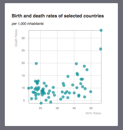
Playing with codepen is fun, but chances are that you have other ambitions for your visualization projects. In the real world, well, in my day job at least, React is used to create web apps. So, in that last part, we’re going to create our own web app, load some real data, and use some existing modules to visualize it like pros! In this article, we are going to build this:

You can try a demo of the app at https://jckr.github.io/example-react-app/.
All the code is at https://github.com/jckr/example-react-app.

What’s the difference between a web app and a web page you may ask? Well, a web page is an html document with some links to scripts or some inline javascript. A web app is a comprehensive system of code files working together, including a server. All of these files are transformed via a build system, which creates a compiled version that runs on the browser. Such transformations can include JSX support, or supporting ES6/ES7 syntax. Your work can be split in many, easy to read, easy to maintain source files, but your browser will just read one single file written in a version of Javascript it can understand.

That may sound like a lot of work to setup. Up to a few weeks ago, the easiest way to get started was to use a web scaffolding tool such as Yeoman. Scaffolding means that all the little parts that need to be installed or configured to get that going are taken care of, leaving you with a structure that you can use to build your web app upon.
Facebook recently released ‘create-react-app’, which is a simpler scaffolding tool, aimed at simple React apps.

You will need access to a command line environment, such as Terminal on MacOS or Cygwin on windows, and have nodejs and npm installed. (see https://nodejs.org/en/). You will need node version 4 and above. You may want to use nvm to easily change versions of node if needed.

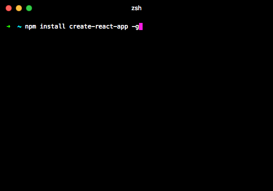
Here’s an illustrated guide to what you need to do to get started:

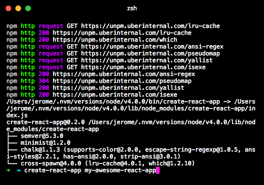
First, install create-react-app with the command: npm install create-react-app -g.

From the parent directory where you want your app to be, use the command: create-react-app + the name of your app. This will also be the name of the directory this app will be in.

The above command will copy a bunch of files. When it’s done, go to the directory of your app and type npm start…

And lo and behold, the app will start and a browser window will appear with the results!
From now on, whenever you change one of the source files, the app will reload and reflect the changes.

Remember when we did scatterplots, I never really got into doing the menial work of making gridlines, axes etc. Exactly for this reason – it can be a lot of manual work.
But now that we are going to build a professional looking web app, we are going to go all the way.

One component, one file

The app we are building has 3 components: the App, which is the parent; Scatterplot, which is the chart proper and HintContent, for some fine control about what the tooltip looks like.
There an index.html and an index.js file, which are very simple:

<!doctype html>
<html lang="en">
  <head>
    <meta charset="utf-8">
    <meta name="viewport" content="width=device-width, initial-scale=1">
    <title>React App</title>
  </head>
  <body>
    <div id="root"></div>
  </body>
</html>
import React from 'react';
import ReactDOM from 'react-dom';
import App from './App';
import './index.css';

ReactDOM.render(
  <App />,
  document.getElementById('root')
);

There’s really not much to say about the index.html. All it does it create a div with an id of root, where everything will go.
The index.js ends with the familiar command ReactDOM.render( … ), which will output our component into the aforementioned root div.

But it starts with a few import statements. What they do is that they link the source files together.
Index starts by importing functionalities from react: React and ReactDOM. This was done in our codepen environment by using the settings.
The next two lines link our index.js file with other files that we control: App and index.css. App contains our highest-level component, and index.css contains the styles.
I’ve done some changes in index.css for styles I couldn’t reach with react – styles of the body, for instance, or some styles of elements created by libraries over which I didn’t have direct control (more on that later). Else, I’m using inline styles, in the React tradition.

Let’s move to our App.js source file, which describes the App component.

Its last line is:

export default App;

And this is the line which corresponds to what we had seen earlier in index.js:

import App from './App';

With this pair of statements, inside of index.js, App will be equivalent to what it was inside of App.js when exported.
Using this construct, using import and export, files can be kept short, legible and focused on one specific problem.

But let’s take another look at the first two lines of App.js:

import React, {Component} from 'react';
import {csv} from 'd3-request';

What are those curly braces?

If a module (a javascript file which imports or exports) has a default export, then when importing it, you can just use

import WhatEverNameYouWant from 'module'; 

Where WhatEverNameYouWant is actually whatever name you want. Typically, it would start by an uppercase letter, but you do you.
But a module can export other things than the default export. In that case, you have to use curly braces. There’s many articles on the subject such as this one. I’m mostly bringing it up so that you see there’s a difference between using the curly braces or not.

In our source files, we are going to use export default. We are also going to define one component only per source file, which makes the whole import / export deal easier to follow.

create-react-app has no dependencies beyond react – which means that it doesn’t need other modules to be installed. But this project does! It needs d3-request and react-vis.
You can install them from the command line, by typing npm install d3-request –save, and npm install react-vis.

The App component – loading and passing data

Our app component will do two things: load the data, and when the data is loaded, pass it to the Scatterplot component so it can draw a chart.
I’ve hinted at the componentWillMount lifecycle method as a great place to load data, so let’s try that!

class App extends Component {
  constructor(props) {
    super(props);
    this.state = {};
  }

I’m starting with the constructor method. The only reason why I do that is to initialize the state to an empty object. If I didn’t, the state would initially be undefined. And while it’s not a deal-breaker, I would have to add more tests so that the app doesn’t break before there’s anything actually useful in the state.

  componentWillMount() {
    csv('./src/data/birthdeathrates.csv', (error, data) => {
      if (error) {
        this.setState({loadError: true});
      }
      this.setState({
        data: data.map(d => ({...d, x: Number(d.birth), y: Number(d.death)}))
      });
    })
  }

ComponentWillMount: there we go.
we are using the same data file as before. Here, I’ve hardcoded it in a string, but that address could totally come from a property passed to App.
Also, note I’m using csv from d3. That used to be d3.csv, but not anymore because I’m importing just csv from d3, or more precisely from its sublibrary ‘d3-request’. One of the big changes of d3 v4, also recently released, is that its code is available as smaller chunks. There are other ways to load a csv file, but d3’s csv method is super convenient and it’s also a great way to show how to cherrypick one useful part of a large library.

So, we are loading this file. What’s next? If loading the file raises an error, I am going to signal it via the state (setState({loadError: true});). Else, I am going to pass the content of the file to the state.
Not just the raw contents: I am going to slightly transform it. Inside the csv method, data is an array of objects corresponding to the columns of my file. There are three columns: country, birth and deaths. I have therefore arrays with three properties, and their values is what is being read by csv from the file, as strings.
The map statement turns that object into: a copy of all these properties (that’s what {…d does), plus x and y properties which simply convert the birth and deaths properties of each object to numbers (ie “36.4” to 36.4).
So, whether this file succeeds or fails to load, I’m going to change the state of the component.

What values can the state take?

When the component is first created, state is empty.
Then, componentWillMount attempts to load the file. State is still empty. During that very short time, render will fire (more on that soon).
Then, the file will either load or not. If it loads, state will now hold a data property, and since state changes, the component will re-render. If it doesn’t load, state will have a loadError property and the component will also re-render.

Which takes us to the rendering of the component. You’ll see that these 3 situations are taken care of.

render() {
    if (this.state.loadError) {
      return <div>couldn't load file</div>;
    }
    if (!this.state.data) {
      return <div />;
    }
    return <div style={{
      background: '#fff',
      borderRadius: '3px',
      boxShadow: '0 1 2 0 rgba(0,0,0,0.1)',
      margin: 12,
      padding: 24,
      width: '350px'
    }}>
      <h1>Birth and death rates of selected countries</h1>
      <h2>per 1,000 inhabitants</h2>
      <Scatterplot data={this.state.data}/>
    </div>;
  }

if (this.state.loadError) – that’s the situation where the data didn’t load. That’s also why I did initiate state to an empty object, because if this.state was undefined, this syntax would cause an error. (this.state && this.state.error) would be ok, but I might as well just initialize the state.

if (!this.state.data) takes care of the situation where the data didn’t load yet. We also know that there hasn’t been an error yet, else the first condition would have been triggered. In a professional setting, that’s where you’d put a progress bar or a spinner. Loading a 70 line csv isn’t going to take long though, so that would be over the top, which is why there’s just an empty div.

Finally, if neither of these conditions are met, we are going to render a card with a Scatterplot element inside. We’re going to render a little more than just the Scatterplot element – we’re styling the div on which it will stand and adding some titling.

The Scatterplot component: introducing react-vis

React-vis is the charting library we use at Uber.
The main idea is that we can create charts by composing elements, just like a web page:

<XYPlot
  width={300}
  height={300}>
  <HorizontalGridLines />
  <LineSeries
    data={[
      {x: 1, y: 10},
      {x: 2, y: 5},
      {x: 3, y: 15}
    ]}/>
  <XAxis />
  <YAxis />
</XYPlot>

… creates a very simple line chart with horizontal gridlines and axes. Don’t want the gridline? remove the part. Want vertical gridlines too? Just add underneath.
Do you need another line chart? You can add another LineSeries element. Or a VerticalBarSeries. Or a RadialChart (pie or donut charts). And so on and so forth.
React-vis handles all the nitty gritty of making charts, so we don’t have to.

Let’s dive into Scatterplot.

import React, {Component} from 'react';
import {
  Hint,
  HorizontalGridLines,
  MarkSeries,
  VerticalGridLines,
  XAxis,
  XYPlot,
  YAxis
} from 'react-vis';

scatterplot.js starts by familiar import statements. We only import what we need from ‘react-vis’.

import HintContent from './hint-content.js';

Then, we import HintContent – hint-content.js uses a default export, so no need for curly braces. By the way, that .js extension is not mandatory in the file name.

export default class Scatterplot extends Component {
  constructor(props) {
    super(props);
    this.state = {
      value: null
    };
    this._rememberValue = this._rememberValue.bind(this);
    this._forgetValue = this._forgetValue.bind(this);
  }

  _rememberValue(value) {
    this.setState({value});
  }

  _forgetValue() {
    this.setState({
      value: null
    });
  }

We could have made Scatterplot a pure functional component… if we had passed callback functions for handling mouseover. Those functions could have changed the state of the App component, which would re-render its children – Scatterplot. Since no component outside of Scatterplot is interested in knowing where the mouse is, that component can have its own state.
We are also adding two private functions. They have to be bound to “this” – we are creating a class, and those functions have to be tied to each instance of that class. The other way to think about it is: you can add private functions to a React component, but if they use the state, properties or private variables, you will have to bind them to ‘this’ in the constructor.

render() {
    const {data} = this.props;
    const {value} = this.state;
    return <div>
      <XYPlot
        margin={{top:5, left: 60, right: 5, bottom: 30}}
        width={320}
        height={290}>
        <VerticalGridLines />
        <HorizontalGridLines />
        <XAxis/>
        <YAxis/>
        <MarkSeries
          data={data}
          onValueMouseOver={this._rememberValue}
          onValueMouseOut={this._forgetValue}
          opacity={0.7}
        />
        {value ?
          <Hint value={value}>
            <HintContent value={value} />
          </Hint> :
          null
        }
      </XYPlot>
      <div style={{
        color: '#c6c6c6',
        fontSize: 11,
        lineHeight: '13px',
        textAlign: 'right',
        transform: 'rotate(-90deg) translate(120px, -160px)'
      }}>Death Rates</div>
      <div style={{
        color: '#c6c6c6',
        fontSize: 11,
        lineHeight: '13px',
        textAlign: 'right',
        transform: 'translate(-5px,-14px)',
        width: '320px'
      }}>Birth Rates</div>
    </div>;
  }

What we are returning is a div element. The reason is that at the very end, we are writing the name of the axes on that div. But mostly, that div will hold a XYPlot component, which comes from react-vis. I’m passing: a margin property, a height and a width. Margin is optional and I’m using it for control. Height is mandatory, width as well, though react-vis has a responsive component that makes the charts adapt to the width of the page (not used here).
Then, I’m simply adding: horizontal and vertical gridlines, and horizontal and vertical axes. I’m using default settings for all of them (full disclosure – I’ve changed a few things via the index.css stylesheet). But the way labels and lines are organized is fine by me.
Then, we’re adding the MarkSeries component, which is all the circles.

 <MarkSeries
  data={data}
  onValueMouseOver={this._rememberValue}
  onValueMouseOut={this._forgetValue}
  opacity={0.7}
/>

The data property comes from the properties passed to the Scatterplot component. It needs to have an x and y properties, which is why I transformed our csv file like so. It could also have a size or a color property, but we’re not going to use these in our example.
I’m using an opacity property to better show which marks overlap. I could also have made them smaller, but I’m sticking to the defaults.
Finally, we’re using the onValueMouseOver and onValueMouseOut properties to pass functions to handle what happens when the user is going to, well, mouse over one of the marks, or remove their mouse cursor from them. Those are our private functions from before:

  _rememberValue(value) {
    this.setState({value});
  }

  _forgetValue() {
    this.setState({
      value: null
    });
  }

When a user passes their mouse on a mark, the corresponding datapoint (value) will be passed to the state. And when the user removes their mouse, the value property is reset to null.

finally, right under the MarkSeries component, is where we call our Hint:

  {value ?
    <Hint value={value}>
      <HintContent value={value} />
    </Hint> :
    null
   }

If value (from the state) is worth something, then we create a Hint component. That one comes from react-vis, and handles positioning of the tooltip plus some default content. But I want to control exactly what I show inside my tooltip, so I’ve created a component to do just that.
Creating a specialized component like this is great, because it hides this complexity from the Scatterplot component. All that Scatterplot needs to know is that it’s passing properties to a HintContent component, which returns… something good.

Because of imports and exports, it’s generally a good idea to create such small specialized components.

For the win: the hint content component

import React from 'react';
export default function HintContent({value}) {
  const {birth, country, death} = value;
  return <div>
    <div style={{
      borderBottom: '1px solid #717171',
      fontWeight: 'bold',
      marginBottom: 5,
      paddingBottom: 5,
      textTransform: 'uppercase'
    }}>{country}</div>
    {_hintRow({label: 'Birth Rates', value: birth})},
    {_hintRow({label: 'Death Rates', value: death})}
  </div>;
}

function _hintRow({label, value}) {
  return <div style={{position: 'relative', height: '15px', width: '100%'}}>
    <div style={{position: 'absolute'}}>{label}</div>
    <div style={{position: 'absolute', right: 0}}>{value}</div>
  </div>;
}

The HintComponent is a pure functional component and is our default export.
There’s another function in that module, and we’re not exporting it. In other words, it won’t be accessible by other parts of the app. The only place where it can be used is within this file. Traditionally, those start with an underscore.

The only point of the HintComponent is to offer fine control on the appearance of the tooltip (which also receives styles from index.css). But I wanted to control exactly how the various parts of the data point will appear inside.
So, it has 3 rows. The first one contains the name of the country (well, its 3-letter ISO code). I chose to make it bolder and uppercase. Also, it will have a border separating it from the rest of the card.
The next two rows are similar, which is why I created a function to render them as opposed to just retype it.
It’s a relative div, which takes all the space, with two absolute divs as children. The label one has no position information, so its attached to its top left corner, but the value one has a right attribute of 0, so its attached to its top right corner. So, for each row, the label is going to be left-aligned, and the value, right-aligned.

And that’s it!

For our grand finale, we are going to create a more complex application with several charts that interact with one another…


React components

This article is part of my series Visualization with React. Previous article: Coding with React

Using React to create elements out of data is nice, using JSX is hip but until you use your own components, you won’t use React to the fullest.
So let’s do that. Fair warning: that’s the speed bump, especially if you’re not familiar with javascript concepts like ‘this’, which you’re not really required to master with d3.

In the previous examples, we created an element that held a bunch of elements. We are now going to create a custom Point component, to replace our circles. We’re going to do more than just replace it: our new component will be able to do more stuff. Each Point element should remember whether it’s highlighted or not. If it’s highlighted, it will be displayed in red. Else, it will stay in gray. Clicking on a Point will switch its highlighted status.

The way we are going to maintain that highlighted status is by using the state of the component (remember that switch example?).

There are two syntaxes to create components: one uses React.createClass method, and the other uses ES6 classes. I’m providing this next step using both syntaxes. I don’t know which one is more common for the time being, but I feel that the ES6 class one will be in the future, so this is the one I personally use.

See the Pen React scatterplot with custom component – using es6 class by Jerome Cukier (@jckr) on CodePen.

Our custom component is an ES6 class (gasp!) and it’s based on the existing class, React.Component.
So we declare our custom component like this:

class Point extends React.Component {
... a bunch of stuff which is different from React.Component ...
}

Specifically we are going to specify two properties of our new class: constructor and render. Constructor describes what happens when an element of this component is first created, and render is what should be displayed on screen for that element.
Don’t confuse the component and the elements: the component is the type of things that we are going to create, you can think of it as the mold. The elements are what are created with this component, think of it as casts. Creating the component describes how the elements should be created. Later in the code, we are going to create, or instantiate, the individual elements using the component. In Javascript, as in many other languages, by convention, classes like our component have a name that starts with an upper case.

So let’s look at the first property.

constructor(props) {
super(props);
this.state = {highlighted: false};
}

what’s the argument of constructor, props? In React world, props is short for properties. Until now, we never really had to manipulate properties inside the component.
In this specific example, we don’t really do anything with props, so we could write just constructor() {…}. But it’s a convention, and if at some point we want to do something with these properties right when the component is first created, we might.
The second line is super(props). What this does is that it passes whatever arguments the constructor had to the constructor of the original React.Component class. You don’t have to know what happens then, just that it’s a mandatory step.
The third line introduces us to the state. we assign an object to “this.state”.
But what is this? the 10000 ft view is that it refers to a specific context or scope (the article under the link above is fantastic if you want to know more).
We’re going to have many Point elements. Each of them can be highlighted or not. Each of them also corresponds to a different data point. Each of them can access and manipulate data that no other can. This is where this comes from. Properties of this (that is, whatever comes after “this.”) are going to be private to that element, in other words, not accessible from the outside.
And there are going to be two very important properties: props and state.

this.props are the properties of the element, which the element cannot change. They come from its parent element.
this.state is the state of the element, which the element can change: and when it does, the element will be re-rendered.

Speaking of rendering, let’s look at the next property of our class: the render method.
That method must render a React element or null.

So:

render() {
  return <circle
  onClick = {
    this.setState({
      highlighted: !this.state.highlighted
    });
  }}
  r = {
    5
  }
  style = {
    {
      fill: this.state.highlighted ? 'red' : '#222',
      opacity: 0.2,
      transition: 'fill .5s'
    }
  }
  />;
}

Our component will create a element. But it could also be another custom component! Let’s just keep it simple for now.
cx, this time, will be expressed as a calculation based on this.props.birth. (and likewise cy will be computed from this.props.death).
birth and death are the properties that will have to be passed to the component to create an element (which we’ll see in the end).

we have a new property: onClick. onClick, unsurprisingly, handles click events. So when a user clicks, that will trigger a function which will do the following:

this.setState({
highlighted: !this.state.highlighted
});

The intention here is to assign to the highlighted property of the state the value which is opposite to that it currently holds. That value is stored at this.state.highlighted. Remember that originally, we stored {highlighted: false} in this.state, so this.state.highlighted is where it’s at. And so, !this.state.highlighted is the opposite of the current highlighted status.
this.setState adds the relevant property to the state. So, this construct effectively reverses the value of this.state.highlighted.
Whenever the state changes, the component is automatically re-rendered without any other action required (we can prevent that if needed, but we’ll see that later).

Finally, let’s look at what’s happening towards the end, with our style.
As we’ve seen several times before, we pass an object to style. Because of the JSX notation, that’s two sets of curly braces.
The fill property of the style depends on the state. So, if highlighted is true, it’s going to be red, else it’s going to be gray. Just as we said.
I’m also adding to the style a transition property, so that instead of just blinking from red to gray, our component smoothly fades from one color into the other.

So that’s our class.
The second part of the code is the same with both syntaxes, so let’s see how we create a component using React.createClass.

See the Pen React scatterplot with custom component – using createClass by Jerome Cukier (@jckr) on CodePen.

So instead of creating a class, we create a variable:

const Point = React.createClass({
... object with properties ...
});

So this time, we pass to React.createClass an object that describes the component that we’re going to create.
As above, we care about two things: that the elements it creates have a state, which starts as not highlighted, and how they should be rendered.
When we use React.createClass, the way to initialize a state is to use a property called getInitialState.
You have to assign to that property a function that returns an object: that object is the initial state.

...
getInitialState: function getInitialState() {
return {highlighted: false};
},
...

A word of caution: React.createClass takes an object as an argument, so its properties are separated by commas. There are no commas between the properties of a class, with the first syntax.

The second property of our object is render. Render gets a function that will output a React element or null. The syntax is very close to the above.
getInitialState, like render, are called lifecycle methods. This is because they are called at specific moments of the life of our component. There are more than 2, and they are one of the most interesting parts of React. We’ll cover them in our next article.

Now let’s look at the second part of our code. Now that we’ve got a custom component, what of it?
well, let’s use it to create elements!

const svg = <svg height={300} width={300}>{
 birthdeathrates.map(d => <Point birth={d.birth} death={d.death} />)
}</svg>;

What’s different here is that line with the element.
Remember that before, we created a element and we specified its cx and cy properties. This time, we don’t pass cx or cy, instead we just pass a value for birth and a value for death. The component can do the rest!

Pure functional components

Our Point component is somewhat complicated because we maintain its state. Because we care about its state, we need to initialize it, we need to capture events that could affect it, and have our output depend on it.
By contrast, if all we had were properties (which, again, do not change), what the component does could be much simpler: it takes an input, and produces an output. The same input produces the same output. Just like each time when you add two numbers, the result is the same if the numbers you add are the same.
In javascript terms, if you had a function that didn’t use global variables, randomness or external APIs, when you pass the same argument to that function, you get the same result. This is what’s called a pure function. Pure functions have a lot of good things going for them, not least their stability and predictability and simplicity.
So let’s suppose we didn’t care about the state of our Point component.
React let us write it as a pure functional component.
Here’s how:

See the Pen React scatterplot with pure functional component by Jerome Cukier (@jckr) on CodePen.

function Point({
  birth,
  death
}) {
  return <circle
  cx = {
    birth * 10
  }
  cy = {
    300 - death * 10
  }
  r = {
    5
  }
  style = {
    {
      fill: '#222',
      opacity: 0.2
    }
  }
  />;
}

Our component is now just a function! we pass it an object with properties {birth, death} and you can use them directly in the body of the function. No need for this.props.birth or whatever.
The second part of the code doesn’t change, the elements are still created exactly the same way.

Combining components: I’ll call you back

In a real world situation, you’ll probably have many custom components being parts of one another and passing data back and forth.
So, let’s step up in complexity.
Let’s use the same dataset, but this time we’ll make a bar chart.
Initially, we’ll show birth rates. But we’ll also add a switch! and if the user touches the switch, we’ll show death rates instead.
So. Let’s think this through a little bit.

We’ll have a Chart component that is going to be at the top level.
That component will have a Switch component as a child.
It will also have several Bar components that will correspond to the actual data. We can make the Bar components out of our birthdeathrates dataset as before.

<Chart>
  <Switch />
  <Bar />
  <Bar />
  <Bar />
  ...
</Chart>

There will be an event attached to the switch, so that when it’s clicked, the Bars can change.
Now the real question is: which component’s state should be changed by the switch?

We’ve seen how the switch could change its own state. But the Bar components wouldn’t be able to read it.
Ideally, the switch will trigger some kind of change in the Bar component, but likewise, it cannot reach the state of those.

So: we’ll have to find a way to get our switch to update the state of the Chart component. When the state of Chart updates, it re-renders. That means that it can pass new properties to its children. It can tell its Bars to use the death property instead of the birth one.
But how to access the state of the parent from one of its children? That’s possible using callback functions.

If we are within the parent element, we can access its state.
So, we could create a function that would do:

updateMetric(metric) {
  this.setState({metric}); // this.setState({metric: metric}) in short hand notation, possible with babel
}

That function would work within our future Chart component. Now what if… we passed that function to Switch as a property? then, when executed, it would change the state within Chart. That would trigger a re-render, and Chart could pass different props to all of its children.

Let’s make it work.

See the Pen React bar chart with callback by Jerome Cukier (@jckr) on CodePen.

Lots of stuff going on here!

class Chart extends React.Component {
   constructor(props) {
     super(props);
        
     this.state = {
       metric: 'birth',
     };
   }
// ...

This is the constructor of our class. We’ve seen it before, the only special thing is that we give it an initial start here by giving a value to this.state.

render() {
    const metric = this.state.metric;
    const data = this.props.data.sort((a,b) => b[metric] - a[metric])
      .map((d, i) => ({...d, rank: i}))
      .sort((a, b) => b.country > a.country);

Here, metric gets the value of whatever we put in the state.
And data is: whatever is passed to the props as data, first sorted by the value of the corresponding metric, then given a rank property which is just its order in that sorted list, and finally sorted alphabetically. So whatever the metric, the same country will always be at the same position in this array, only its rank property, which was computed while the list was sorted, would be different.

    return <div className='chart'>
      {[
       <span className='label'>Birth rate</span>,
       <Switch metric={metric} updateMetric={(d) =>
            this.setState({metric: d})
       }/>,
       <span className='label'>Death rate</span>,
       <div>
         {data.map(d => 
          <Bar country={d.country} value={d[metric]} rank={d.rank}/>
         )}
      </div>
      ]}
    </div>; 

Nothing that we’ve never seen before in that render function – we’re just creating divs or instances of components that remain to be described, and we pass them props. The only new thing is that updateMetric property of Switch. Instead of passing a value or an array, we pass a function. And in that function, we call this.setState.
Because we are still within the Chart component, this.setState will change the state of a Chart component. But wait: we are actually passing that function to another component, Switch! This component, a child of Chart, receives a function that lets it change the state of its parent.
That’s the callback function.

Here’s that Switch component:

function Switch({metric, updateMetric}) {
  return <div className = 'switch__track'
     onClick = {() => updateMetric(metric === 'birth' ? 'death' : 'birth')}
    >
      <div className = {'switch__thumb ' + metric} />
    </div>
};

Switch doesn’t have a state of its own, so we can just use a functional component. Switch receives updateMetric as a property. Switch doesn’t know anything about this function – it doesn’t have to. It doesn’t need to know that this function will affect its parent. All it does is launch this function when it’s being clicked – that’s what the line with onClick does.

Here’s another example presented without comments with similar data, with a slightly different ways to order the components.
This time, the top level component is Dashboard, which has 2 Chart components, which each have several Bar components as children. Mousing over Bar components updates the state of the Dashboard components, which re-renders its Charts children and their Bar children.

See the Pen react dual bar chart by Jerome Cukier (@jckr) on CodePen.


Making my 2015 new year cards

Getting the data

For this year’s greeting cards I had decided to take a radical turn from my previous 2 greeting cards projects which were entirely based on data from interaction with whomever was getting the card and just focus on creating something closer to generative art. I decided to use people’s names as the basis of the shape I would use. The other departure I took from my previous project is that I wanted to send physical cards. I also like the idea of the cards being a surprise, so I didn’t want to tell people “hey, I’m going to generate a card from your name. Can you give me your address?” Instead, I set up a google form and asked people several questions.

What is their name (obviously)? What is their address? How long have they lived here? What is their home town? Where were they born? What is their birthday? and finally, I gave them the chance to write whatever they want.

While I always thought I would only use name + address to create the cards, I also wanted to make a visualization on the ensemble of people who would fill my form, and among other things I thought of a map of where my friends are versus where they are from.

I sent about 300 messages asking people to fill the form, and got about 100 replies. The form was also a way to commit to do that project… Because I proposed to so many people to get a card, there was no way I could back off afterwards 🙂 whereas if I had just created something online and sent it via mail, I could have definitely stopped mid-way.

Layer as tiles

I was pretty much set on creating cards as a layer of tiles from the get go. Each word in a person’s name could be a layer, and each letter could be an attribute. Attributes could change things like patterns, colors, size, orientation, all kind of things! Eventually I decided to use the 5 first letters of people’s names, and only use 2 layers, even if the person’s first name (or last name) is composed of two or more words.

When designing patterns, I wanted something that could tile on a card. Squares, while not the only possibility, were the easiest. So I started to come up with many patterns that could be placed on squares and that would tile (ie the right of one pattern would connect with its left end, and the top to its bottom). I decided (arbitrarily) that both the height and width would scale together, as opposed to vary independently (turning the squares into rectangles). Also, I wanted two colors per layer, but one would be more prominently used than the other. Finally, I allowed the layers to be rotated as opposed to be necessarily strictly parallel to the borders of the card.

Since words are made of letters, I went for simplicity. There would be 5 attributes (pattern, main color, secondary color, scale and orientation), and for each one, each of the 26 possible letters corresponded to one value. And while there were “only” 26 possible patterns, I experimented much much more – possibly 100 or so.

Letters as patterns

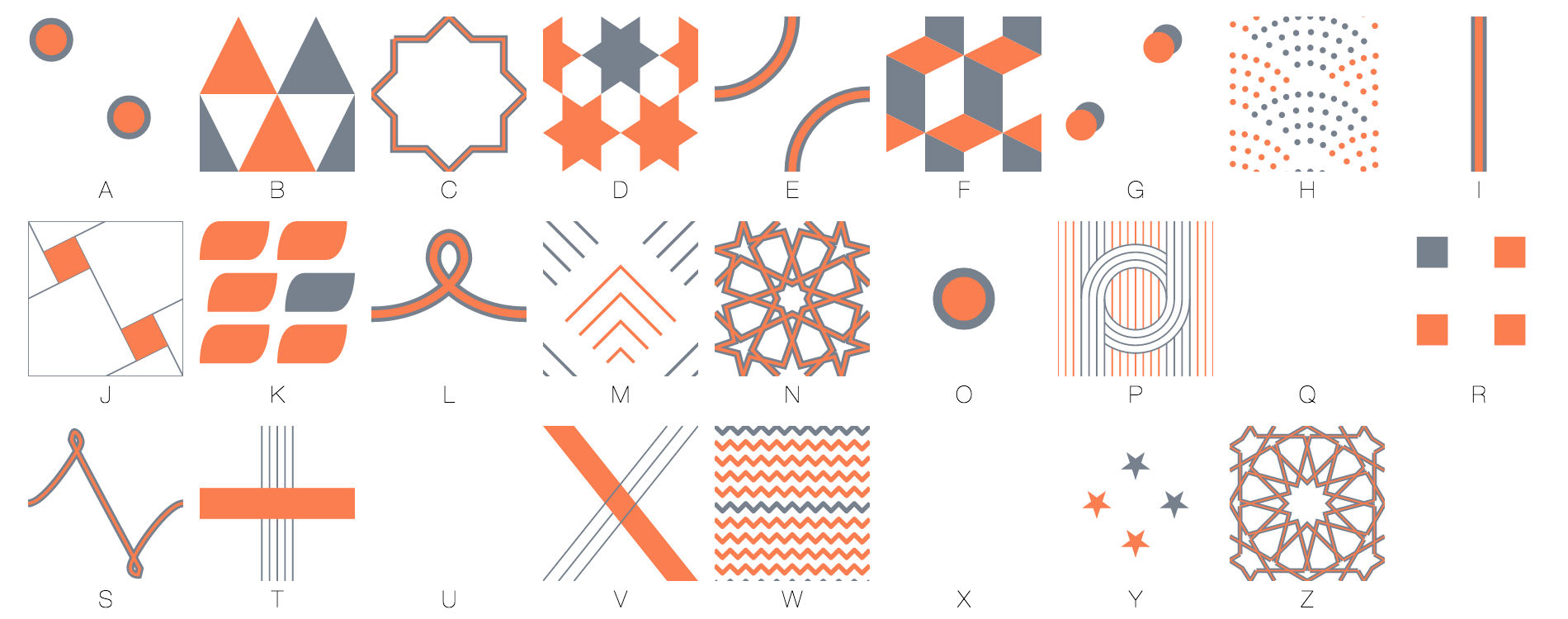
My patterns fell in several categories. There were very simple geometric shapes (A, G, I, O, R). Some were hand-drawn (L and S). Some were more sophisticated geometric shapes (B, D, E, F, H, J, K, M, P, V, W, Y). Finally, some were inspired by islamic art (C, N, Z).

Finally, there are some letters I didn’t assign patterns to, because there was just no name starting with those letters in my dataset 🙂 (Q, U and X).

In my explorations / experimentations one thing I kept in mind was the weight of the pattern. The M, or the O, for instance, are really light. But the K or the F are heavier. I tend to attribute the lighter patterns to letters that started first names, while giving the heavier patterns to letters that mostly started last names (and were in the back).

Pinterest was a great source of inspiration for patterns. At some point in the process I really wanted to use islamic patterns. I have a couple of books on the subject and I always really liked their look and feel, their “tileliness” and also that they are built with ruler and compass. Many of these patterns, even if very intricate, can easily be reproduced with computers (ie, drawing an hexagon requires using a compass 7 times, but with a computer all you need to do is compute the cosine and sine of 6 points and link them). And I thought there was beauty in the process of building them. So I created an ‘islamic pattern builder” as a side project – which will get its own blog post.

Here is a slightly modified card maker compared to the one I used (it only exports a card in 600×1080 as opposed to 1875 x 3375)

Wrapping it up

Eventually I put together the cards. Minor setback – I don’t have a color printer at home, so I would have to have the cards printed. Since I had to use a vendor anyway, I thought I might as well look for someone who could also send them, and that’s how I ended up choosing lob.com. Lob.com allowed me to send 6×11″ cards which seemed cool (although, to be honest, I didn’t have a good sense of how big that was) and took as input 300 dpi png bitmaps. So I had to create 3375 x 1875 images, that’s up to 10 Mb per card! I initially hesitated between creating my cards with d3 and processing and chose d3 because it was easier for me to manipulate shapes using svg. I soon regretted that decision because exporting large bitmaps is not easy from the browser. Chrome won’t let you do that – exporting a png over a certain size (I think 2.56mb) will crash it. So my way around it was to export it as webp, chrome’s preferred compression format (which was with one exception always below its threshold) and then, convert them to png. Then, we ran into some unexpected issues and delays 🙂 but eventually all the cards were sent and people are telling me that they are getting them 🙂

Making the ensemble visualization

I always intended to show things about all the cards. But I also wanted to keep all the information that had been shared with me private. I made the front side of the cards public in a pinterest board but it would be really difficult to reverse engineer them to come up with a name. I made a map, by geocoding all the information I was given, but I also clustered all of the addresses and rounded all geocoding, so it’s not possible to go from one of the pixels of the map (or the data file) to an actual address.

I also contributed the visualization I had made to show the distribution of names and initials.

I was conflicted about whether using what people shared with me in the free text section of my form. On one hand, I wanted to find a way to show it, but on the other, showing even fractions of a phrase would challenge the confidentiality of what was written. But still, I wanted to restitute what I was given. Some of the text that was sent to me was really awesome. So I opted for a word cloud kind of setting. This is the first time since word clouds have gained mainstream acceptance that I used one 🙂 I thought it was appropriate – I’d show only words, not phrases. Also the aesthetics was interesting – with only 2 angles (0 or 30 degrees) and a cool set of colors. I’m using Jason Davies wordcloud generator for d3.

And there you have it – here’s the final visualization.


Interactive map of the subway

My last project is an interactive map of the Paris subway.
Interacive subway map

Interactive subway map

Quite some time ago, I had seen Tom Carden’s Tube Travel Times and was fascinated. So while I initially had tried to do something different I ended up borrowing a lot of his design, so it wouldn’t be fair to start this post without acknowledging that.
Then again, there are a few original things in this worth writing about.
A subway system can be seen as a network of nodes and edges. Nodes would be the stations, and edges, the subway lines that connect them. Finding the shortest path between two parts of the graph is a classic problem of computer science. That path is the sum of the length of all the edges it takes to traverse the graph from the source to the destination.
However a typical subway journey, and I should know, is not entirely spent in a train. You first have to get from the street to the platform, wait for your train; in the event of a connection, you have to go from one platform to another, wait for another train; and eventually you have to return to the street level.
So in my representation of the subway system in addition to the stations themselves, I’ve added nodes for all the platforms within a station and edges between them. So if you have to go from one station A to station B, which is three stops away on a given subway line, you would really traverse 5 edges: station A to platform, stop 1, stop 2, stop 3, then platform to station B.
While the Paris subway agency, RATP, has recently publicized its open data intent, the travel times between two stations are not public. I actually had reliable and accurate measured travel times for 90% of the network, on the basis of which I could estimate the rest. The great unknown that remains is the complexity of the stations, some are very straightforward so going from the street to a train is a matter of seconds, while some are downright mazes. While I think I have travelled through almost every stations by now, I definitely not have stopped in many of them. So as part of the project I am asking users to complement my data on the stations they know well. Actually, I didn’t use much of the datasets that RATP published. The position of the stations on the canonical plan has a lot of inaccuracies. For the geographical positions I used my own measures rather than the published data (I had been playing on and off with subway data for close to 5 years now, http://www.openprocessing.org/sketch/22252). I did use the trafic data to give an idea of the occupancy of a given section, and the official color codes as well. Because I am using my own measures, I have not added other railway systems like the RER or tramway for which I don’t have enough data.

So when a user selects a station, the rest of the network moves according to their (shortest path) distance to the selected station. So at the heart of the exercise there is a shortest path calculation from any station to any other. Including stations, platforms, connections, entrances and exits, that’s a network of 680 nodes and 1710 edges (for 299 stations, I didn’t include a couple of the very last ones). And it’s a directed network, because there are some sections which go in only one direction. At most, a network that big could have close to 500,000 edges, so it’s fairly sparse.
There are several algorithms to compute shortest paths in the code. I am using the best known one, Dijkstra, which works on path with no negative edge length. The way it is implemented here, with binary heaps, makes it so fast that it’s not noticeable. Not using that improvement, or relying on a more versatile but slower shortest path algorithm, would result in considerably greater computing times.

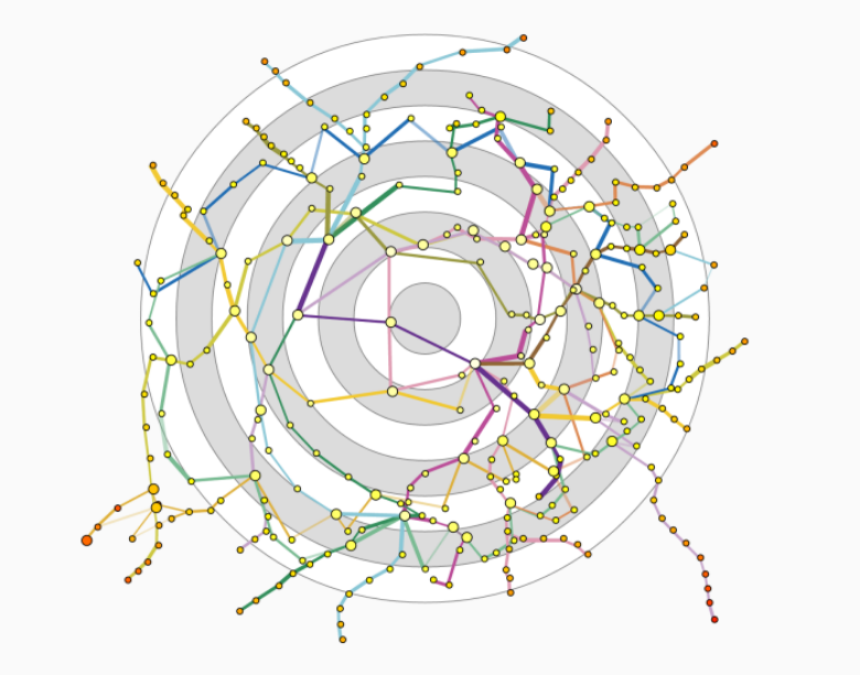
When a user selects one station a few things happen. First, all of the others are arranged around the selected station. Imagine the station is the fixed point in a polar coordinate system, all the other stations retain their angular coordinate but their radii now depends on the shortest path time. That idea came directly from Tom’s applet. Another thing I took from him is the addition of rings in the background which give an indication of the travelling time to those destinations. But I settled for that after much fumbling and with the conviction that there was no better solution.
What also happens is that all the edges which are not part of any shortest path disappear. So subway lines are no longer continuous.
Once a station is selected, more things happen when hovering on a second station, the actual shortest path is revealed while all others fade out, and the station marks are hidden except those of the start, destination and all connections on the way, for which names are displayed.
Finally, an interace appears that let users enter estimations for the times I don’t know so well about the stations. I haven’t added any hard figures there so I am only asking for impressions, but I believe that with some usage the time estimations can get much more accurate.


Edit 1
the vis has been quite successful, so I decided to awesomize it a bit.
Now by clicking on any colored line, it’s possible to “block” any given subway section. The shortest routes become those which do not go through that section. You can simulate what happens, for instance, when a given line is down.
The other change is that I’ve added walking distances. For each station I’ve computed the beeline distance with its 5 nearest neighbors. I’ve translated that distance into time (knowing that pedestrians can’t traverse buildings, have to mind trafic etc.).
But in many cases it is still quicker to go from one station to the next on foot than by train.


Dimensionality reduction

Following my Tableau politics contest entry, here is another view I had developed but which I didn’t include in the already full dashboard.

In the main view I have tried to show how the values of candidates relate to those of the French. It’s difficult to convey that graphically when these values are determined by the answers to as many as 19 questions (and there are many many more that could be used to that effect).

Enter a technique called dimensionality reduction. The idea is to turn a dataset with many dimensions into a dataset with much fewer dimensions, as little as one, two or three. So we compute new variables, so that they capture virtually all the variability of the original dataset. In other words, if two records have different values in the original dataset, they should have different values in the transformed dataset too.

If you’re not allergic to words like eigenvalues the math is actually pretty simple. But let’s not go into that. The point is that with this technique you can represent a complex dataset as a two-dimensional dataset with very little loss.

Of course the technique doesn’t tell you what these new variables represent. Getting a feel for the data I postulate that the one on the X axis represents the toughness of a candidate (pro-security measures, no sensitivity for minorities, etc.) and the one on the Y axis is happiness with previous government. Or possibly, lover of the capitalistic doctrine.

Now you get a better feel for how close or distant the various candidates are from individual voters. You can also see which “spaces” remain empty or which are competitive. The top-right quadrant, for instance, looks tempting, but it is really nearly empty (about 200 respondents on over 1500). The right half of the matrix, that is the one which is sensitive to strength, has only one possible competitor but also few voters (~400 respondents). It makes more sense to remain an acceptable choice for the top half (750 voters) and especially the top left (550). In other words the Sarkozy mark should drift slightly towards the top left for optimal impact.


Tableau 2012 politics contest – justification and making-of

what led me to those choices

I was technically happy of my entry for the sports contest. I had done what I wanted: obtain a hard-to-find, interesting dataset, attempt to create an exotic, hard-to-make and never-tableau’d-before shape with aesthetic appeal and insights.

Yet the rules stated that the entries shall be judged on the story-telling front. While there were interesting insights, indeed, they didn’t constitute a story, a structured narration with a beginning and an end. Having worked on that subject on occasion, I think there is an inherent contradiction between a dashboard tool that lets a user freely manipulate a bunch of data and that articulated story where the user is more led throughout a process.

So that’s what led most of the work.

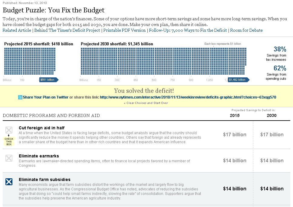
The second idea was that there is an unspoken, but IMO unnecessary rule about making Tableau dashboards compact things, highly interactive and interconnected. First, the elephant in the room: Tableau public is slow. It’s too slow. So too many interactions do not make a pleasant experience. Second, it is true that in Tableau one can assemble a dashboard out of interconnected worksheets, where clicking on one makes things happen in another. But just because you can doesn’t mean you should. Remember the <BLINK> element in the webpage of the 1990s? And this is this interconnectivity that causes dashboards to be compact and fit over the fold. If clicking on one element causes changes on another, you’d better be able to see both even on a laptop screen.

So the second idea was to create instead a long dashboard where a user would be held by the hand as she’s taken from point A to point B. Along the way, there would be texts and images to explain what’s going on, data – not necessarily interconnected, worksheets with little interactivity which can be understood at first sight, and which can stand some manipulation but don’t need to.

When visualization and storytelling intersect there is one form that I like which is to start with a preconception and to let the user find through manipulation that this idea is wrong. So I tried to use that in the dashboard as well.

The subject

That’s actually the #1 issue in French politics right now. Which strategy should the main right-wing party adopt? Typically, during the presidential campaign, both large parties fight for the votes of the center and are less radical than usual. But during this campaign the UMP, the party of the former president Nicolas Sarkozy, steered hard to the right in an attempt to steal back the voters gone to the far-right.

Apparently, that strategy was successful, even if he lost the presidential rate, he managed to somehow catch up against his rival.

Yet there are those who argue that if the party was more moderate, it would have been more successful and possibly win.

Anyway. The presidential race is over. But now the party is deciding which way to go next by electing its next leader.

Fortunately, there is data that can be used to determine whether the far-right or the moderate strategy can be more fruitful. This is what it is about.

Making the viz

Tableau dashboards can go up to 4000px in height, so that’s what I shot for.

So let’s say it loud and clear, it’s hell to manipulate large dashboards in Tableau, even with a very strong computer. When you add a new worksheet the legend part and the quickfilter part are added whenever there is room which could be thousands of pixels away. Since you can’t drag an element across screens you may have to proceed in babysteps. Once there is a certain number of elements, be they text, blanks or very simple and stable worksheets, adding another element takes a very long time, so does moving them around, etc.

As usual fixed size is your only friend, fixed heights, fixed widths, alternating horizontal and vertical layout containers.

So up to the last 2 worksheets there is really nothing to write home about. Only this: when you interact on the published workbook on the web it is painstakingly slow as the dashboard is reloaded and recomputed in its entirety. While this is ok for most of the worksheet, for the most complex one (the one with many sliders) it’s just unacceptable because the sheet won’t have time to be redrawn between two interactions.

So I came up with an idea: create a secondary dashboard with just that sheet, publish it independently, and then, in the previous dashboard, I have added a web page object. And that web page pointed to that other dashboard. So in effect, there is a dashboard within a dashboard, so when there is interactions in the complex worksheet, the secondary, smaller dashboard is the only one which is reloaded and recomputed, which is noticeably faster. Still not faster as in fast, but usable.

now publishing aspects aside this worksheet is interesting. The idea is to update a model based on 19 criteria. For every record, the outcome depends the “closeness” of the answers of the record and those of the candidates. The 19 parameters control the position of one of the candidates: Nicolas Sarkozy. So what I’ve done is calculate, outside of Tableau, the “distance” between each record and each of the other 8, and in the data file, I’ve specified that minimal distance and the name of the corresponding candidate. Then, in Tableau, I compute in real time the distance between the record and the parameters, and if that score is inferior to the threshold in the data file, then Sarkozy is deemed to be the closest, else it is the one from the data file. The worksheet tallies up the number of records which are closest to each candidate. Also, in order to keep the parameters legible I have constrained them to 9 values, when they really represent numbers between -2 and 2.

Also for the record, I have made a French and an English version. Why? Because I hope to get the French version published in a media and weight in on the debate, while I need the English version for the contest. This raises a lot of issues, all the worksheets need to exist in 2 versions, many variables need to be duplicated as well. As a sidenote the marks concerning a candidate are colored in tableau blue /orange in English in order to highlight candidate Sarkozy, but according to the campaign colors of the candidates in the French version.

That’s about it. I hope you enjoy my viz!


VAST challenge 2011

This year I have participated to the VAST Challenge (VAST stands for visual analytics science and technology). The VAST symposium is part of the yearly VisWeek conferences.

Anyway. The rules required contestants to send videos with voiceovers, so without further ado here they are.


Watch me in HD instead!!


Watch me in HD too!!

If you want to play with the tools you can download them here: mini-challenge 1, mini-challenge 3.

Unfortunately, I couldn’t find the time to complete mini-challenge 2 and the grand challenge. I’m making this on my free time and I had to balance all kinds of commitments, so I couldn’t secure enough time to finish. Unlike previous years, though, I managed to find enough time to start ! so, in the words of Charlie Sheen: winning.

So what is this about?
In the fictional Vastopolis, a mysterious infection strikes. Where does it come from and how is this transmitted? To answer these questions we have one million tweets sent by residents in the past 3 weeks. and among that million, there are quite a few about people reporting symptoms.

The first thing that I did was coming up for a method to tell whether one tweet was actually about a disease or not. so I scored them. I made a list of words that were required to consider that one message related to sickness, they were fairly univoquial like sick, flu, pneumonia, etc. Each of those words added one point to a “sickness” score. Then there was a second list of more ambiguous words like “a lot”, “pain”, “fire” etc. I added one point for each of these words or phrase, if a message already contains a required word. So, there were a few false negative, a few false positive, but all in all it was fairly accurate.

Fairly soon I had the idea to show the sums of all the scores of a part of the map, rather than showing each individual tweet. But originally, the sectors were quite large and I showed data by day.

Then, I worked with finer sectors and by 6 hours chunks. That’s how I could exhibit how people moved towards the center of the map by day, and back to its edges every night. With finer geographic details I could also see some spikes in various areas of the map during the period that I couldn’t see before, which were not necessarily related to the disease.

Eventually, I wanted to read what the tweets corresponded to, so I loaded the full text of the messages so that clicking on a square would reveal what was said at that moment. In this dataset, every spike in volume corresponds with an event that’s been added by the designers, so it was fun to discover everything happening there, from baseball games to accidents or buildings catching fire. Often, there were articles in the mini-challenge 3 dataset that would give more information about what really happened.

so, what was mini-challenge 3 about? nothing less than diagnosing possible terrorist threat. This time we were given not one million tweets, but thousands of articles which were much longer than 140 characters! From reading a few sample articles, I saw that most didn’t talk about terrorism or vastopolis at all. But couldn’t they contain clues that could link 2 and 2?

my first idea was to find all entities in the articles, that is names of people, or names of organizations (which follow a certain syntax) and arrange them in a network. The problem is that there were just too many names and groups (thousands of both) and I couldn’t tell from such a list which sounded suspicious. Although, a group called “network of hate” is probably not a charity. I’m sure it is possible to solve the challenge like this, but I chose another way to get my first leads.

I just did like in mini-challenge 1 and scored my articles, but I gave them several scores instead of just one by comparing them to several series of words. One series, for instance, was all the proper names in Vastopolis, like names of neighborhoods, because articles about Vastopolis are probably more interesting. The other series corresponded to various kind of threats.

That allowed me to create the scatterplot form which I used both to represent articles and to narrow the selection by selecting an area if needed. Then, as time went by I added more and more features to the tool, for instance an interface to read articles with keywords highlighted, the possibility to filter articles by keyword in addition to a graphical interface, being able to see all the articles as a list and select from that list, not just from the scatterplot, and finally the possiblity to mark articles as interesting and regroup them in another list…

That was about when I felt I could run out of time, so I didn’t add the other features I had planned or worked on making a decent interface. Also, I spent a lot of time not just trying to solve the challenge, but reading all the stories that were planted in the dataset, linking them to the tweets of MC1, etc.

Anyway. I quite enjoyed working on that and really, really appreciated the humongous work that went into creating the vast challenge universe. I’m looking forward seeing what other teams came up with. On a side note, it’s probably my last protovis projects as it makes sense to completely switch to D3 now…


An analysis of two New York Times interactive visualization

In the field of information visualization, professing one’s admiration for the work of the New York Times is not a very bold statement. However, my point is that they are admired mostly for the wrong reason (excellence in visual design and aesthetics). And by that, I don’t mean that it is not important to produce a visually pleasing experience, but rather that the work of the NYT graphics team deserves even more praise for its conception than its execution.

In the two examples I have chosen I’m highlighting aspects of their work that should be emulated with more dedication than their trademark visual style.

The examples

You fix the budget

You fix the budget, New York Times, November 13th 2010

Those will be: You Fix the Budget, published in November 13th 2010, and the recent The Death of a Terrorist: A Turning Point? published May 3rd, 2011.

Death of a terrorist - a turning point

Death of a terrorist - a turning point, New York Times, May 3rd 2011

Putting the user in charge

In both examples the visualizations work by asking the user their opinion in a very simple, non-intrusive manner. In the budget example the user can check or uncheck boxes. Each box is attached to a highly legible text that can easily entice a reaction. The title alone (i.e. “cut foreign aid in half”) which is always short and to the point, is enough for the user to take a position – agree (and check the box) or disagree. In a possible second phase, the user can read a more detailed description and see how much money can be saved by enacting such or such measure.

All in all, the experience is not directive and feels user-controlled. On typical information visualizations (say, gapminder) even if there are many controls the user is left on the spectator seat: the data unfold, they can be presented differently but the output cannot be changed. Conversely,  this is a simulation: by capturing a certain number of key inputs from the user, there can be different outcomes.

The same can be said about the Ussama Bin Laden one. The user simply positions their mood on a map. In one gesture they answer two questions. Then, they can speak their mind.  While this doesn’t take a lot of energy from the user the system is able to collect, in this simple interaction, a very precise answer that can be aggregated with everyone else’s.

Each user input has an impact on the overall shape of the visualization. By using it, people are naturally re-shaping it. Again, the question is non-directive (although it seems in all fairness that extreme positions are made more appealing with this presentation). There is no right, or wrong answer. The authors of the visualization are not giving a lecture on how people should feel or react to the event, likewise, they were not weighing too heavily on one side or the other of the political spectrum in the budget puzzle. I did feel a slight bias but I think they did their best to make it objective. But by letting the user experiment with the options at their disposal they encourage them to make their own opinion.

The visualization reacts to me

So we’ve established that the user in charge in both cases. The visualization reinforces that feeling by providing clear feedback when the user interacts with it, even it this is not the “end” of the experience. For instance, every cross checked and unchecked causes mini-panels to rotate in the budget puzzle, which are an evidence that something is happening, or that the system is taking the user into account. Technically, these transitions are absolutely not necessary but they really support that idea that the user is in charge and that even the most innocuous input is taken into account.

This relates to me

When discussing budget it’s easy to get carried away in a swirl of millions, billions, and the like. This is why it is not uncommon to see, even in the most serious publications, writers who, by an honest mistake, divide or multiply an economic indicator by a factor of thousand or a million. It is not very effective to present such big numbers without a referent, especially to a non-specialist audience. I don’t know what a billion dollar is. This is too abstract. A million people? this is awfully like 2 million people or 100,000 people in my opinion.

I think it is pointless to try to “educate” the citizens and hope they will remember “important statistics”  like GDP. Those large and abstract numbers don’t relate to them and they don’t need them to live their daily lives. That said, every citizen can make an informed decision based on their values if they are presented facts in a way that speak to them. For instance, whether medicare budget should be cut by $10 billion per year is a difficult question. But whether the eligibility age should be risen to 68 years is framing the question in a way that does relate to users.

For the death of a terrorist one, my initial reaction was to look for the words of people who would be in the same quadrant as me. Do they feel as I do? How about those who are in very different parts of the matrix? how do they put their feelings into words? I relate to both of these groups, differently but in a way that interests me and encourages me to interact further. Also, I see that I am not part of the majority. That again tells me something which is based on my relationship with the visualization and the respondents. This relationship is enabled by the author, but again not directed.

Going further – game mechanisms in visualization

Letting the user manipulate parameters that change not only how data is represented, but change the data proper, is not unlike videogames. Many games are really a layer of abstraction over an economic simulation, like Sim City or (gasp) Farmville. There is now ample research in gamification, which is the introduction of game mechanisms in non-game contexts. Such game mechanisms can make visualizations more compelling, more engaging for the users and, by putting them in the right state of mind, these mechanisms can improve the transmission of ideas and opinions.