Experiencing the sexperience 1000

If you think of data visualization as a great way to bring together heaps of interesting data and, well, a visual language, one of the most exciting areas in terms of room for improvement has to be how surveys are visualized.
In conversations with my pollster friend @laguirlande, I often find myself regretting that when reading an opinion survey, we see answer tallies in isolation. That is: we can see what proportion of people gave the first answer to question A, and what proportion of people gave the second answer to question B. But what we we don’t know is, out of the first group, how many find themselves in the second?
Another frustration: survey data is very tabulated. Pollsters know respondents age, gender, and all kind of categories they can fit their respondents in. But again when reading the results, more often than not it is not possible to utilize this structure to filter answers by category – do men react like women to the issue?
Yet opinion surveys are always interesting and topical, else they wouldn’t be paid for. And the interestingness may lie there: little nuggets of data that could have escaped analysts could be found by readers as they try various manipulations.

And then last week, Chanel 4 released the sexperience 1000, a project around the “Great British Sex Survey” by Ipsos MORI, which as its name implies is a large-scale survey on sexual practices of UK citizens.

The project walks us through around 20 questions where little icons represent individual respondents. When the reader changes questions, the icons arrange themselves in bars or circles to form a chart.

Yes, filtering! Yes, cross-tabulating!

It is then possible to click on a column label to “track” that group and find out what they’ve been up to.
Here, for instance, we can select the group of people who had over 101 partners and follow them through another question: the longest period without intercourse, for instance.

The selected individuals will show in green, so we can see that some of them went through long periods of abstinence.

It is also possible to select one interesting individual and see all of their answers.

It is also possible to filter the individuals according to many categories. Here, for instance, we can see that a majority of respondents had intercourse in a car. Including quite a few who don’t drive or don’t have a car!

Great interactivity, yet legibility could be improved

Those functions are truly great and encourage the reader to explore. Yet the choice of representation makes it a bit difficult to understand the answers.


Going back to the first chart I showed about the number of partners for instance, this representation highlights the mode, the most frequent answer to the question. In this case, this is the 11-20 bracket with 121 answers. A close second is just 1 partner (120 answers). The composition of the answer brackets has a lot of influence on that, because if we had made a 5-9 bracket for instance it would have outweighed both (217). Also, they chose not to directly represent the people who had 0 partners, which are over 7% of the respondents.
More fundamentally, I suppose that people want to know where do they fit in the distribution. Are they normal? Less then the norm? Or better? From that chart it’s very difficult.
With that in mind, it’s more relevant to show a cumulative chart.


Less than 5! who would have known?

The site choose to display bar charts when the answer is quantitative, but to present circles for qualitative questions. This is fine when several circles are displayed: it’s ok to figure out if one is bigger than the other.

But it’s much harder when only one is shown, like for the question on places I’ve shown above. It’s difficult to know whether this is a “big circle” or “small circle” without any indication of the total size of the sample. I only know that the majority of respondents had intercourse in a car because of the small number 550 next to the circle, but there is no graphical way to show that.

It’s even harder to compare proportions across groups which have different sizes.

Here, for instance, I’m trying to see whether people with an iPhone are more likely to cheat on their partners. What I see is two grey bubbles – it’s relatively easy to say that one is bigger than the other – then two smaller blue and pink ones, which are harder to compare one to another because they are smaller. What’s even harder is to assess whether the ratio between the larger balls is greater or smaller than the one between the smaller balls. However, the proportion between both balls (that is the share of the respondents who have an iPhone) is relatively easy to figure out, too bad it doesn’t answer the question at all.
To compare across groups of different size, you just can’t escape switching to proportions. I understand the design choice and enjoy its consistency but in this case it goes against the function of the site. I feel that in this case, the designers chose playability and aesthetic appeal over ease of getting questions answered, which is not a bad choice per se condidering the subject and audience, even if there are more academic possibilities. At any rate, the Sexperience 1000 shows the way survey results could be displayed and is a great improvement over the current situation.


Better life index – a post mortem

Today, OECD launched the Your better Life Index, a project on which I had been involved for months.

The short

I’m happy with the launch, the traffic has been really good, and there was some great coverage.

The three main lessons are:

  • Just because data is presented in an interactive way doesn’t make it interesting. The project is interesting because the design was well-suited to the project. That design may not have worked in other contexts, and other tools may not have worked in this one.
  • The critical skill here was design. There are many able developers, but the added value of this project was the ability of the team to invent a form which is unique, excellent and well-suited for the project.
  • Getting a external specialists to develop the visualization was the critical decision. Not only did we save time and money, but the quality of the outcome is incomparable. What we ended up with was far beyond the reach of what we could have done ourselves.

The less short

Before going any further, I remind my kind readers that while OECD pays my bills, views are my own.

Early history of the project

OECD had been working on measuring progress for years and researching alternative ways to measure economy. In 2008-2009 it got involved in the Stiglitz-Fitoussi-Sen commission which came up with concrete recommendations on new indicators to develop. It was then that our communication managers started lobbying for a marketable OECD indicator, like the UN’s Human Development Index or the Corruption Perception Index from Transparency International.

The idea was to come up with some kind of Progress Index, which we could communicate once a year or something. Problem – this was exactly against the recommendations of the commission, which warned against an absolute, top-down ranking of countries.

Eventually, we came up with an idea. A ranking, yes, but not one definitive list established by experts. Rather, it would be a user’s index, where said user would get their own index, tailored to their preferences.

Still, the idea of publishing such an index encountered some resistance, some countries did not like the idea of being ranked… But at some point in 2010 those reserves were overcome and the idea was generally accepted.

Our initial mission

It was then that my bosses asked  a colleague and I to start working on what such a tool could look like, and we started working based on the data we had at hand. I’ll skip on the details of that but we first came up with something in Excel which was a big aggregation of many indicators. It was far from perfect (and further still from the final result) but it got the internal conversation going.

Meanwhile, our statistician colleagues were working on new models to represent inequality, and started collecting data  for a book on a similar project, which will come out later this year (“How is Life?”). It made sense to join forces, we would use their data and their models, but will develop an interactive tool while they write their book, each project supporting the other one.

From prototypes to outsourcing

It wasn’t clear then how the tool would be designed. Part of our job was to look at many similar attempts online. We also cobbled some interactive prototypes, I made one in processing, my colleague in flash. Those models were quite close to what we had seen, really. My model was very textbook stuff, one single screen, linked bar charts. Quite basic too.

I was convinced that in order to be marketable, our tool needed to be visually innovative. Different, yes, but not against the basic rules of infovis! No 3D glossy pie or that kind of stuff. Unique, but in a good way. There was also some pressure to use the existing infovis tools used by OECD. We have one, for instance, which we had introduced for subnational statistics and which was really good for that, and which we have used since then in other contexts, with mixed success. My opinion was that using that tool as is on this project would bury it.

That’s my 1st lesson here. I’ll take a few steps back here.

In 2005, the world of public statistics was shaken by the introduction of gapminder. The way that tool presented statistics, and the huge success of the original TED talk – which attracted tens of millions of viewers – prompted all statistical offices to consider using data visualization, or rather in our words to produce “dynamic charts”, as if the mere fact that gapminder was interactive was the essence of its success. The bulk of such initiatives was neither interesting nor successful. While interactivity opens new possibilities, it is a means and certainly not than an end in itself. Parenthese closed.

At this stage, the logical conclusion was that we needed to have a new tool developed from scratch, specifically suited for the project. Nothing less would give it the resonance that we intended. My colleague lobbied our bosses, who took it to their bosses, and all the way to the Secretary-General of OECD. This went surprisingly well, and soon enough we were granted with a generous envelope and tasked with finding the right talent to build the tool.

Selecting talent

So our job shifted from creating a tool and campaigning for the project to writing specifications that could be understood by external developers. We had to “unwrite” our internal notes describing our prototypes and rewrite them in a more abstract way, trying to describe functionality rather than how we thought we could implement it (i.e. “the user can select a country” rather than “and when they click on a country, the middle pane changes to bla bla bla”.)

Being a governmental organization we also had to go through a formal call for tenders process, where we’d have a minimum number of bidders and an explicit decision process that could justify our choices.

This process was both very difficult and very interesting. Difficult because we had many very qualified applicants and not only could we only choose one, but that choice had to be justified, vetted by our bosses, which would take time. And it was rewarding because all took a different approach to the project and to the selection process. What heavily influenced the decision process was (nod to the 2nd lesson I outlined) whether the developers showed potential to create something visually unique. We found that many people were able to answer functionally to what we had asked. But the outcome probably wouldn’t match the unspoken part of our specifications. We needed people who could take the project beyond technical considerations, and imbue it with the creative spirit that would make it appealing to the widest audience.

Working with a developer

When we officially started to work with the selected developer – a joint effort by Moritz Stefaner and RauReif, some time had passed since we had introduced the project to them. When Moritz started presenting some visual research (which by the way has very little to do with the final site) I was really surprised by how much this was different what we had been working on. And that’s my 3rd lesson here.

We had become unable to start again from a blank sheet of paper and to re-imagine the project from scratch. We were too conditioned by the other projects we had seen and our past prototypes that we lacked that mental agility. Now that’s a predicament that just can’t affect an external team. Besides, even if we had the degree of mastery of our developers in flash or visual design (and we don’t), we still had our normal jobs to do, meetings to attend and all kind of office contingencies, and we just couldn’t be that productive. Even if we had equivalent talent inhouse, it would still had been more effective to outsource it.

What I found most interesting in our developers approach is that it underplayed the accuracy of the data. The scores of each country were not shown, nor the components of that score. That level of detail was initially hidden, which produced a nice, simple initial view. But added complexity could be revealed by selecting information, following links etc. At any time, the information load would remain manageable.

Two things happened in a second phase. On one hand, Moritz had that brilliant idea of a flower. I instantly loved it, so did the colleagues who worked with me since the start of the project. But it was a very hard sale to our management who would have liked something more traditional. Yet that flower form was exactly what we were after: visually unique, a nice match with the theme of the project, aesthetically pleasing, an interesting construction, many possibilities of variation… Looking back, it’s still not clear how we managed to impose that idea that almost every manager hated. The most surprising is that one month after everybody had accepted that as an evidence.

On the other, the written part of the web site, which was initially an afterthought of the project, really gained in momentum and importance, both in terms of contents and design. Eventually the web site would become half of the project. What’s interesting is that the project can cater to all kinds of depths of attention: it takes 10 seconds to create an index, 1 minute to play with various hypotheses and share the results on social networks, but one could spend 10 more minute reading the page of a country or of a topic, and several hours by checking the reference texts linked from these pages…

Closing thoughts

Fast forward to the launch. I just saw a note from Moritz that says that we got 60k unique visitors and 150k views. That’s about 12 hours after the site was launched (and, to be honest, it has been down during a couple of these 12 hours, but things are fine now)!! those numbers are very promising.

When we started on that project we had an ambition for OECD. But beyond that, I hoped to convince our organization and others of the interest of developing high-quality dataviz projects to support their messages. So I am really looking forward to see similar projects that this one might inspire.


Plotter: a tool to create bitmap charts for the web

In the past couple of months, I have been busy maintaining a blog for OECD: Factblog.

The idea is to illustrate topics on which we work by a chart which we’ll change regularly. So in order to do that, I’d have to be able to create charts of publishable quality.

Excel screenshots: not a good option

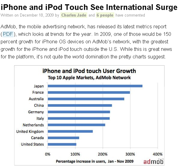
There are quite a few tools to create charts on the net. Despite this, the de facto standard is still a screenshot of Excel, a solution which is even used by the most reputable blogs.

excelinblog

This is taken from http://theappleblog.com/2009/12/18/iphone-and-ipod-touch-see-international-surge/

But alas, Excel is not fit for web publishing. First, you have to rely on Excel’s choice of colours and fonts, which won’t necessarily agree to those of your website. Second, you can’t control key characteristics of your output, such as its dimensions. And if your chart has to be resized, it will get pixelated. Clearly, there is a better way to do this.

That's a detail of the chart on the link I showed above. The letters and the data bars are not as crisp as they could have been.

That's a detail of the chart on the link I showed above. The letters and the data bars are not as crisp as they could have been.

How about interactive charts?

Then again, the most sensible way to present a chart on the web is by making it interactive. And there is no shortage of tools for that. But there are just as many issues.
Some come from the content management system or blogging environment. Many CMS don’t allow you to use javascript and/or java and/or flash. So you’ll have to use a technology which is tolerated by your system.

Most javascript charting solutions rely on the <CANVAS> element.  Canvas is supported by most major browsers, with the exception of the Internet Explorer family. IE users still represent roughly 40% of the internet, but much more in the case of my OECD blog, so I can’t afford to use a non-IE friendly solution. There is at least one library which works well with IE, RaphaelJS.
Using java cause two problems. First, the hiccup caused by the plug-in loading is enough to discourage some users. Second, it may not be understood well by readers:

This is how one of my post reads in google reader.

This is how one of my posts reads in google reader.

And it’s futile to believe that readers will read blogs from their home pages. So if all readers can’t show it well it’s a show-stopper.

A tool to create good bitmap charts

So, in a variety of situations the good old bitmap image is still the most appropriate thing to post. That’s why I created my own tools with Processing.

plotter windows

plotter mac OS X

plotter linux

Here’s how it works.

when you unzip the files, you have a file called “mychart.txt” which is a set of parameters. Edit the file according to the instructions in “instructions.txt” to your liking, then launch the tool (plotter application). It will generate an image, called “mychart.png”.

The zip files contain the source code, which is also found here on my openprocessing account.

With my tools, I wanted to address two things. First, I wanted to be able to create a chart and to have a precise control of all of its components, especially the size. In Excel, by contrast, it’s difficult to control the size of the plotting area, or the placement of the title – all of this things are done automatically and are difficult to correct (when it’s possible). Second, I wanted to be able to create functional thumbnails.

If you have to create smaller versions of a chart from a bigger image, the easiest solution is to resize the chart using an image editing software. But that’s what you’d get:

That's the original chart.

That's the original chart.

And that's the resized version. Legible? nah.

And that's the resized version. Legible? nah.

But what if it were just as easy to re-render the chart in a smaller size, than to resize it with an external program? My tool can do that, too.

Left: resized, right: re-rendered.

Left: resized, right: re-rendered.

Here’s a gallery of various charts done with the tool. The tool supports: line charts, bar charts (both stacked and clustered), dots charts and area charts. No pie charts included. It’s best suited for simple charts with few series and relatively few data points.

Impact of energy subsidies on CO2 emissions

Impact of energy subsidies on CO2 emissions

Temperature and emission forecasts

Temperature and emission forecasts

Greenhouse gas emission projections

Greenhouse gas emission projections

I hope you find it useful, tell me if you do and let me know if you find bugs.


New data services 2: Wolfram|alpha

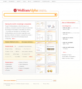
In March this year, überscientist Stephen Wolfram, of Mathematica fame, revealed the world he was working on something new, something big, something different. The first time I heard of this was through semantic web prophet Nova Spivack, who is not known to get excited by less-than-revolutionary projects. That, plus the fact that the project was announced so short before its release, contributed to build anticipation to huge levels.

wolframalpha

Wolfram|alpha describes itself as a “computational knowledge engine” or, simply put, as an “answer engine”. Like google and search engines, it tries to provide information based on a query. But while search engines simply try to retrieve the keywords of the query in their indexed pages, the answer engine tries to understand the query as a question and forms an educated answer. In a sense, this is similar to the freebase project, which is to put all the knowledge of a world in a database where links could be established across items.

It attempts to detect the nature of each of the word of the query. Is that a city? a mathematic formula? foodstuff? an economic variable? Once it understands the terms of the query, it gives the user all the data it can to answer.

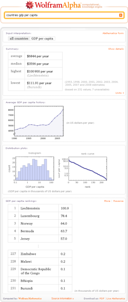
Here for instance:

wolframalpha-2

Using the same find access process present share diagram as before,

Wolfram|alpha’s got “find” covered. More about that below.

It lets you access the data. If data have been used to produce a chart, then there is a query that will retrieve those bare numbers in a table format.

Process is perhaps Wolfram|Alpha’s forte. It will internally reformulate and cook your query to produce all meaningful outputs in its capacity.

The presentation is excellent. It is very legible, consistent across the site, efficient and unpretentious. When charts are provided which is often, the charts are small but both relevant and informative, only the necessary data are plotted. This is unusual enough to be worth mentioning.

Wolfram|alpha doesn’t allow people to share its outputs per se, but since a given query will produce consistent results, users can simply exchange queries or communicate links to a successful query result.

Now back to finding data.

When a user submits a query, the engine does not query external sources of data in real time. Rather, it used its internal, freebase-like database. This, in turn, is updated by external sources when possible.

For each query, sources are available. Unfortunately, the data sources provided are for the general categories. For instance, for all the country-related informations, the listed sources are the same, and some are accurate and dependable (national or international statistical offices), some are less reliable or verifiable (such as the CIA world factbook or what’s cited as Wolfram|Alpha curated data, 2009.). And to me that’s the big flaw of this otherwise impressive system.

Granted, coverage is not perfect. That can only improve. Syntax is not always intuitive – to make some results appear in a particular way can be very elusive. But this, as well, will get gradually better over time. But to be able to verify the data presented, or not, is a huge difference – either it is possible or not. I’m really looking forward to this.


New data services 1: Google’s public data

Google’s public data has been launched somewhat unexpectedly at the end of April 2009.

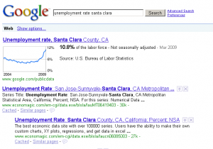
The principle is as follows. When someone enters a search query that could be interpreted as a time series, Google displays a line graph of this time series before other results. Click on it, and you can do some more things with the chart.

googlepublicdata1

The name public data can seem ambiguous.

Public, in one sense, refers to official, government-produced statistics. But, for content, public is also the opposite of copyrighted. And here, a little bit of digging reveals that it’s clearly the latter sense. If you want this service to point to your data, it must be copyright-free.

I’ve seen Hans Rosling (of Gapminder fame, now Google’s data guru) deliver a few speeches to national statisticians to which he expressed all the difficulties he had to access their data, and battle with formatting or copyright issues. So I can understand where this is coming from. However. Imagine the outcry if google.com decided to stop indexing websites which were not in the public domain!

Remember my find > access > process > present > share diagram?

I’d expect that google will solve the find problem. After all, they’re search people. But they don’t! You’d find a time series if you enter its exact name in google. There is no such thing (yet, as I imagine it would be easy to fix) as a list of their datasets.

They don’t tackle the access problem either. Once you see the visualizations, you’re not any step closer to actually getting the  data. You can see them, point by point, by mousing over the chart. I was also disappointed by the inaccuracy of the citation of their datasets. I’d have imagined that they’d provide a direct link to their sources, but they only state which agency produced the dataset. And finding a dataset from an agency is not a trivial matter.

They don’t deal with process, but who will hold that against them? Now what they offer is a very nice, very crisp representation of data (presenting data). I was impressed how legible the interface remained with many data series on the screen, while respecting Google’s look and feel and colour code.

Finally, it is also possible to share charts. Or rather, you can have a link to an image generated by google’s chart API, which is more than decent. A link to this static image, and a link to the chart on google’s public data service, and that’s all you should need (except, obviously, a link to the data proper!)

Another issue comes from the selection of the data sets proper.

One of the datasets is the unemployment rates, which are available monthly and by USA county. Now I can understand the rationale to match a google query of “unemployment rates” to that specific dataset. But there are really many unemployment rates, depending on what you divide by what. (are we counting unemployed people? unemployed jobseekers? which definition of unemployment are we using – ILO’s, or the BLS’s? and against what is the rate calculated – total population? population of working age? total labour force?) But how could that work if you expand the system to another country? To obtain the same level of granularity (to a very narrow geographic location, to a period of a month) would require some serious cooking of the data, so you can’t have granularity, comparability and accuracy.

I don’t think the system is sustainable. I don’t like the idea that it gives the impression to people that economic statistics can be measured in real time at any level, just like web usage statistics for instance. They can’t be just observed, they’re calculated by people.

Google public data is still in its infancy. To have a usable list of the datasets, for instance, would alleviate much of my negarive comments on the system. But for the time being, I’m not happy with the orientation they’ve chosen.


Gerry McGovern paid us a visit

And he gave us a talk about the internet in general. While I enjoyed the talk in general, there were some ideas which I really liked and some with which I’d adamantly disagree.

Here goes.

The task-centric internet.
That’s the main theory. We went from a tool-centric internet to a content-centric internet. Now the web is (or should be) task-centric, that is focused around what people who come to your web site want to do. All the rest is clutter.

I’m not too convinced about that. I like the idea of helping visitors achieve what they want to do, right from the homepage and without hassle. Now in a web site design, you should also consider what you want your visitors to do. Yes the choices a visitor faces should be kept to a minimum. But in my opinion it is ok to orient those choices. It is ok to send a message to tell your visitors about something they were not necessarily looking for, but which may be of interest to them.

Navigation should help people, not reflect the brand.
I mostly agree with that. This echoes what Jakob Nielsen says about links, which should look like links, i.e. in blue and underlined, with a different color for visited links. Now Nielsen is more subtle about this than McGovern was. Navigation links, menu options etc. are seldom underlined and this is generally for the best.

In your text, use words that people search for.
The two examples he gave were “low fares” vs. “cheap flights” and “climate change” vs. “global warming”. It turns out that airline companies liked to use “low fares” while customers were rather searching for “cheap flights”. And, in the academic litterature, you’d find more mentions of “climate change” than “global warming”, although, again, people search the latter. So the advice was to use the searched expressions.

While it makes sense in the first case, it’s more questionable for the 2nd. If you write a website for academics, you want to attract the people who searched for “climate change”, not necessarily “global warming”, even if they are more numerous.

Don’t write links in paragraphs.
Huh? While I agree you shouldn’t write a paragraph around a link when the link itself suffice, I don’t see anything wrong with using a link within a paragraph, far from it. When writing for the web, connecting with other resources and websites has many benefits. The rationale he gave was that people are either reading or clicking, hence the paradox. To that I say, not anymore! there are so many things you can do with a link, like opening it in a new tab, bookmarking it or tagging it for future reference, etc.

Keep headings short.
Indeed. There are only advantages to that. It was quite interesting to see him bashing our clippings.

An interesting point he raised was that before the internet, news releases were never meant to be published. Now they are available to the main public, and often redistributed by some e-journalists as is.

Blogging is really a conversation.
Blogging is about exchanging rather than proposing. I really didn’t like that analysis. In my book, unless you have something to say, unless you have substance, no one will want to exchange with you. You just can’t run a blog saying, ok you guys tell me what I should write about. Protagonists won’t materialize out of thin air. There are quite a few successful blogs without comments. In my view, comments are a side effect of blogging rather than its essence.

Update your content frequently.
Some content has a shorter time span than other. He showed us great examples of that on our own website. Basically, everything you’d write in the future tense is soon outdated. There’s some content, however, that in my opinion can stay online for a while.

Monitor your content and take it out when needed.
That was a very interesting point. When you hear something like that, anyone’s reaction would be to say, my site is already huge, so I need extra resources to monitor my content. His approach is the opposite. He says that you should only build a site so big that you can monitor it with your current resources. If your web site is too big, you should downsize it. And in fact, most organizations are taking large chunks of their public web site offline!


Junk charts

The enemy.

I’d like to write a few words about blogs I read regularly and to start this series, I am happy to talk about Junk Charts. 

Junk Charts is the one-man crusade of Kaiser Fung against ineffective charts, who has been working on the blog since 2005. Kaiser is a convinced follower of Tufte, whom he owes his blog’s name. Tufte describes chart junk as whatever clutters graphs and obscures information contained in the chart data. 

To this end, Kaiser collects ineffective, misleading or just plain wrong graphs and redraws them according to sound principles. He fights a current trend that gives too much emphasis on the aesthetics of a published graph, to the expense of its meaning. 

He is now assisted by readers who gladly submit candidates for redesign. I am grateful that no OECD chart ever had the honors of Junk Charts, although a couple of charts which were direct copies of ours have been featured, such as this one.

In 3 years, Junk Charts has amassed quite a diverse community of readers, and posts are always followed by a healthy discussion – just what blogging is about. I have found great tips and ideas both in the articles and the comments.

So thank you Kaiser for Junk Charts and I am always looking forward to the next post!