Making my 2015 new year cards

Getting the data

For this year’s greeting cards I had decided to take a radical turn from my previous 2 greeting cards projects which were entirely based on data from interaction with whomever was getting the card and just focus on creating something closer to generative art. I decided to use people’s names as the basis of the shape I would use. The other departure I took from my previous project is that I wanted to send physical cards. I also like the idea of the cards being a surprise, so I didn’t want to tell people “hey, I’m going to generate a card from your name. Can you give me your address?” Instead, I set up a google form and asked people several questions.

What is their name (obviously)? What is their address? How long have they lived here? What is their home town? Where were they born? What is their birthday? and finally, I gave them the chance to write whatever they want.

While I always thought I would only use name + address to create the cards, I also wanted to make a visualization on the ensemble of people who would fill my form, and among other things I thought of a map of where my friends are versus where they are from.

I sent about 300 messages asking people to fill the form, and got about 100 replies. The form was also a way to commit to do that project… Because I proposed to so many people to get a card, there was no way I could back off afterwards 🙂 whereas if I had just created something online and sent it via mail, I could have definitely stopped mid-way.

Layer as tiles

I was pretty much set on creating cards as a layer of tiles from the get go. Each word in a person’s name could be a layer, and each letter could be an attribute. Attributes could change things like patterns, colors, size, orientation, all kind of things! Eventually I decided to use the 5 first letters of people’s names, and only use 2 layers, even if the person’s first name (or last name) is composed of two or more words.

When designing patterns, I wanted something that could tile on a card. Squares, while not the only possibility, were the easiest. So I started to come up with many patterns that could be placed on squares and that would tile (ie the right of one pattern would connect with its left end, and the top to its bottom). I decided (arbitrarily) that both the height and width would scale together, as opposed to vary independently (turning the squares into rectangles). Also, I wanted two colors per layer, but one would be more prominently used than the other. Finally, I allowed the layers to be rotated as opposed to be necessarily strictly parallel to the borders of the card.

Since words are made of letters, I went for simplicity. There would be 5 attributes (pattern, main color, secondary color, scale and orientation), and for each one, each of the 26 possible letters corresponded to one value. And while there were “only” 26 possible patterns, I experimented much much more – possibly 100 or so.

Letters as patterns

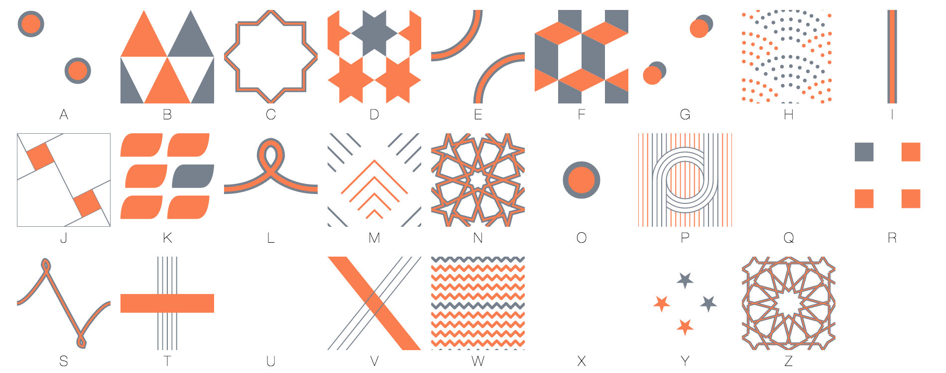
My patterns fell in several categories. There were very simple geometric shapes (A, G, I, O, R). Some were hand-drawn (L and S). Some were more sophisticated geometric shapes (B, D, E, F, H, J, K, M, P, V, W, Y). Finally, some were inspired by islamic art (C, N, Z).

Finally, there are some letters I didn’t assign patterns to, because there was just no name starting with those letters in my dataset 🙂 (Q, U and X).

In my explorations / experimentations one thing I kept in mind was the weight of the pattern. The M, or the O, for instance, are really light. But the K or the F are heavier. I tend to attribute the lighter patterns to letters that started first names, while giving the heavier patterns to letters that mostly started last names (and were in the back).

Pinterest was a great source of inspiration for patterns. At some point in the process I really wanted to use islamic patterns. I have a couple of books on the subject and I always really liked their look and feel, their “tileliness” and also that they are built with ruler and compass. Many of these patterns, even if very intricate, can easily be reproduced with computers (ie, drawing an hexagon requires using a compass 7 times, but with a computer all you need to do is compute the cosine and sine of 6 points and link them). And I thought there was beauty in the process of building them. So I created an ‘islamic pattern builder” as a side project – which will get its own blog post.

Here is a slightly modified card maker compared to the one I used (it only exports a card in 600×1080 as opposed to 1875 x 3375)

Wrapping it up

Eventually I put together the cards. Minor setback – I don’t have a color printer at home, so I would have to have the cards printed. Since I had to use a vendor anyway, I thought I might as well look for someone who could also send them, and that’s how I ended up choosing lob.com. Lob.com allowed me to send 6×11″ cards which seemed cool (although, to be honest, I didn’t have a good sense of how big that was) and took as input 300 dpi png bitmaps. So I had to create 3375 x 1875 images, that’s up to 10 Mb per card! I initially hesitated between creating my cards with d3 and processing and chose d3 because it was easier for me to manipulate shapes using svg. I soon regretted that decision because exporting large bitmaps is not easy from the browser. Chrome won’t let you do that – exporting a png over a certain size (I think 2.56mb) will crash it. So my way around it was to export it as webp, chrome’s preferred compression format (which was with one exception always below its threshold) and then, convert them to png. Then, we ran into some unexpected issues and delays 🙂 but eventually all the cards were sent and people are telling me that they are getting them 🙂

Making the ensemble visualization

I always intended to show things about all the cards. But I also wanted to keep all the information that had been shared with me private. I made the front side of the cards public in a pinterest board but it would be really difficult to reverse engineer them to come up with a name. I made a map, by geocoding all the information I was given, but I also clustered all of the addresses and rounded all geocoding, so it’s not possible to go from one of the pixels of the map (or the data file) to an actual address.

I also contributed the visualization I had made to show the distribution of names and initials.

I was conflicted about whether using what people shared with me in the free text section of my form. On one hand, I wanted to find a way to show it, but on the other, showing even fractions of a phrase would challenge the confidentiality of what was written. But still, I wanted to restitute what I was given. Some of the text that was sent to me was really awesome. So I opted for a word cloud kind of setting. This is the first time since word clouds have gained mainstream acceptance that I used one 🙂 I thought it was appropriate – I’d show only words, not phrases. Also the aesthetics was interesting – with only 2 angles (0 or 30 degrees) and a cool set of colors. I’m using Jason Davies wordcloud generator for d3.

And there you have it – here’s the final visualization.


Charts, assemble!

From the past posts, you would have gathered that dashboards are tools to solve specific problems. They are also formed from individual charts and data elements.

Selecting information

That dashboards are so specific is great, because the problem that they are designed to solve will help choosing the information that we need and also prioritizing it – two essential tasks in dashboard creation. Again, we don’t want to shove every data point we have.

Another great tool to help us do those two tasks is user research. As a designer, we may think we chose the right metrics, but they have to make sense to real users and resonate with them. The bias that we may have is that we would favor data which is easy to obtain or that makes sense to us, compared to data which can be more elaborate, more sophisticated or more expensive to collect or compute, even if that makes more sense to the user.

Here’s an illustration of that.

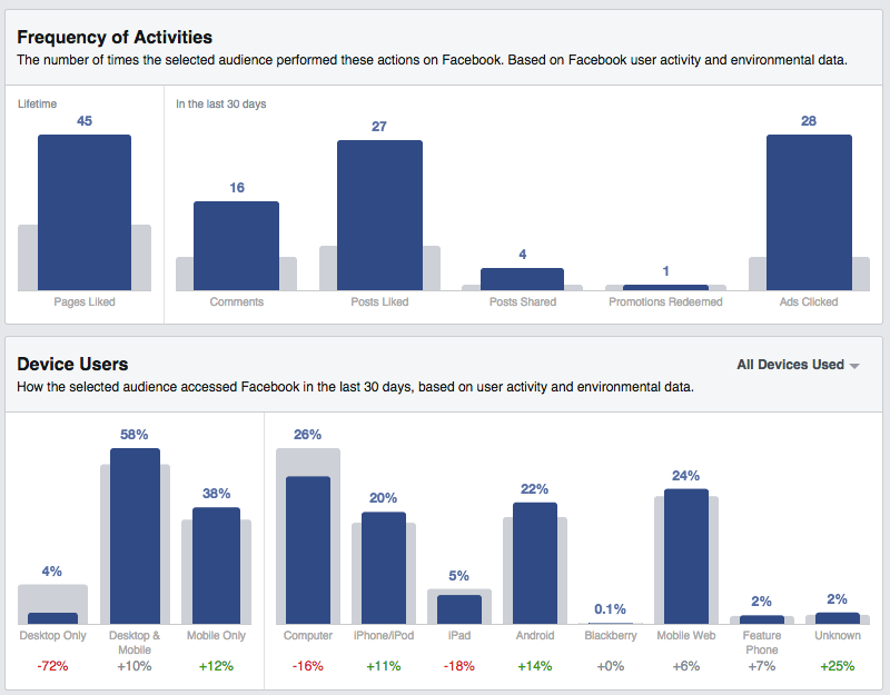
When I was working at Facebook on this product, Audience Insights, we designed this page to help marketers understand how a group of users they could be interested in used Facebook. (The link / screenshot showcases fans of the Golden State Warriors). One of the main ways we classified users at Facebook, for internal purposes, is by counting how many days of the last four weeks they have been on Facebook. It’s a metric called L28 and one of the high-level things Facebook knows about everyone. So, we integrated it in the first version of this page. But, even though it’s not a concept unique to Facebook, it wasn’t that useful to our users, and it was taking space from a more relevant indicator.

Instead, we have included indicators which are more relevant to the task at hand (ie getting a sense of who those users are through the prism of their activity). For instance we can see that very few Warriors fans only use Facebook on their computer, compared to the general population of US Facebook users. They tend to skew more towards Android and mobile web (going to www.facebook.com from their phone, versus using an app.) They tend to be more active in terms of likes, comments and shares.

Information hierarchy

Once information is chosen and you get a sense of what is more important than the rest, it’s time to represent that visually.

Here are some of the choices you can make.

Show some metrics on top or bigger than others

That’s probably the first thing that comes to mind when thinking hierarchy and prioritization. And it needs to be done! Typically, you should get one to three variables that really represent the most important thing you want your users to read or remember. If you come up with more than 3, you should refine your question/task and possibly split it in two.

The rest of the variables will support these very high level metrics. Again, in a typical situation, you could come up with up to three levels of data (with more than three being a good indication to rethink your scope). Some metrics can support the high-level metrics (i.e. show them with a different angle, or explain them) and some metrics could in turn support them.

Present some metrics together

Stephen Few argues that dashboards should fit on one page or one screen because their virtue is to present information together. With the flexibility offered by the modern web, and the size constraints of mobile, this is a requirement that shouldn’t be absolute. But it’s relevant to remember that some variables add value when seen along other variables. With that in mind, you can have part of your dashboard as a fixed element (always visible on screen) while the rest can scroll away, for instance.

Push some metrics to secondary cards (such mouseovers, pop-ups or drill-down views)

Hierarchizing information is not just about promoting important information. It’s also about demoting information which, while is useful in its own right, doesn’t deserve to steal the show from the higher level metric. The great thing about interactive dashboards is that there are many mechanisms for that. Some information can be kept as “details on demand” and only shown when needed.

Figure out what form to give to the data

So you have data. It probably changes over time, too (and you have that history as well!). And a sense of how important it is.

You can represent it as a static number (and, further, to adjust the precision of that number) or as a time series (i.e. line graph, area graph, bar graph etc.), or both.

The key question to answer is whether the history and how the metric moved over time is relevant and important, versus the latest figures.  If you think that the history is always important or that it doesn’t hurt to have it for context anyway, consider that it’s yet another visual element to digest, another thing that can be misinterpreted, and that unless its importance is clearly demonstrated, you’d rather not include it. Yes – even as a tiny sparkline.

Here is another example from my work at Facebook of a page where proper hierarchy has been applied.

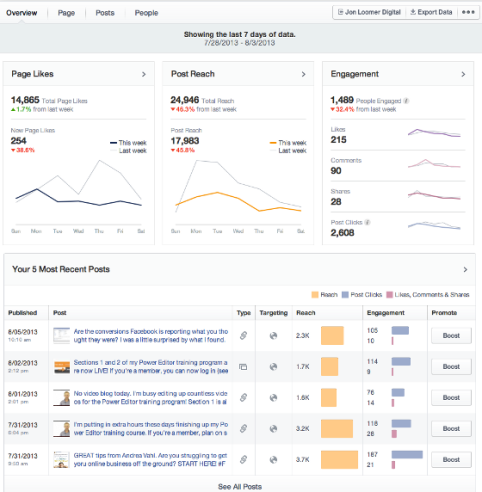
Page Insights, to use a parallel with a better known product, is like google analytics, only for Facebook Pages instead of web sites. Unsurprisingly, the metric we put to the top left is the Page Likes, which is the number of people who like a page. The whole point of the system is to let people understand what affects that number and how to grow it. Two other high-level metrics are shown on the same row in the two cards on the right: the Post Reach for the week (number of people who have seen content from this page this week, whether they like the Page or not) and Engagement (number of people who acted on the content – actions could be liking, commenting, sharing, clicking, etc.)

The number of new Page Likes of the past week, which is represented as a both a line chart and a number in the left card, is an example of a level two metric. It supports the top metric – total likes. The number of Page Likes of the past week, which is represented as a line chart only, is a level three metric. It’s here just as a comparison to the number of the current week – here, it helps us figuring out that last week has been a better week.

Connecting the dots

Ultimately, a dashboard is more than a collection of charts. It’s an ensemble: charts and data are meant to be consumed as a whole, with an order and a structure. Charts that belong together should be seen together. The information gained like so will be much more useful than from looking at them in sequence.

Linking, for instance, is the concept of highlighting an element in a given chart with repercussions on other charts, depending on the element highlighted. A common use case is to look at a data for one given time point, and see the value for that time point highlighted in related charts. Here is an example:

In this specific case, the fact that both charts share the same x-axis makes comparing the shape of both charts easier even without linking.

Each variable doesn’t have to be on its own chart. Your variables can have an implicit relation between one another. Bringing them together might make that relation explicit. Here are some interesting relationship between variables or properties of variables that can be made apparent through the right chart choice.

  • One variable could be always greater than another one, because the second is a subset of the first. Here are some examples:
  1. The number of visits on a website last week will always be greater or equal than the number of unique visitors that week, which will always be greater than the number of visitors last day.
  2. The number of visitors will always be greater to the number of first-time visitors.
  3. The cumulative number of orders over a period of time will always be greater than the number of daily orders over that same period.
  4. The time that users spend with a website in an active window of their browser will always be greater than the time they spend actively interacting with the site.

What’s interesting here is that these relations are not just true because of experience, they are true by definition. It’s also metrics that are expressed in the same units, and, in most cases, with the same order of magnitude, so they can be displayed on the same chart. When applicable, showing them together can show how they, indeed, move together or not.

  • One variable could be the sum of two other, less important variables.

In the example below we go even one step further and we show that one variable is the sum of two variables minus a fourth one.
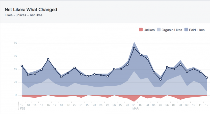
Here, we look at the net likes of a Facebook Page, that is, the difference between the number of people who like a page on a given day and the day before.
Two factors can make more people like a page: paid likes (a user sees an ad, is interested, and from it, likes the page) or organic likes (a user visits a page, or somehow see content from that page, and likes it, without advertisement involved). Finally, people may also decide to stop liking the page (“unlikes”).
Here, net likes = organic likes + paid likes – unlikes. The reason why we have decomposed Likes between organic and paid is because we wanted to show that ads can amplify the effect of good content. So, visually, we chose to represent that as a layer on top of the rest. (important remark: your dashboard doesn’t have to be neutral. If it can show that your product, company, team etc. is delivering, and you have an occasion to demonstrate it, don’t hesitate a moment). By showing the unlikes as a negative number, as opposed to a positive variable, going up, possibly above the likes (which would be unpredictable) we can keep the visual legible and uncluttered. A user can do the visual combination of all these variables. This chart, by the way, shows the typical dynamic of a Page : new content will generate peaks of new users, but also will cause some users to stop liking the page.

  • One variable could be always growing. Or always positive.

When that is the case this can be used to make choices to represent the chart. If a variable is always growing by nature (i.e. cumulative revenue) you may want to consider representing a growth rate rather than the raw numbers. A reason to consider that is that your axis scale will have to change over time (i.e. if you plot a product that sells for around $1m per day, having an axis that goes from 0 to $10m would be enough for a week, but not for a month let alone for a year, whereas with a growth rate you can represent a long period of time consistently). And if a variable is always positive (ie stock price), your y axis can start at 0, or even at an arbitrary positive value, as opposed to allocate space for negative values.

Conversely, if a variable doesn’t change over time, it doesn’t mean that it’s not interesting to plot. That absence of change could be a sign of health of the system (which is the kind of task that dashboards can be useful for). So the absence of change doesn’t mean that there’s an absence of message.


Dashboards as products

In the past few articles I’ve exposed what dashboards are not:

  • an exercise in visual design,
  • an exercise in data visualization technique.

Another way to put this is that “let’s do this just because we can” is a poor mantra when it comes to designing dashboards, or visualizations in the broader sense by the way.

Do it for the users

Now saying that dashboards should be products is a bit tautological. Products, in product design, refer to the result of a holistic process that solves problems of users – a process that includes research, conception, exploration, implementation and testing.

Most importantly, it’s about putting the needs of your users first. And your users first. Interestingly, treating your dashboard as a product means that the dashboard – your product – doesn’t come first.

Creating an awesome dashboard is a paradox. Googling for that phrase yields results such as: 20+ Awesome Dashboard Designs That Will Inspire You25 Innovative Dashboard Concepts and Designs24 beautifully-designed web dashboards that data geeks or 25 Visually Stunning App Dashboard Design Concepts. This is NOT dashboard product design (though it’s a good source of inspiration for visual design of individual charts).

Eventually, no one cares for your dashboard. When designing a dashboard, it’s nice to think that somebody out there will now spend one hour everyday looking at all this information nicely collected and beautifully arranged, but who would want to do that? Who would want to add to their already busy day an extra task, just to look at information the way you decided to organize it? This point of view is a delusion. We must not work accordingly.

Instead, let’s focus on the task at hand. What is something that your users would try to accomplish that could be supported by data and insights?

What is the task at hand?

If you start to think “show something at the weekly meeting” or “make a high-level dashboard” I invite you to go deeper. Show what? a dashboard for what? not for its own sake.

Trickier – how about: “to showcase the data that we have”? That is still not good enough. You shouldn’t start from your data to create your dashboard, and for several reasons. Doing so would limit yourself to the data that you have or which is readily available for you. But maybe that this data, in its raw form, is not going to be relevant or useful to your users. Conversely, you would be tempted to include all the data that you have, but each additional information that you bring to your dashboard would make it harder to digest and eventually detrimental to the process. Most importantly, if you don’t have an idea of what the user would want to accomplish with your data, you cannot prioritize and organize it, which is the whole point of dashboard design.

Finally – “to discover insights” is not a task either. Dashboards are a curated way to present data for a certain purpose. They are not unspecified, multi-purpose analytical exploration tools. In other words: dashboards will answer a specific, already formulated question. And they will answer in the best possible way, if they are designed as such. For exploration, ad-hoc analysis is more efficient, and is probably best left to analysts or data scientists than end users.

Here are some example of tasks:

  • check that things are going ok – that there is no preventable disaster going on somewhere. For instance: website is up – visits follow a predictable pattern.
  • Specifically, check that a process had completed in an expected way. For instance: all payments have been cleared.
  • If something goes wrong, troubleshoot it – find the likely cause. For instance: sales were down for this shop… because we ran out of an important product. Order more to fix the problem, make sure to stock accordingly next time.
  • Support a tactical decision. For instance: here are the sales of the new product, here are the costs. Should we keep on selling it or stop?
  • Decide where to allocate resources. For instance: we launched three variations of a product, one is greatly outperforming the other two, let’s run an ad campaign to promote the winner.
  • Try to better understand a complex system. For instance: user flow between pages can show where users are dropping out or where efficiency gains lie.

This list is by no means limitative. But it’s really useful to start from the problem at hand than just try to create a visual repository for data.

Next, we’ll see how to implement these in the last article: charts assemble!


Dashboards versus data visualization

Dashboards are extreme data visualizations

In the recent Information is Beautiful 2014 awards,  I found interesting that there is an infographics and a data visualization categories. My interpretation is that the entries in the infographics section are static and illustrated, while those in the data visualization are generated and data-driven. However, all the featured data visualization projects are about a one-off dataset. So aesthetical choices of the visualization depend on the characteristics of this particular dataset. By contrast, the dashboards I have worked with are about a live, real-time datastream. They have to look good (or at least – to function) whatever the shape and size of the data that they show. The google quote and news chart that we saw earlier must work for super volatile shares, for more stable ones, for indices, currencies, etc. So, if the distinction between infographics and data visualization makes sense to you, imagine that dashboards sit further in that continuum than data visualization. Not only are dashboards generated from data, like data visualizations, but they are also real-time and should function with datasets of many shapes and sizes.

But dashboards problems are not data visualization problems

Data visualization provides superior tools and techniques to present or analyze data. With libraries and languages dedicated to making visualizations, there is little that can’t be done. In many successful visualizations, the author will create an entirely new form, or at least control the form very finely to match their data and their angle. Even without inventing a new form, there are many which have been created for a specific use, and which are relatively easy to make on the web (as opposed to say, in Excel): treemaps, force-directed graphs and other node-link diagrams, chord diagrams, trees, bubble charts and the like. And even good old geographic maps.

In most cases, it is not a good idea to be too clever and have a more advanced form.

Up until mid November 2014, Google Analytics allowed users to view their data using motion charts.

This was really an example of having a hammer and considering all problems as nails. Fortunately, this function disappeared from the latest redesign.

Likewise, on twitter followers dashboard, the treemap might be a bit over the top:

and possibly confusing and not immediately legible to some users. On the other hand, it is economical in terms of space and would probably work in almost every case which are two things that dashboards should be good at. So while I wouldn’t have used it myself I can understand why this decision has been made.

Dashboards are not an exercise in visual design either

A dashboard such as this:

(for which I can’t find the source. I found it on pinterest and was able to trace it to this post but not prior) is well designed visually, it makes proper use of space, colors and type, its charts are simple.

But what good is it? what do I learn, what can I take away from it, what actions can I perform?

Most of the dashboards examples I find on sites like dribbble or beyance (see my Pinterest board) fall into that category: inspiring visual design, probably not real data, no flow, no obvious use.

Dashboards are problems of their own

What makes a dashboard, or any other information-based design successful, is neither the design execution nor the clever infovis technique. Dashboards, eventually, are meant to be useful and to solve a specific problem.

How so? We’ll see in the next article: dashboards as products. 


Charts in the age of the web

In 2008, when I was working at OECD, my job description was that of an editor. That implied I was mostly working on books. I was designing charts, but they were seen as components of books. And this was typical of the era.

So we would create charts like this one:

And it was awesome! (kind of). I mean, we respected all the rules. Look at that nicely labelled y-axis! and all the categories are on the x-axis! the bars are ordered in size, it’s easy to see which has the biggest or smallest value! And with those awesome gridlines, we can lookup values – at least get an order of magnitude.

What we really did though was apply styling to an excel chart (literally).

Print charts vs interactive charts

Origin of rules for print charts

Rules that govern traditional charts (which are many: ask Tufte, Few) make a certain number of assumptions which are interesting to question today.

One is that charts should be designed so that values can be easily looked up (even approximately) from the chart. This is why having labeled axes and gridlines is so useful. This is also why ordering bar charts in value order is nice. With that in mind, it also makes sense that charts like bar charts or area charts, which compare surfaces, be drawn on axes that start at 0.

The other assumption is that a chart will represent the entirety of a dataset that can be shown at a time. We have to come up with ways to make sure that every data point can be represented and remains legible. The chart author has to decide, once and for all, which is the dataset that will be represented, knowing that there will be “no backsies”.

In the same order of thought, the author must decide the form of his chart. If she wants to compare categories, she may go for a bar chart. If she wants to show an evolution over time, for a line chart. And if she wants the user to have exact values, she will choose a table.

And so, when everything else than a table is chosen, we typically don’t show values with all the data points, because adding data labels would burden the chart and make its overall shape harder to make out.

In this framework, it makes sense to think in term of data-ink (the cornerstone of Tuftean concepts): make sure that out of all the ink needed to print the chart (you can tell it’s a print concept already…), as much should go to encode the data as possible, versus anything else.

How about now

However, there is not a single of these reasons which is valid today in the world of web or mobile charts. Data-ink only made sense on paper.

Web charts have many mechanisms to let the user get extra information on a given data point. That can be information that updates on mouseover, callouts and tooltips… This might be less true of mobile in general where the distinction between hovering and clicking is less distinct. But it is definitely possible to obtain more than what is originally displayed. If I want to have an exact value, I shouldn’t have to simply deduce that from the shape of the chart. There can be mechanisms that can deliver that to me on demand.

An example: Google Finance Quote & News

The Google Finance Quote and News chart is a very representative example of a web-native chart. Around since 2006, they provide the price of a given security, along with news for context. While its visual design has probably been topped by other dashboards, what makes it a great example is that it’s publicly available, which is uncommon for business data.

While this chart has gridlines and labelled axes, that is not enough to lookup precise values. However, moving the mouse over the chart allows the user to read a precise value at a given point in time. A blue point appears and the precise value can be read in the top left corner.

One very common data filter in chart is controls that affect the time range: date pickers. By selecting a different time range, we make the chart represent a different slice of the dataset – we effectively filter the dataset so that only the relevant dates are shown. This is in contrast with the traditional printed charts, again, where all of the dataset is shown at once. For instance, we can click on “6m” and we’ll be treated with data from the last 6 months:

Comparing the selected security with others will make the chart show the data in a different mode. This is the same data (plus added series), in the same screen and the same context, but the chart is visually very different:

As to the other two characteristics of web charts I mentioned, data exports and drill downs, they are also featured (but less graphical to show, so I haven’t captured a screenshot for those). There is a link on a left-side column to get the equivalent data (so it is always possible to go beyond what is shown on screen). The little flags with letters in the 3 first screenshots are clickable, and represent relevant news. Clicking them will highlight that article in a right-side column. So it is always possible to get more information.

What does that change?

Everything.

Rules or best practices based on the assumption that data is hard to lookup or to compare are less important. The chart itself has to be legible though. So, for instance, it’s ok to have pie charts or donut charts, as long as the number of categories doesn’t go totally overboard.

Web charts, and dashboards even more so, should focus on only showing relevant data first, then showing it in the most useful and legible way. Again, a noted difference with the print philosophy where as much data as possible should be shown.

How this play out is what we’ll cover in the next articles of the series: Dashboards versus data visualizations.


Dashboards ahoy!

During my time at Facebook, I worked almost exclusively on one problem: dashboards. More specifically, how to present frequently-updated data in the most efficient way to business users. And so today, I am starting a series of blog posts / tutorials about dashboards.

Why talk about dashboards?

Legit questions. Dashboards are so uncool and boring! I could make more advanced tutorials on d3 or canvas or processing (which is also… in the plans). Or update new cool visualizations.

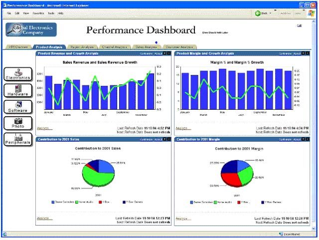
But the interest of discussing dashboards is precisely because they are not cool. In the first part to his Information Dashboard Design, Stephen Few presents a lengthy gallery of terrible dashboards he collected over years. Most of these dashboards exhibit a serious and obvious production flaws: they are often gaudy, using 3d columns or pie charts, when not taking the dashboard metaphor too literally with replicas of gauges and meters. Here’s a typical dashboard from the early 2000s:

In the past 5 years though, these problems have largely been solved. The overall “Graph Design IQ”, to borrow another Stephen Few concept, has greatly increased. People who make charts are increasingly aware that there are some best practices to build them and that there are a variety of forms beyond the core “Excel” chart types such as bar charts, line charts, pie charts and scatterplots. Besides, anyone who had to code a chart from scratch realized that, as opposed to Excel or similar software where users can rely on defaults, every detail of a chart needs decisions: not only how to encode the data (ie bars, lines etc.) but also whether to have gridlines or not and if so how, how to format axes, how to present legends, and so on and so forth. Oftentimes, having to make these decisions implies taking the time to think about these choices which makes the overall chart quality stronger. Also, in products like Tableau (and to be honest in every version of Excel) the default choices are much more robust than they used to be.

Down with the old, up with the new

While these old problems are as good as solved, dashboards are still not awesome because they are plagued with a set of new problems.

First, the rules and best practices for charts that we keep perpetuating were thought for an old world of printed or otherwise static charts,  not the interactive environments such as web or mobile. As such, some recommendations of the 90s have become myths that need to be busted (I’m looking squarely at you, data-ink ratio).

Second, dashboard design is neither a data visualization problem, nor a visual design problem. By this I mean that thinking strictly as a designer or as a data visualization specialist might provide a textbook answer to some well-identified problems that arise with dashboards, but neither of these approaches is optimal.

The not-so-secret secret to dashboards is to apply product thinking. How will people use the dashboard? That should guide what you try to accomplish.

Finally, it’s really critical to realize that dashboards are not collection of individual charts, but an ensemble. Components of a dashboard should not be thought individually but as pieces that fit with one another.

Each of these themes will be the subject of an individual article!

Follow me on Pinterest

On Pinterest, I maintain two dashboard-related boards you may find interesting.

The first is called “Dashboards” (duh) and is examples of complete dashboards, with no judgment on quality, most often found in the wild.

The second, data vis / dashboard UI elements, is centered around lower-level problems such as charts, parts of dashboards and their visual design. Virtually every dashboard example found on a visual design platform like dribbble or beyance is not so much a true dashboard than a collection of individual charts, not that it’s not interesting.


New personal project: slopes of San Francisco

Hi, it’s been a while since I last posted!
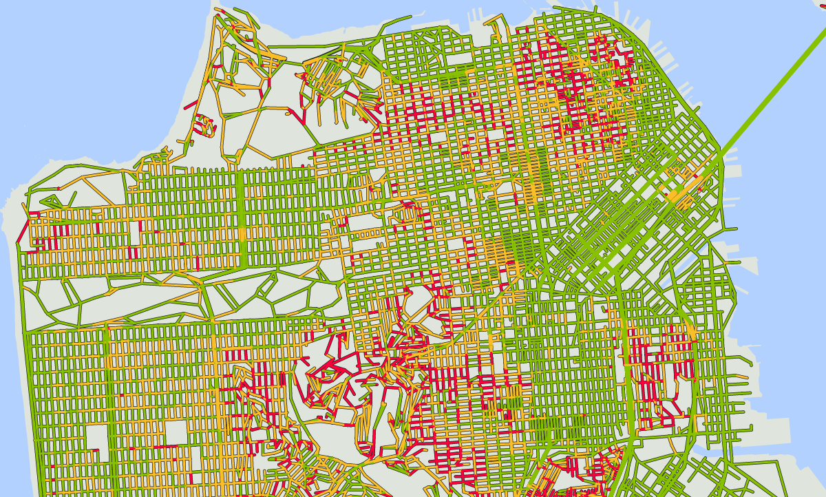
Here is a new project using publicly available data: slopes of San Francisco.

As a San Franciscan who likes to walk, I’m confronted to a common problem. Most cities, such as Paris where I’m from, are mostly flat. So, in order to go one block east and one block north of where I am standing, I can go North then East or East then North: this is mostly equivalent (except that streets never meet at a right angle in Paris but that’s another problem). In San Francisco, going North then East can mean climbing a huge hill then down, versus walking on a flat surface. Itineraries matter, and often times I found myself going through mountains and valleys just because I thought the straight line was the simplest way to go from A to B.

Which is why I wanted to create a map of streets by slope, to help me (and my fellow San Franciscans) figure out which streets are practicable, and which should be avoided.

Here’s how I did it.

Getting the data

To compute slopes, I needed elevation data and the most convenient way to obtain it is through google elevation API. This API takes one or several points (longitude and latitude) and returns an elevation. Now which points was I going to feed it?

I started by the San Francisco metro extract from Open Street Map. What you get is an XML file which has a list of nodes with longitudes and latitudes, and a list of structures that connect them (such as landmass, streets, buildings, etc.). Now the problem was that the file I used had some 1.4m nodes, and Google Elevation API limits are 25000 locations per 24 hour period.

So my first task was to figure out how many of those 1.4m nodes I really needed. Turns out that the metro extract covers much more than the city but also the whole bay area. So my first pass was to filter out nodes that were outside a bounding box. Then, I only kept nodes that were part of a street, and furthermore, only the ones that would be either at the end of one street or at an intersection. By doing so, I’m assuming that all streets are straight between any two intersections, which is far from true, but would do for our purposes. I applied further filtering to weed out streets that were made of just one node. Eventually, I arrived at just over 10000 nodes! and in the process, I also extracted from the XML file the shape of the streets, that is, in which order nodes appeared in those streets. After several iterations in my code, I also scrapped their number of lanes when available and the street names.

Sanity check

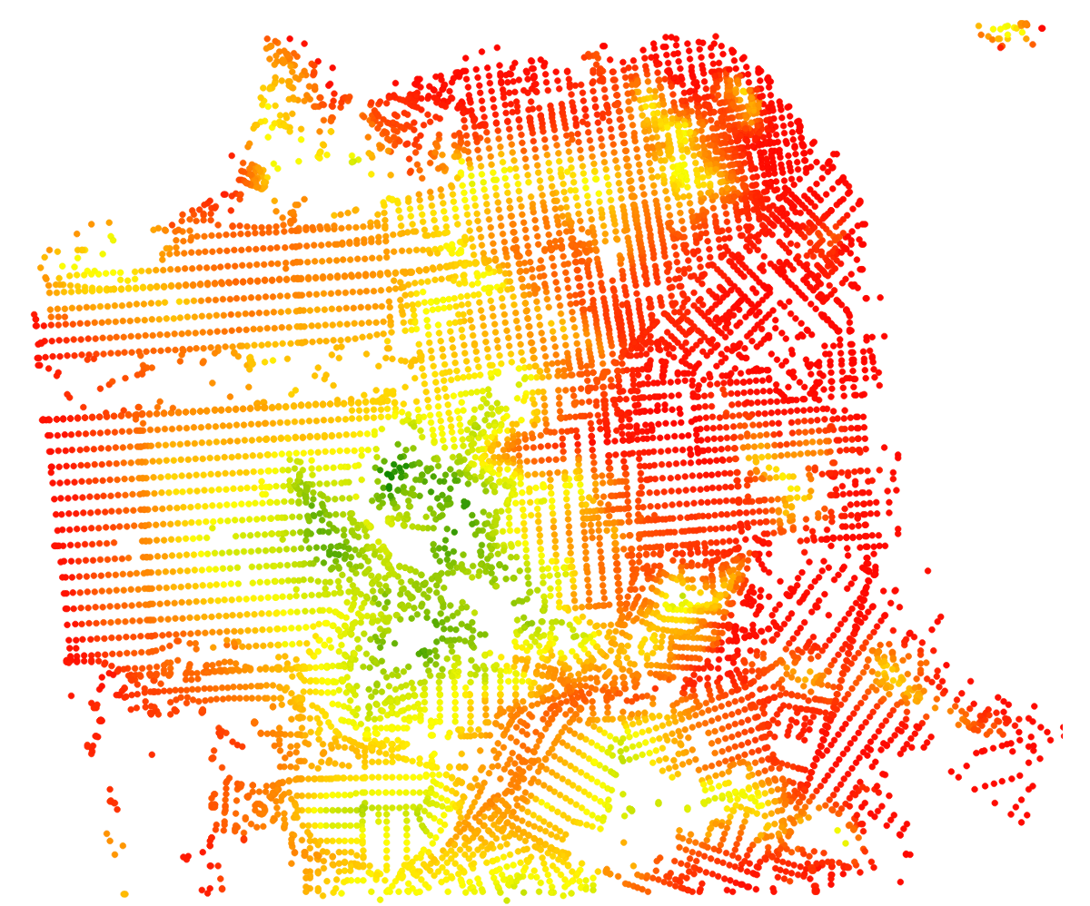
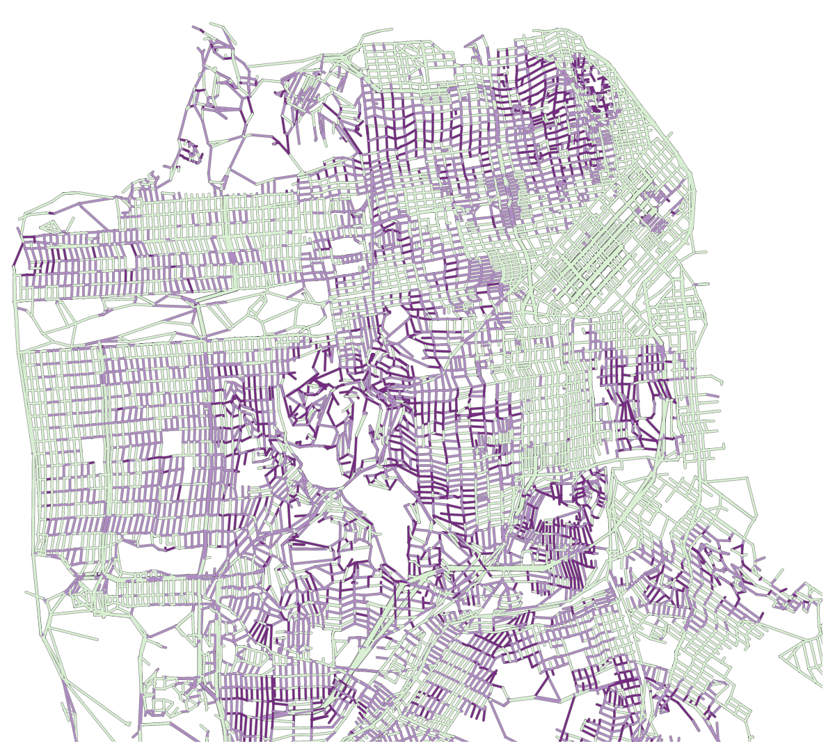
The first thing I did was to plot my nodes on a map.

First draft

First draft

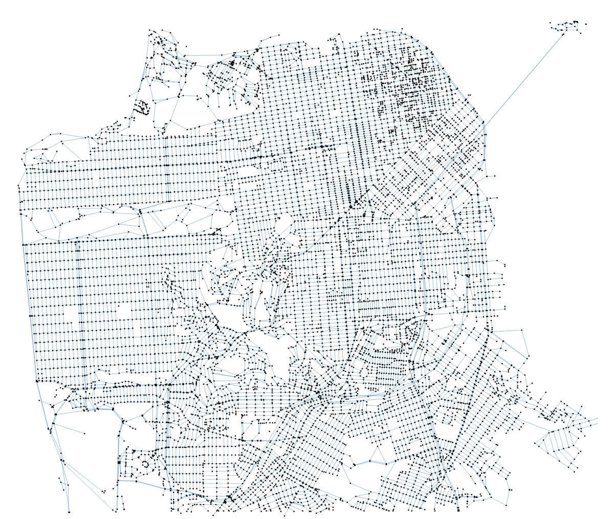
Looks ok. So next, I just drawed my streets. I did that using d3, and each of my streets in this next iteration is a single path object.


First network of streets

First network of streets

So that’s a basic node-and-link mesh of San Francisco, the problem with that approach is that I can only style one street (i.e. the links between the nodes) as a whole. However, what I wanted to highlight was where the streets were steep: many streets just go up and down, so giving them a single “steepness” rating wasn’t going to cut it.

Encoding steepness

Segments of streets

Segments of streets

The next logical step was to draw each of the edges individually (this time, they are lines, not paths). There are 6000+ “streets” (in the OSM sense – streets can be split in any number of different entities in Open Street Map), versus about 16000 different edges. I also found I didn’t really need to draw the nodes.

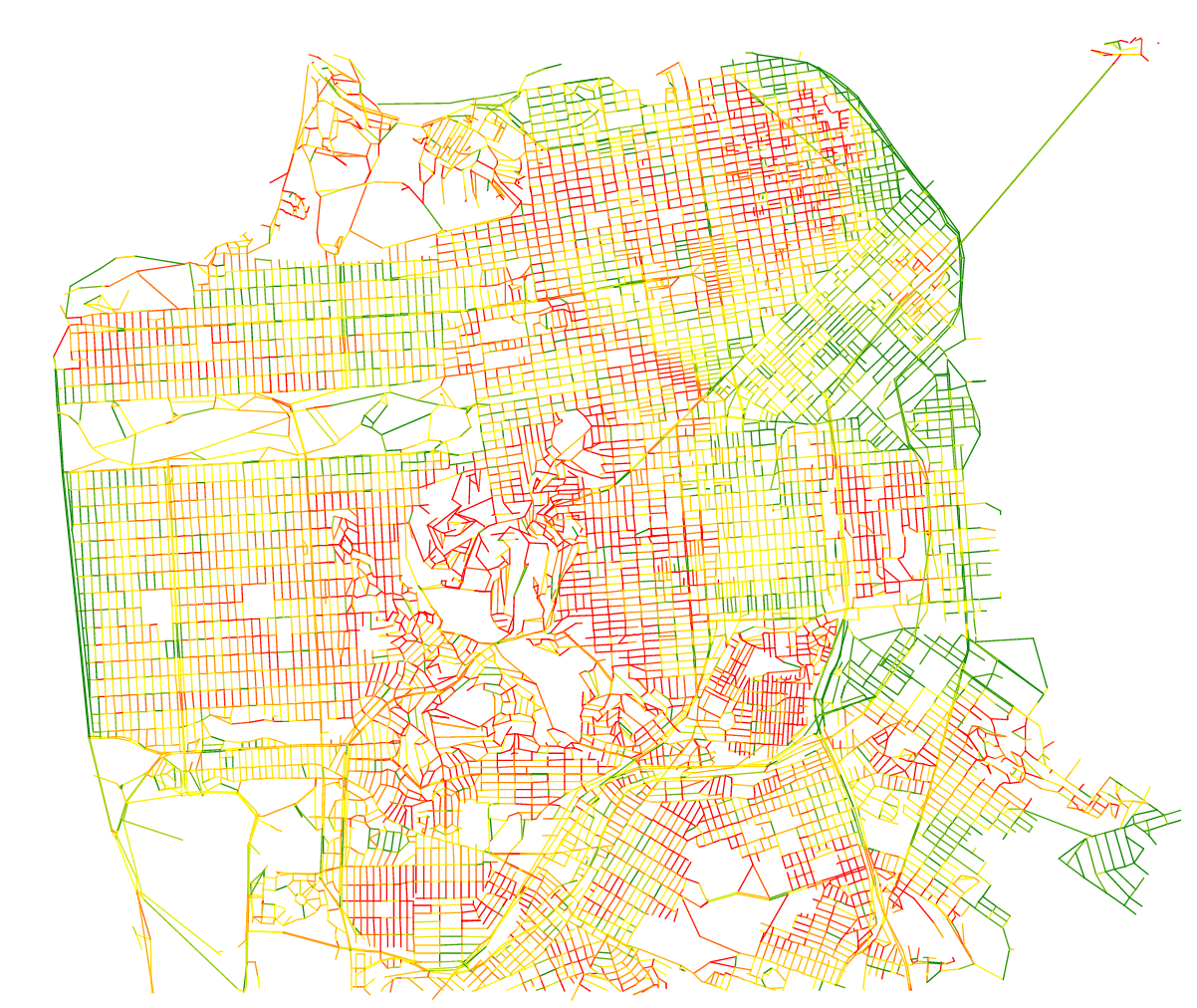
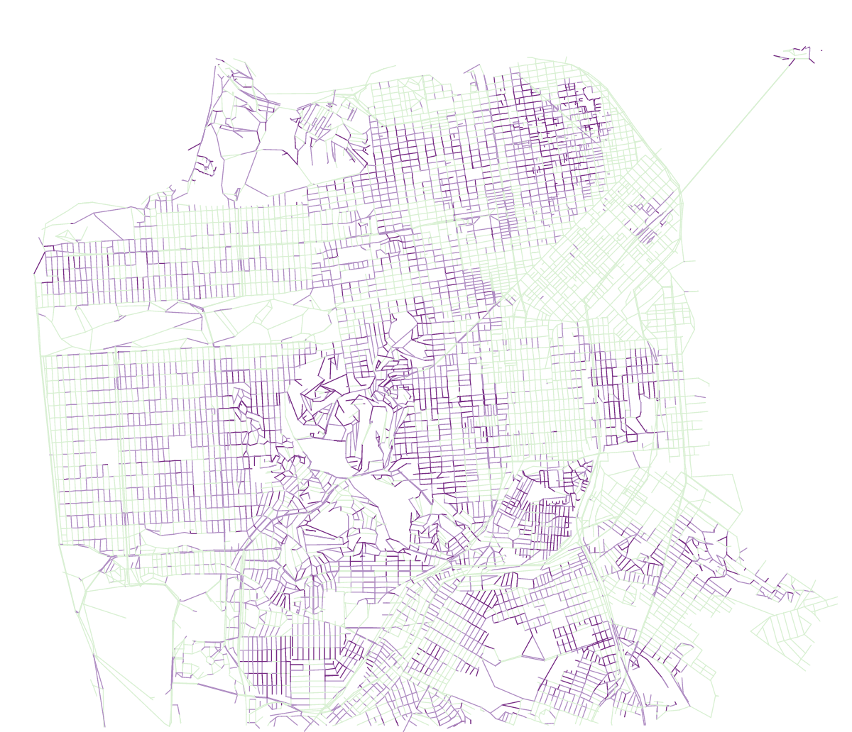
The obvious way was to encode steepness from green to red on a linear scale. That looks ok, but that’s not super interesting because it’s very difficult to tell whether one street is steeper than another just by comparing colors. I didn’t need an infinite variation of colors, I just wanted to know whether a street was flat (or quasi-flat), with a noticeable slope, or really steep. So instead of using a full linear scale, I just used 3 colors from the green – purple colorbrewer scale.

Same map with discrete colors

Same map with discrete colors

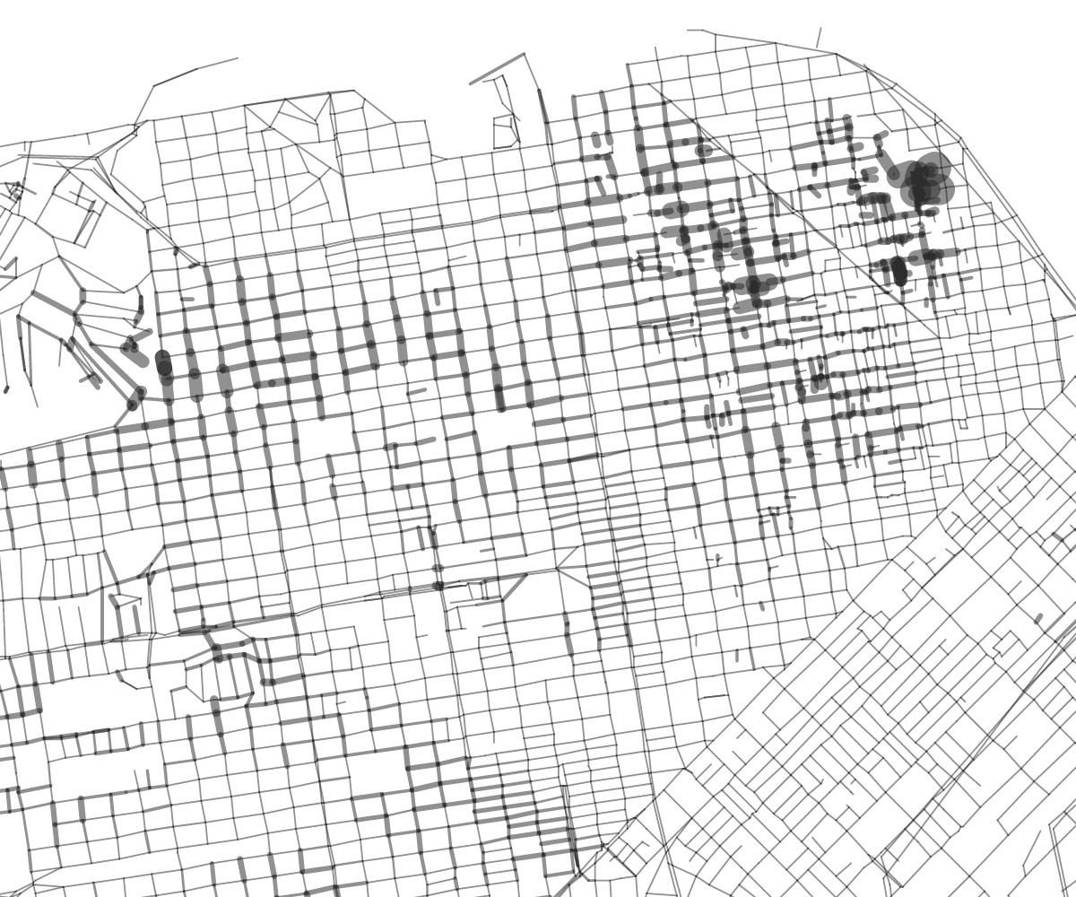
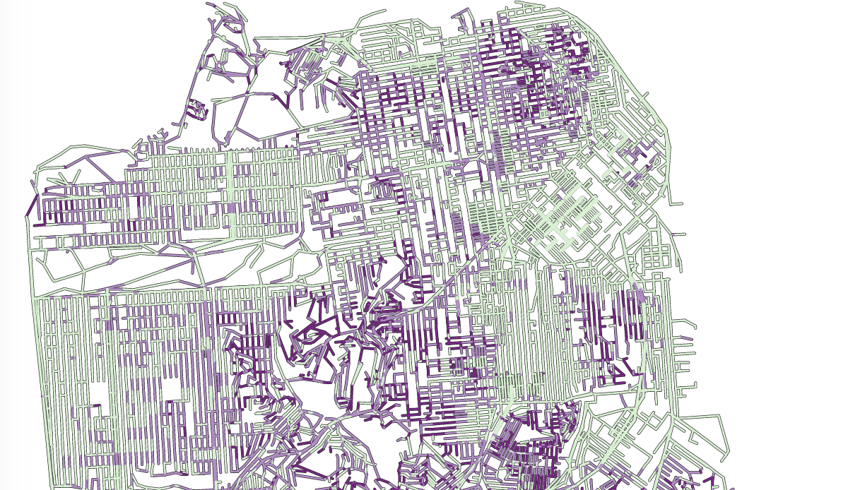
I could see instantly which streets were flat or not, yet wondered if there wasn’t a good simple way to compare between two streets which would be the steepest. Color is no good for that, but how about line width?

Using line width to express steepness

Using line width to express steepness

That was kind of an interesting aesthetics but I found it was difficult to find a precise cross street. When looking on a map of San Francisco, we instinctively look for larger streets like Market or Van Ness and if width was used by something else, it can be confusing. At that moment I didn’t have a good measure of street width, so I went back to my OSM extract and tried to scrap the number of lanes from my dataset.

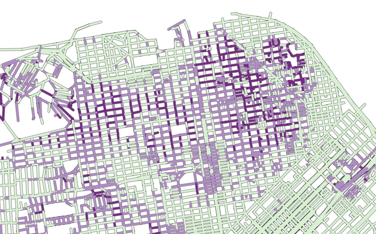
using street widths

using street widths

You will notice that the streets now have an outline. I don’t draw the shape of each block, that would be too difficult given my dataset. Instead, for each street segment, I first draw a dark grey line, then on top of it, a slightly thinner colored line 🙂

Have the map do something

This being a data visualization I thought there could be interesting calculations that could be done with the map. My first intuition was to reuse the ideas of my interactive Paris metro map and make a deformed SF map based on the effort needed to go from one point of the map to everywhere, taking the slopes of the streets into account.

I basically refactored my code which I hadn’t visited in almost two years… and adapted shortest-path algorithms to my network of streets. It confirmed what I feared, that not all of my streets connect. Some streets in the map form tiny islands which are isolated from the rest of the network, and so cannot be reached from outside. I decided not to deal with it, debugging the dataset was really too complicated at this stage (and to be honest the filters I had used to extract the street data had already gone through many, many iterations).

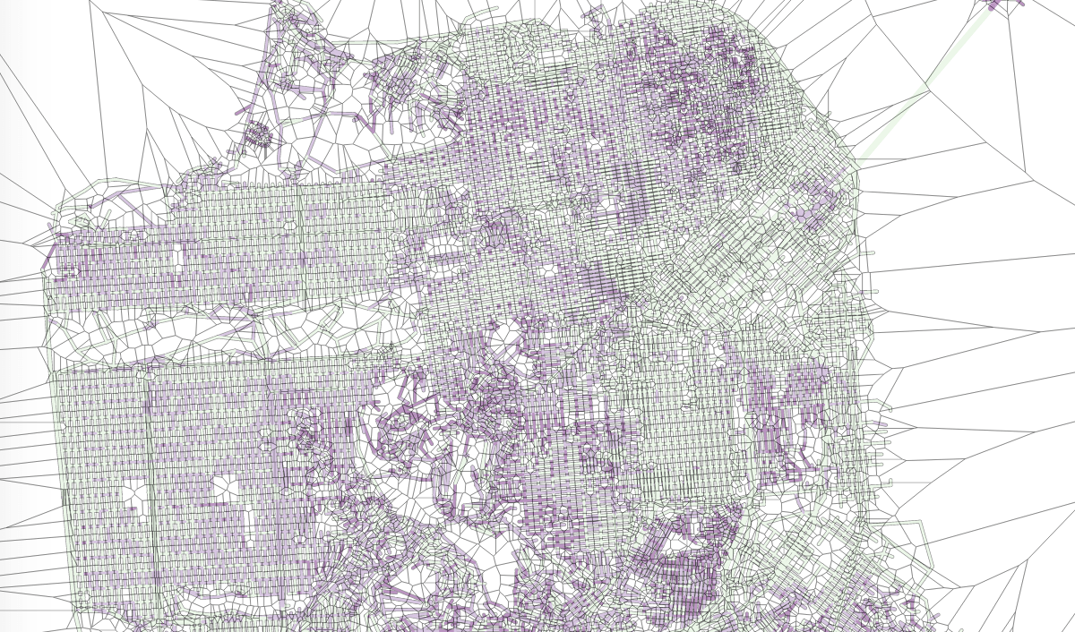
I also used voronoi tessellation to create a layer of polygons on top of my nodes to capture clicks. The user can choose where to base their map, not by clicking on a precise cross street, but in the area around it, like so:

Showing the voronoi layer on top of the map

Showing the voronoi layer on top of the map

However, the results proved to be underwhelming.

Deformed map by effort needed to walk from a given point

Deformed map by effort needed to walk from a given point

All right, so some points are closer, some points are further, but overall it’s not a super interesting map. It’s less legible, and it doesn’t help me figuring out my initial problem: from a given point, which streets should I take to not go up and down?

So I was back to the drawing board. Now with the Dijkstra algorithm which I use to compute the shortest distance from one point to the others in the network, I can also get which path is the shortest, i.e. which is the actual itinerary, edge by edge, that takes me from one point to the others using the shortest path.

Path-finding

So my next idea was to hide all the edges that would not be in a shortest path. Again there were about 16000 edges, and 10000 nodes; there is only 1 shortest-path edge per node, so that’s hiding about 1/3 of the streets. Let’s see how this looks:

All streets which are not in a shortest path are hidden.

All streets which are not in a shortest path are hidden.

That’s more interesting! At least, I know which streets I should not even consider from a given starting point.

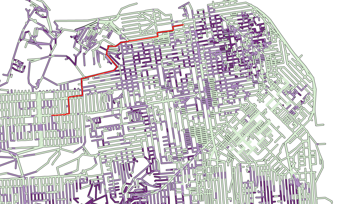
I could do better: once this is done and a starting point is selected, I can actually draw the shortest path to wherever the user moves his or her mouse:

Drawing the shortest path

Drawing the shortest path

Styling and wrapping it up

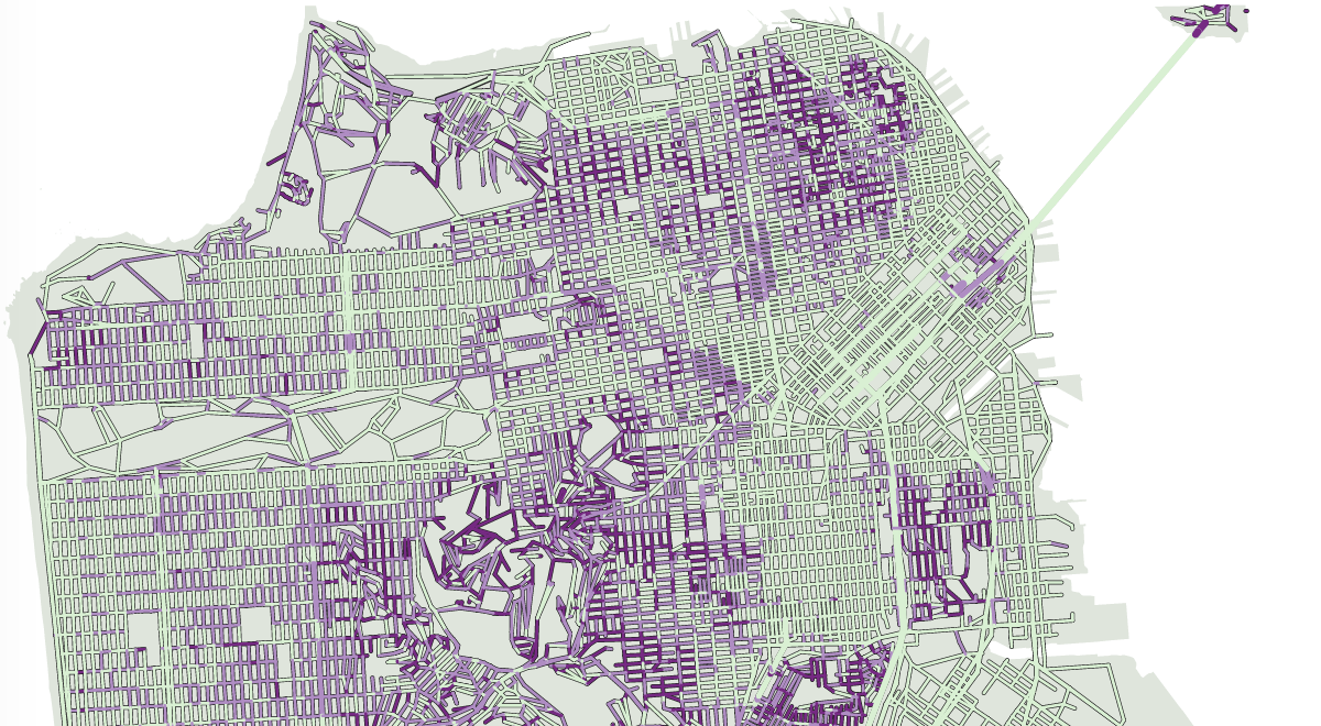
In parallel I had worked on a page template to put everything on and my map looked kind of abstract. I had considered adding street names but algorithmically it’s pretty complicated (it would have been much quicker to do it completely manually but eventually I decided against that). I needed the map to belong to one specific part of the page as opposed to be just hanging in free space. For this I thought I really needed the shape of the land.

So I went back to my OSM dataset and this time looked at the nodes which were on coastlines. Coastlines, though, are lines, not shapes, so some reworking was in order. In the original dataset there were some 200 different lines. Many of them were outside San Francisco proper, but still by removing those there were about 50 left. Many of them could be joined, and I had just to do a tiny bit of manual stitching to come up with one landmass shape for San Francisco.

Now with a landmass

Now with a landmass

I tried various combinations for styling and finally fell back on using green, orange and red for the steepness – the very palette I avoided in the beginning. I used more balanced, slightly less saturated colors though.

One last thing I did on the data side was to get, for every node (which is every end of street or cross-street) the name of all the streets that go through it, so I could describe them – both the first node the user will click on and anyone he or she will mouseover on.

The end result!

The end result!


Getting beyond hello world with d3

About a year ago I proposed a very simple template to start working with d3. But is that the way I actually work? Of course not. Because, though you and I know that displaying hello world in d3 is not exactly trivial, this is not a highly marketable skill either. That said, I just can’t afford to start each of my projects from scratch.

So in this article I will present you the template I actually use. I won’t go in as much detail as last time because the exact instructions matter less than the general idea.

My template is a set of two files, an html file and a js file. Of course, extra files can be used as needed.

There’s not much to the html file – its role is really to call the javascript code. There is a little twist though. This is also where the interface elements (ie buttons and other controls) may be. Another thing is that I don’t load a css file through the html. The reason is that when I work with svg, I may export the svg proper to a file to have it reworked in Adobe Illustrator etc. and so having style inside the file makes things easier. So I would instead load a style sheet into the svg through javascript.

The javascript file is written with the following assumptions:

  • there could be other scripts called by the same page, so let’s try to avoid conflict as much as possible.
  • some variables need not to be accessed by other scripts.
  • the execution of my visualization is divided into several phases:
    • initialize: assigning initial values to variables, if needed forecasting interaction,
    • loading data: acquiring and processing external data,
    • drawing: this is where the visualization will be actually rendered or updated

    In addition to these three phases which always occur in my visualizations, there are several optional operations which I may or may not use which are included in the template.

    • reshaping data: operations like filtering or sorting the initial dataset after certain choices of the user. Following such an operation, the visualization has to be re-rendered.
    • self-playing animation: when this is required, then the visualization should be able to update itself at given intervals of time. If that is the case, then the html will include controls such as a start and stop button and a slider that can be used to move to an arbitrary time. Then, the javascript includes functions to start and stop the animation, and the drawing function is done so it can be called with a time argument, and not assuming that it will always just show the next step (because the slider can be used to jump ahead or back).
    • helper functions which can make me gain time but which don’t need to be accessed by other scripts.

To address the first concern, I wrap all my code in an anonymous function, like so:

(function() {
// ... my code
})();

within that function, any variable which is declared using the var keyword is not accessible to other scripts. Variables which are declared without the var keyword, however, can be accessed. So in order to minimize the footprint of my code, I create one single object, vis, so I can store the functions and values I will need to call as properties of that object.

(function() {
vis = {}
vis.init = function() {
// code for my init function ...
}
vis.height = 100;
var local = 50;
})();

So outside of that anonymous function, I can call vis.init(), I can access and change the value of vis.height, but I cannot access local.

One step further:

(function() {
vis = {}
vis.init = function(params) {
  // code for my init function ...
  vis.loaddata(params);
}
vis.loaddata = function(params) {
  // code for loading data ...
  vis.draw(params);
}
vis.draw = function(params) {
  // code for drawing stuff ...
}
})();

This gets a bit closer to how the code actually works. From the HTML, I would call vis.init and pass it parameters. vis.init will do its thing (assigning values to variables, creating the svg object, preparing interactions etc.) then call vis.loaddata, passing the same parameters. vis.loaddata will fill its purpose (namely, load the data and perhaps do a little data processing on the side) then call the drawing function.

Any of these functions can be called from the outside (from the HTML, ot from the console for debugging). The nice thing about it is that nothing really happens unless there’s an explicit instruction to start the visualization.

Let’s go a step deeper:

(function() {
vis = {}
var chart, svg, height, width;
vis.init = function(params) {
  if (!params) {params = {};}
  chart = d3.select(params.chart || "#chart");
  height = params.height || 500;
  width = params.width || 960;
  chart.selectAll("svg").data([{height: height, width: width}]).enter().append("svg");
  svg = chart.select("svg");
  svg
   .attr("height", function(d) {return d.height;})
   .attr("width", function(d) {return d.width;})
  vis.loaddata(params);
}
vis.loaddata = function(params) {
  if (!params) {params = {};}
  d3.csv((params.data || "data.csv") + (params.refresh ? ("#" + Math.random()) : ""), function(error, csv) {
    vis.csv = csv;
    vis.draw(params);
  })
}
vis.draw = function(params) {
  // code for drawing stuff ...
}
})();

Now we’re much closer to how it actually works. After we create our publicly accessible object vis, we create a bunch of local variables. Again, these can be used freely by the functions within our anonymous function, but not outside of it (notably in the console). I’m assuming that the code can be called without passing parameters, in which case within the functions I am testing if params actually exists, failing that I give it an empty object value. This is because down the road, if it is undefined and I try to access its properties, that would cause a reference error. If params has a value, even that of an empty object, if a property is not assigned, its value is “undefined”. So let’s take a look at the first 2 lines of vis.init:

if(!params) {params = {};}
chart = d3.select(params.chart || "#chart");

if params is not passed to vis.init, it gets an empty object value (that’s the first line). So, all of its properties have an undefined value. So the value of (params.chart || “#chart”) will be “#chart”. Likewise, if params is passed to vis.init, but without a chart property, params.chart will also be undefined, and (params.chart || “#chart”) will also be “#chart”. However, if params is passed to vis.init and a chart property is defined (i.e. vis.init({chart: “#mychart”}), then params.chart will be worth “#mychart” and (params.chart || “#chart”) will also be “#mychart”.
So that construct of assigning an empty object value to params then using || is like giving default values which can be overridden.

Within vis.init, we use local variables for things like height, width etc. so we can redefine them with parameters, and they can be easily accessed by anything within the anonymous function, but not outside of it.
I’ve also fleshed out the vis.loaddata function.
Likewise, we use the same construct as above: instead of hardcoding a data file name, we allow it to be overridden by a parameter, but if none is specified, then we can use a default name.
The part with params.refresh is a little trick.
When developing/debugging, if your data is stored in a file, you are going to load that file many times. Soon enough your browser will use the cached version and not reload it each time. That’s great for speed, but not so great if you edit your file as part as your debugging process: changes would be ignored! By adding a hash and a random string of character at the end of the file name, you are effectively telling your browser to get your file from a different url, although it is the same file. What this does is that it will force your browser to reload the file each time. Once you’re happy with the shape of your file, you can stop doing that (by omitting the refresh parameter) and the browser may use a cached version of your file.
In the vis.loaddata function, the most important part is that d3.csv method. As you may remember this is what loads your csv file (and btw if your data is not in csv form, d3 provides other methods to load external files – d3.json, d3.text etc.). How this method works is that the associated function (i.e the bit that goes: function(error, csv) {}) is executed [em]once the file is loaded[/em].
So since loading the file, even from cache, always take some time, what’s inside that function will be executed [em]after[/em] whatever could be written after the d3.csv method. This is why in the loaddata function, nothing is written after the d3.csv method, as there is no reliable way of knowing when that would be executed. The code continues inside the function. At the very end of that function, we call vis.draw, passing parameters along.
If I need to load several files, I would nest the d3.csv functions like this:

d3.csv((params.data || "data.csv"), function(error, csv) {
  // .. do things with this first file
  d3.csv((params.otherfile || "otherfile.csv"), function (error, csv) {
    // .. and then things with that other file. repeat if necessary..

    // the end of the innermost function is when all files are loaded, so this is when we pass control to vis.draw
    vis.draw(params);
  })
})

Another way to do this is using queue.js which I would recommend if the nesting becomes too crazy. For just 2 small files it’s a matter of personal preferences.

It’s difficult to write anything inside the code of vis.draw in a template, because this will have to be overwritten for every project. But here is the general idea though.
vis.draw can be called initially to, well, draw the visualization a first time when nothing exists but an empty svg element. But it can also be called further down the road, if the user presses a button that changes how it should be displayed, etc.
So, if the external context doesn’t change, running vis.draw once more should do nothing. As such, I avoid using constructs like “svg.append(“rect”) ” and instead use “svg.selectAll(“rect”).data(vis.data).enter().append(“rect”)” systematically.
The difference between the two is that using append without enter will add elements unconditionally. Using it after enter would only add new elements if there are new data items.
But what if I need to draw just one element? well, instead of writing “svg.append(“rect”)”, I would write something like “svg.selectAll(“rect.main”).data([{}]).enter().append(“rect”).classed(“main”, 1)”.
Let me explain what’s happening there.
What I want is the function to create one single rectangle if it doesn’t exist already. To differentiate that rectangle from any other possible rectangles I am going to give it a class: “main”. Why a class and not an id if it is unique to my visualization? Well, I may want to have several of these visualizations in my page and ids should really be unique. So I never use ids in selections, to the exception of specifying the div where the svg element will sit.
If there is already one rect element with the class “main”, svg.selectAll(“rect.main”).data([{}]).enter() will return an empty selection and so nothing will happen. No new rect element will be appended. This is great because we can run this as often as we want and what’s supposed not to change will not change.
However, if there is no such rect element, since there is one item in the array that I pass via data, svg.selectAll(“rect.main”).data([{}]).enter().append(“rect”) will create one single rect element. The classed(“main”, 1) at the end will give it the “main” class, so that running that statement again will not create new rectangles. Using [{}] as default, one-item array is a convention, but it’s better than using, say [0] or [“”] because when manipulating our newly-created element, we can add properties to the data element (i.e. d3.selectAll(“rect.main”).attr(“width”, function(d) {d.width = 100; return d.width;}) ) which you couldn’t do if the data elements were not objects. (try this for yourself).

That being said, the general outline of the vis.draw function is so:

  • remove all elements that need to be deleted,
  • create all elements that need to be added, including a bunch of one-off elements that will only be created once (ie legend, gridlines…)
  • select all remaining elements and update them (using transitions as needed).

One last thing: how to call vis.init() in the first place? Well, the call would have to happen in the HTML file.

<script>
var params = {data: "data.csv", width:1400,height:800};
var query = window.location.search.substring(1);

var vars = query.split("&");
vars.forEach(function(v) {
	var p = v.split("=");
	params[p[0]] = p[1]
})
vis.init(params);
</script>

What’s going on there?
First, I initiate the params variable with some values I want to pass in most cases.
Then, the next line is going to look at the url of the page, and more specifically at the search part, that is, whatever happens after the ?. (I use .substring(1) as to not include the “?”).
The idea is that when I would like to pass parameters via the browser, like so: …/vis.html?mode=1&height=500&data=”anotherfile.csv”
The two splits (first by &, then by =) allow to get the parameters passed by url, and add them to params, possibly overriding the existing ones.
Then we pass the resulting params variable to vis.init.

Wihtout further ado, here are the two files in their entirety.

<!DOCTYPE html>
<meta charset="utf-8">
<head>
	<title></title>
	<style>

	</style>
</head>
<body>
<script src="http://d3js.org/d3.v3.min.js">
</script>
<div id="chart"></div>
<script src="template.js"></script>
<script>
var params = {data: "data.csv", width:960,height:500};
var query = window.location.search.substring(1);

var vars = query.split("&");
vars.forEach(function(v) {
	p=v.split("=");
	params[p[0]]=p[1]
})
vis.init(params);
</script>
</body>
</html>
(function() {
	vis={};
	var width,height;
	var chart,svg;
	var defs, style;
	var slider, step, maxStep, running;
	var button;

	vis.init=function(params) {
		if (!params) {params = {}}
		chart = d3.select(params.chart||"#chart"); // placeholder div for svg
		width = params.width || 960;
		height = params.height || 500;
		chart.selectAll("svg")
			.data([{width:width,height:height}]).enter()
			.append("svg");
		svg = d3.select("svg").attr({
			width:function(d) {return d.width},
			height:function(d) {return d.height}
		}); 
		// vis.init can be re-ran to pass different height/width values 
		// to the svg. this doesn't create new svg elements. 

		style = svg.selectAll("style").data([{}]).enter() 
			.append("style")
			.attr("type","text/css"); 
		// this is where we can insert style that will affect the svg directly.

		defs = svg.selectAll("defs").data([{}]).enter()
			.append("defs"); 
		// this is used if it's necessary to define gradients, patterns etc.

		// the following will implement interaction around a slider and a 
		// button. repeat/remove as needed. 
		// note that this code won't cause errors if the corresponding elements 
		// do not exist in the HTML.  
		
		slider = d3.select(params.slider || ".slider");
		
		if (slider[0][0]) {
			maxStep = slider.property("max");
			step = slider.property("value");
			slider.on("change", function() {
				vis.stop(); 
				step = this.value; 
				vis.draw(params);})
			running = params.running || 0; // autorunning off or manually set on
		} else {
			running = -1; // never attempt auto-running
		}
		button = d3.select(params.button || ".button");
		if(button[0][0] && running> -1) {
			button.on("click", function() {
				if (running) {
					vis.stop();
				} else {
					vis.start();
				}
			})
		};
		vis.loaddata(params);
	}
		
	vis.loaddata = function(params) {
		if(!params) {params = {}}
		d3.text(params.style||"style.txt", function (error,txt) {
			// note that execution won't be stopped if a style file isn't found
			style.text(txt); // but if found, it can be embedded in the svg. 
			d3.csv(params.data || "data.csv", function(error,csv) {
				vis.data = csv;
				if(running > 0) {vis.start();} else {vis.draw(params);}
			})
		})
	}
	
	vis.play = function() {
		if(i === maxStep && !running){
			step = -1; 
			vis.stop();
		}
		if(i < maxStep) {
			step = step + 1; 
			running = 1;
			d3.select(".stop").html("Pause").on("click", vis.stop(params));
			slider.property("value",i);
		vis.draw(params);} else {vis.stop();}	
	}

	vis.start = function(params) {
		timer = setInterval(function() {vis.play(params)}, 50);
	}

	vis.stop = function (params) {
		clearInterval(timer);
		running = 0;
		d3.select(".stop").html("Play").on("click", vis.start(params));
	}

	vis.draw = function(params) {
		// make stuff here! 
	}
})();
 

Making the game of thrones visualization

So I made this interactive visualization about the 5 Game of Thrones books. How?

The project

The visualization is based on the events which happen to the main characters of the books. With over 2000 characters and close to 5000 pages over 343 chapters, it’s not possible to show everything, so I took about 300 characters and restricted to a small selection of events, such as characters killing each other. Also, I regrouped characters in a 2-level hierarchy so that it would be easier to find them and see what happens at a higher level.

Data

Data is the first word in data visualization, and in order to visualize one must collect data.
this has not been a small task. When I read the books, which was a while back (before a Dance with Dragons was published), I had already half a mind to make a visualization, so I jotted down some notes but I had no clear idea of how it would look like. But I started writing down when in the books characters did die. Eventually I realized that if I wanted to prioritize characters I had to find a way to discriminate between those who appeared infrequently and could be left out, and those who were recurring. So, I had to find a way to determine when did the various characters appeared and what happened to them.

To achieve that I had the five books in printed version, which is definitely not the best way to approach this. So I tried to find something to scrape. So I approached this on two fronts. On one hand, I got a raw text version of the books. But they were very hard to scrape. For instance, there are at least 11 different characters named Pate (just Pate), and 23 called Jon something. Besides, many have aliases, titles and other names so a query to find all instances of “Jon” won’t capture all mentions of, say, Jon Snow, but will also return appearances of the Jon Conningtons, Jon Arryns and the like. To make matter worse, my text file was scanned from the book and was of less than optimal quality, with many typos on names.

The other source were the two fan-maintained ressources on the series, Tower of the Hand and a Wiki of Ice and Fire, which both contain summaries of the chapters and information on the characters. Some chapters were described in meticulous detail with all the characters that appear specified, and a description of all that happens then. But others are more loosely narrated. That said, both sites propose an exhaustive list of characters of the books which were extremely useful.

So I first scraped a wiki of Ice and Fire to know which characters were mentioned in each chapter, then read the summaries to get a feel from the events happening, which I maintainted by hand.

With that first level of material, I decided to keep characters mentioned at least 5 times, or the named character who had been killed by another named character (as opposed to “a guard” being killed by “a soldier”). That left me with about 250 characters (out of slightly over 2000). Later, when the visualization became usable, playing with it I found some inconsistencies – how come this character is not dead yet in that book? That was because some characters were missing from my roster. So by checking in the original books, I increased the roster to about 300 (296 precisely). Also for most (and not all) characters, using the text file, I was able to get all the mentions of a given character in all the books.

Data analysis

I wanted to do something around the relationships among characters and I soon noticed that there are many cliques, that is groups of characters where every one of them trust every other one. This is the case of most families of organizations. When there is one character that defects, this is clearly signalled. You never get a situation where A trusts B but not C, B trusts C and not A and C trusts A and not B, or anything complex really.

But still, that’s many, many groups.

While in the books, families and groups are presented as independent entities, they almost always align on a larger, more powerful one. So it was interesting to regroup the smaller groups in larger alliances, especially if the focus was to represent kills

In the books most characters belong to or serve noble houses, and those who don’t belong to well-identified groups. There are very few characters who just mind their own business. There is a plethora of such Houses which can make things confusing (and again: 2000 characters). After several attempts I concluded it’s neither possible nor a good idea to represent this diversity visually. Instead, I tried to “group the groups” and to create higher-level aggregates.

Eventually (and I did that fairly late in the process, after few tries on the visualization) I created 5 groups. One for the Starks and the Lannisters, which are the families which receive the most attention during the book, as 70%  of the chapters are written from the point of view of a member of either family.Also, contrary to the Targaryen house whose point of view accounts for about 10% of the book, Starks and Lannisters have many allies and followers. So, as a consistent group they are larger and more interesting.

The other 3 groups are as follows: antagonists, that is aggressive characters (including monsters) who may attack any other; neutral characters, who tend to stay out of conflict, and opportunists, who look for more power.

Each of the 5 groups exhibits different patterns when it comes to killing: Starks (“the good guys”) don’t kill their own or neutral characters, but may have to fight characters from the other groups; conversely, some characters in the Lannister clan or among opportunists may carry out assassinations where anyone can be targeted. Neutral characters don’t fight except against antagonists, and the latter may fight characters from any group.

Drawing the visualization

I started thinking of that project a long time ago, and I’ve made experiments taking many forms. One of such form was a previous visualization on the places in Games of Thrones. That one visualization was the low-hanging fruit of the dataset I was building and refining. I knew I wanted to show events happening to the characters. Originally I thought of something linear, like a gantt chart, possibly grouping the characters by families which would be collapsable. But even in the broad sense that’s a lot of families, it wouldn’t make the visualization very legible.

What I had in mind then was to find a way to represent the status of the characters over time, who got killed, who got crippled, that sort of thing.

Eventually, I thought it was more interesting to represent the relationships of characters among themselves, so I started to take notice of all the interactions between characters, such as: who kills whom, who captures whom, who marries whom, etc. There were many which didn’t make it in the final visualization which is already complex enough as is.

I thought of the chord form early because it’s possible to use it to represent a lot of nodes and a lot of relationships among them even and even if it’s difficult to see one individual node expect the most important ones, and even more difficult to see one individual relationship, it’s possible to get a vague idea of mass. So I thought of representing characters as circles around a main circle coloring them by family or something. But doesn’t work, there are just too many different families. By so doing I was just plotting complexity.

Then, I realized that one very important aspect of the story, that is, one way in which a visualization could actually help understand what’s going on in the books, is that of trust. Within a group, all characters trust each other. Actually, this is much simpler than in real life: Westeros families are very close-knit; there are no murders among siblings or even though such things were commonplace in History! In network parlance, a group of entities which are all connected among each other is called a clique. And Game of Thrones is really a game of cliques. In all key moments of the book, one character of the clique will change sides. So all other characters of that clique continue to trust him, without realizing that he is setting them up, and a string of murders usually ensues.

So I decided to show action only at the clique level (families, organizations…). The problem I had was that once a character dies the representation of the clique won’t change much, whereas if I represented characters individually I could reflect that state of affairs.

So I thought of drawing one circle per clique around the main circle, and to represent characters individually within those circles using the packed circle method.

The method I chose was good (but not completely accurate) at preserving the relative importance of one clique compared to all the others, but just barely ok at preserving the relative importance of one given character.

I would take all the mentions of all the characters, tally that by clique, then take the square roots of that for each clique. Then, for each clique I compute the ratio of that square root to the sum of all the other square roots.

I multiply that by 2π and that’s an angle, that’s the “slice” of the main circle that will be occupied by the circle corresponding to that clique. Picture:

(btw click on the circle on the left to regenerate the data points)

So while those proportions don’t exactly match they are very very close. That doesn’t hold at the character level, because the sum of the areas of the character circles can occupy anywhere between 50% and 100% of the areas of the larger circle. But that’s not important. Accuracy is not important, as long as it is sufficient to say: this character appears often and this one doesn’t.

Two other technical points about the making of the viz.
All positions for all possible time periods had to be computed ahead of time.
In d3, it is natural to add, add, add stuff over time without worrying so much. More data? we’ll just add more datapoints.
Here I couldn’t really do that because I allowed the user to go back and forth in time. So a user could set the visualization in autoplay and go from time 0 to time 50, for instance, then pause and jump to time 200 and then back to time 25.
So it wasn’t possible to read the datafile in sequence and to draw some additional data points at each step. In the above exemple, all that happens between time 50 and time 200 has to be shown at once, and then all that happened between time 25 and time 200 has to be hidden at once.

so it’s just a matter of separating the code that calculates all the positions from the one that draws the viz, two operations which more often than not are intertwined.

Last, in the visualization I get to write group names in a circle around the main circle. How is this done?

Well, in svg, you can’t write “on a circle”. You can write on a path, which can be anything, a circular arc for instance. In this case it’s a bit more complicated because I wanted to make sure that the writing would not be upside down. So I actually used two arcs.


Selections in d3 – the long story

This past week, Scott Murray and I presented a tutorial at Strata on d3 (of all things!)
First things first, you probably want to get Scott’s book on the subject when it’s out. I should be translating it into French eventually.
You’re also welcome to the slides and examples of the tutorial which can be found on https://github.com/alignedleft/strata-d3-tutorial. That include my d3 cheat sheet.

We had done a d3 workshop a few months back at Visweek with Jeff Heer. This time around, we changed our approach: we covered less ground, went at a slower pace, but targeted what is in our opinion the most troublesome aspects of learning d3: selecting, creating and removing elements.

I have learned d3 from deciphering script examples and in the earliest ones one ubiquitous construct was this sequence : select / selectAll / data / enter / append.
It does the work, so like everyone else I’ve copied it and reused very often. It happens to be the most proper way of adding new elements in most cases, but the point is, while learning d3, I (and many people before and after me) have copy/pasted it without understanding it deeply. Though, copy pasting something you don’t understand thoroughly is the best way to get errors you don’t understand any better, and it would prevent you from accessing the rest of the potential of the library. Conversely, once this is cleared, you can be “thinking in d3” and easily do many things you might have thought impossible before.

We did the tutorial hands-on, live coding most of the time. To follow through, I invite you to create or open an empty page with d3 loaded (such as this one – the link opens a new tab) and then open the “console” or “web developer tools” which allow you to type javascript statements directly, without having to write and load scripts. Here are the shortcuts to the console:

  • Chrome: Ctrl-J (windows), ⌥ ⌘+j (Mac)
  • Firefox: Ctrl+Shift+k (windows), ⌥ ⌘+k (Mac)
  • Safari: Ctrl+Alt+c (windows), ⌥ ⌘+c (Mac)
  • IE9+: F12

To make the best of this tutorial, please type the examples. Some tutorials show you impressive stuff and show you step by step how to do it. That’s not one of them. I’ve sticked to very, very basic and mundane things. We’ll be only manipulating HTML elements such as paragraphs, which I assume you have seen earlier (plot twist: you are reading one at this very moment)
Some of the code snippets don’t work. That’s the idea! I think you can’t progress by merely copying code that works. It’s important that you try out code that looks reasonable but that doesn’t produce the expected result or that causes an error, but then understand why.

Adding simple stuff

Creating elements

Our empty page is, well, empty, so we are going to add stuff.
to create elements, we need the append method in d3, which takes as an argument the type of element that needs to be created, while the html method at the end allow us to specify a text.

so let’s go ahead and type:

d3.append("h1").html("My beautiful text")

and see what happens.

what do we get? and why is that?
In d3, every element which is created cannot appear out of thin air, and must be added to a container. If we don’t specify a container element, we just can’t create anything.
In HTML, most elements can be containers, that is, it’s usually possible to add elements to almost everything. Then again, our template is fairly empty, so we can select the tag and take it from there.

d3.select("body").append("h1").html("My beautiful text")

we’re in business! as long as there is a sensible place to put them, you can create as much stuff as you like. Since we’re on a roll, why won’t we throw in a few paragraphs (p element in HTML):

d3.select("body").append("p").html("Look at me, I'm a paragraph.")
d3.select("body").append("p").html("And I'm another paragraph!")
d3.select("body").append("p").html("Woohoo! number 3 baby")

and lo and behold, all our paragraphs appear in sequence. Simply beautiful.
But wait! paragraphs are containers, too. Why don’t we try to add a span element to one paragraph? For those of you with no HTML knowledge, span elements are like paragraphs, except there is no line break by default at the end.

So let’s try this:

d3.select("p").append("span").html("and I'm a span!")

Before typing it, take a minute to think where you expect it to go.
Then go ahead and type it.

Surprised?
you may have guessed that our new bit of text could go on a line of its own at the end of the document, or at the end of the last paragraph. But instead, it goes at the end of the first paragraph.
Why is that? well, our select method stops the first instance of whatever it tries to find. In our case, since we asked it to find paragraphs – p, it stopped at the first p element it found, and added the span at the end of it (append).

Beyond creating new things

adding new elements to a page programmatically is kind of useful, but if d3 stopped at that you probably wouldn’t be so interested in this tutorial to begin with. You can also modify and manipulate elements. We’ve done that to some extent with the html method. But we can also modify the style of the elements, their attributes and their properties. For the time being, don’t bother too much about the difference between these three things. Style refers to the appearance of elements, attributes, to their structure, and properties, to what can be changed in realtime, like values in a form. But again, let’s not worry about that for now and let’s just follow along. Look at this code snippet:

d3.select("p").style("color","red")

this will select the first paragraph and change its style, so that the text color is changed to red.
But wait! our first paragraph, isn’t that the one with a span at the end of it? What will happen to that bit of text? Well, type the statement to find out.
All the paragraph, including its children (that is, everything added to it, in our case the span) is turned to red.

d3.select("span").style("color","blue")

That singles out our span and writes it in blue. Can this be overturned?

d3.select("p").style("color","red")

That won’t change a thing. Our first paragraph is, in fact, already red. But its child, the span, has a style which overrides that of its parent. To have it behave like the rest, we can remove its style like so:

d3.select("span").style("color",null)

then

d3.select("p").style("color","green")

it will behave like its parent, the paragraph.
But let’s try something else:

d3.select("span").style("color","blue")

we write our span in blue,

d3.select("span").style("color","green")

and now back in green, like its parent.

d3.select("p").style("color","red")

What will happen?
well, the paragraph turns red, but the span doesn’t. It’s still following its specific instruction to be written in green.

That goes to illustrate that children behave like their parents, unless they are given specific instructions.

For HTML elements, we can play with styles, not so much with attributes or properties. One thing worth noting though is that an element can be given a class or an id.

Classes and ids can be used to style elements using a cascading style sheet (CSS). Knowing how CSS works is entirely facultative in learning d3, since d3 by itself can take care of all styling needs. Though, knowing basic CSS is not the most useless of endeavors, and some sensible CSS statements can save a lot of tedious manipulation in d3.
The other use of classes and ids is that they can be used to select elements.

Let’s reload our page so we start from scratch.

d3.select("body").append("p").html("First paragraph");
d3.select("body").append("p").html("Second paragraph").attr("class","p2");
d3.select("body").append("p").html("Third paragraph").attr("id","p3");

without the use of classes and ids, it’s still possible to select and manipulate the 2nd or 3rd instance of an element, but it’s a chore. You have to use pseudo-classes like d3.select(“p:nth-of-type(2)”) to select the 2nd instance of a paragraph, for instance.
Personally, I’d rather avoid this and prefer using simpler statements. With classes and IDs set, we can write instead:

d3.select(".p2").html("I'm classy");
d3.select("#p3").html("I've got ideas");

To select things of a given class, you must use a period before the name of the class. To select things of a certain id, you must use the hash sign.
Here, we are looking for the first element of the p2 class. This happens to be our 2nd paragraph. When you know you will have to manipulate elements which are not easily accessible, you may as well give them classes which will make this easier down the road.

In theory, there should only be one element of a given ID in one page, so I recommend not using them dynamically unless you can be 100% sure that there will not be duplicates. And, in case you were wandering, one element can have several (even many) classes.

Two birds, one stone

Introducing selectAll

So far, we’ve changed properties of one element at a time. The exception was when we changed the colors of both a paragraph and a span, but even then, we were still technically only changing the characteristics of one paragraph, which its child, the span, just happened to inherit.

For a complex document, that can be super tedious, especially since we’ve seen that it’s not easy to retrieve an element which is not the first of its kind.

so let’s go ahead and type:

d3.selectAll("p").style("font-weight","bold");

(for a little variety. I mean, changing text color is so 1994.)
What was that? Everything turned to bold!

Indeed: while the select method returns the first element that matches the clause, selectAll matches them all.
Let’s do more.
We’re going to add a span to our first paragraph.

d3.select("p").append("span")
.html("I'm a rebel child.")
.style("background-color","firebrick")

we’re adding a gratuitous styling command.
Now, let’s change the background color of all the paragraphs.

d3.selectAll("p").style("background-color","aliceblue")

As could be expected, the span doesn’t change its background color, and so it appears differently from its parent (which could be a desired effect – this gives us flexibility).
but what if we wanted to change the background color of everything? can we do better?

d3.selectAll("*").style("background-color","whitesmoke")

(quite fitting in these times of papal conclave)

Well – everything gets a background color of “white smoke” (which is a fine background color btw.). Including the “body” element – that is, everything on the page!
selectAll(“*”) matches everything. With it, you can grab all the children, their children etc. (“descendants”. I know…) of a selection, or, if used directly like so: d3.selectAll(“*”), everything on the page.
So we’ve seen we can select moaar. But can we be finer? Can we select the paragraphs and the spans only, without touching the rest?

we sure can!

d3.selectAll("p, span").style("background-color","lawngreen")

The outcome of that one statement probably won’t make it to our web design portfolio, but it does the trick: you can select as much as you like, or as little as you like.

Nested selections

To illustrate the next situation, let’s add a span to our document.

d3.select("body").append("span").html("select me if you can")

Well, just like there is a way to select directly the 2nd paragraph using pseudo classes, there’s also a (complicated) way to select directly that last span (namely: selectAll(“span:not(p)”) )
there’s also a simpler way which is what we’re interested in.
let’s suppose we want to turn it to bold:
we can just do

d3.selectAll("span").style("font-weight","bold");

then change the first one:

d3.select("p").select("span").style("font-weight",null);

Admittedly, the complicated way is more compact. But conceptually, the “simple” way is easier to follow: we can do a selection, and within that selection perform a newer selection, and so on and so forth. That way, we can get away with just using super simple selectors, as opposed to master the intricacies of CSS3 syntax. Do it for the people who will read your source code 🙂

At this point:

  • You know how to dynamically create content. Pretty cool!
  • More! you can dynamically change every property of every element of the page. woot!
  • Bonus! you’re equipped with tactics to easily reach any element you want to change.

You should also have a good grasp of d3.select, d3.selectAll and the difference between the two.
what more could you possibly want? Well, since this is about data visualization, how about a way to tie our elements to data? This is what d3 is really about.

Putting the data in data visualization

Introducing data: passing values to many elements at once

So far, we’ve entered “hard coded” values for all of our variables. That’s fine, but we can’t really set our elements one by one. I mean, we could, but it’s no way to “industrialize” the way elements are created.
Fortunately, d3 provides. Its more interesting characteristic is the ability to “bind” elements with data.

If you’ve followed the instructions step by step, you should have 3 paragraphs in the page. Plus a span afterwards, but whatever.
Let’s introduce the data method. This will match an array of values to a selection of elements in the page. Let’s go:

var fs=["10px","20px","30px"];
d3.selectAll("p").data(fs).style("font-size",function(d) {return d;})

wow wow wow what just happened?
First, we create an array of values which we intelligently call fs (for font size).
Then, right after the selectAll(“p”) which gathers a selection of elements (3 “p” elements to be exact), we specify a dataset using the data method.
It just happens that our dataset has just the same number of items as our selection of elements!

finally, we use style, like we used to, with a twist: instead of providing one fixed value, which would affect our 3 p elements in the same way, we specify a function.
This function will parse the dataset, and for each element, it will return the result of an operation in the corresponding data point: the result of the function on the first item for the first p element, the result on the 2nd item for our 2nd paragraph, and lastly the result on the last item for our last paragraph.
We write the function with an argument: d. What is d? it’s nothing but a convention. We can call it anything. d is standard fare in d3 code because that’s the writing style of Mike Bostock, the author of the framework and of many of its examples.
This function is nothing special, it returns the element itself, so we are passing “10px” for the font-size of our first paragraph, and so on and so forth (20px, 30px).
As an aside, we can use the String function, which converts any element into a string, instead of writing function(d) {return d;}. So:

d3.selectAll("p").data(fs).style("font-size",String)

would also work and is shorter to write.

Let’s recap what just happened here, because this is important.
We want to apply a dynamic transformation to a bunch of existing elements, as opposed to finding a way to select each individual element, and passing it a hard-coded value.
What’s more, we want to apply a transformation of the same nature, but of a different magnitude, on each of these items.

How to proceed?
well, first we create an array of values. That’s our fs boy over there.

var fs=["10px","20px","30px"];

Then, we will first select all of the elements we want to modify, then we’ll tie our dataset to that selection. This is what selectAll, then data does.

var selection=d3.selectAll("p").data(fs);

By the way, I’ve stored the result of the selectAll then data in a variable. In the original example, I just “chained” the methods, that is, I followed each method by a period and another one. The two syntaxes are equivalent. Chaining works, because each of these methods returns a value which is itself a selection on which further operations can be done. This syntax works well through most of d3 with some exceptions which will be duly noted.

Then, we are going to change the style of the selection, using a function on our data.

selection.style("font-size",function(d) {return d;})

(or

selection.style("font-size",String)

That function will run on each value of our dataset, and return one result per value, which will be passed to all elements in sequence.

At this stage you may have two questions:

  • Can we use more sophisticated functions, because this one is kind of meh?
  • What happens if there is not the same number of items in the dataset and of elements?

The second question is actually more complicated than the first, but we’ll answer it in painstaking detail.
So let’s take care of the question on functions first.
Yes, obviously, we can use the function not just to return the element, but to do any kind of calculation that a language such as javascript is capable of, which is nearly everything.
To illustrate that, here are some variations of our initial code which will return the same result, but with a different form.

var fs=[10,20,30]; // no more px
d3.selectAll("p").data(fs).style("font-size",function(d) {return d+"px";})

Here, instead of returning just the element, we append “px” at its end. Sadly, style(“font-size”,10) doesn’t work, but style(“font-size”,10+”px”) – which is the same as style(“font-size”,”10px”) is valid.

Here is yet another way.

d3.selectAll("p").style("font-size",function(d,i) {return 10*(i+1)+"px";})

function(d,i) ? what is this devilry?
Here, i (or anything we want to call it, as long as it’s the 2nd argument of this function) represents the order of the element in the selection, so the first gets a 0, the second a 1, etc. (well, in our example it goes to 3 elements, so the last one gets a 2).
This may be a bit abstract to say here, but even if we haven’t passed data, this would still work – i represent the order of the element, not the data item. so, if no data had been passed, within this function call, d would be undefined, but i would still be equal to 0,1,2, …

The answer to the second question is the last great mystery of d3. Once you get this, you’re golden.

Creating or removing the right number of elements depending on data

Before we get further, let’s quickly introduce append’s reckless cousin, remove(). Writing remove at the end of a selection deletes all the corresponding elements from the document object model.
so,

d3.selectAll("p").remove()

would remove our 3 paragraphs. Let’s do it and get rid of our paragraphs.
Actually, let’s do

d3.select("body").selectAll("*").remove()

and remove everything below the body.

Now, earlier, we were alluding to what could happen if we didn’t have the same number of elements as of items in our dataset.

That means that we should be able to do the following:

  • If there are fewer elements than items in a dataset, create the missing elements
  • If there are fewer elements than items in a dataset, disregard the extra data items
  • If there are more elements than items in a dataset, remove the extra elements
  • If there are more elements than items in a dataset, don’t change the extra elements/li>
  • As data are updated, keep some elements, remove some, add some

Why would we want to do all of this?
The first case is the most common. When we start a data visualization script, chances are that there are no elements yet but there is data, so you’ll want to add elements based on the data.
Then, if you have interaction or animation, your dataset may be updated, and depending on what you intend to do you may just want to update the existing elements, create new ones, remove old ones, etc. That’s when you may want to do 2, 3 or 4.
The last (5th case) is more complicated, but don’t worry, we’ve got you covered.

Right now, we should have 0 p elements on our page (and if for some reason this is not the case, feel free to reload it).

let’s create a variable like so:

var text=["first paragraph","second paragraph","third paragraph"];

somewhat uninspired, I know, but let’s keep typing to a minimum, if you want to go all lyrical please go ahead.

We are smack in case 1: we’d like to create 3 paragraphs, we have 3 items in our dataset, but 0 elements yet.
Here’s what we’ll type:

d3.select("body").selectAll("p").data(text).enter().append("p").html(String)

A-ha! we meet again, select selectAll data enter append.
After all we’ve done, select selectAll should make some sense, even though, at this stage, this selection returns 0 p elements. There are none yet.
Then we pass data as we’ve done before. Note that there are 3 items in our dataset.

Then, we use the enter() statement. What it does is that it prepares one new element for every unmatched data item. We’ll expand a bit later on the true meaning of unmatched, but for the time being, let’s focus on the difference. We have 0 elements, but 3 data items. 3 – 0 = 3, so the enter() selection will prepare 3 new elements.
What does prepare means? the elements are not created yet at this stage, but they will with the next command. Right after enter(), think of what’s created as placeholders for future element (Scott’s vocabulary), or buds that will eventually blossom into full-fledge elements (mine).
After enter(), we specify an append(“p”) command. Previously, when we had used the append method, we created one element at a time. But in this case, we are going to create as many as there are placeholders returned by enter(). So, in our case, 3.
You may legitimately wonder why we needed a select statement to begin with – after all, enter() works on the difference between selectAll and data. But when we are going to append elements, we will need to create them somewhere, to build them upon a container. This is what the first select does. Omit it, and you’ll have an error, because the system will be asked to create something without knowing where.
The final method, html, will populate our paragraphs with text. The String function, which we have already seen, simply returns the content of each item in our dataset.

We’re using select > selectAll > data > enter > append, but hopefully you will see why (and if you don’t, hang on to the end of the article, and feel free to ask questions).

But let’s recap once more. Actually, let’s see the many ways to get this wrong (or, surprisingly, right)

d3.selectAll("p").data(text).enter().append("p").html(String)

We’ve alluded to that: without a container to put them in, p elements can’t be created. This will result in a DOM error.

d3.select("body").selectAll("p").data(text).append("p").html(String)

No enter statement. After the selectAll, the selection has 0 items. This doesn’t change after the data method. As such, append creates 0 new elements, and nothing changes in the document. (but no error though)

d3.select("body").data(text).selectAll("p").enter().append("p").html(String)

In many cases in d3, it’s ok to switch the order of chained methods, but that’s not true here. selectAll must come before data. We bind data to elements. The other way round would have made sense, but that’s the way it is. First selectAll, then data. Here, we get an error, because enter() can’t be fired directly from selectAll.

d3.select("body").selectAll("wootwoot")
.data(text).enter().append("p").html(String)

This actually works. Why?
There are actually 0 elements of type “wootwoot” in our document, which may or may not surprise you. There are still 3 items in the dataset, so enter() returns space for 3 new elements. the next append subsequently creates 3 p elements, which are populated by the html method.
It usually makes more sense to use the same selector in the selectAll and the append methods, but that’s not always the case. Sometimes, you will be selecting elements of a specific class, but in an append method, you have to specify the name of an element, not any selector. So you’d go

d3.select("body").selectAll(".myClass")
.data(text).enter().append("p").html(String).attr("class","myClass")

Now that we’ve seen a few variations on the subject, here is a really cool use of enter. Check this out:

d3.select("body").selectAll("h1").data([{}]).enter().insert("h1").html("My title")

ok there are 3 things here worth mentioning. 2 are just for show, though it doesn’t hurt to know them, but the 3rd one is really neat and useful.
In data, we’ve passed: [{}]. This is an array of one object which is empty. There are two interesting things with that construct, one is that there’s only one element, the other one is that it’s an object. When you pass objects, the functions you run on them (like in the attr or style methods) can be used to add properties to them or change them. If that doesn’t make sense yet, just accept for now that it gives you more flexibility than using, say, [0].
We’ve used insert instead of append. What this means is that we’re adding things before the first child of our container, not at the end (ie after the last child). In other words, our h1 (a title) will go at the top of the body element – fitting.

But what’s really interesting is what would happen if you were to run that statement again – nothing. try it. See?
Why is that? Well, on your first go, at a point where there are no h1 elements yet, it works the standard way – you do a selectAll that returns nothing, you bind a dataset with more elements, then enter prepares space for the unmatched elements – 1 in our case – and then append creates that element. You may notice that the html part doesn’t use the data.
When you run it again, the selectAll finds one h1 element, there’s still one item in the dataset, so enter won’t find any unmatched element, so the subsequent append is ignored.

So, you can run this kind of thing in a loop safely, it will only do what it’s supposed to do on the first go, it will be ignored afterwards. Don’t be afraid to use this construct for all the unique parts of your visualization, so you won’t have to worry about creating them multiple times.

Other cases of mismatch between data items and elements

All right, so now we have 3 p elements and 3 items in our dataset.
What happens if we do this:

text2=["hello world"]
d3.selectAll("p").data(text2).html(String)

?

There is now one item in the data set, versus 3 p elements. Try to make a guess before you type this in. At the tutorial, the audience made a few reasonable guesses, namely: the last 2 paragraphs will be removed, only “hello world” will remain. Or: all paragraphs will be changed to “hello world”.
Either could happen if d3 was trying to be smart and guess your intent. Fortunately, d3 is no excel here and behaves consistently even if that means extra work for you. When you do that (and please try this now) what happens is that the first paragraph of text is changed and the other two are untouched.

We are in the case, change the matched elements, ignore the others.

By the way, by now you should be able to guess what would have happened if there had been an enter() right after the data. Do I hear… nothing? almost! There would be no unmatched data element, so enter() would not return anything. Besides, enter() would require an append afterwards to make anything. This is why you’ll get an error: html can’t work directly after enter(). you would need an append.

Now what if we want to remove the extra 2 elements? This is where the exit() method comes into play.
exit() is pretty much to enter() what remove() is to append(). Kind of.

let’s see how this work by example.

let’s recreate our 3 p paragraphs just in case:

d3.selectAll("p").remove();
d3.select("body").selectAll("p").data(text).enter().append("p").html(String);

Now we pass the new dataset:

d3.selectAll("p").data(text2).html(String)

– remember that only the first paragraph has changed, the other two are untouched.
Now, while all the items in the dataset are matched with elements, there are elements which are not matched with an item in the dataset: the last two. This is where exit() comes into play. exit() will select those two paragraphs, so they can be manipulated. Typically, what happens then is a remove(), but you could think of other options.

d3.selectAll("p").data(text2).exit().style("color","red");

That will flag them instead of removing them.
But typically, you do:

d3.selectAll("p").data(text2).exit().remove();

.

note that even though you have already matched a one item dataset to that selection, to use exit(), you will need to use data before. selectAll(“p”).exit() won’t work. You’ll have to re-specify the data match.

So that takes care of the case when you want to remove extraneous data items.
This leaves us with only one simple case: where you have more items in your dataset than you have elements and you don’t want to create elements for the extra data items.
That’s the simplest syntax, really.

Here, for instance, we have only one paragraph left, but there are 3 items in the text variable.
so let’s do:

d3.selectAll("p").data(text).html(String)

(no enter, no exit, no append).
The paragraph text will now come from the new dataset (from its first item to be precise), no extra paragraphs will be created, none will be deleted.

Data joins

the last case (pass a new dataset, create new elements as needed, make some elements stay and make some elements go) requires more complexity and actually I won’t cover it in detail here, instead I will explain the principle and refer you to this tutorial on object constancy by Mike Bostock.
In the general case, when you try to match your dataset to your elements, you count them and deal with the difference. So you have 5 data items and 3 elements: you can make 2 extra elements appear by using enter. With the concept of data joins, you can assign precisely each data item to one given element, so the first data item doesn’t have to be that of the first element, etc. Well, the first time it will be, and each element will receive a key, a unique identifier from the dataset. If the dataset is subsequently updated, the element will only be matched if there is an item in the dataset with the same key. Else, it will be found by an exit() method.

And that’s the general gist of it.
At Strata, we went further – we discussed interaction and transition, but that is downward trivial once you have understood – and by that, really understood, with all the implications and nuances – the selections.