Hi, it’s been a while since I last posted!
Here is a new project using publicly available data: slopes of San Francisco.
As a San Franciscan who likes to walk, I’m confronted to a common problem. Most cities, such as Paris where I’m from, are mostly flat. So, in order to go one block east and one block north of where I am standing, I can go North then East or East then North: this is mostly equivalent (except that streets never meet at a right angle in Paris but that’s another problem). In San Francisco, going North then East can mean climbing a huge hill then down, versus walking on a flat surface. Itineraries matter, and often times I found myself going through mountains and valleys just because I thought the straight line was the simplest way to go from A to B.
Which is why I wanted to create a map of streets by slope, to help me (and my fellow San Franciscans) figure out which streets are practicable, and which should be avoided.
Here’s how I did it.
Getting the data
To compute slopes, I needed elevation data and the most convenient way to obtain it is through google elevation API. This API takes one or several points (longitude and latitude) and returns an elevation. Now which points was I going to feed it?
I started by the San Francisco metro extract from Open Street Map. What you get is an XML file which has a list of nodes with longitudes and latitudes, and a list of structures that connect them (such as landmass, streets, buildings, etc.). Now the problem was that the file I used had some 1.4m nodes, and Google Elevation API limits are 25000 locations per 24 hour period.
So my first task was to figure out how many of those 1.4m nodes I really needed. Turns out that the metro extract covers much more than the city but also the whole bay area. So my first pass was to filter out nodes that were outside a bounding box. Then, I only kept nodes that were part of a street, and furthermore, only the ones that would be either at the end of one street or at an intersection. By doing so, I’m assuming that all streets are straight between any two intersections, which is far from true, but would do for our purposes. I applied further filtering to weed out streets that were made of just one node. Eventually, I arrived at just over 10000 nodes! and in the process, I also extracted from the XML file the shape of the streets, that is, in which order nodes appeared in those streets. After several iterations in my code, I also scrapped their number of lanes when available and the street names.
Sanity check
The first thing I did was to plot my nodes on a map.
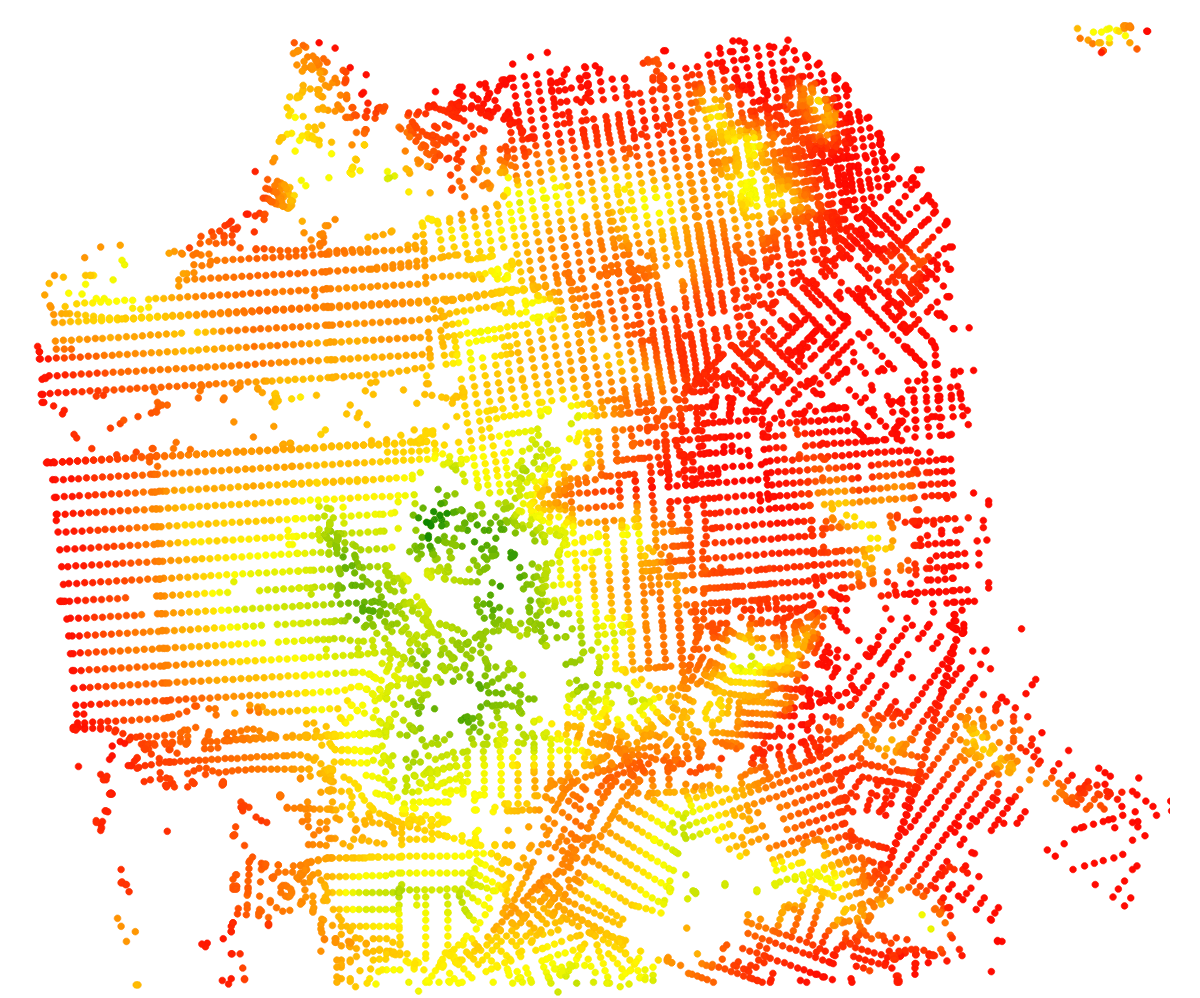
First draft
Looks ok. So next, I just drawed my streets. I did that using d3, and each of my streets in this next iteration is a single path object.
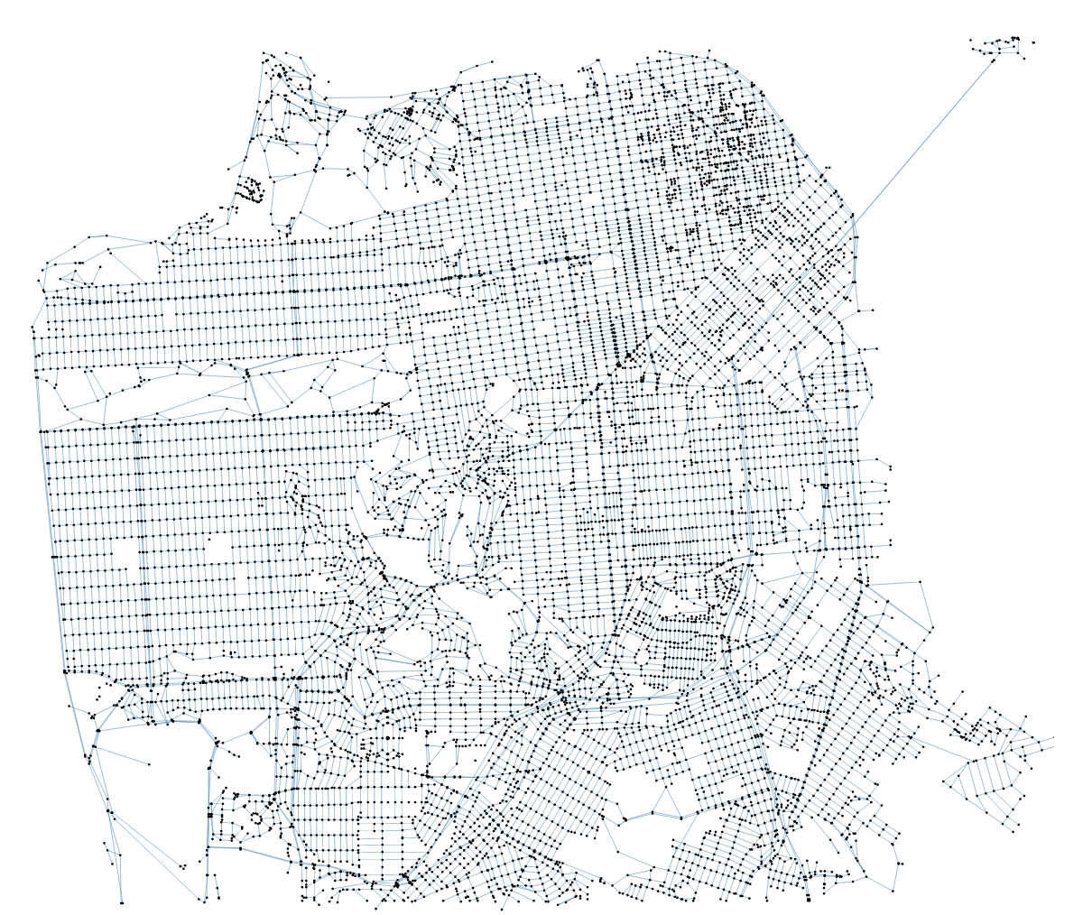
First network of streets
So that’s a basic node-and-link mesh of San Francisco, the problem with that approach is that I can only style one street (i.e. the links between the nodes) as a whole. However, what I wanted to highlight was where the streets were steep: many streets just go up and down, so giving them a single “steepness” rating wasn’t going to cut it.
Encoding steepness
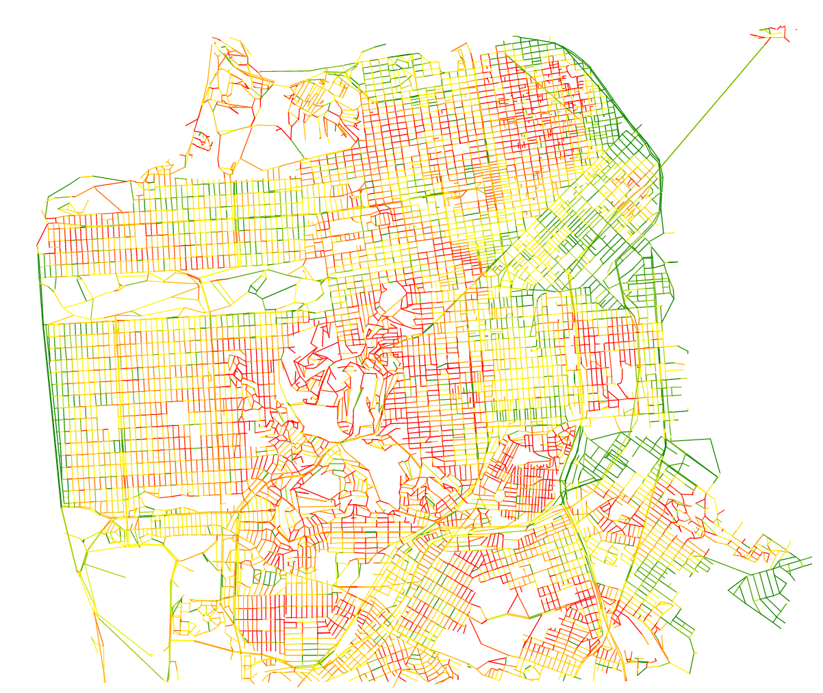
Segments of streets
The next logical step was to draw each of the edges individually (this time, they are lines, not paths). There are 6000+ “streets” (in the OSM sense – streets can be split in any number of different entities in Open Street Map), versus about 16000 different edges. I also found I didn’t really need to draw the nodes.
The obvious way was to encode steepness from green to red on a linear scale. That looks ok, but that’s not super interesting because it’s very difficult to tell whether one street is steeper than another just by comparing colors. I didn’t need an infinite variation of colors, I just wanted to know whether a street was flat (or quasi-flat), with a noticeable slope, or really steep. So instead of using a full linear scale, I just used 3 colors from the green – purple colorbrewer scale.
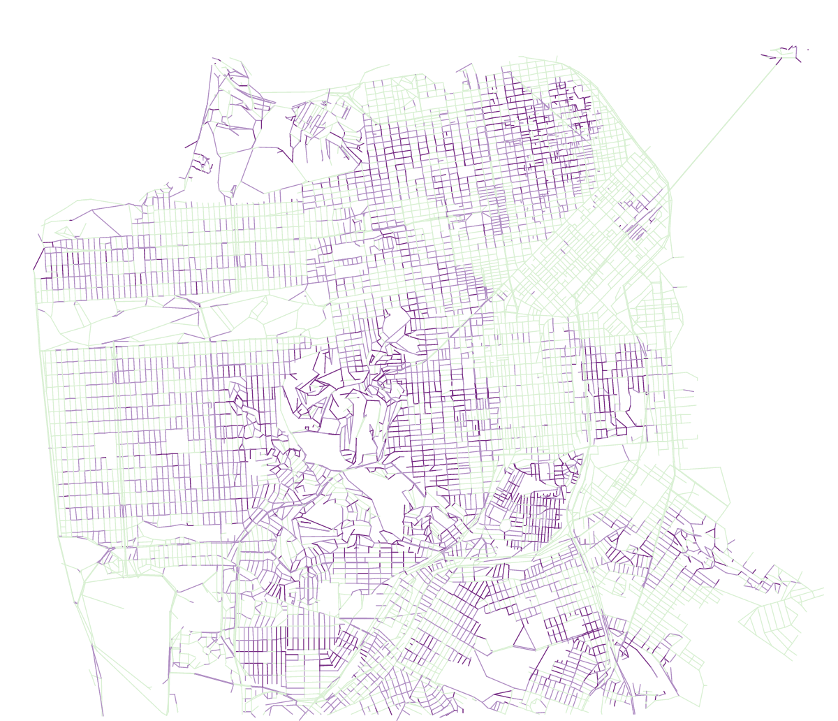
Same map with discrete colors
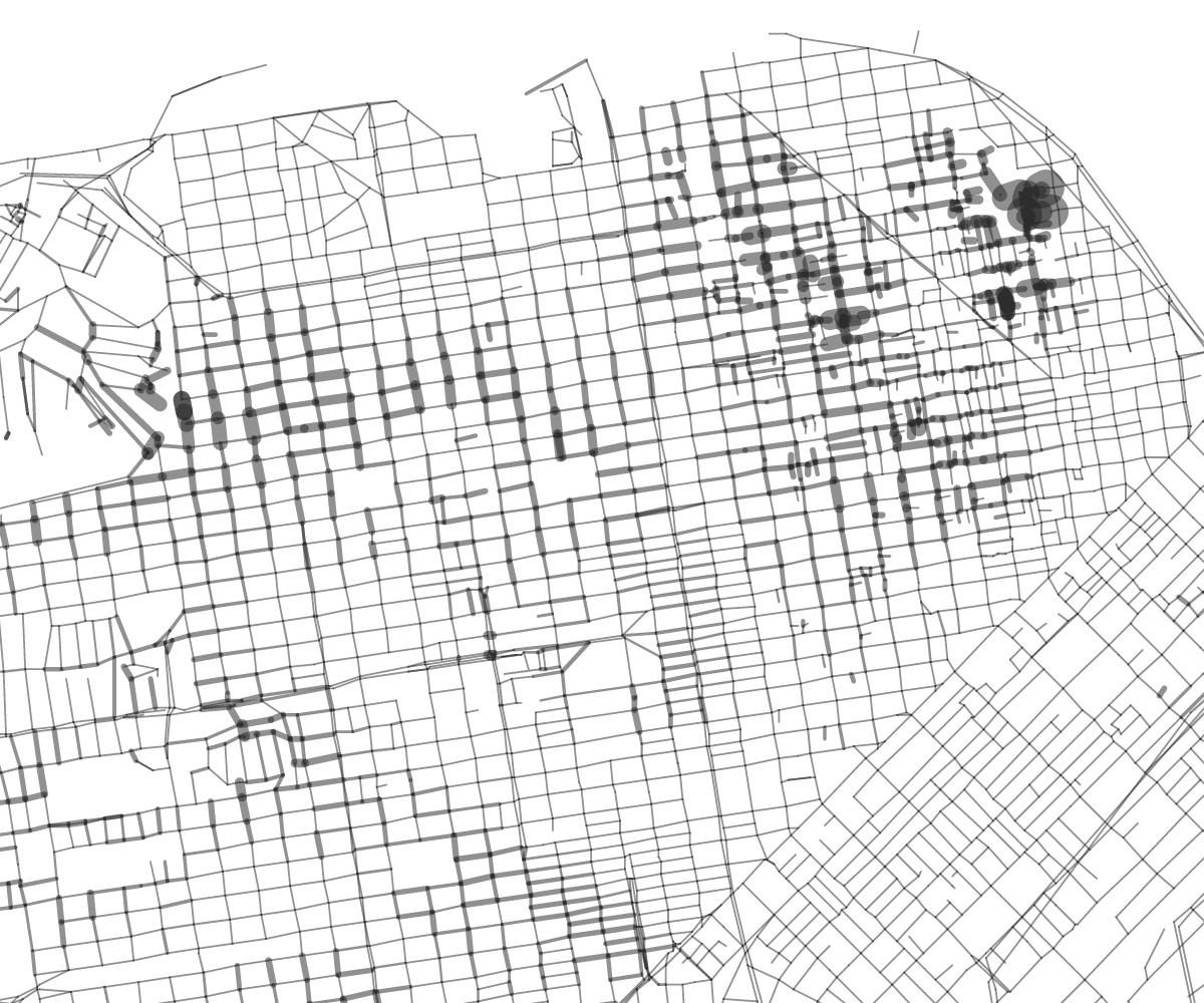
I could see instantly which streets were flat or not, yet wondered if there wasn’t a good simple way to compare between two streets which would be the steepest. Color is no good for that, but how about line width?
Using line width to express steepness
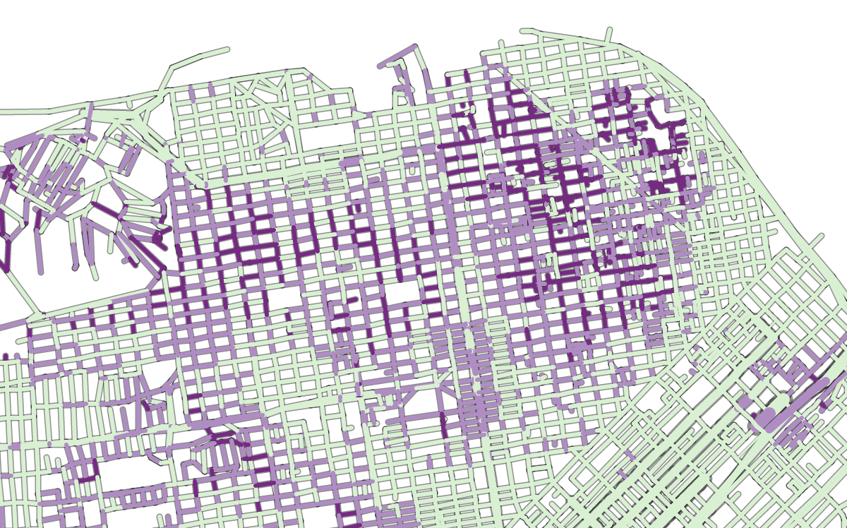
That was kind of an interesting aesthetics but I found it was difficult to find a precise cross street. When looking on a map of San Francisco, we instinctively look for larger streets like Market or Van Ness and if width was used by something else, it can be confusing. At that moment I didn’t have a good measure of street width, so I went back to my OSM extract and tried to scrap the number of lanes from my dataset.
using street widths
You will notice that the streets now have an outline. I don’t draw the shape of each block, that would be too difficult given my dataset. Instead, for each street segment, I first draw a dark grey line, then on top of it, a slightly thinner colored line 🙂
Have the map do something
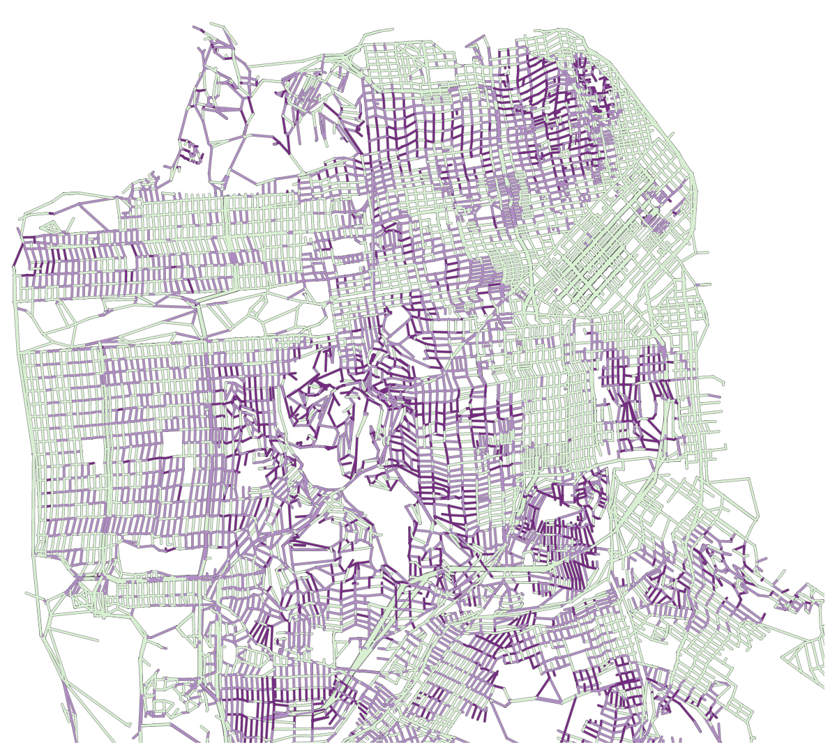
This being a data visualization I thought there could be interesting calculations that could be done with the map. My first intuition was to reuse the ideas of my interactive Paris metro map and make a deformed SF map based on the effort needed to go from one point of the map to everywhere, taking the slopes of the streets into account.
I basically refactored my code which I hadn’t visited in almost two years… and adapted shortest-path algorithms to my network of streets. It confirmed what I feared, that not all of my streets connect. Some streets in the map form tiny islands which are isolated from the rest of the network, and so cannot be reached from outside. I decided not to deal with it, debugging the dataset was really too complicated at this stage (and to be honest the filters I had used to extract the street data had already gone through many, many iterations).
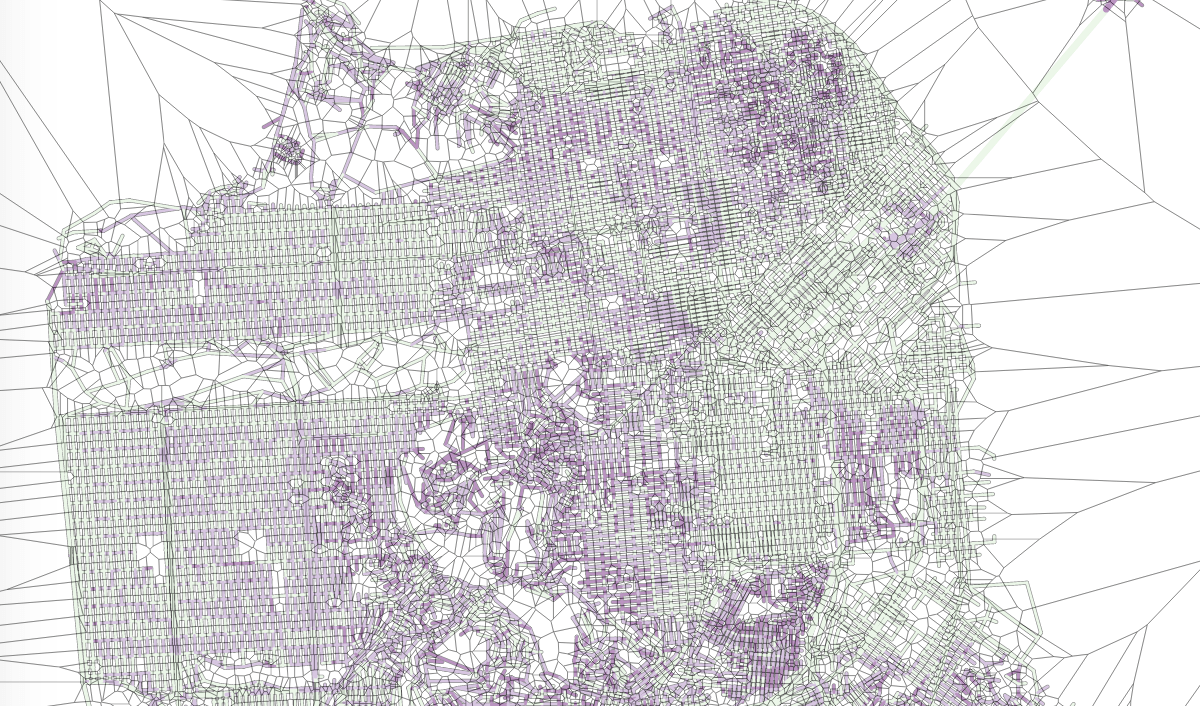
I also used voronoi tessellation to create a layer of polygons on top of my nodes to capture clicks. The user can choose where to base their map, not by clicking on a precise cross street, but in the area around it, like so:
Showing the voronoi layer on top of the map
However, the results proved to be underwhelming.
Deformed map by effort needed to walk from a given point
All right, so some points are closer, some points are further, but overall it’s not a super interesting map. It’s less legible, and it doesn’t help me figuring out my initial problem: from a given point, which streets should I take to not go up and down?
So I was back to the drawing board. Now with the Dijkstra algorithm which I use to compute the shortest distance from one point to the others in the network, I can also get which path is the shortest, i.e. which is the actual itinerary, edge by edge, that takes me from one point to the others using the shortest path.
Path-finding
So my next idea was to hide all the edges that would not be in a shortest path. Again there were about 16000 edges, and 10000 nodes; there is only 1 shortest-path edge per node, so that’s hiding about 1/3 of the streets. Let’s see how this looks:
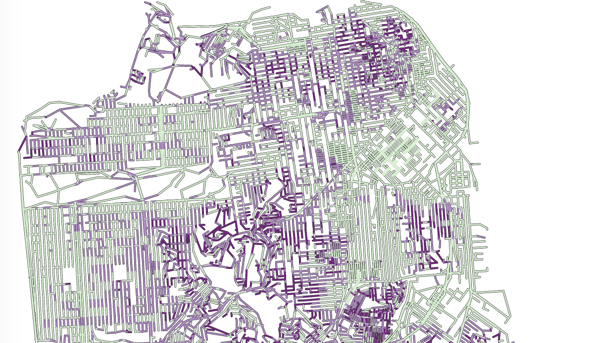
All streets which are not in a shortest path are hidden.
That’s more interesting! At least, I know which streets I should not even consider from a given starting point.
I could do better: once this is done and a starting point is selected, I can actually draw the shortest path to wherever the user moves his or her mouse:
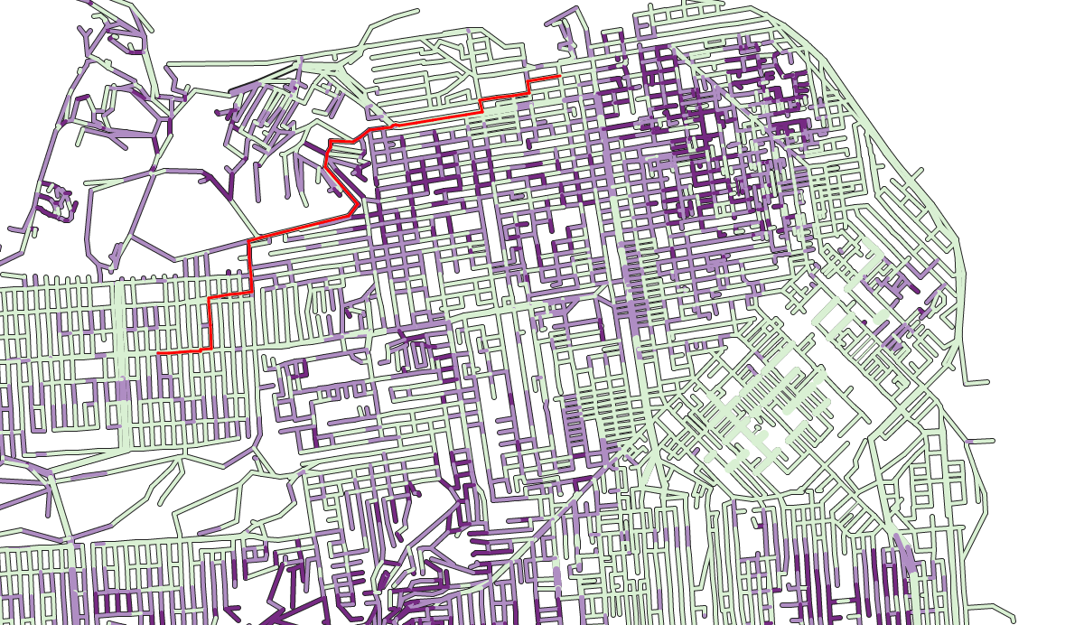
Drawing the shortest path
Styling and wrapping it up
In parallel I had worked on a page template to put everything on and my map looked kind of abstract. I had considered adding street names but algorithmically it’s pretty complicated (it would have been much quicker to do it completely manually but eventually I decided against that). I needed the map to belong to one specific part of the page as opposed to be just hanging in free space. For this I thought I really needed the shape of the land.
So I went back to my OSM dataset and this time looked at the nodes which were on coastlines. Coastlines, though, are lines, not shapes, so some reworking was in order. In the original dataset there were some 200 different lines. Many of them were outside San Francisco proper, but still by removing those there were about 50 left. Many of them could be joined, and I had just to do a tiny bit of manual stitching to come up with one landmass shape for San Francisco.
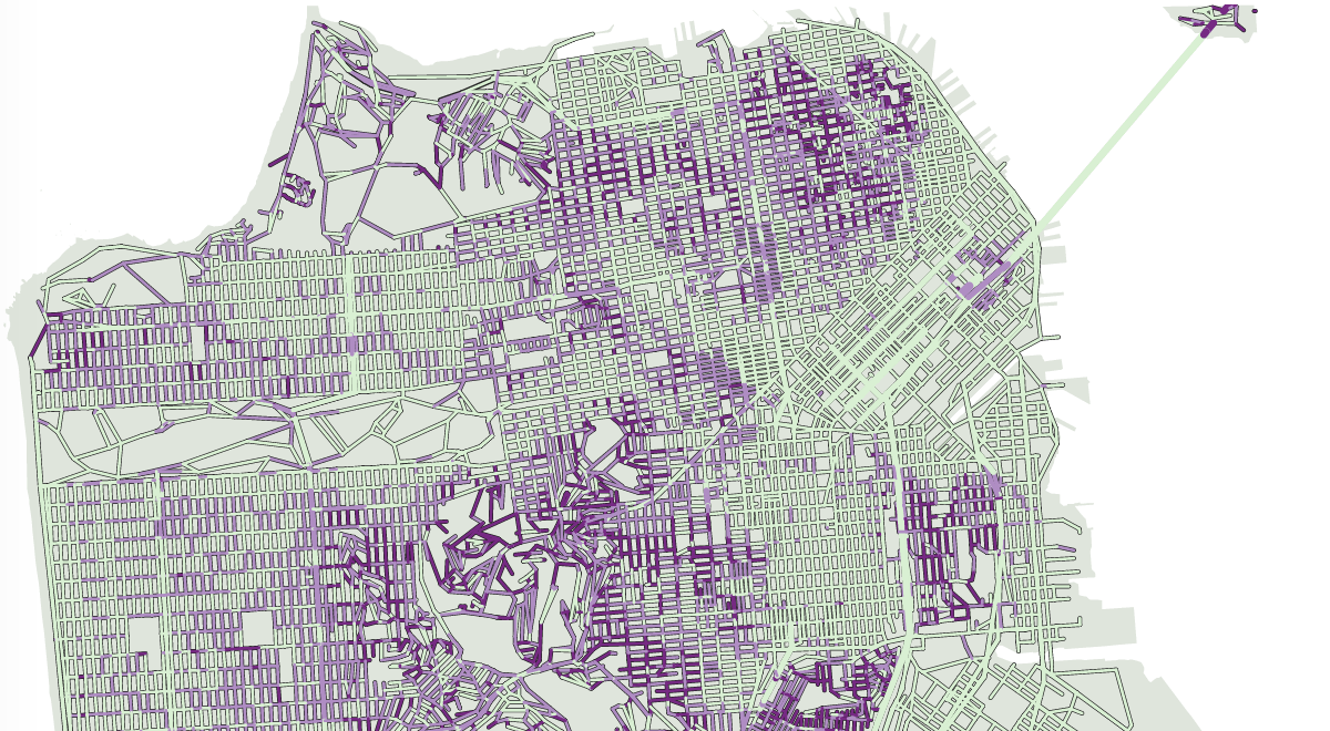
Now with a landmass
I tried various combinations for styling and finally fell back on using green, orange and red for the steepness – the very palette I avoided in the beginning. I used more balanced, slightly less saturated colors though.
One last thing I did on the data side was to get, for every node (which is every end of street or cross-street) the name of all the streets that go through it, so I could describe them – both the first node the user will click on and anyone he or she will mouseover on.
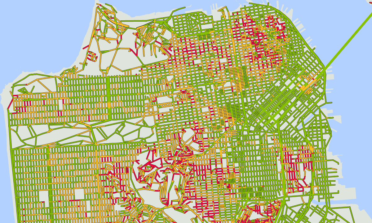
The end result!
Hi, congrats on your work. Would like to actually see it in action but the link at the top does not work (it redirects to your homepage), can you fix it?
thanks! typo in the link fixed
I’ve experienced this routing problem too. For Bike directions, Google Maps shows elevation change along a proposed route with a line chart with distance traveled on the x-axis and elevation on the y-axis. The line chart is a small inset layered over the top-right corner of the map.
To show an example, I’ve tried to pick starting and ending points near to those shown in the ‘Drawing the Shortest Path’ map image.
a map:
https://www.google.com/maps/dir/4550+Geary+Blvd,+San+Francisco,+CA+94118/37.802712,-122.4281773/@37.7936641,-122.4500266,14z/data=!4m9!4m8!1m5!1m1!1s0x8085873de3f56681:0xda42e472efc0d3c3!2m2!1d-122.468389!2d37.781143!1m0!3e1
images of three possible routes:
http://imgur.com/a/fOcW9
Interesting enough, if you view Walking Directions in Google Maps, it gives to you an option to show terrain. I feel like it is tough to infer hill-climbing difficulty from the altitude encoded in the terrain shading.
map:
https://www.google.com/maps/dir/4550+Geary+Blvd,+San+Francisco,+CA+94118/37.802712,-122.4281773/@37.7918046,-122.4660525,14z/data=!4m10!4m9!1m5!1m1!1s0x8085873de3f56681:0xda42e472efc0d3c3!2m2!1d-122.468389!2d37.781143!1m0!3e2!5i2
images of three possible routes:
http://imgur.com/a/ycWVv
I don’t know how they compute traveling time for walking or cycling. I don’t ride bikes so I won’t comment on this but one walk I know well is from my house on the top of a hill to Crissy Field where I run, which is about 30 mins downhill, and maybe 45 minutes uphill. Google maps gives me 50 mins both ways and I’m not too sure about their recommended route either. Capturing or calculating walking speeds has got to be a tricky problem.
Agreed! I usually walk a bit faster than Google’s maps estimate. I wonder if the estimated walking time changes with the grade of the road ( ie hills take longer to walk ).
Not colorblind-safe 😉 Just kidding. So good to have you back blogging…
plot twist: i am colorblind 🙂